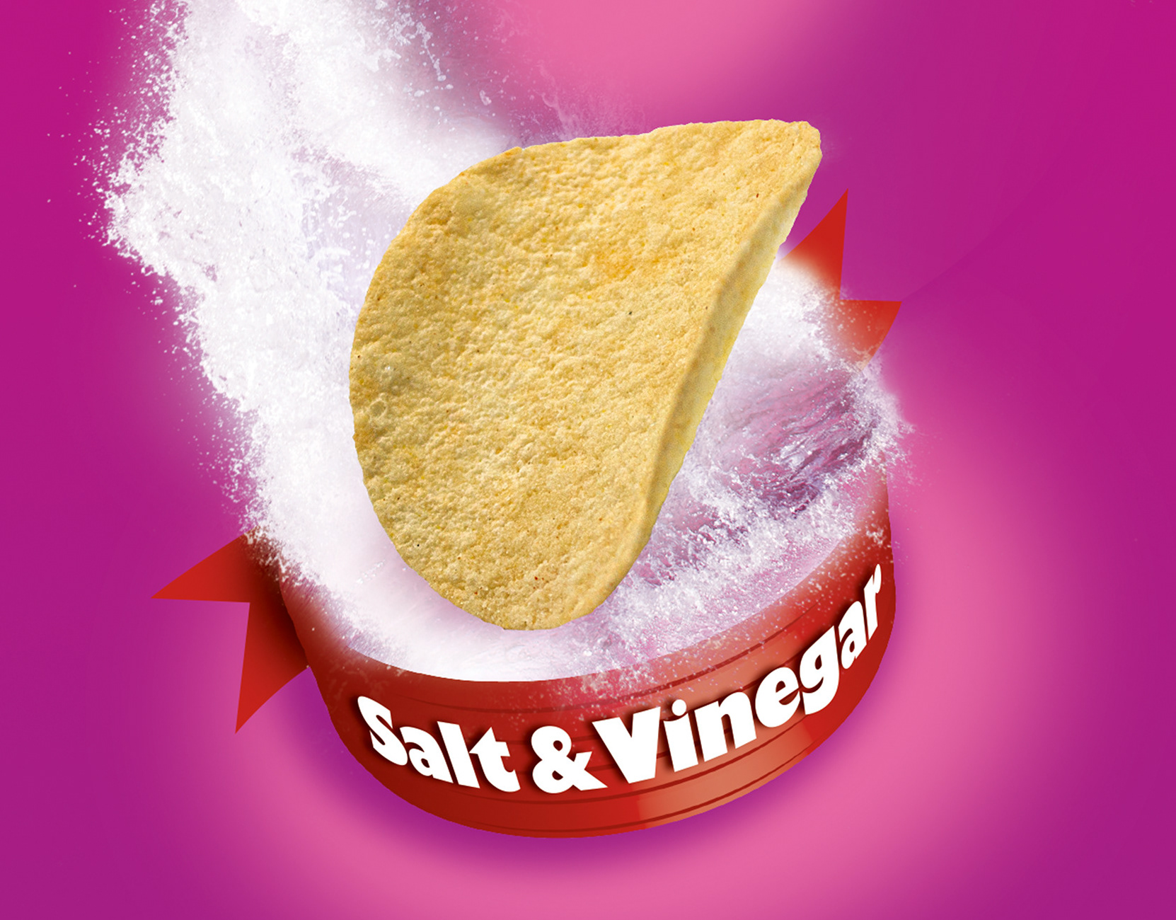
The Ishimodo Brand and Design Agency was tasked with helping LiteLiving to develop a strong brand presence in the growing lemon detox market, which was fast becoming over saturated. They commissioned Stephen to design a solution that would be youthful, fun, and have a refreshing taste appeal. Franklin answered the initial brief creating four lemon photography concepts - movement, still, medical, and results. After narrowing down to the movement direction Stephen iterated on the front of pack hero image and product branding. The result was a piece of brand packaging bursting with life and flavour, giving it a distinct on-shelf presence that communicated trust and taste.
Design Direction: Ishimodo Brand and Design Agency
Creative Direction: Stephen Franklin
Printing: AMR Hewitts PrintPackaging
Creative Direction: Stephen Franklin
Printing: AMR Hewitts PrintPackaging
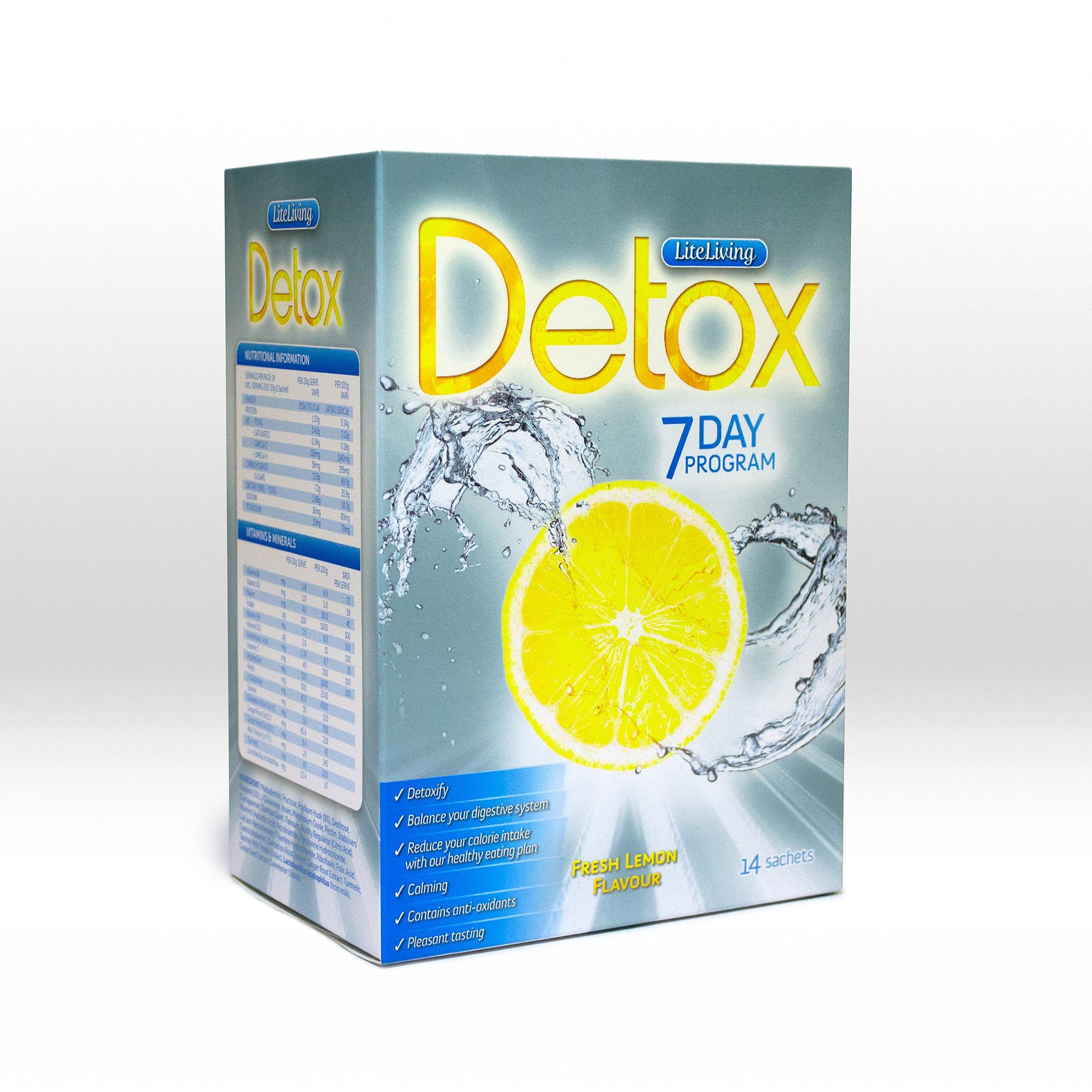
The printed packaging had a clean fresh look, indicative of Franklin’s design ethos.
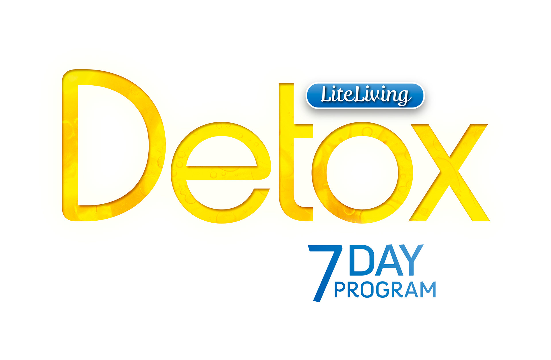
Stephen went with Fertigo Pro Script Regular for LiteLiving and Harry Plain for the Detox, incorporating a refreshing lemon background into the product name.

Ishimodo directed Stephen towards a single slice of lemon contrasted against a clean metallic background.
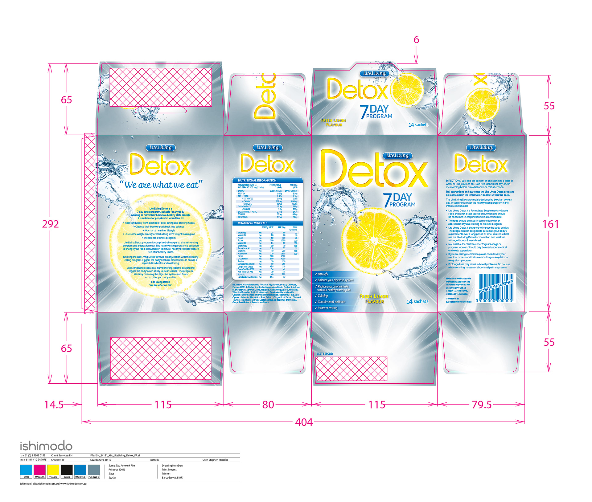
The final print included a special spot silver for the background with an overlay of a spot blue.