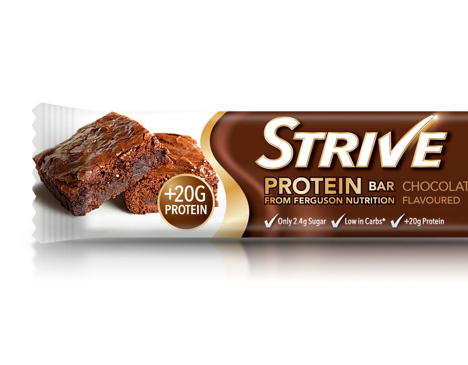
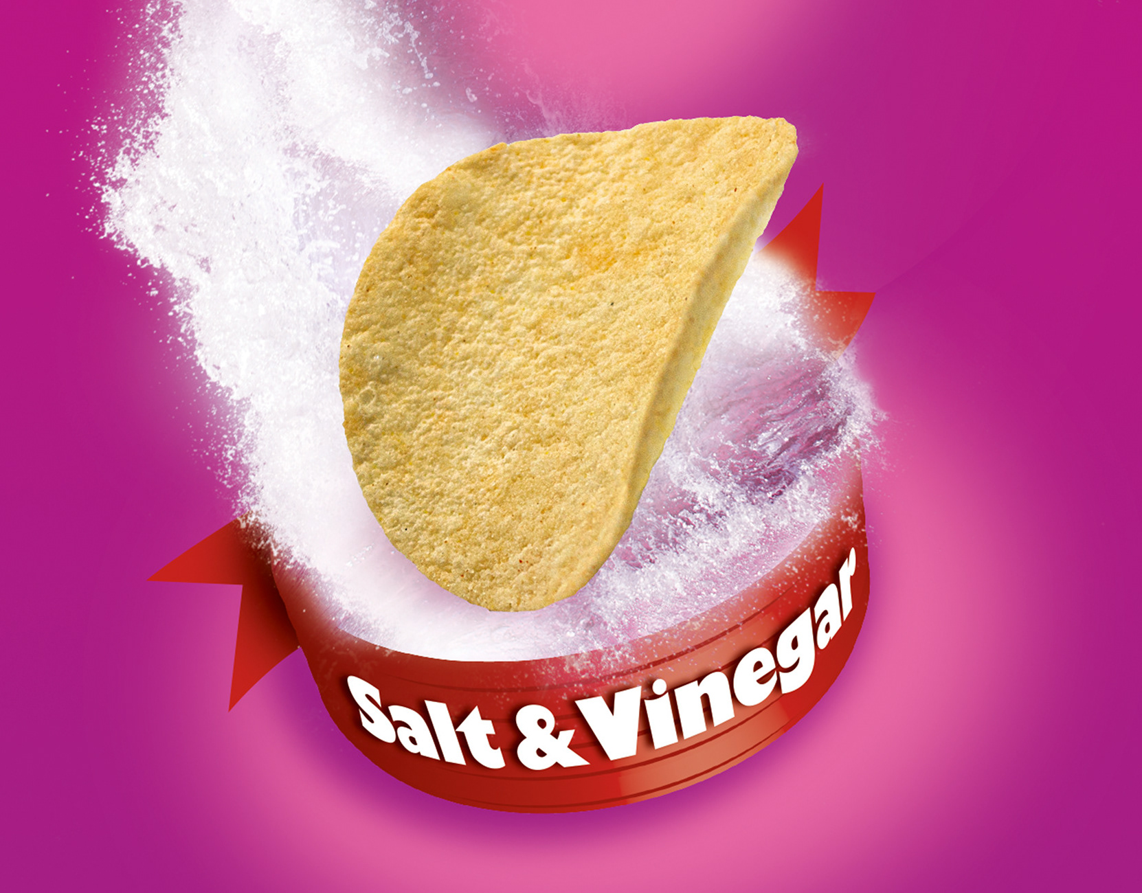
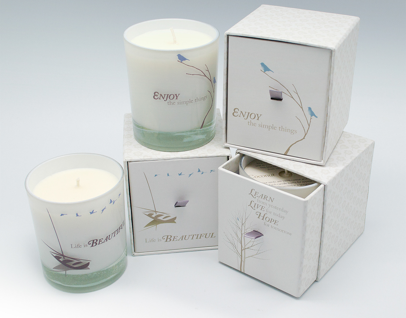
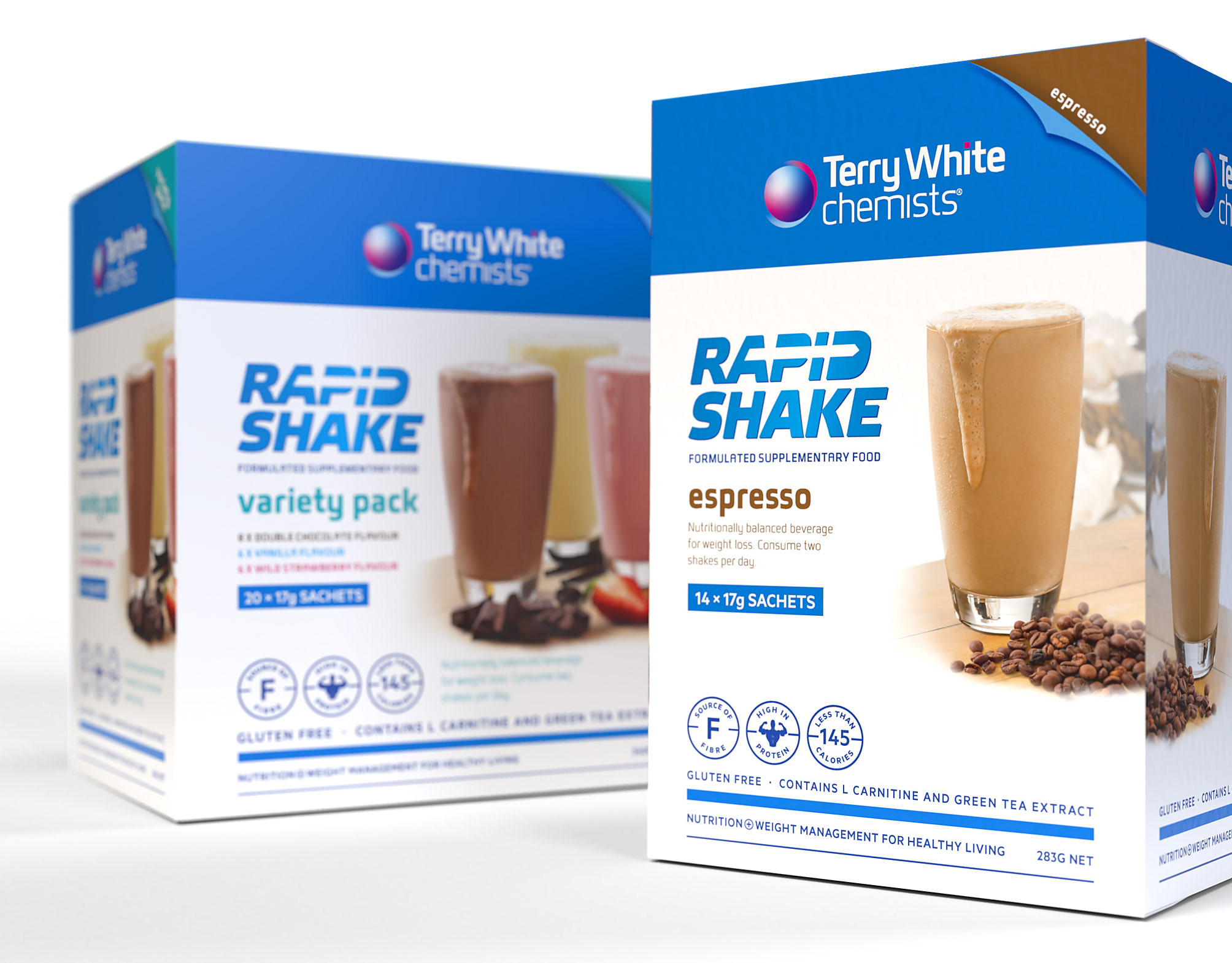
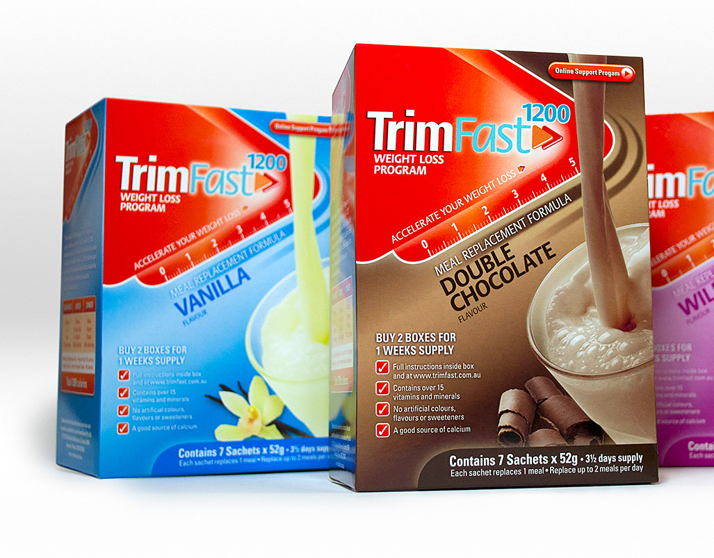
Working with the Ishimodo Brand and Design Agency, Stephen was tasked with refreshing the design for the Tony Ferguson product range. The brief was to create a design that merged the pharmaceutical cues of the existing Practitioner range, whilst also having an emotive consumer feel. Franklin expanded the centre aligned grid of the original packaging giving more space to the variant name and front of pack copy. He also replaced the stylised food cameos with actual product images that had movement and taste appeal. The outcome was a design with strong flavour cues and a clear messaging hierarchy that targeted a more consumer centric segment.
Design Direction: Ishimodo Brand and Design Agency
Creative Direction: Stephen Franklin
Photography: Adam Cleave
Retouching: Stephen Franklin
Based on Stephen’s initial designs and mock-ups, the Ishimodo Agency directed the photography for all the front of pack images using Melbourne photographer Adam Cleave.
Stephen produced the product shots for the Tony Ferguson Ready to Drink shakes, combining multiple stock images into a single composition. This preliminary retouching work would set the tone of the subsequent product photography.
This ‘wet’ soup range by Tony Ferguson came in ready to heat sachets.
The redesign of the original Practitioner Only meal replacement shakes was paired back to just the branding and variant name. Differentiating them further from the consumer-focused Impulse range.
Franklin’s front of pack design grid could be adapted to a wide variety of packaging sizes and print processes as seen in the Side Dish range above and the Snack range below. Helping to maintain the consistency of the Tony Ferguson brand across the entire range.

