York Studios are a creative content services company, specialising in video production. When they approached Stephen about the LaserMAX range of brand packaging, they needed a trusted design partner to execute on a short deadline. York was in pre-production for the LaserMAX TVC (Television Commercial), and yet there were no brand assets or packaging available for this new product range. Franklin was able to help develop the creative brief for the project and push through a range of concepts, iterating quickly on feedback from York Studios and their client. The result was a strong brand packaging execution, with all artwork and brand assets delivered on time to meet both the TVC and the product's tight pre-Christmas production schedule.

Design Direction: York Studios
Creative Direction: Stephen Franklin
Graphic Design: Stephen Franklin
Photography: York Studios
Retouching: Stephen Franklin
Stephen designed the LaserMAX range with distinct variants that addressed multiple shopper touch points accurately.
Stephen designed the LaserMAX range with distinct variants that addressed multiple shopper touch points accurately. 
LaserMAX brand name logo.
Franklin began by developing the brand identity for the product that would later expand to incorporate the individual trademarked sub-brand names.
LaserMAX Original sub-brand trademarked logo.
LaserMAX Solar sub-brand trademarked logo.
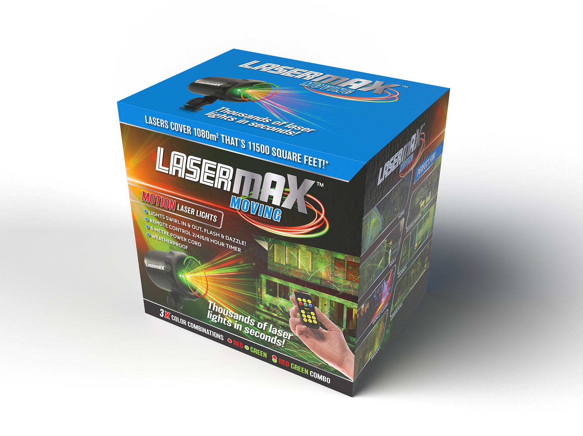
LaserMAX Moving sub-brand trademarked logo.
LaserMAX Pattern sub-brand trademarked logo.
A slightly retro-styled font was used for the word Laser. And based on client feedback, Stephen stepped up the relative heights of the MAX characters to reflect the light coverage of the product.
LaserMAX Pattern packaging showing the front, top, and right side of pack.
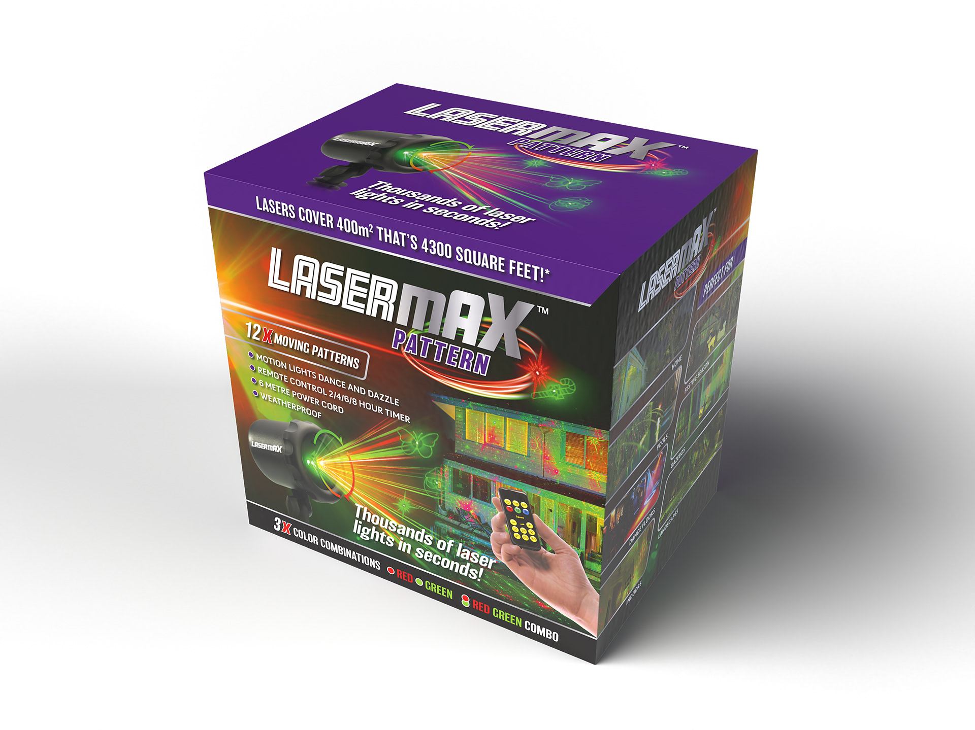
The front of pack had a well-defined messaging hierarchy starting with the master brand and sub-brand, followed by a product description denoting key points of difference.
Right side of pack detail showing product benefits.
Back of pack showing the feature comparison chart and coverage graphic.
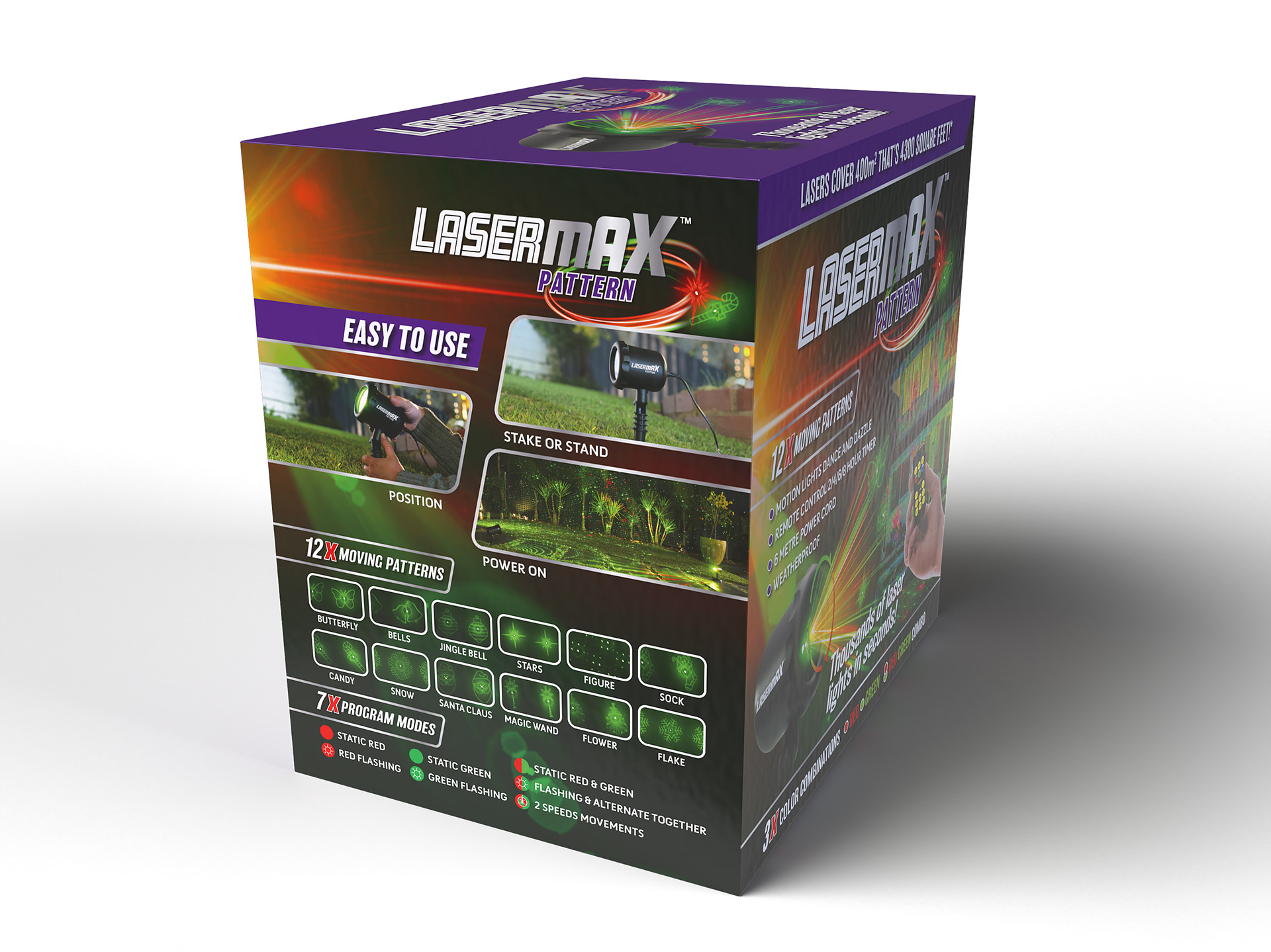
Left side of pack with basic setup instructions and feature list.
The back of pack included a clearly designed comparison chart that helped with consumer purchase decisions.
LaserMAX Original brand packaging showing red colour coded top of pack.
Stephen used a colour coding system for the four product types to help with separation of the sub-brands on shelf. 
LaserMAX Solar brand packaging showing yellow colour coded top of pack.
The colour coding extended from a front band containing a coverage touch point, to the top, and back of pack.
LaserMAX Moving brand packaging showing retouched hero image.
Working with photography taken by York Studios, Stephen retouched stock laser light imagery with images of the product and house locations shots to show the individual product features.

View more projects

.A.K. Identity Design
Self-initiated identity design project for London based EDM Producer/Artist .A.K.
Self Initiated Project - Smiley Old Skool Raver
Self initiated design project ‘Smiley’ emoticon.
Terry White Chemists Rapid Shake Range
Design and rollout of the Terry White Chemists Rapid Shake Range for the Ishimodo Brand and Design Agency. Included the design development and finished artwork for five SKUs (Stock-Keeping Units) based on supplied design handover.
Potato Face Stacked Chips Packaging Design
Packaging design and character development of the Potato Face brand of stacked chips for Dallas International.
TrimLife 1200 Meal Replacement Range
Production of the TrimLife 1200 Meal Replacement Range for the Ishimodo Brand and Design Agency. Included the design development and finished artwork of packaging for multiple variants, including shakes, bars, soups, and associated product shippers.
Songlines CD Cover Packaging, Illustration & Booklet
Creative direction of the Songlines - Songs of the East Australian Humpback Whales CD cover packaging. Included the cover illustration plus the design and layout of an internal information booklet.
Strive Protein Bar Packaging & POS
Design development and production of the Ferguson Nutrition range of Strive Protein Bars for the Ishimodo Brand and Design Agency. Included the design of the product shippers and development of in-store Point-of-Sale material.
Whirlpool Stella Washer & Dryer Retouching
Retouching of the European Stella range of washers and dryers from Whirlpool for the Ishimodo brand design agency. Included product localisation from French to English, clean-up of image backgrounds, and minor colour changes.
TrimFast 1200 Brand Identity and Packaging Design
Design, development and production of the TrimFast 1200 weight loss program brand identity and meal replacement shake product range, for the Ishimodo Brand and Design Agency.
Potato Face Salt and Vinegar Range Extension
Packaging design and character development of the Salt and Vinegar range extension for the Potato Face brand of stacked chips from Dallas International.
Back to Top