TAFISA brings health and social interaction to communities around the globe by promoting sport for all and physical activity. Muttromedia briefed Stephen to modernise and simplify the TAFISA brand and the logos for the organisation’s various programs and events. The leading TAFISA brand was tackled first, which set the tone for the entire identity and subsequent sub-brand logos. The overall colour palette was strengthened, and subtle shadows were added to the brandmark to create a sense of dimension. The result was a reinvigorated look that captured the spirit of TAFISA's mission: "For a Better World Through Sport for All".
Design Management: Muttromedia
Creative Direction: Stephen Franklin
Graphic Design: Stephen Franklin
Creative Direction: Stephen Franklin
Graphic Design: Stephen Franklin
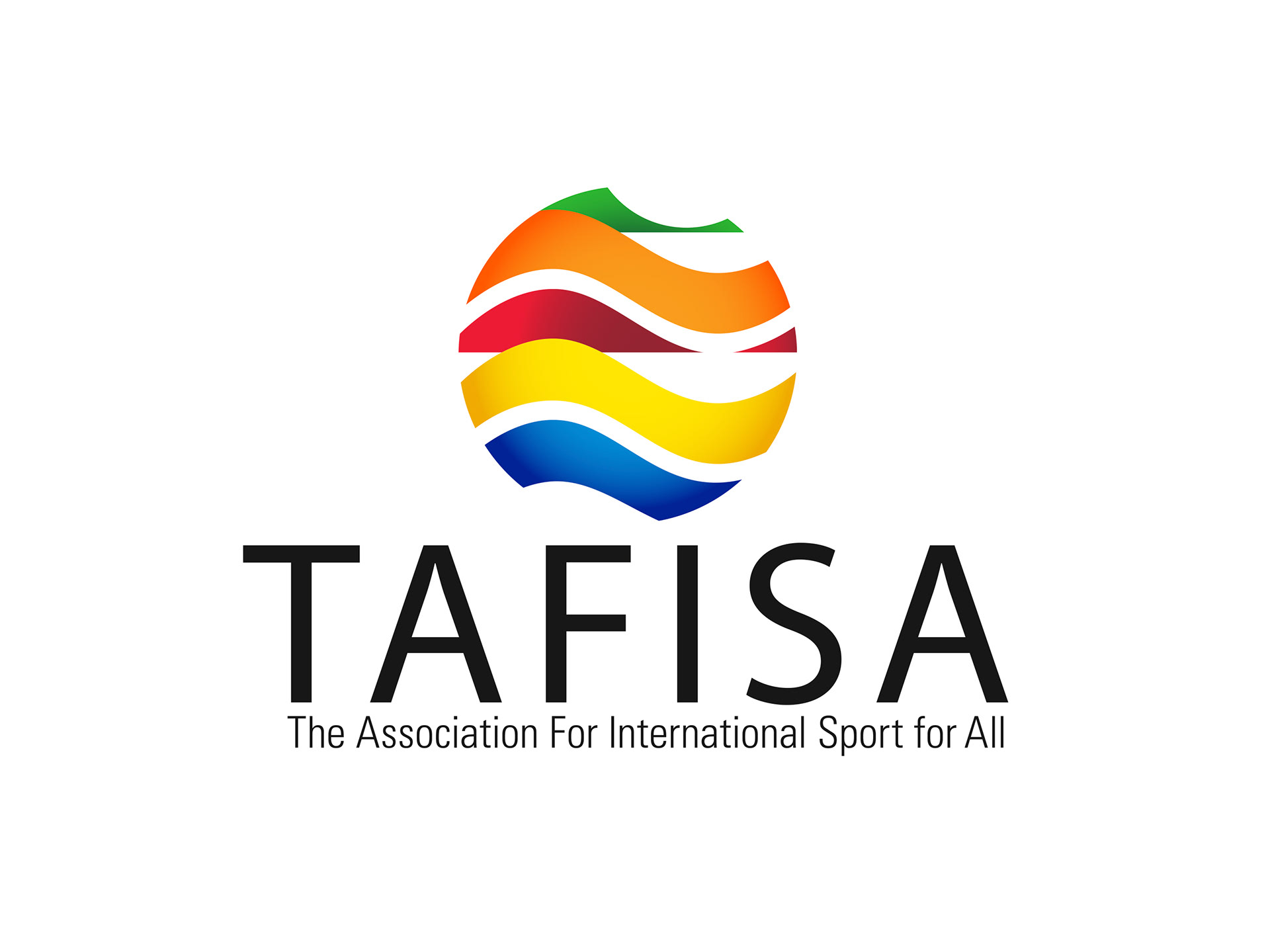
With the strengthened brand colour palette in hand, Stephen worked in shading around the brandmark lifting out the globe shape and giving it internal depth
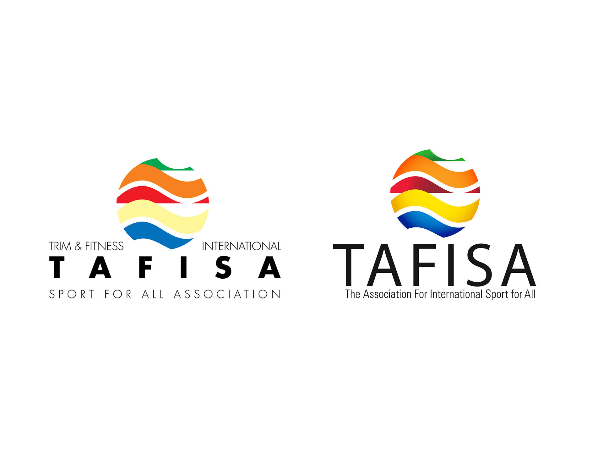
From the original logo to the redesign, the full organisation’s name was pulled together under the acronym to simplify the type layout.
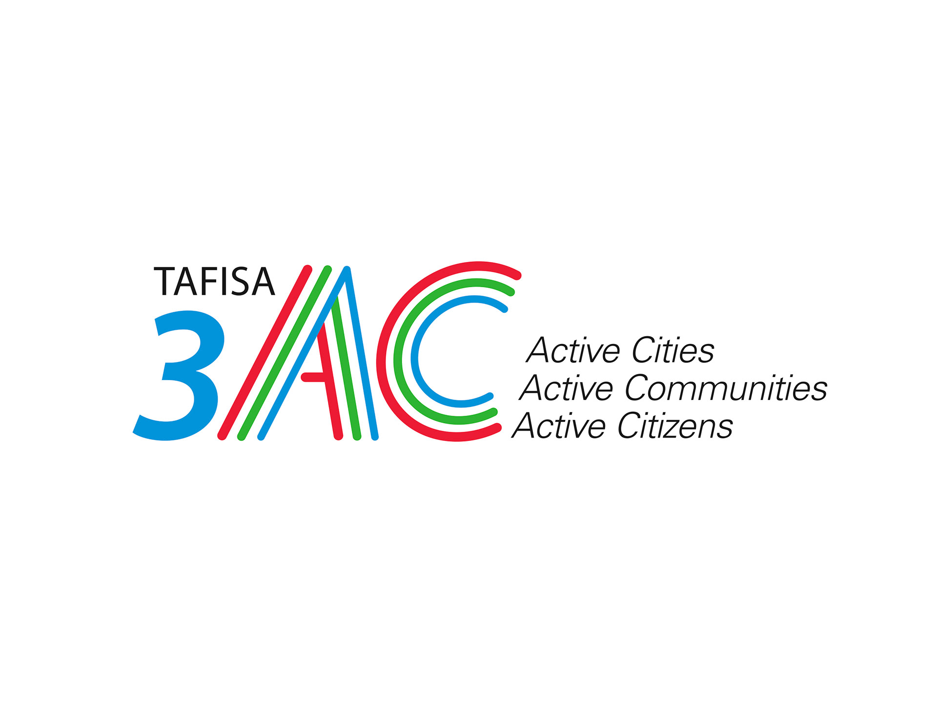
The first of the sub brands to be developed was the Triple AC logo, using the new TAFISA brand palate and corporate font styles.

Stephen also developed the TAFISA World Walking Day logo. This international event, which caters to all ages and walks of life proudly used the logo for many years in its event materials and marketing.
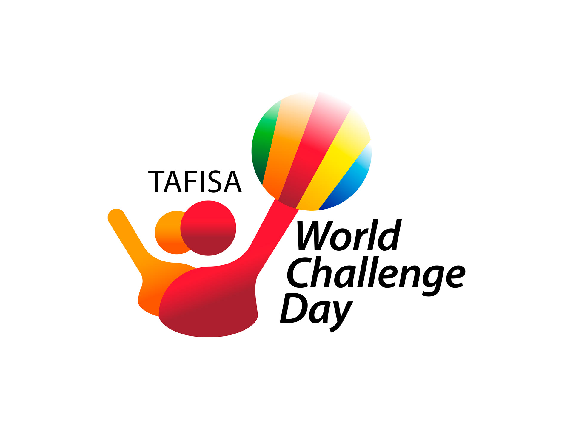
Another annual international event by TAFISA is World Challenge Day. Stephen wanted to convey a sense of fun and community with this design, which also tied in nicely with the TAFISA master brand.

The CLC (Certified Leadership Course in sport for all) logo design is used in TAFISA’s training and certification program.
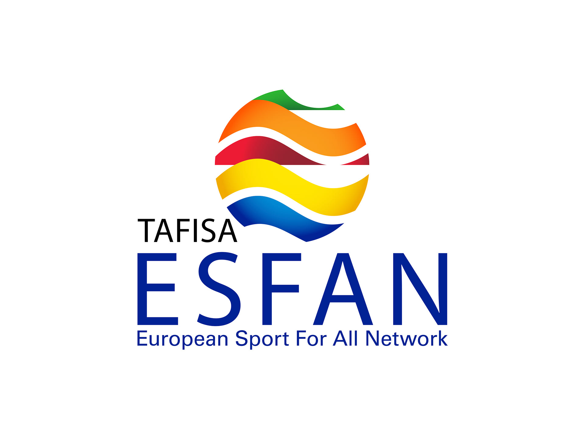
Sister organisation ESFAN (European Sport For All Network) also required a refresh based on the new TAFISA brand identity guidelines.