The Ishimodo Agency chose a shift in design direction from the previous World Vision Annual Health and Nutrition review. The brief for the 2016 report was to create an editorial layout like the Harvard Business Review. Franklin began by creating a design template with a six and seven-column grid that allowed for variations in section length and content supplied by the client. He added a well-defined section intro that starts with the author's headshot, name, and email address to encourage the reader to respond to each article directly. Following Ishimodo's design direction, Stephen paired back the full bleed images and bold infographics, bringing them in line with the copy to strengthen the editorial format. The result was a layout that was informative and engaging, presenting World Vision as the authority on Child Health and Nutrition.
Design Direction: Ishimodo Brand and Design Agency
Graphic Design: Stephen Franklin
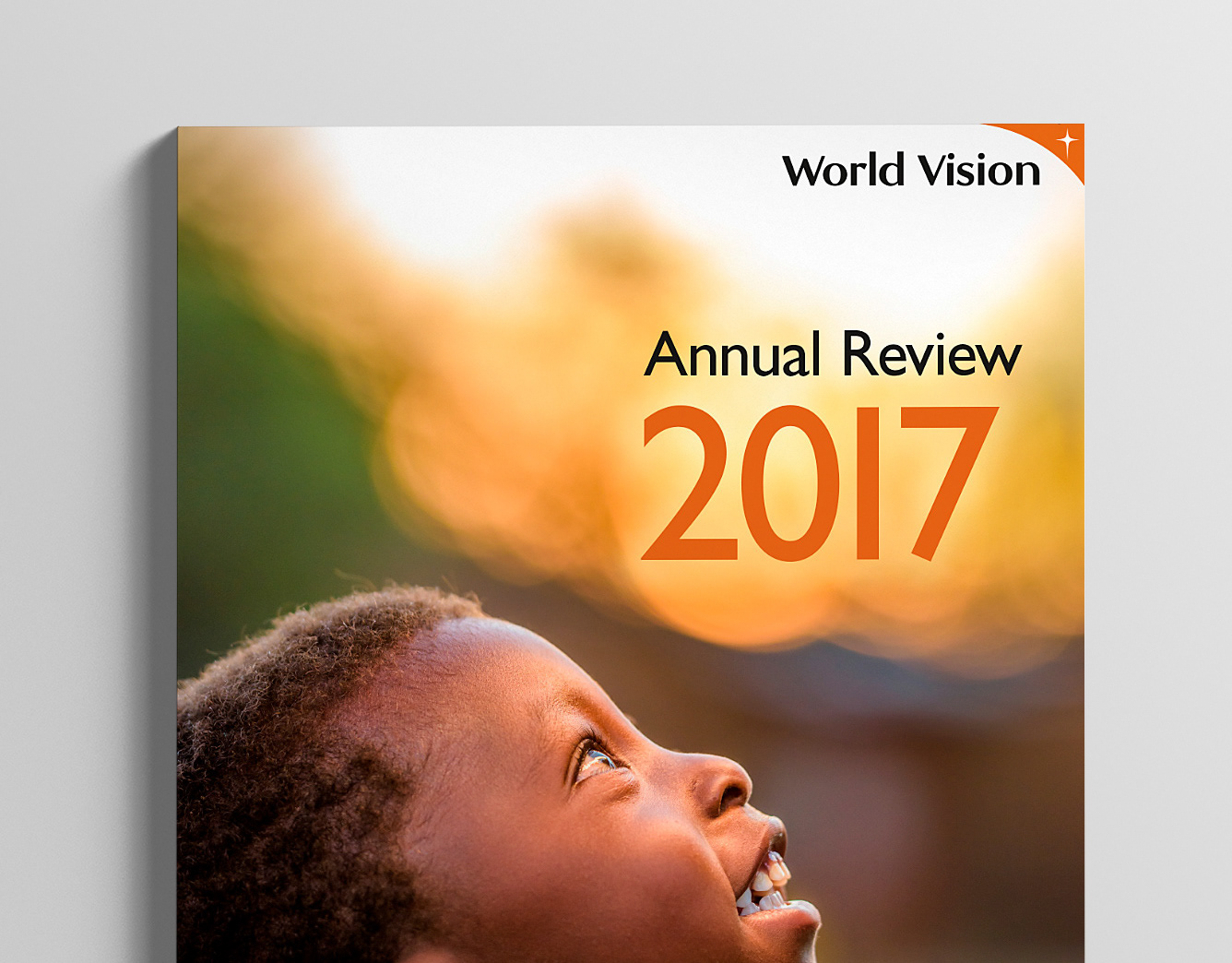
The front cover displayed images from each of the major sections of the report.
The report needed to be in line with the United Nations SDG (Sustainable Development Goals) guidelines, as seen here with the SDG target icon and description.
To focus the attention of the reader Important pieces of information were contained in breakout boxes with tinted orange panels. Quotes were also pulled out and given prominence within the page layout.
The six-column template (left) and seven-column template (right) can be seen here giving the dense content much needed variation.
Significant data point figures were given their own space and typographical treatment.
Some images were given a full page to help break up the flow and keep the reader engaged.
The final spread finished the serious nature of the report with an image of hope and happiness.
The back cover design was kept from the previous 2015 World Vision Annual Report.

