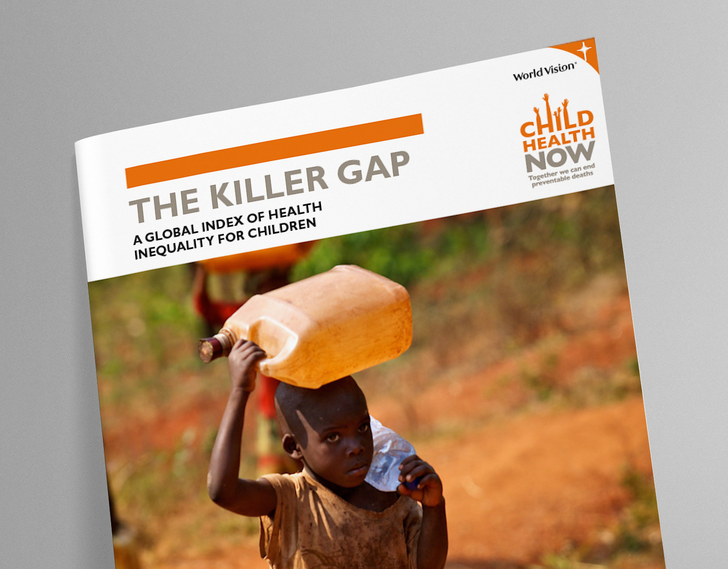
After successfully executing the design of the World Vision Killer Gap report, the Ishimodo Agency came back to Stephen with a new brief from their client. The aim was to create an impactful layout that visualised the information-dense 2015 Annual Health Report in a bright, modern, and legible way. With this open visual brief Franklin focused on the bold use of photography and colour, with a clean typographic style for the layout. Although the design was different and fresh, it sat within the brand language established in the Child Health Now guidelines. And provided a compelling yet hopeful report to engage partners and challenge the status quo in the critical health and nutrition sectors.
Design Direction: Ishimodo Brand and Design Agency
Creative Direction: Stephen Franklin
Graphic Design: Stephen Franklin
Creative Direction: Stephen Franklin
Graphic Design: Stephen Franklin
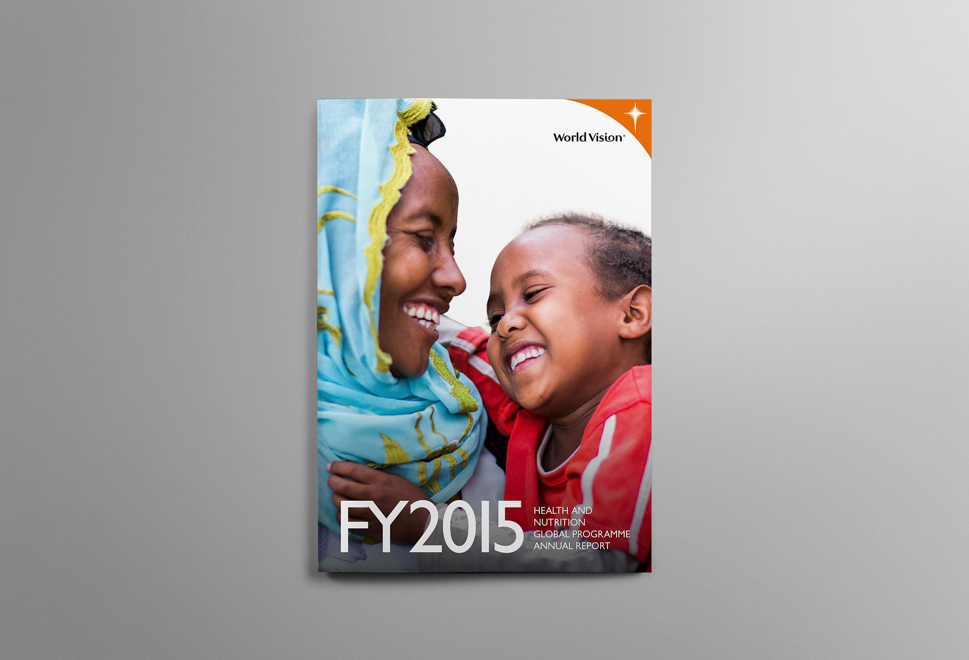
The front cover design set the tone for the rest of this long form document, using large images focused on the subject with minimalist typography.
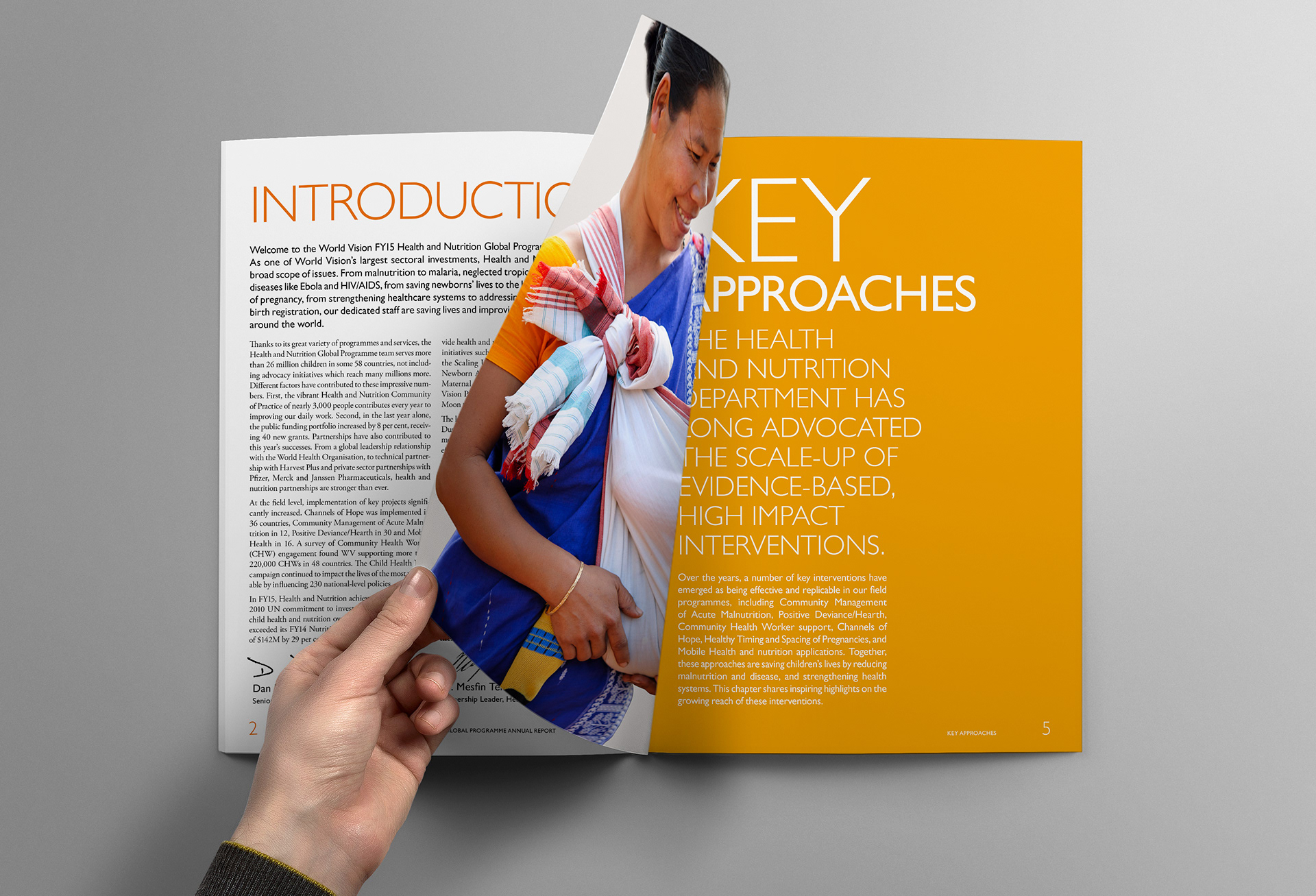
Section headings and subheadings were set in a light font weight but kept in all caps for visual strength.
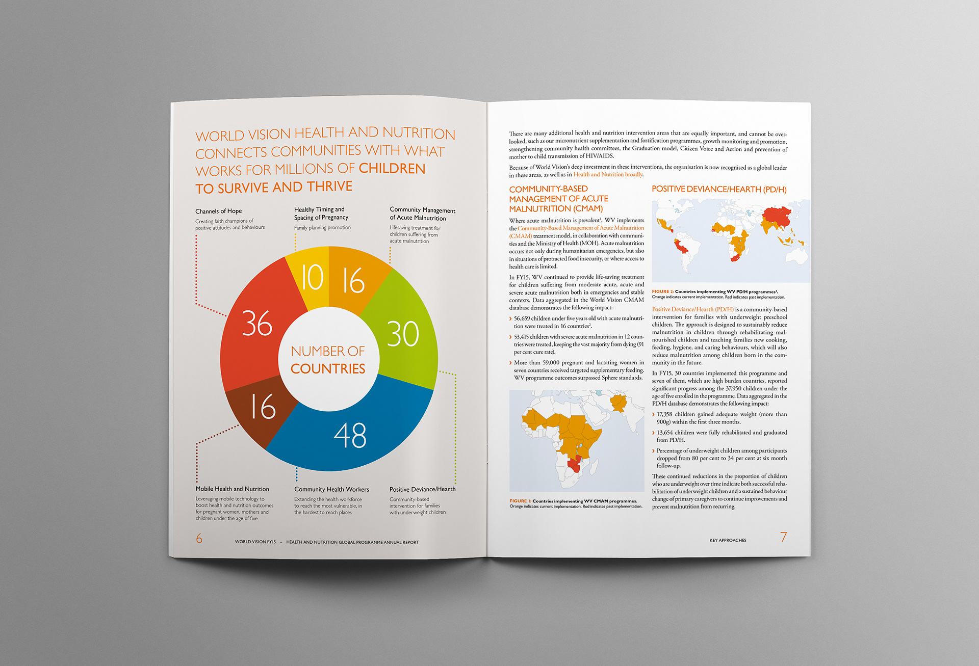
Infographics used large clear figures, easy for the reader to see at a glance.
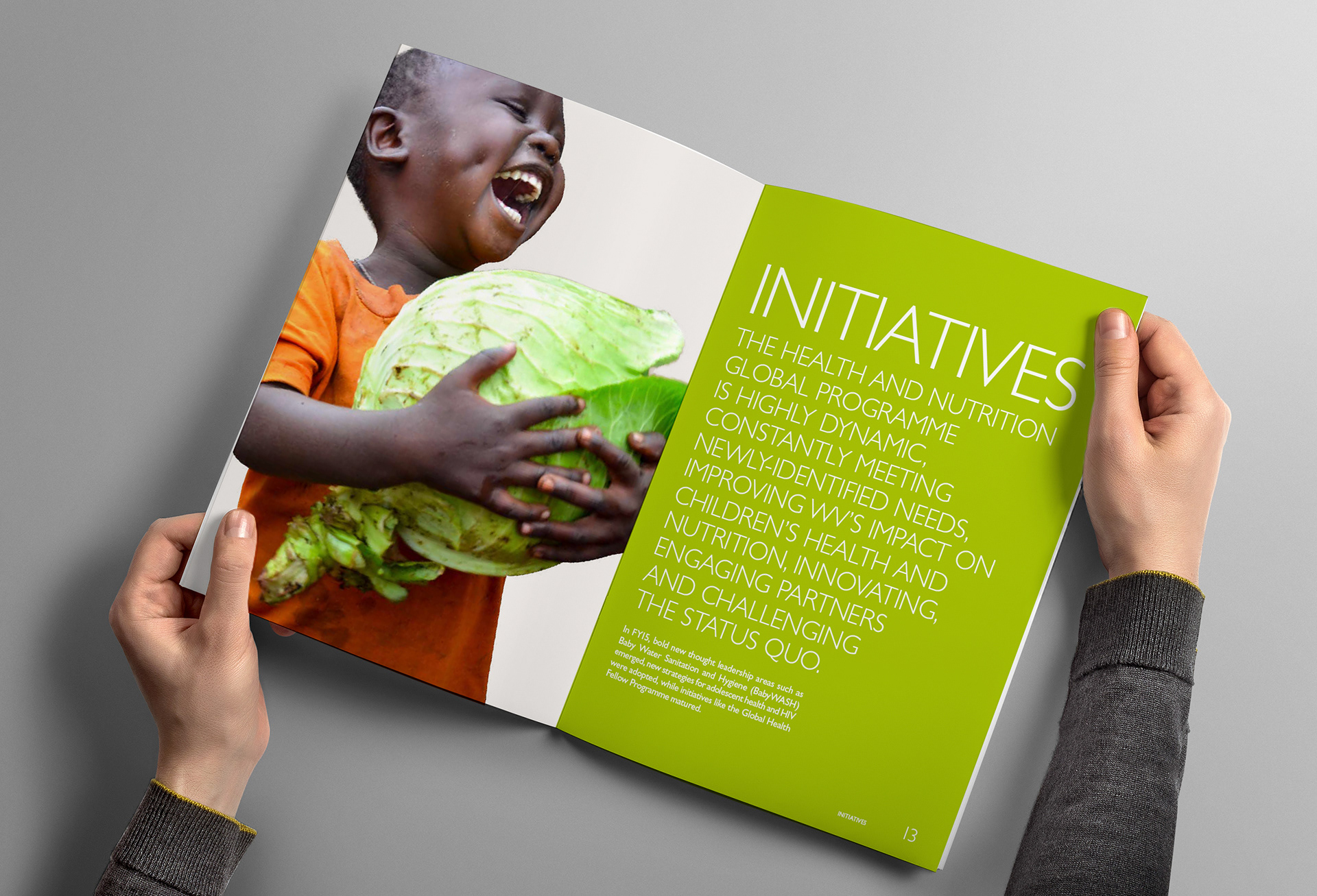
Section page spreads made use of bold full-page photography and colour for visual impact.

The closing infographic shows key data points for World Vision led support programs. They all wrap around their primary focus of child health.
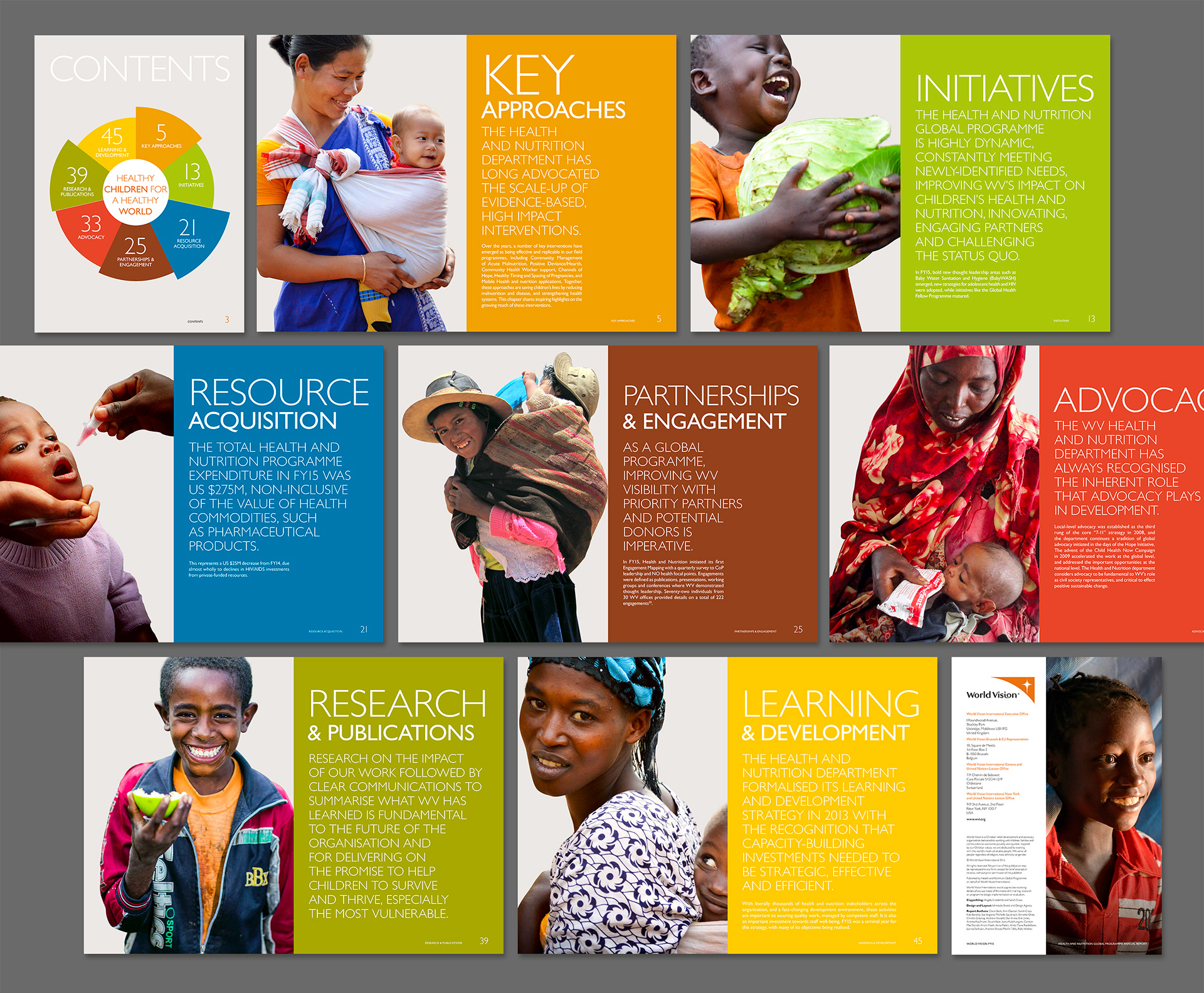
Each image was chosen to support the following section content while complementing the brand colour palette.