The Oceania Project is a not-for-profit research and information organisation established in 1988, dedicated to raising awareness about Cetacea (Whales, Dolphins, and Porpoises) and the ocean environment. They approached Stephen about developing a standalone brand identity, iWhales, that could be used with their shop front and merchandise. Franklin based the design on a photo taken by Dr Trish Franklin of the eye of a humpback whale lying alongside the research vessel in Hervey Bay. He pulled out the main lines of the eye shape and turned them into a stylised brandmark heavily inspired by Japanese woodblock prints and Manga art. The brandmark and brand lockup has been used extensively on movies, CDs, DVDs, and books, with sales supporting the ongoing research and education programs of The Oceania Project and contributing to the costs of presenting the material on the iWhales website.
Photography: Dr Trish Franklin
Creative Direction: Stephen Franklin
Graphic Design: Stephen Franklin
Creative Direction: Stephen Franklin
Graphic Design: Stephen Franklin

The final design for the iWhales brandmark provides enough detail to have visual presence but simplified enough to work well in any size or format required.
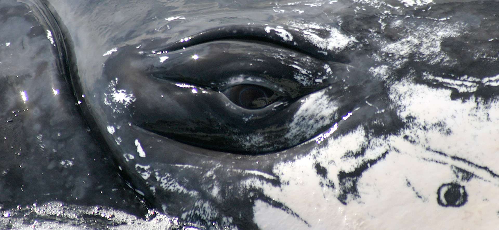
Close-up image of a Whales eye taken by Dr Trish Franklin alongside the research vessel.
This quote from Dr Wally Franklin sums up perfectly the source image Stephen used for the brandmark design, “As we look into the eye of that whale, we realise that humpback whales and all whales and dolphins are special ancient creatures that form part of an amazing living system of life on earth. That system supports all life, including we Humans and Cetacea (whales and dolphins). Like we Humans, Whales and Dolphins are sentient mammals and part of the natural heritage of this ocean/earth planet. They deserve our care and protection so that both species can live in peace and harmony with our unique and wonderful living environment and each other.”

Full colour iWhales logo.
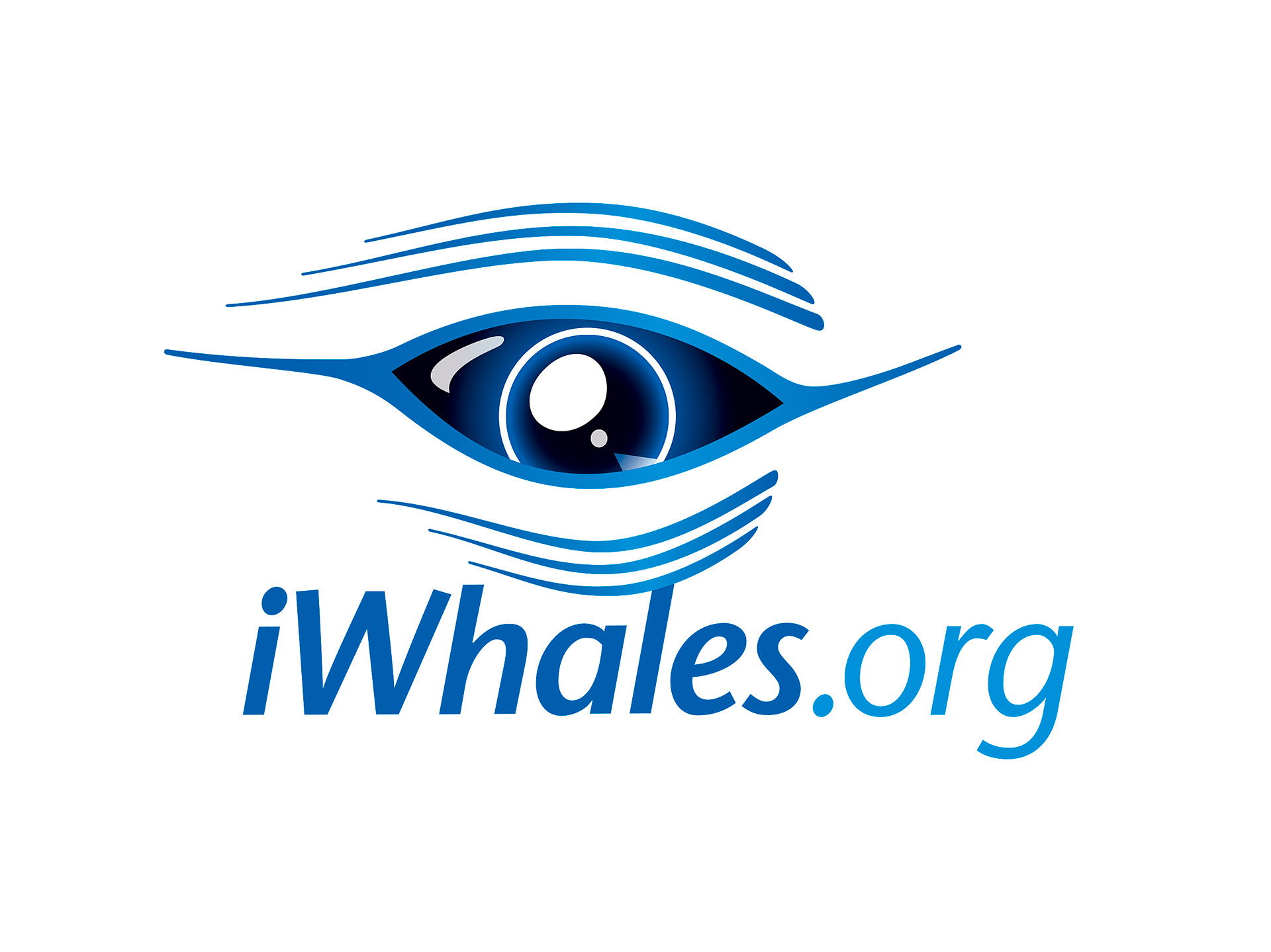
Full colour iWhales logo with .org domain tag.

Black and white iWhales logo.
Franklin connected the iWhales typemark to the brandmark via the ascender on of the ‘l’, leaving it a little off centre to create movement and allow for additional tags such as domain names. As a standard requirement he made sure the logo worked in a single colour format.

iWhales logo reversed white from black background.
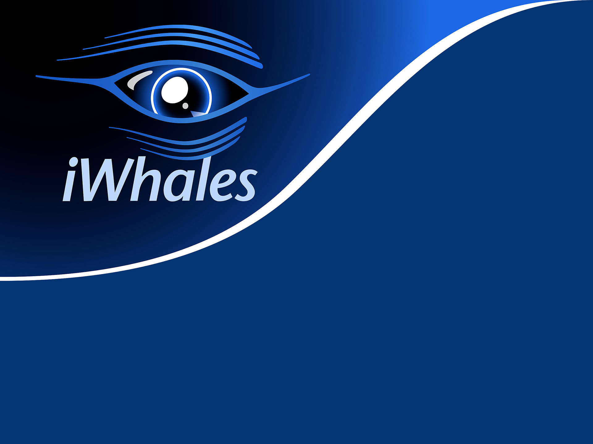
iWhales logo contained in banner lockup that curves on the right side in the shape of a Humpback Whales mouth.
Furthering the development, Stephen created a reversed version of the logo to work on solid backgrounds along with a banner lockup that followed the shape of a Humpback Whales mouth.
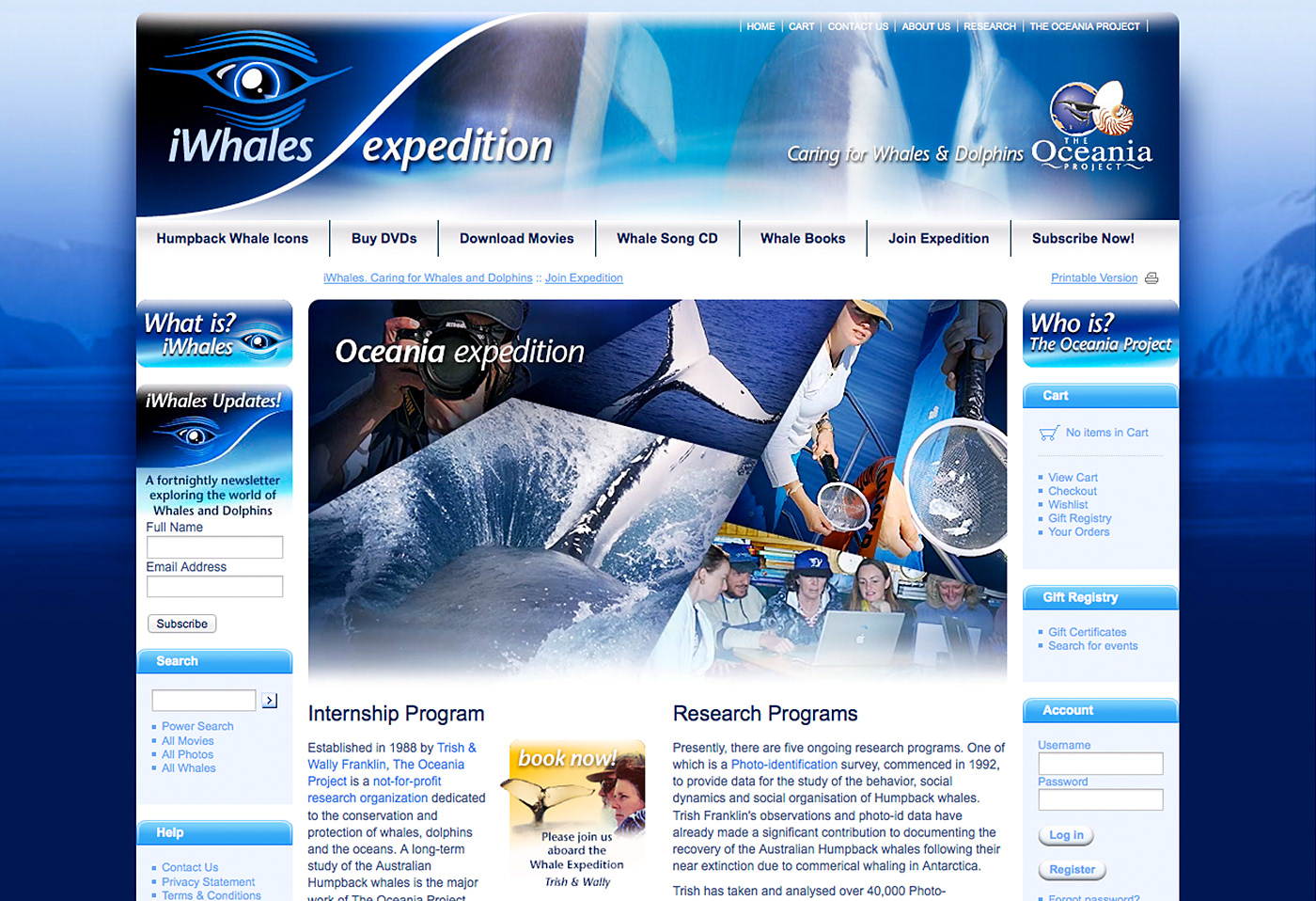
iWhales Expedition landing page on the iWhales website.
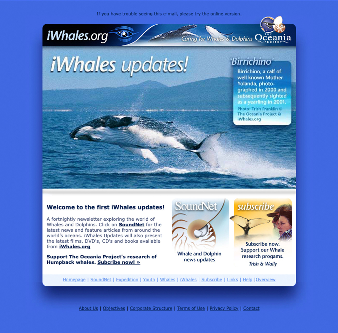
iWhales updates email newsletter design.
The brand identity with the unique banner lockup was used extensively throughout the website and online marketing materials, as seen here on the Expedition landing page and iWhales update email newsletter.
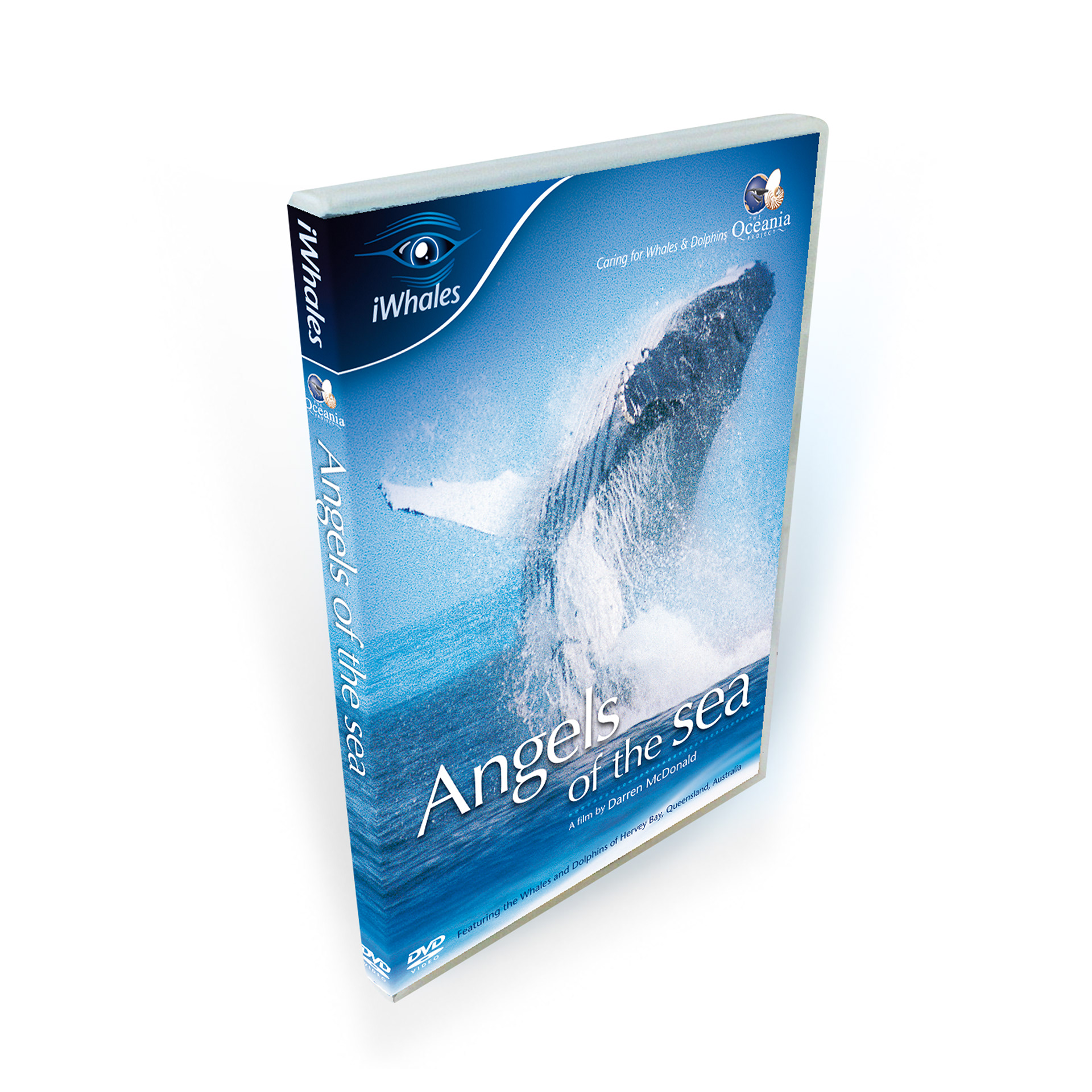
Angels of the Sea revamped cover using iWhales branding.
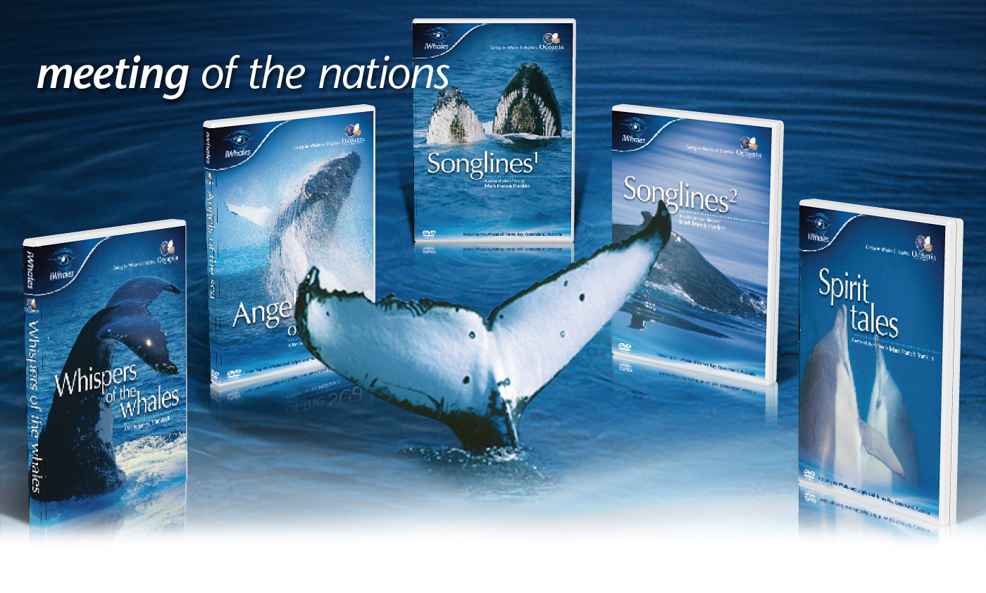
Marketing image of the iWhales range of five DVDs.
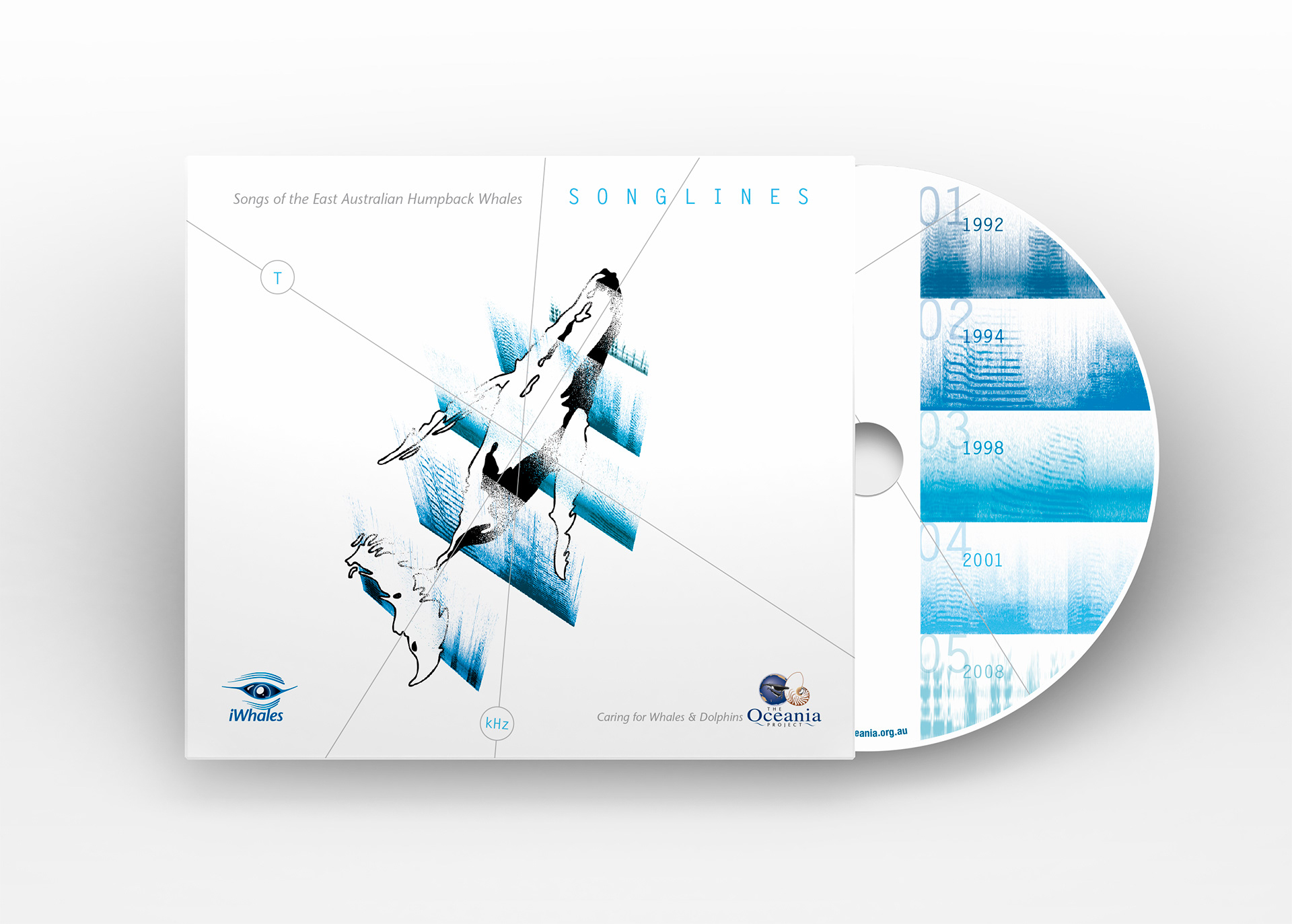
Songlines – Songs of the Eastern Australian Humpback Whales CD and cover.
iWhales produced a range of DVDs along with the Songlines – Songs of the Eastern Australian Humpback Whales CD. The iWhales identity was used much like a record label brand on this range of products.
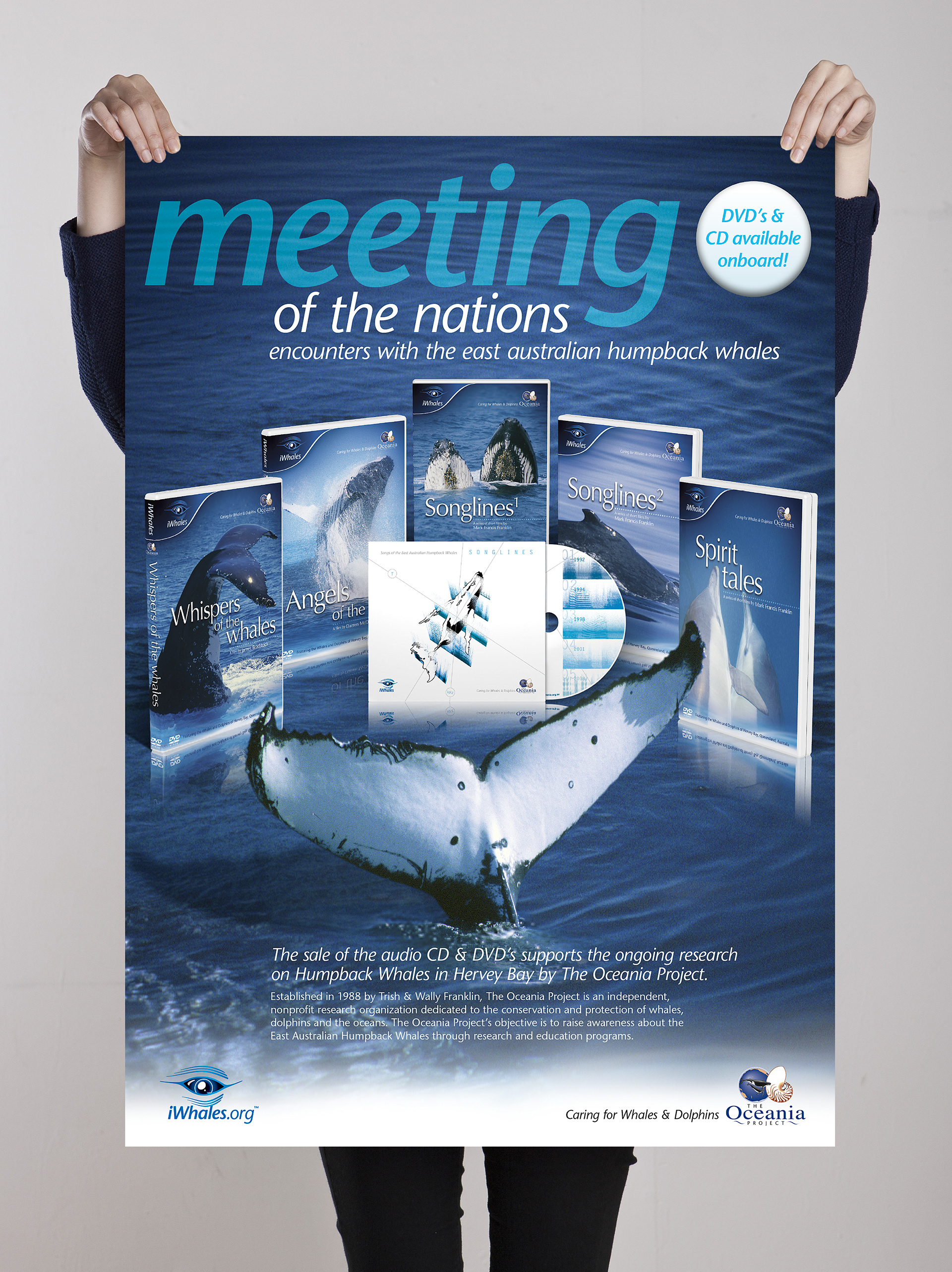
An iWhales marketing poster was developed by Franklin to help promote The Oceania Project products aboard Whale watching vessels in Hervey Bay, Queensland, during the whale watching season.
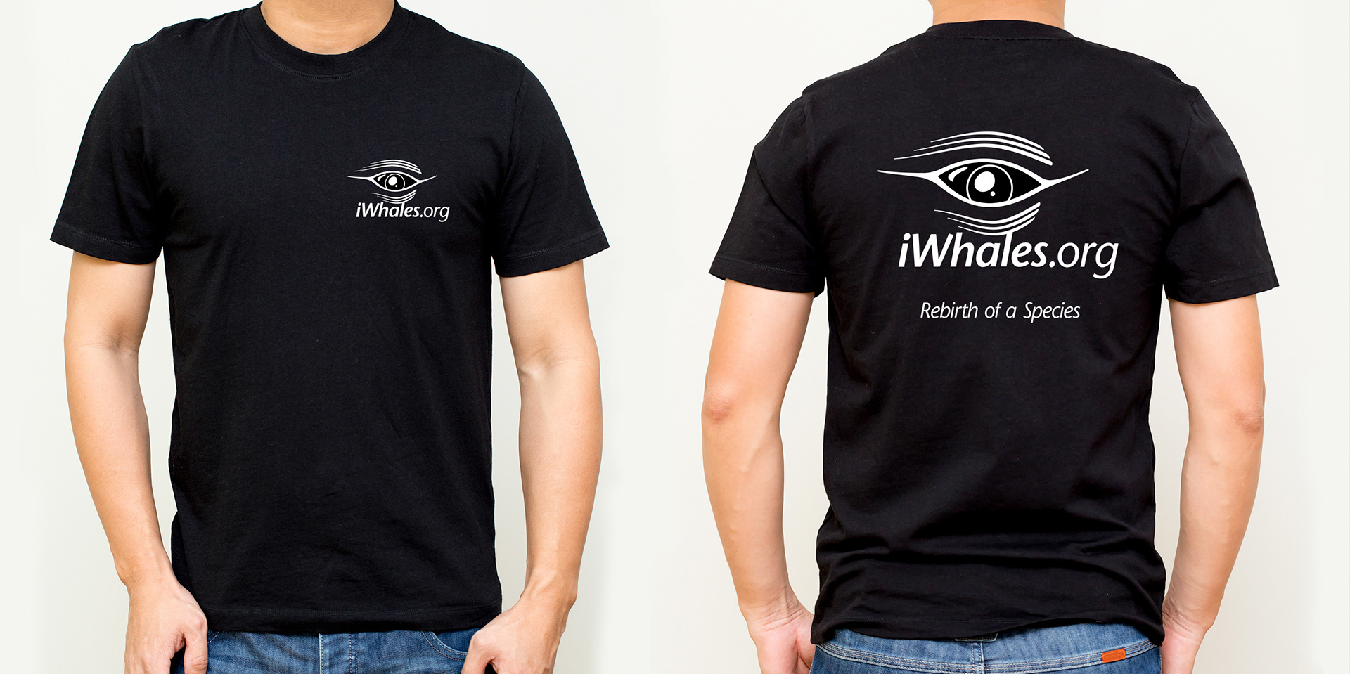
Stephen also created an iWhales T-Shirt for use on the Bondfirefunds crowd funding website.