Black Rice Interiors had created a unique collection of Javanese-inspired contemporary furniture, lighting and homewares made from recycled materials and needed a logo design that complemented this aesthetic. Stephen chose Rue Display Semi Bold Italic, designed by Winnie Tan, as the basis for the Black Rice type. He swapped out the R character of 'Rice' for the lowercase k, crafting a shape that unified the two words visually. The result was a custom wordmark with an organic feel that was as unique as the products it represented.

Creative Direction: Stephen Franklin
Graphic Design: Stephen Franklin
Black Rice wordmark lockup reversed white on product texture.
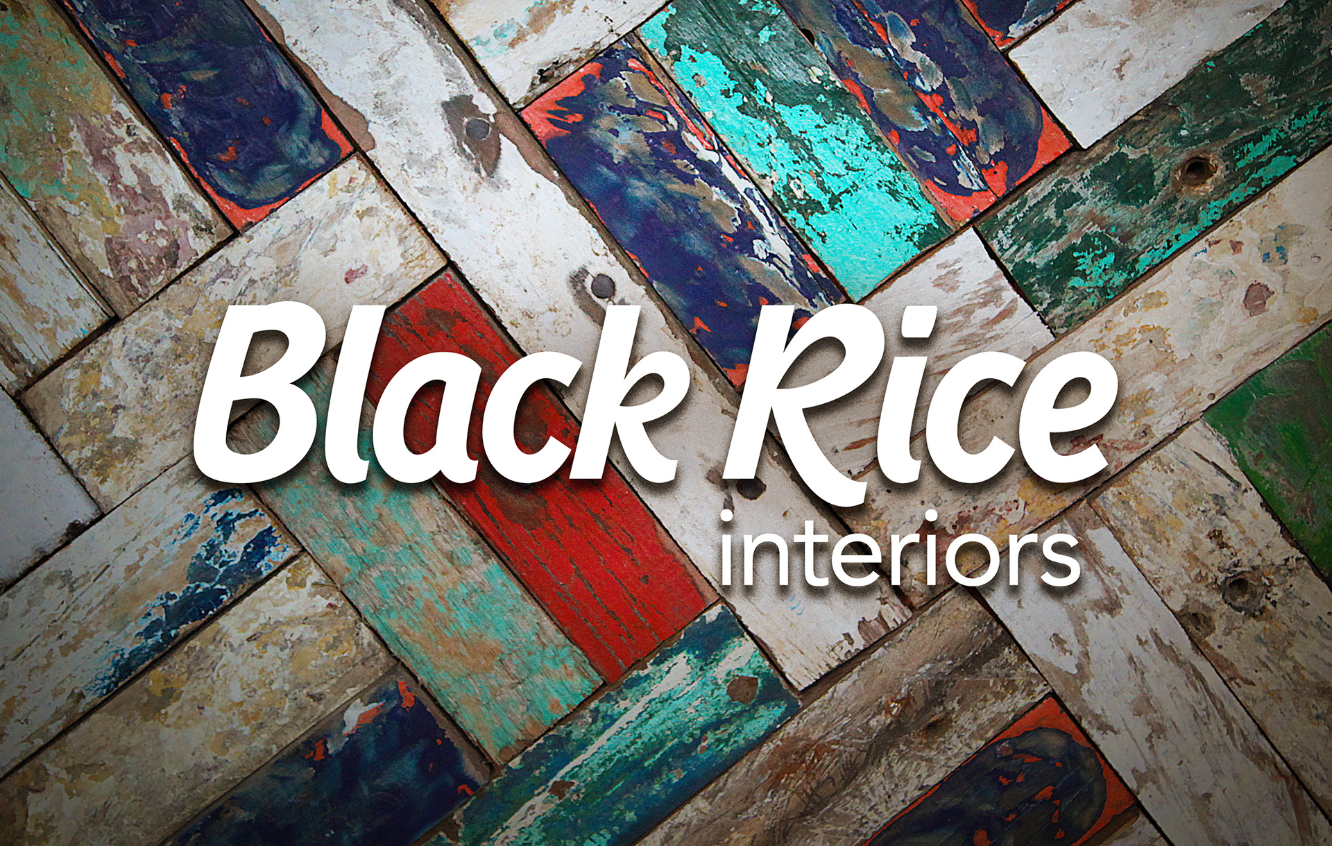
The heavy font weight reflects the rustic nature of the furniture and lends itself to course textures, as seen here in this example. 
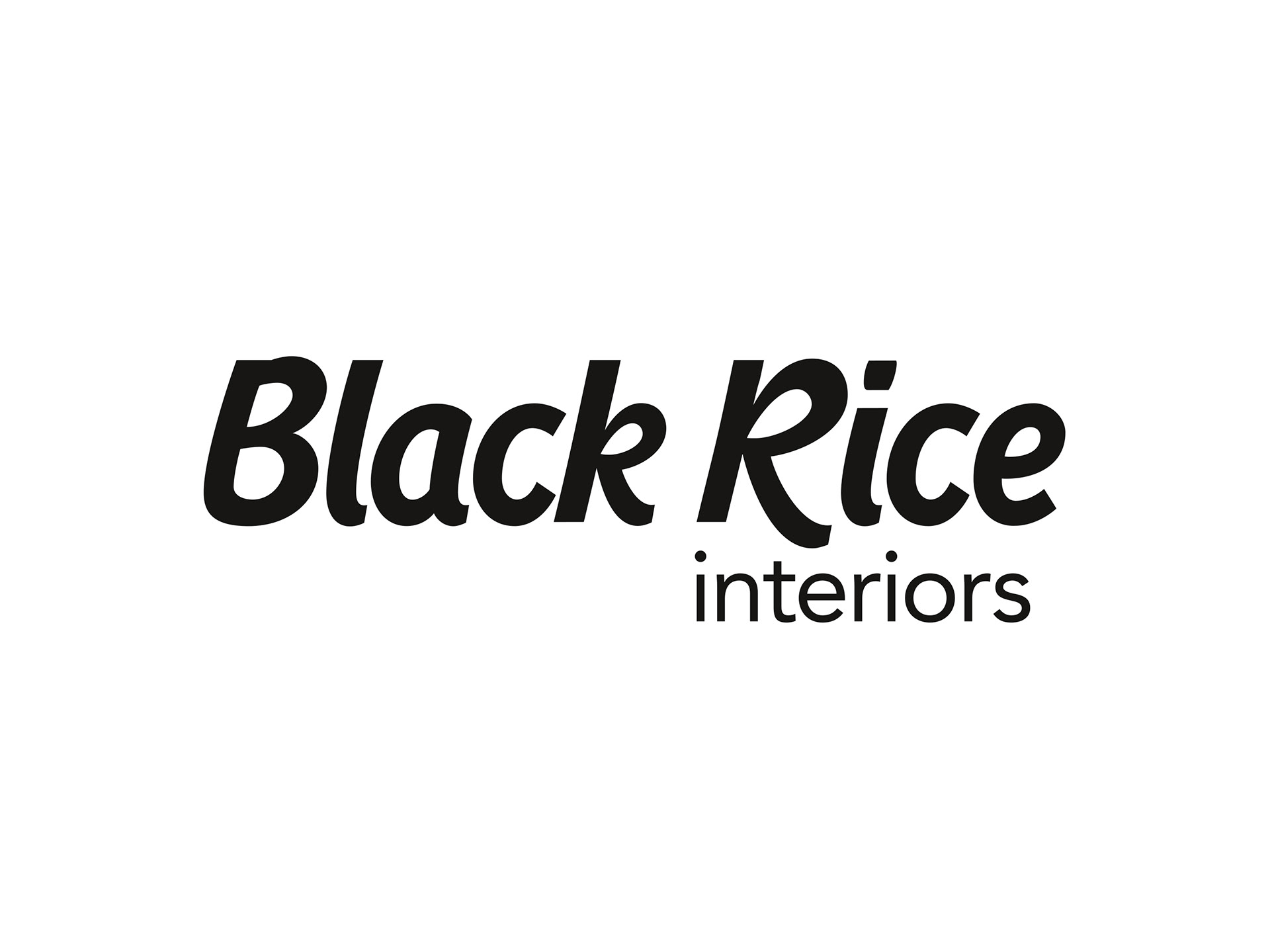
Black and white version of Black Rice Interiors logo.
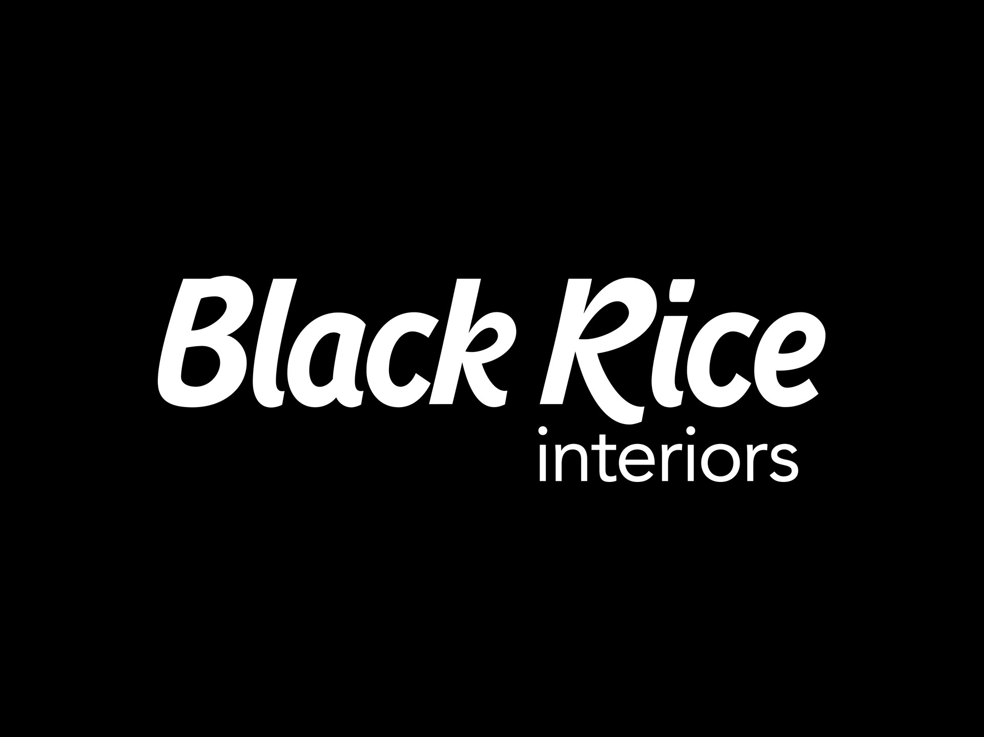
Black Rice Interiors logo reversed white out of black background.
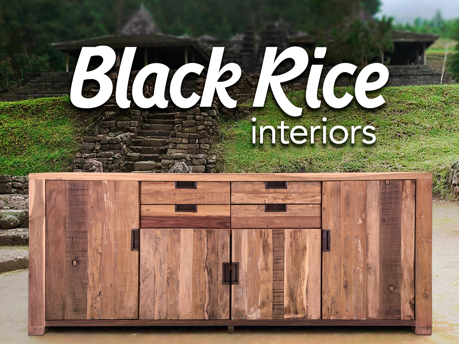
Black Rice Interiors logo reversed white on product image.
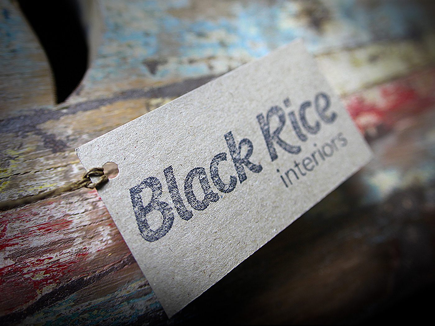
This design also holds well when reversed on solid backgrounds and with rough printing techniques like the label below.
Black Rice Interiors logo stamped on recycled card.
Black Rice Interiors business cards.
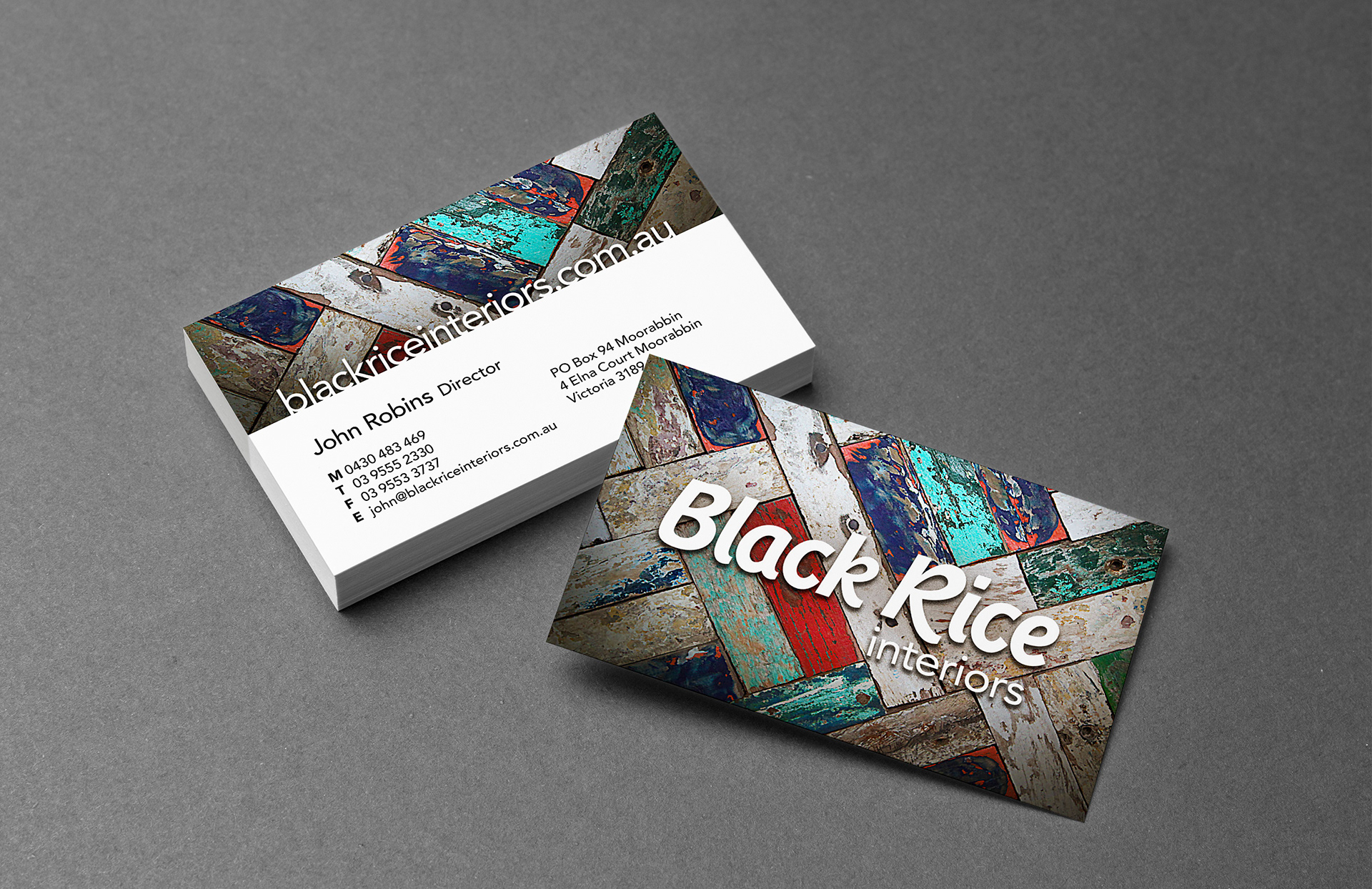
Avenir, designed by Adrian Frutiger in 1988, was chosen as the secondary font family for the Black Rice identity. Its modern geometric look complements the organic feel of Rue, drawing parallels with the modern homes these unique homewares are destined for.
Black Rice Interiors delivery van livery.
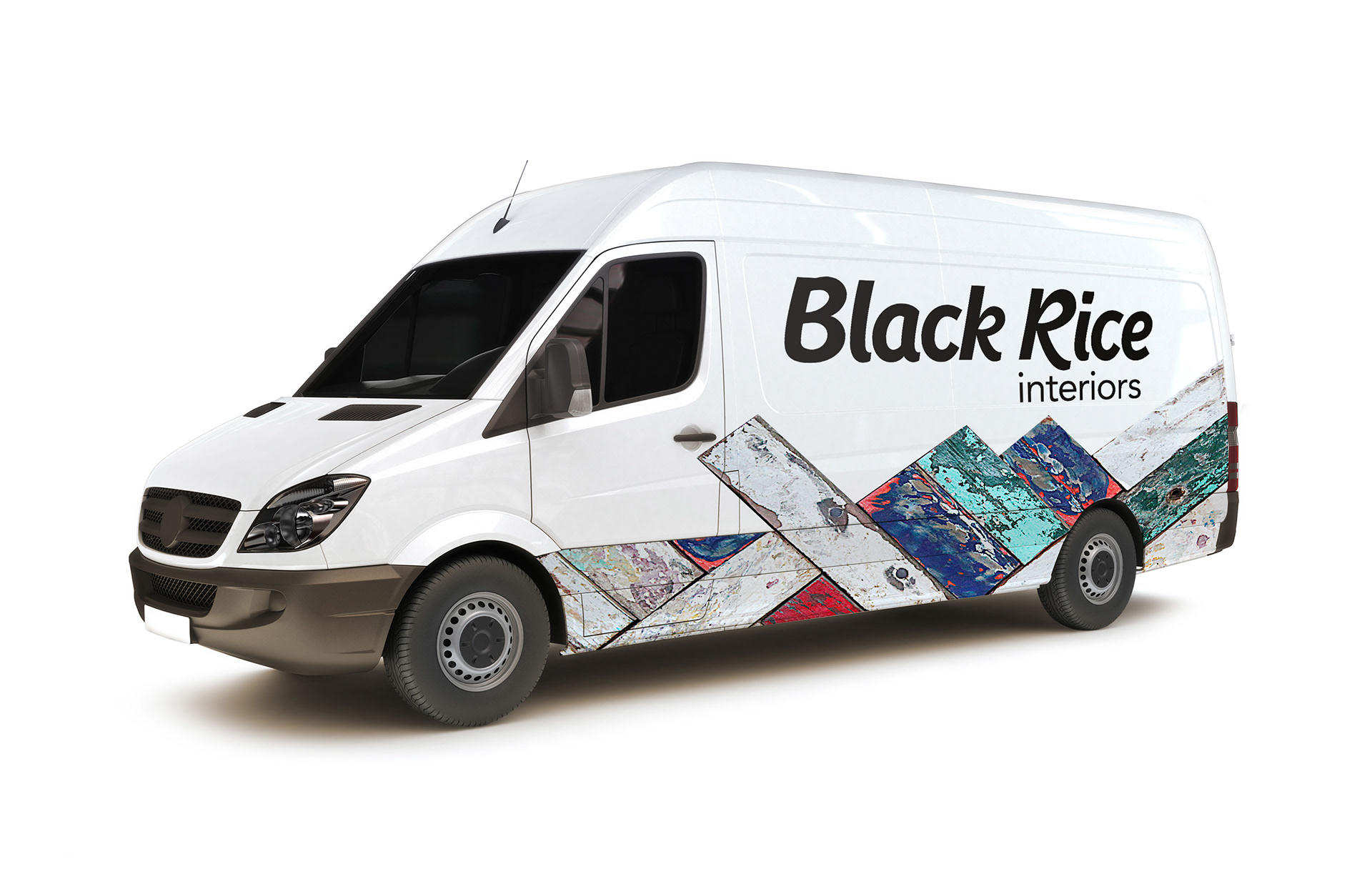
Stephen designed concepts for the van livery, utilising photography of the recycled materials used in the Papan range of the Black Rice products.
Black Rice Interiors website showing the available timber selection.
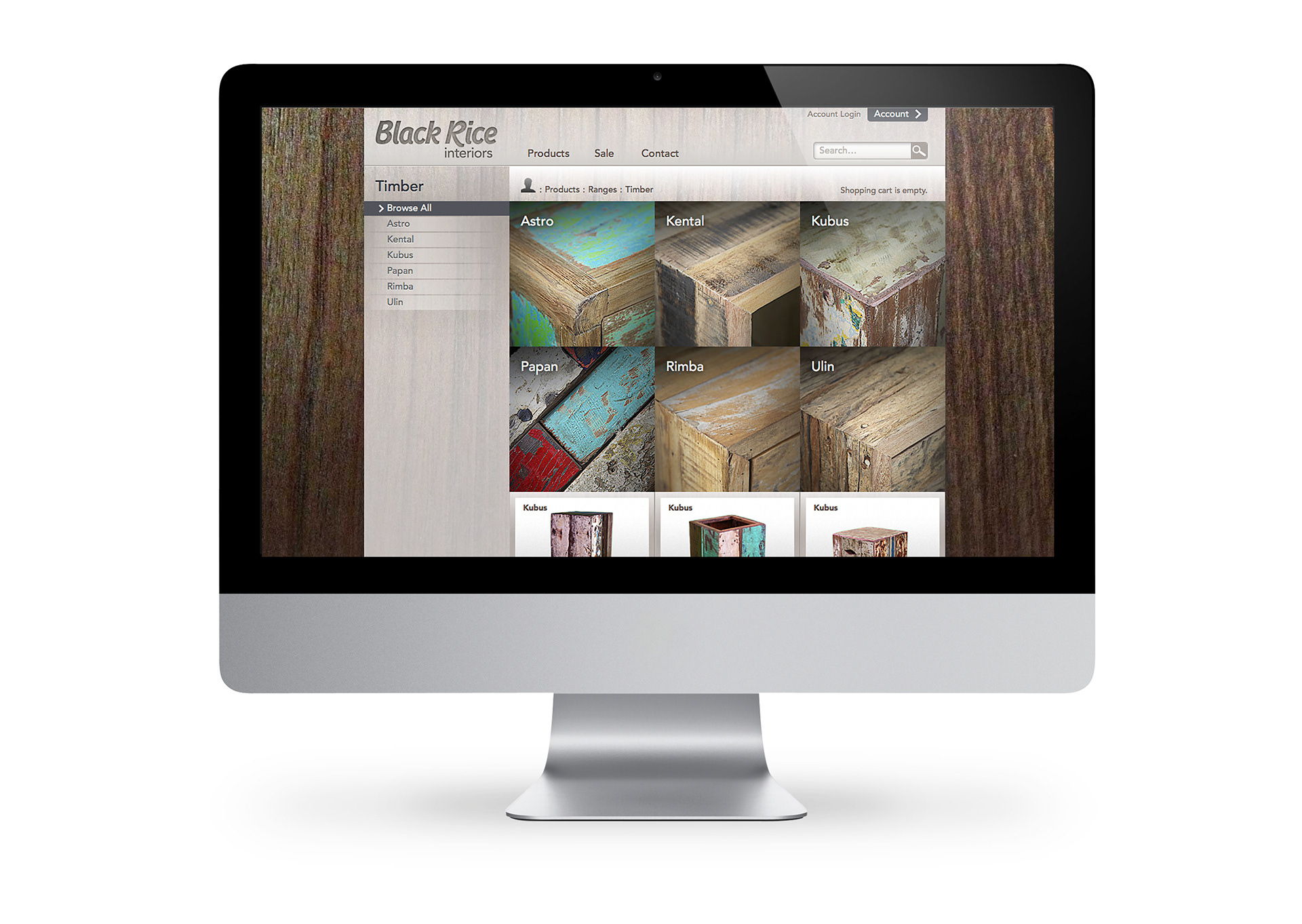
Franklin also developed the Black Rice Interiors online catalogue under his web design and development moniker SF Generator.

View more projects

Tony Ferguson Recipe Book Editorial Design
Creative direction and Editorial Design of the Tony Ferguson - Everyday Favourites recipe book for the Ishimodo Brand and Design Agency. Included design, layout, and prepress production of this sixty-four-page booklet.
World Vision 2016 Annual Report Design
Editorial design, and layout of the World Vision 2016 Health and Nutrition Annual Report for the Ishimodo Brand and Design Agency. This thirty-two-page document was prepared for release in both print and digital formats.
Tony Ferguson Brand Guidelines
Creative direction and design of the Tony Ferguson Brand Guidelines for the Ishimodo Brand and Design Agency. This forty-page digital document included the design, layout, and delivery of the PDF.
Tony Ferguson Point of Sale Brand Collateral
Creative direction of Tony Ferguson's point of sale brand collateral for the Ishimodo Brand and Design Agency. Included the design and layout of in-store Posters, End-shelf Header Cards, Shelf Wobblers, and Ceiling Disks.
Little Yellow Cloud Brand Identity
Brand identity design for the Little Yellow Cloud® kids clothing brand.
World Vision The Killer Gap Report & Infographic
Editorial design and layout of the World Vision - Child Health Now publication "The Killer Gap". Also included the design and illustration of a supporting infographic that would be available for download from the World Vision website.
ARC Victoria Brand Identity
Brand identity design for the Association of Rangers and Conservationists Victoria. This included a refresh of ARC Victoria's logo design and supporting brand collateral such as badges, patches, local event posters, pull-up banners, and social media graphics.
World Vision 2017 Annual Report Design
Editorial design, and layout of the World Vision 2017 Health and Nutrition Annual Report for the Ishimodo Brand and Design Agency. This sixteen-page document was prepared for release in both print and digital formats.
Byron Vista Social Club Logo
Illustrative design for the Byron Vista Social Club logo.
iWhales Brand Identity
Creative direction and design of the iWhales brand identity for The Oceania Project. Included development of the brandmark and brand lockup used on all iWhales marketing materials and merchandise.
Back to Top