Espero Logistics Solutions provides a wide range of management services for the maritime and logistics industries. They commissioned Stephen to design an identity that would accurately reflect their core business. Franklin began by developing a pattern that symbolised the extensive use of shipping containers in the transport industry. He then simplified this pattern into a single brandmark and brought it together with the company name to create the final logo. The result was a strong and clear identity, capable of playing a big game in a logistics solutions landscape dominated by large corporations.

Creative Direction: Stephen Franklin
Graphic Design: Stephen Franklin
Printing: Landmark Printing
Espero Logistics Solutions letter head and business card.
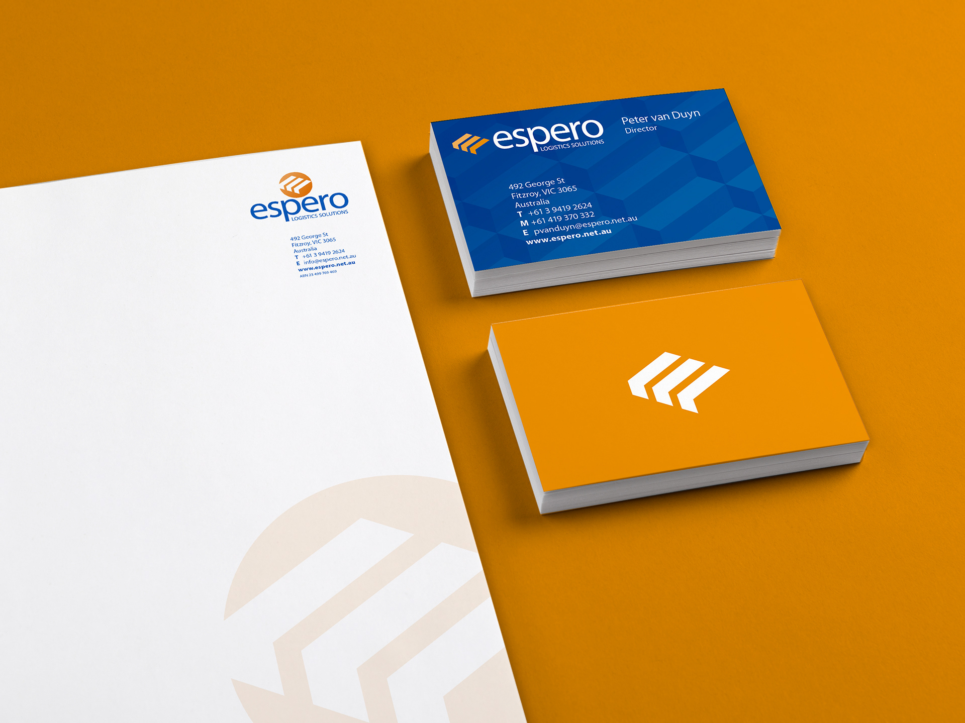
The main stationery pieces were printed in two specials, blue and orange. The business cards had a double hit of blue to increase the strength of this spot colour, giving it more vibrancy.
Horizontal version of the Espero logo.
To provide more strength for the brand mark it was decided to reverse the container symbols out of a circular shape with a subtle orange gradient.
Reversed horizontal version of the logo and band mark on a primary blue colour background.
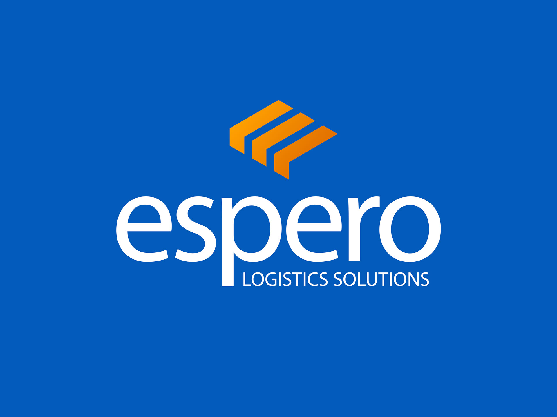
Stephen used a mid-blue and orange as the primary colour palette for the identity. The blue was a call out to the maritime nature of the logistics industry, with the orange matching the dominant colour of shipping containers.
PowerPoint background image with reversed version of the logo.
Franklin also created a slideshow background that merged the primary blue of the identity with a skyline image, creating a deep ocean view.

View more projects

Glycon Brand Identity Design
Design, development and creative direction for the Glycon brand identity.
ECDC Corporate Identity Design
Creative direction and design of the Eastern Cognitive Disorders Clinic (ECDC) corporate identity.
World Vision 2017 Annual Report Design
Editorial design, and layout of the World Vision 2017 Health and Nutrition Annual Report for the Ishimodo Brand and Design Agency. This sixteen-page document was prepared for release in both print and digital formats.
World Vision 2015 Annual Report Design
Creative direction, editorial design, and layout of the World Vision 2015 Health and Nutrition Annual Report for the Ishimodo Brand and Design Agency.
Bink Kids Brand Identity
Creative direction and design of the Bink Kids brand identity, including the wordmark design, brand stationery, and marketing materials for print and online media.
TAFISA Brand Identity Refresh and Sub Brand Designs
Design refresh of the TAFISA (The Association For International Sport for All) brand identity and related sub-brands for the Muttromedia agency.
Tony Ferguson Recipe Book Editorial Design
Creative direction and Editorial Design of the Tony Ferguson - Everyday Favourites recipe book for the Ishimodo Brand and Design Agency. Included design, layout, and prepress production of this sixty-four-page booklet.
World Vision 2016 Annual Report Design
Editorial design, and layout of the World Vision 2016 Health and Nutrition Annual Report for the Ishimodo Brand and Design Agency. This thirty-two-page document was prepared for release in both print and digital formats.
TAFISA Triple AC Program Guidebook
Creative direction, design, and layout of the TAFISA (The Association For International Sport for All) guidebook for their Triple AC program for the Muttromedia Agency.
World Vision The Killer Gap Report & Infographic
Editorial design and layout of the World Vision - Child Health Now publication "The Killer Gap". Also included the design and illustration of a supporting infographic that would be available for download from the World Vision website.
Back to Top