When The Oceania Project began conducting Whale research expeditions in 1989, they needed a logo that captured the essence of their mission, the care and conservation of Cetacea through original research, dissemination of information, education, and networking. To achieve this Stephen focused on presenting the predominant view of Earth, the Pacific Ocean. Drawing attention to this view raises awareness of the ocean’s critical role in the Earth’s ecosystem. The Nautilus, unchanged for more than five hundred million years, was added as a symbol of the ocean’s ancient nature, while also giving it a voice through the shell’s resonance. An illustration of a mother and calf Humpback Whale was subsequently added to reflect the research focus of The Oceania Project expeditions. This logo has since continued to effectively communicate the main objective of the organisation: ‘To promote community awareness and co-operation to instigate and maintain the process of rehabilitation, preservation, and conservation of Cetacea and the Oceans’.

Creative Direction: Stephen Franklin
Graphic Design: Stephen Franklin
Illustration: Stephen Franklin
Oceania Project logo with Ocean world, Nautilus shell, Humpback Whales, and brand name below.
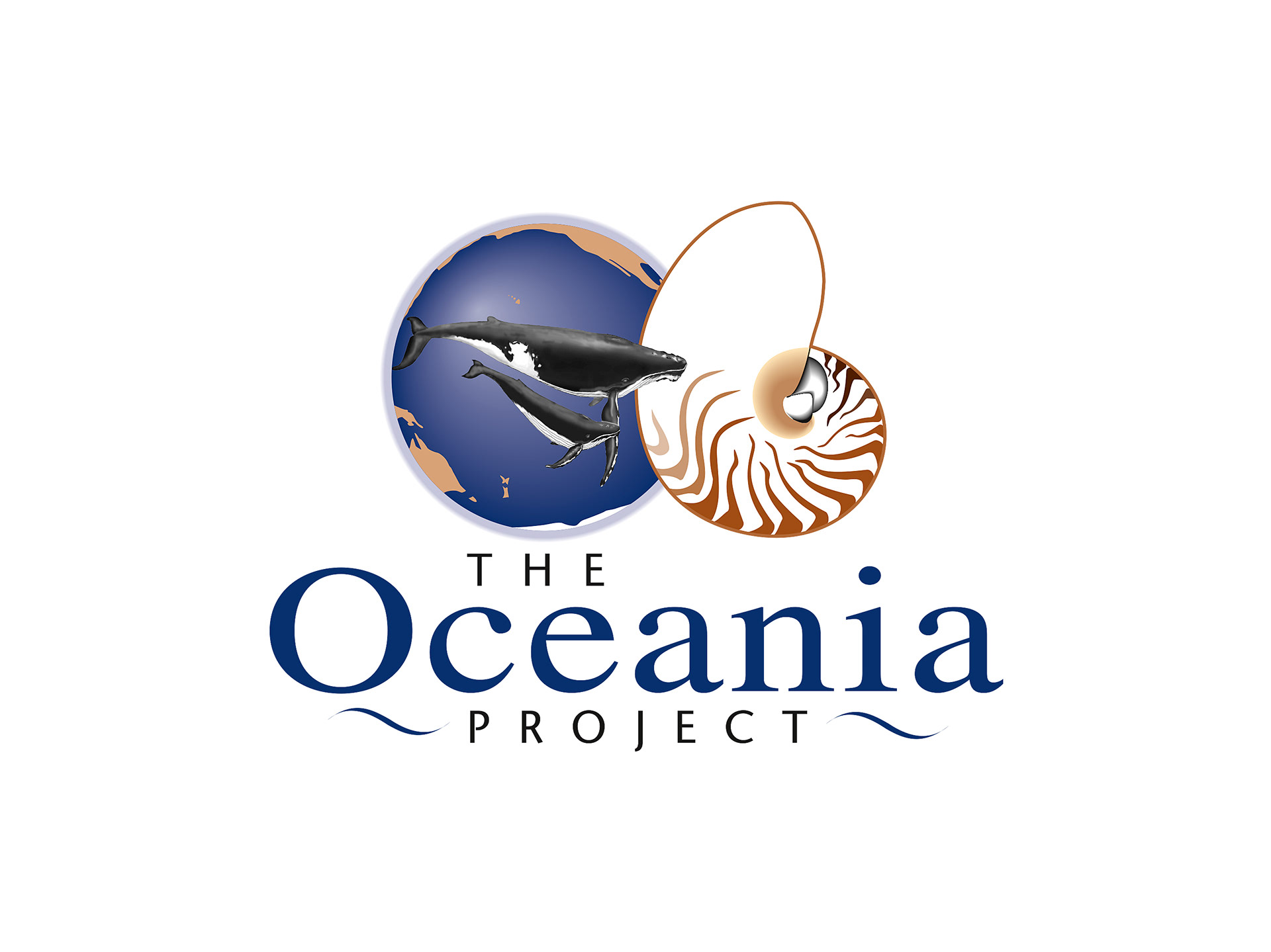
Oceania was called out as the primary part of the brand name, providing a single focus whilst tying it to the symbol above.
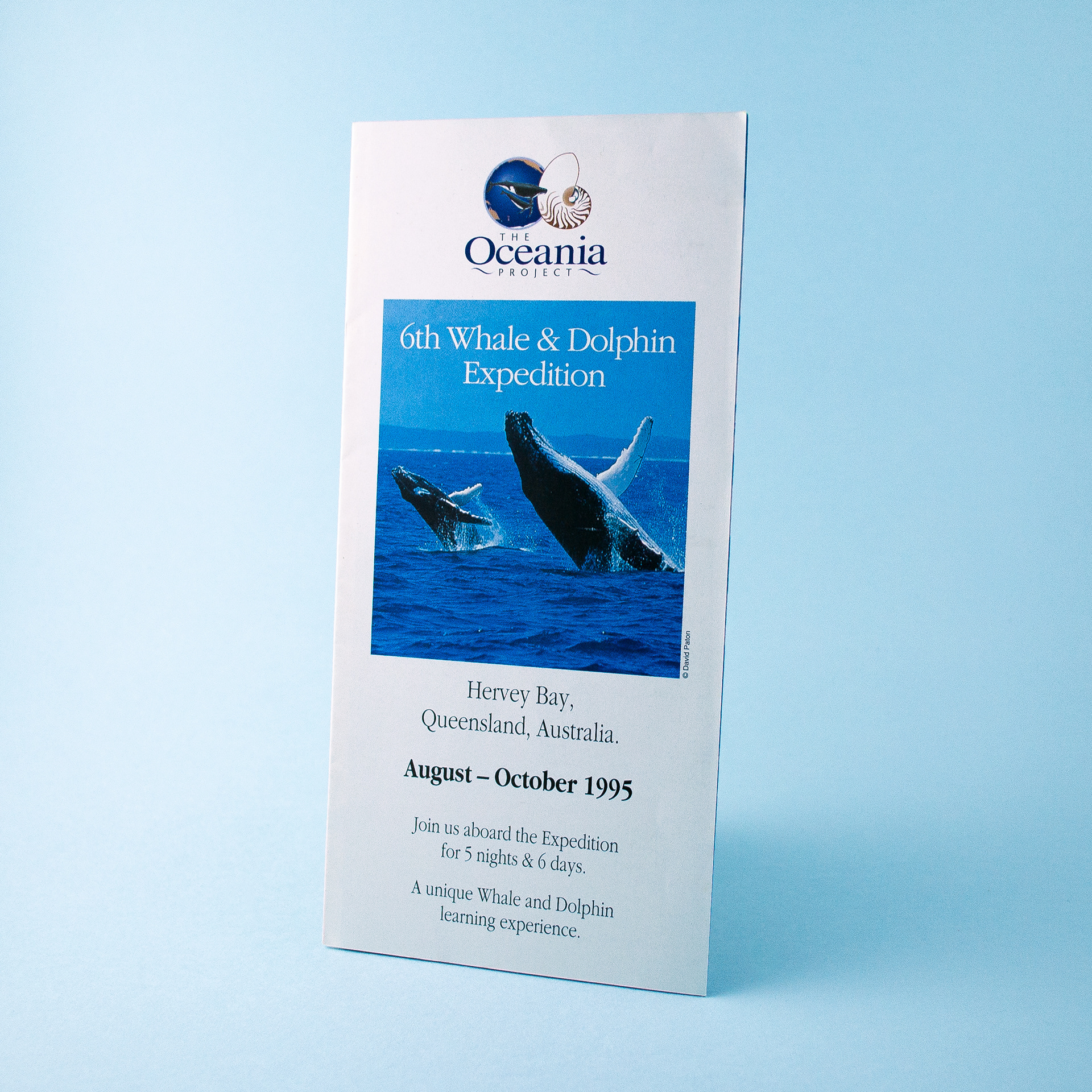
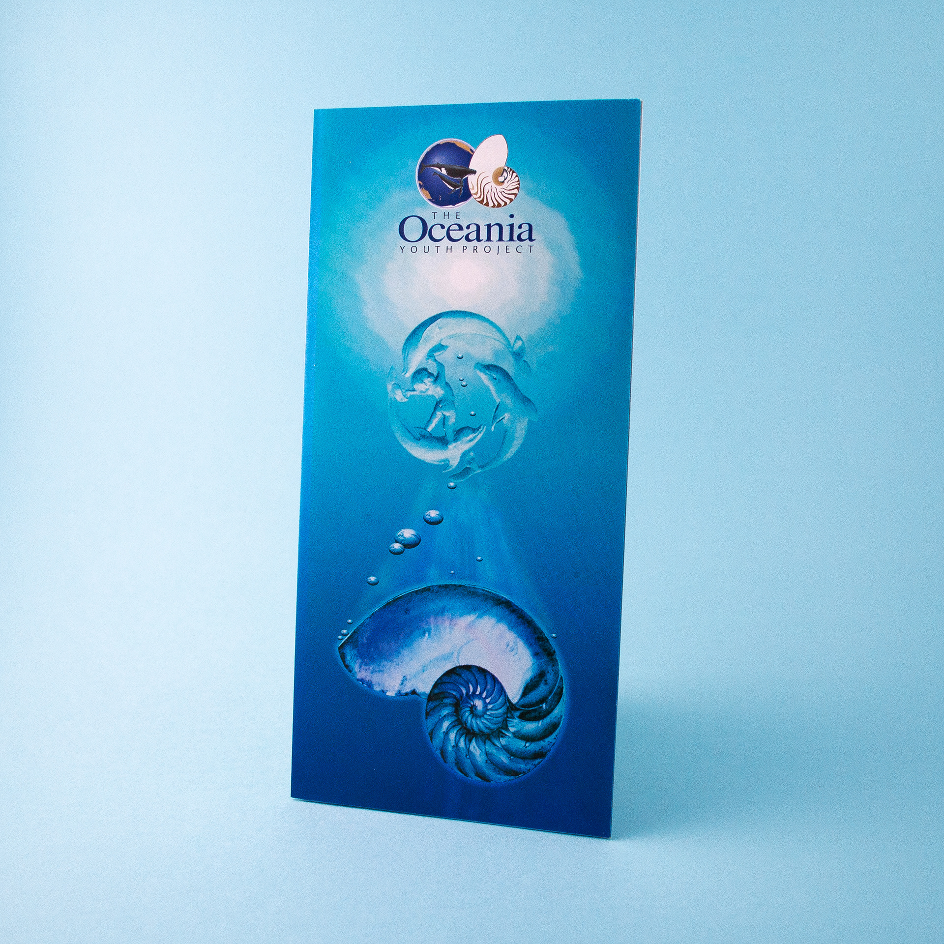
The logo was used extensively throughout The Oceania Project’s marketing materials, as seen here with the Expedition brochure, and a variant of design created for The Oceania Youth Project.
Songlines CD cover with illustration of Humpback Whale floating through sound waves, and logo.
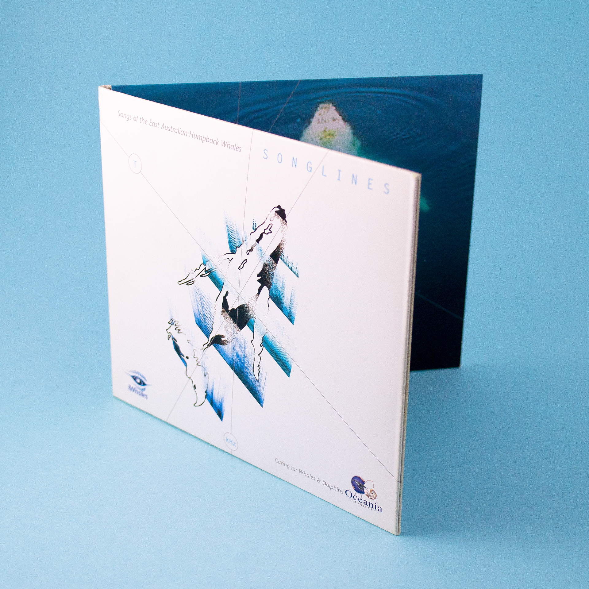
More recent usages saw the addition of the “Caring for Whales & Dolphins” tagline as seen above on the Songlines CD Cover.

View more projects

Thick & Thirsty Point of Sale Hero Image Retouching
Retouching of hero image for Thick & Thirsty point of sale promotion.
Merrilake Promotional Calendar Illustration
Stephen's contribution to the Merrilake agency’s promotional calendar. He was requested to respond to the brief "Merrilake Illustrators are not just bums on seats!" in the style of his favourite artist. Salvador Dali's "Sleep" was Franklin's inspiration.
Escape to Luz Brand Identity
Identity design for Escape to Luz, a Dublin based holiday company which organises personalised trips to the Costa del la Luz in the Southwest of Spain.
Wyeth BioPharma Work Life Harmony Week
Designed both print and digital components for the Wyeth Bio Pharma - Work/Life Harmony Week. This included various printed pamphlets and messaging pieces along with the UX/UI for the program’s website.
Green Isle Stir-Fry Packaging Artwork
Creative artworking on the Green Isle Stir-Fry flexographic packaging finished artwork.
Sqeez Juice Tetra Pak Packaging Finished Artwork
Finished artwork for the Sqeez range of juices in Tetra Pak packaging.
Green Isle Potato Bake Packaging Artwork
Creative artworking on the Green Isle Potato Bake flexographic packaging finished artwork.
Freedom Unlimited Website
Design and development of the Freedom Unlimited website, Dublin, Ireland.
Microsoft Windows Server NT Image
Cover illustration created for a Microsoft Windows Server NT sales brochure for the Frontline agency, Sydney. 
Eventuality Website
Design and development of the Eventuality website, Dublin, Ireland.
Back to Top