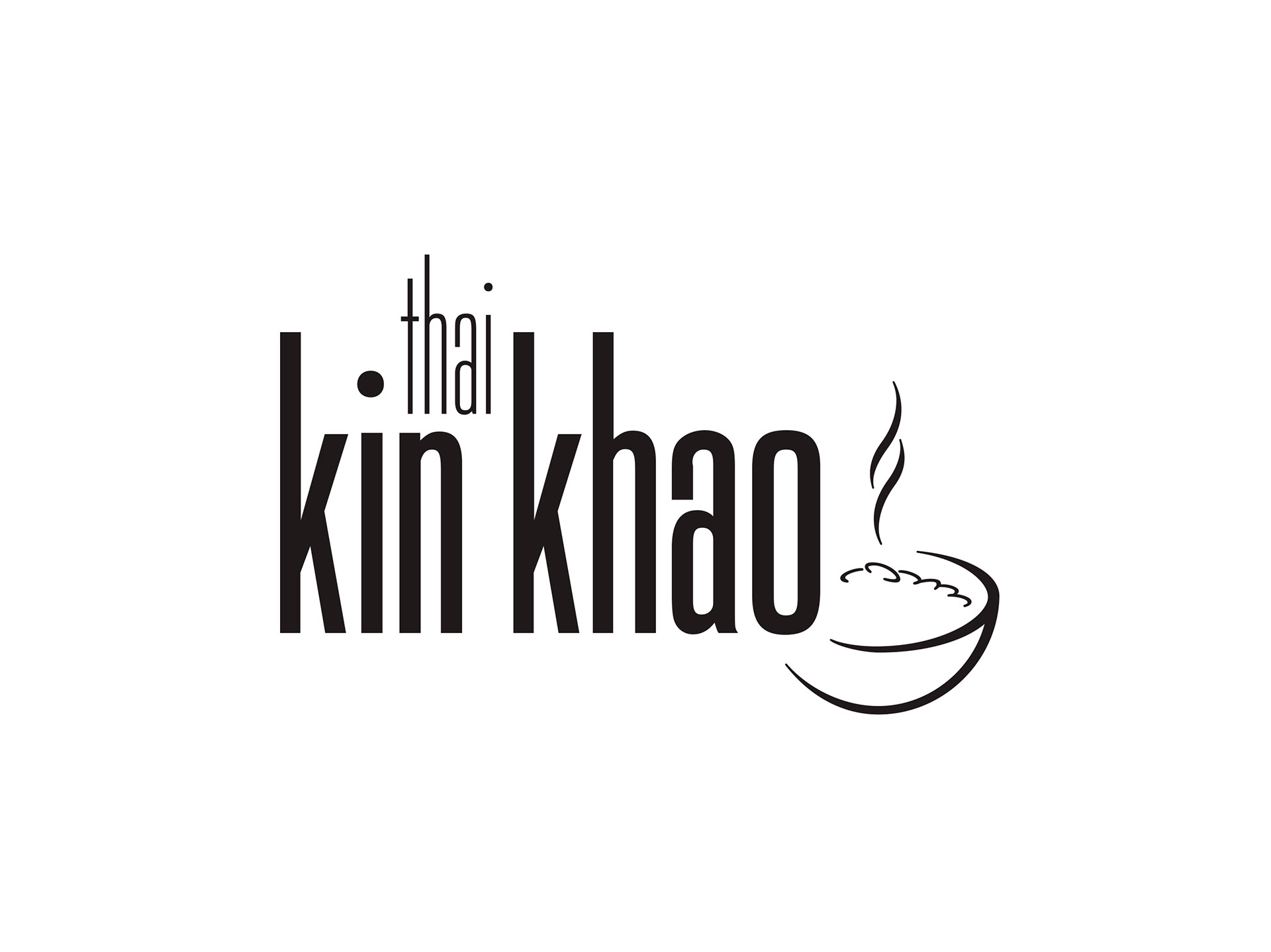
When Janya and Adam wanted to bring the authentic taste of Thai food to Ireland, they needed a brand identity that lived up to the high bar they were setting for themselves. Kin Khao means to "Eat Rice", or colloquially in Thailand, "Let's eat!". Franklin used this directness as the basis for the creative brief, developing a stylised bowl of steaming rice for the brandmark, and complementing this with a highly compressed, mono spaced font, giving the brand name a modern look. Stephen also used visual cues from Buddhist monks, pulling the primary palette of the brand from the colours of their robes. The resulting brand design was a marriage of the traditional and the modern, bringing the rich cultural heritage of Thai cuisine to the forefront in contemporary Irish dining.

Creative Direction: Stephen Franklin
Graphic Design: Stephen Franklin
Kin Khao business card.
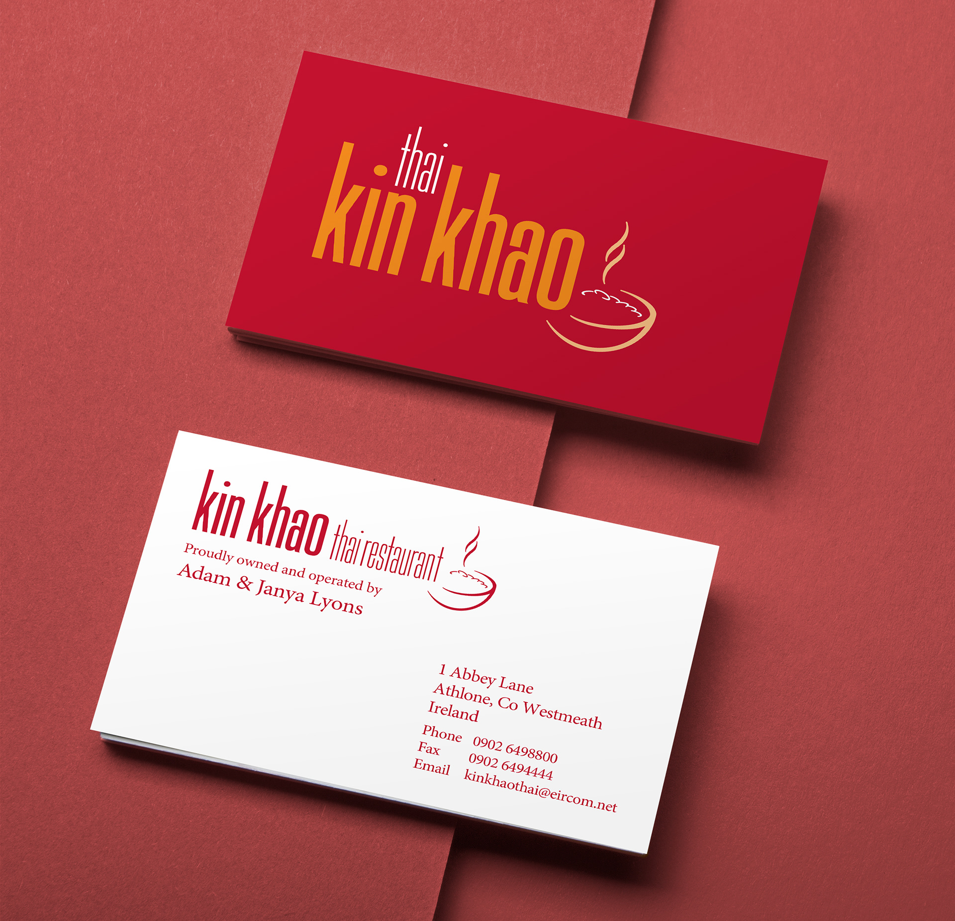
Business cards were printed in two spot colours to keep the vibrancy of the red and orange.
Kin Khao black and white logo.
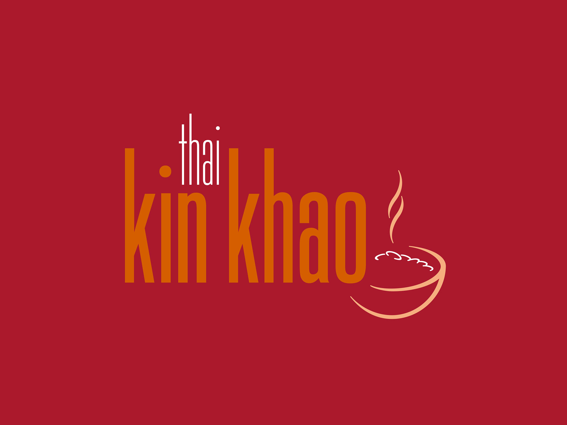
Kin Khao reversed logo on primary colour.
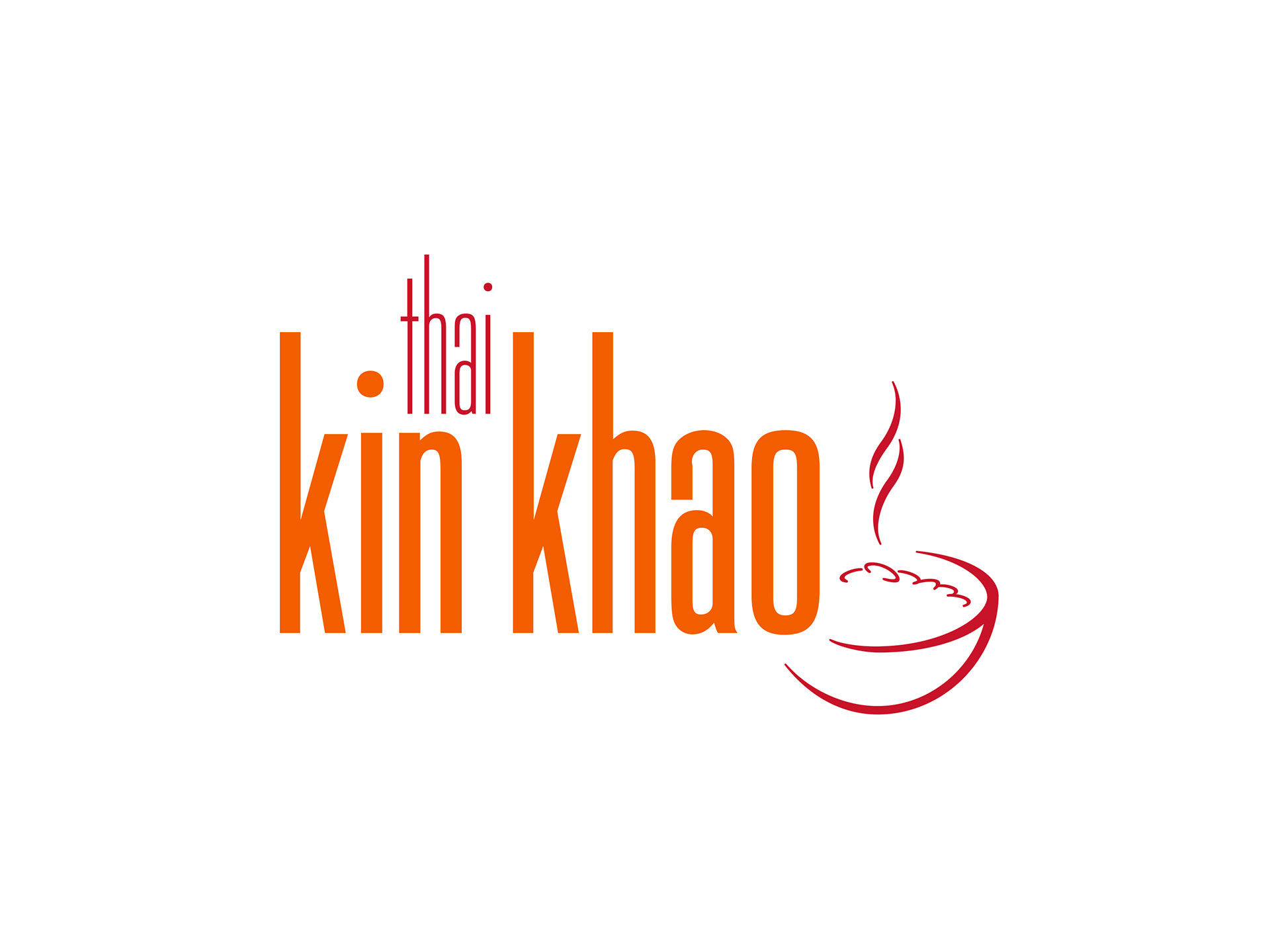
Kin Khao colour logo on white.
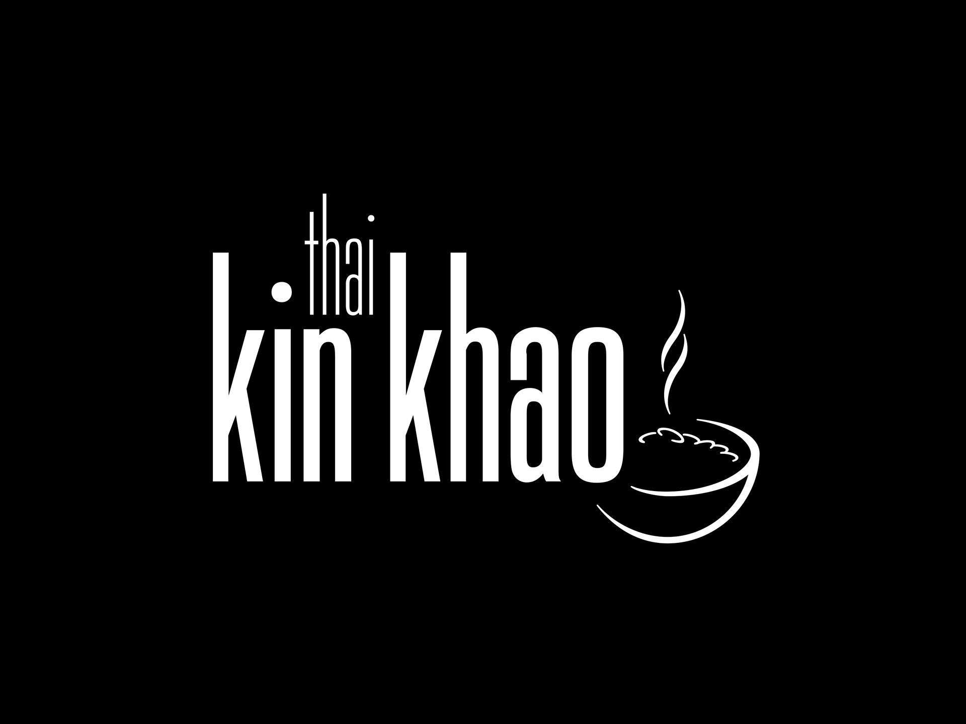
Kin Khao reversed logo.
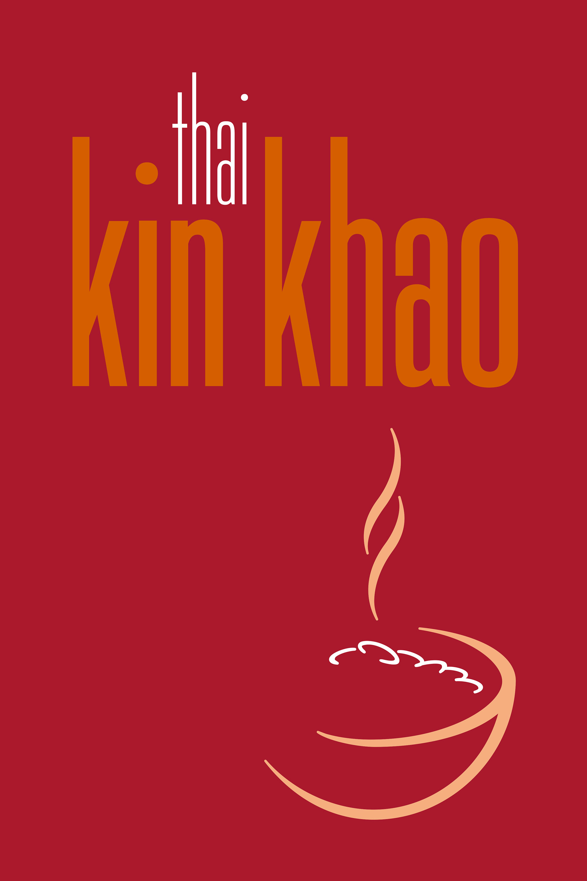
Multiple versions of the logo were developed for differing use cases.
Kin Khao restaurant sign artwork.
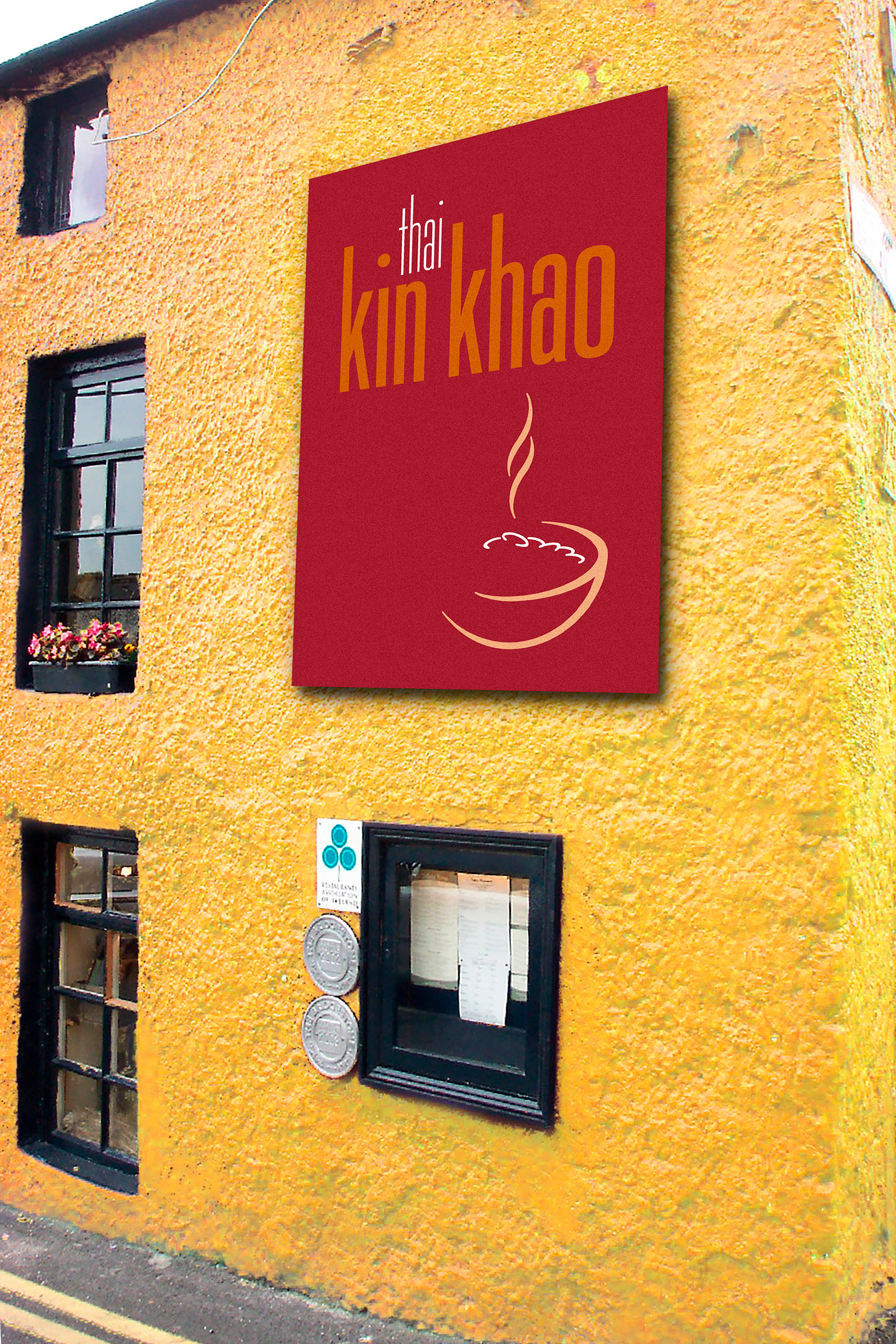
Kin Khao street signage mock-up.
As part of developing the street signage, Stephen created a visualisation of the sign placement and preview of the chosen paint colour for the restaurant exterior.
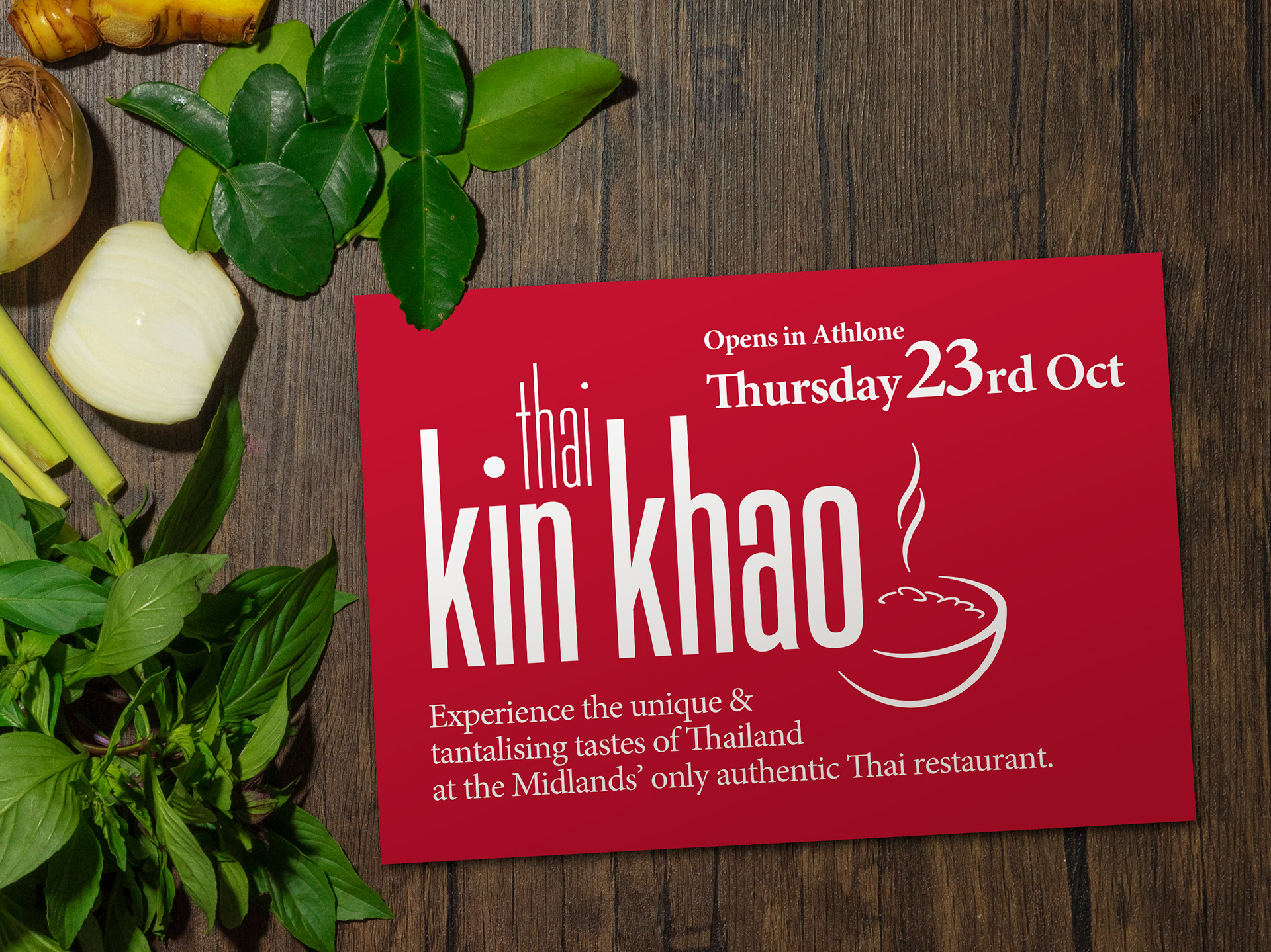
Kin Khao opening invite.
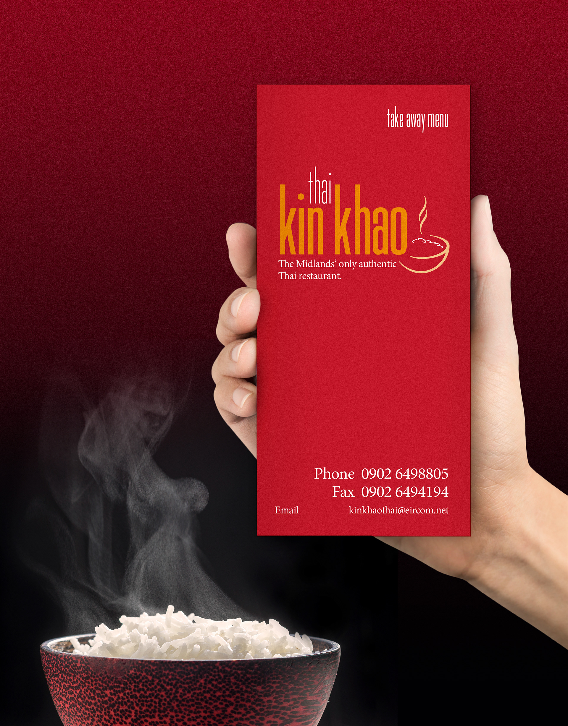
Kin Khao takeaway menu.
Invite and takeaway menu showing the logo in varying print formats and colour usage.
Kin Khao dining menu.
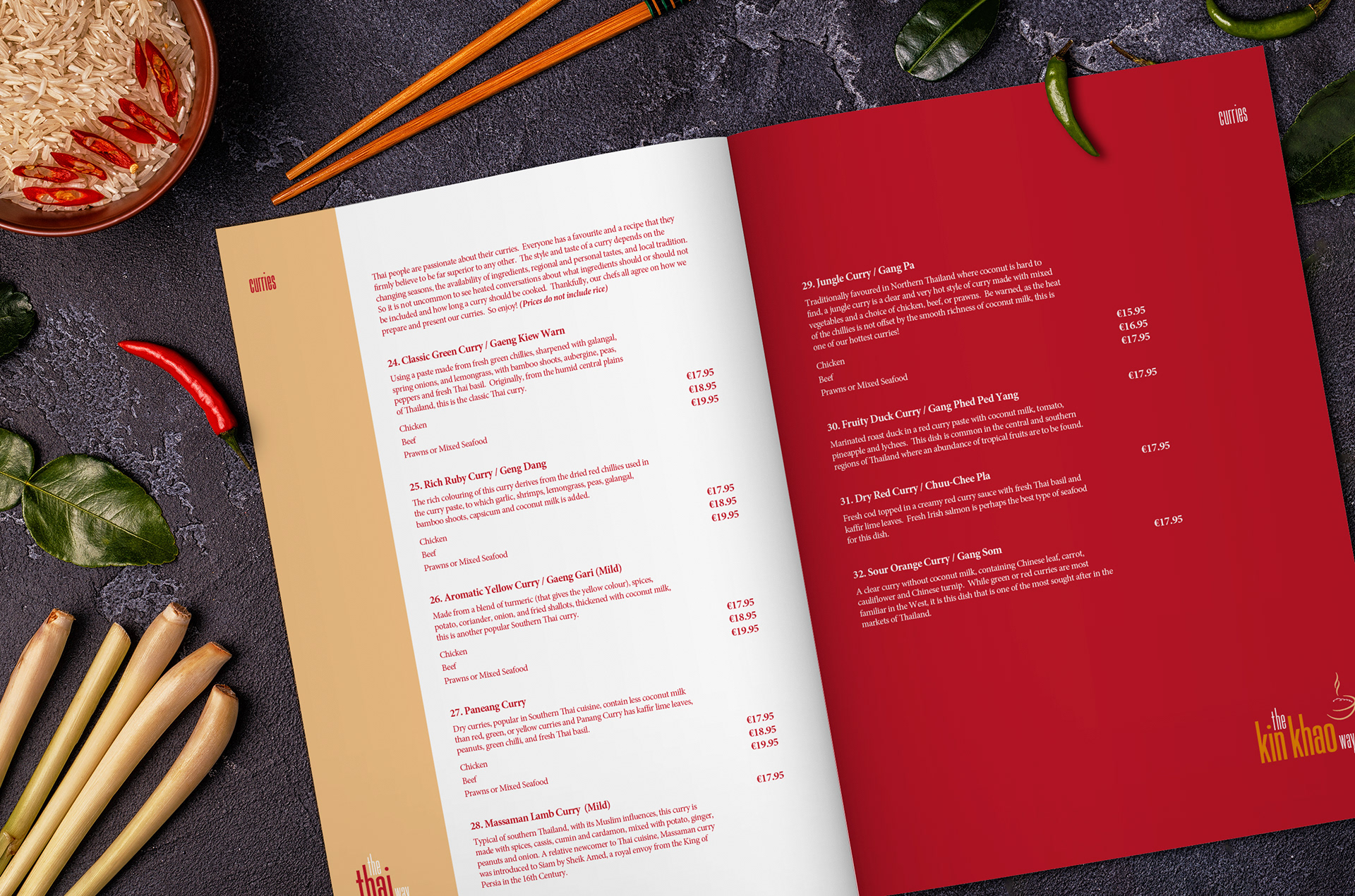
The dining menu featured a parallel design layout with traditional Thai meals on the left, “The Thai Way”, and modern takes on these dishes to the right, “The Kin Khao Way”.

View more projects

Resource Connections Logo
Logo design for Resource Connections, an independent Australian energy consultant.
The Oceania Project Logo
Logo design for The Oceania Project, a Not-for-profit research and information organisation established in 1988, dedicated to raising awareness about Cetacea (Whales, Dolphins and Porpoises) and the ocean environment.
John Bullers Pies Packaging Artwork
Creative artworking for the John Bullers Family Pies. A new product range from Green Isle Foods.
Queensland Energy Revolution Report
A seventy-page report on Queensland energy. Franklin designed the complete report including all graphs, charts, and illustrations. The target format was a short run digitally printed document.
Eventuality Website
Design and development of the Eventuality website, Dublin, Ireland.
Sqeez Juice Tetra Pak Packaging Finished Artwork
Finished artwork for the Sqeez range of juices in Tetra Pak packaging.
Geezah Logo Design
Logo and stencil design for the Geezah Sound System, Dublin Ireland.
Green Isle Stir-Fry Packaging Artwork
Creative artworking on the Green Isle Stir-Fry flexographic packaging finished artwork.
SoundNet Newsletter and Masthead
Editorial design and masthead design of SoundNet, the official newsletter of The Oceania Project a non-profit research organisation dedicated to raising awareness about Whales, Dolphins and Porpoises and the ocean environment.
Thick & Thirsty Point of Sale Hero Image Retouching
Retouching of hero image for Thick & Thirsty point of sale promotion.
Back to Top