Australian grocery distributor Dallas international approached Stephen to produce the label design for the Great mates! 500 mL and value pack bottles. The brief called for a design that would bring something a little different to this FMCG category. Franklin developed a bold stylised tomato illustration sitting on a rich sunburst background. Above this he placed the variant name typography created to complement the feel of the existing Great mates! brand identity. The resulting design met the brief with a fun and bold look which was a little quirky, setting the precedence on how the brand was positioned in the market.
Design Coordination: Anita Martini
Creative Direction: Stephen Franklin
Illustration: Stephen Franklin
Creative Direction: Stephen Franklin
Illustration: Stephen Franklin
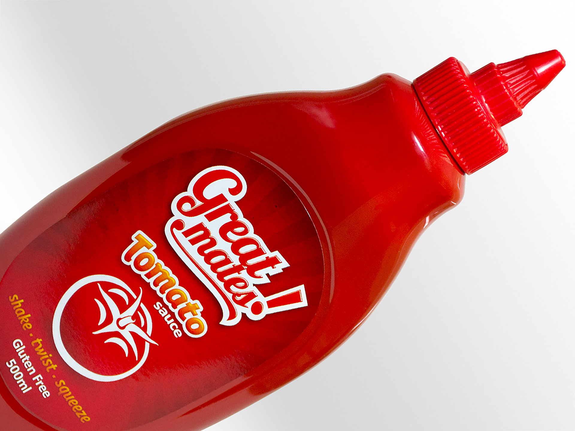
The Great mates! Tomato Sauce 500 mL label design would later be adapted to an 1850 mL value pack label.
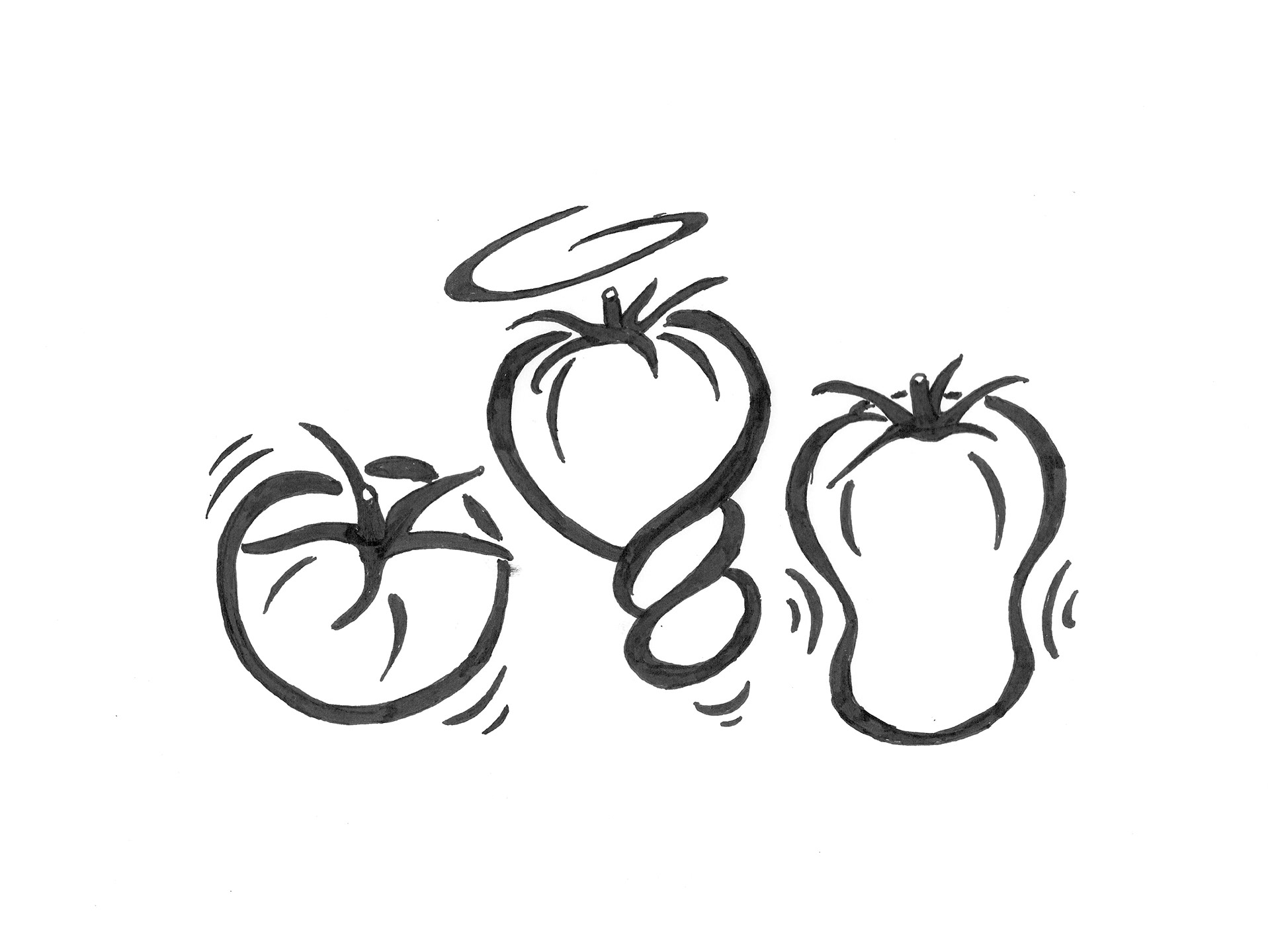
Working to the initial brief Stephen developed a set of tomato illustrations that played to the product tag line of shake, twist, squeeze. The client liked the illustrative feel of the tomatoes but was concerned that three characters may be too busy for such a small label.
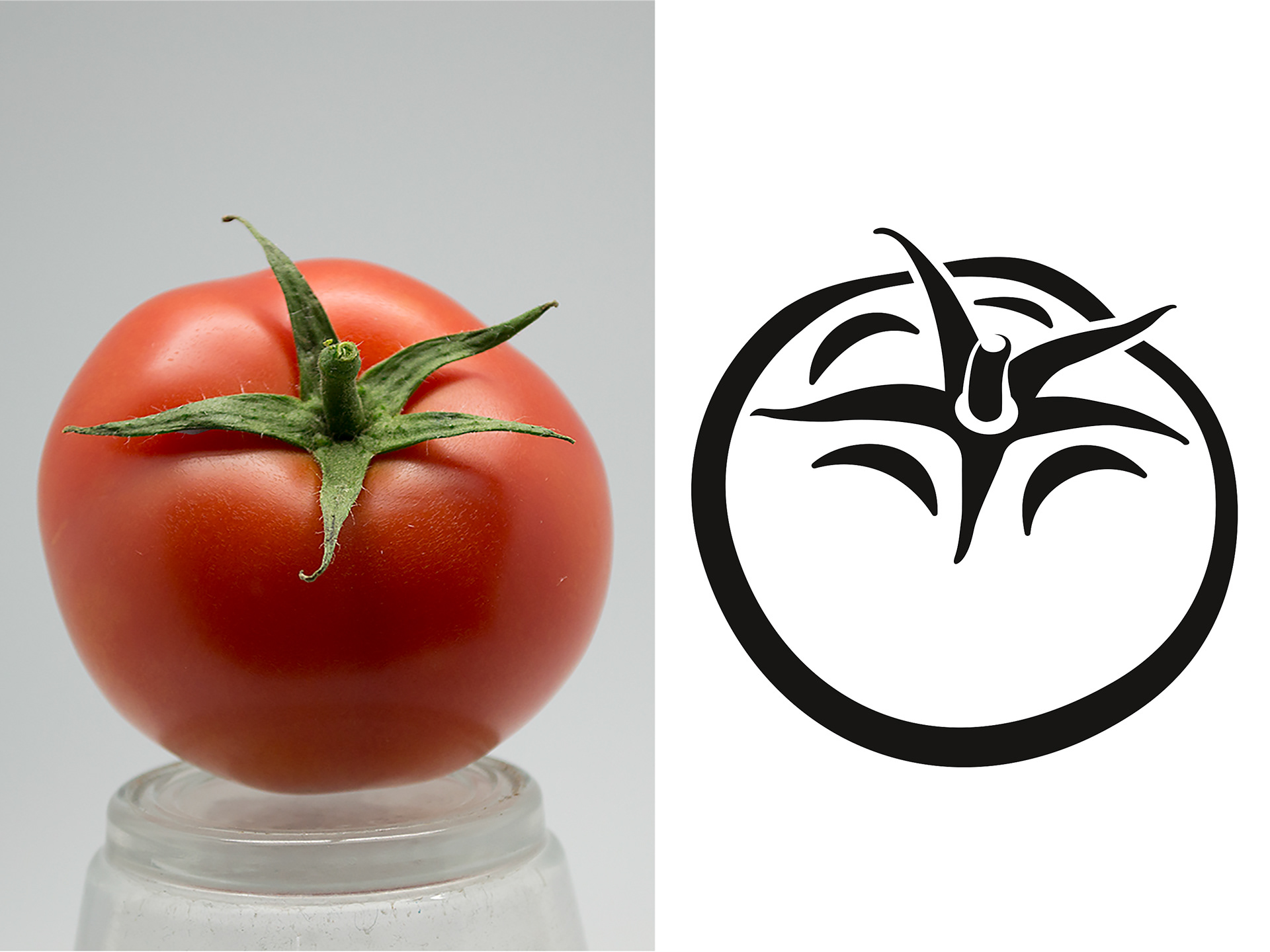
Original tomato photography and resulting line illustration.

Final composition of the tomato illustration and background.
An illustration reference image was shot in the studio for a single tomato illustration and then developed into the final outline version.
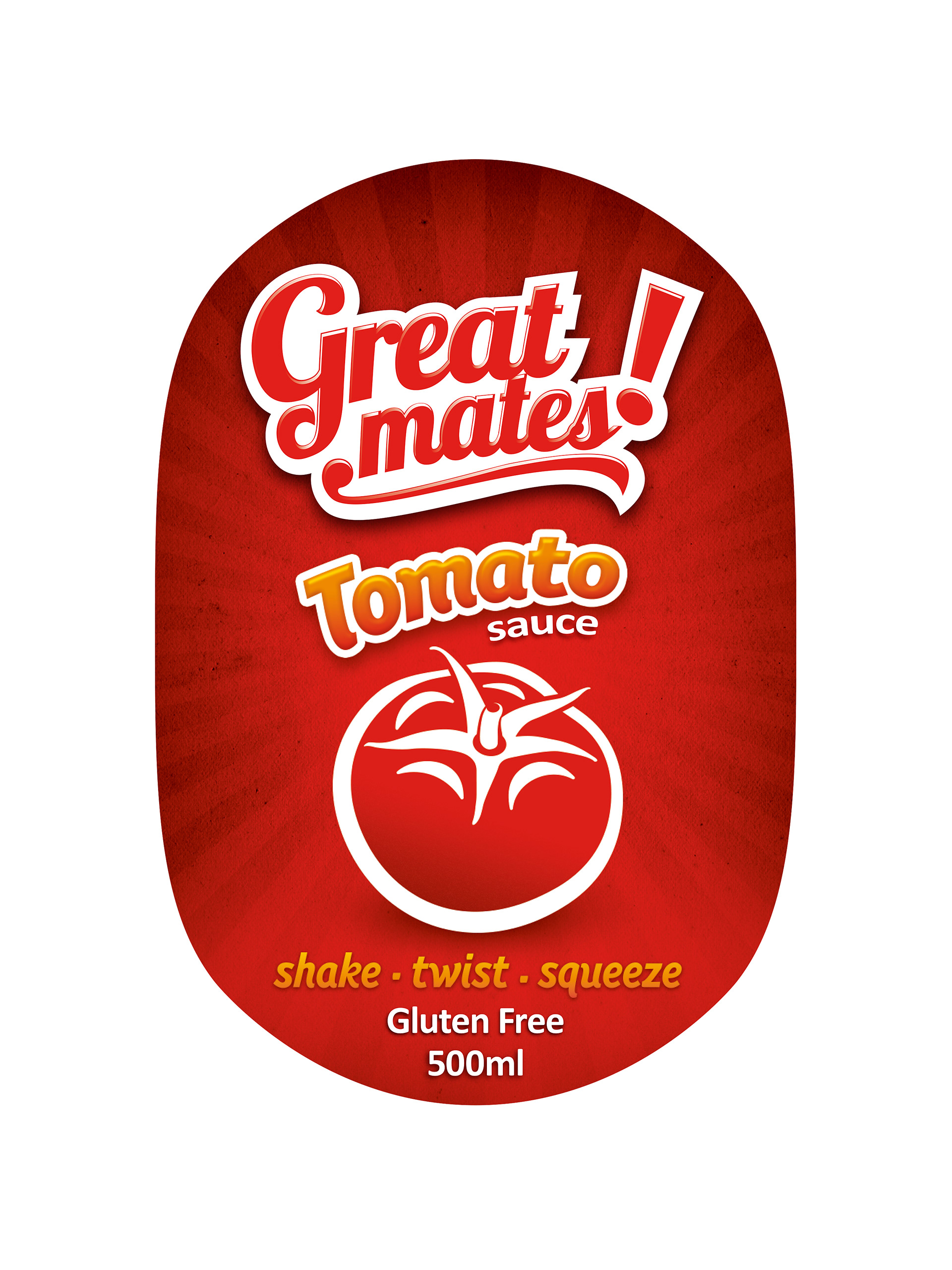
Great mates! Tomato Sauce 500 mL label design.
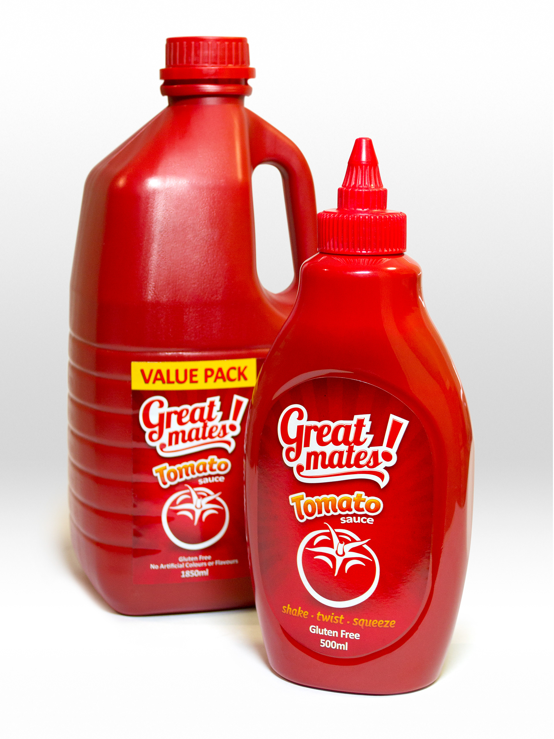
Great mates! Tomato Sauce 500 mL bottle and 1850 mL value pack.
Colourful variant name and tag line typography was created to match the feel of the brand identity. The 500 mL bottle seen here was later reworked into a value pack label design.