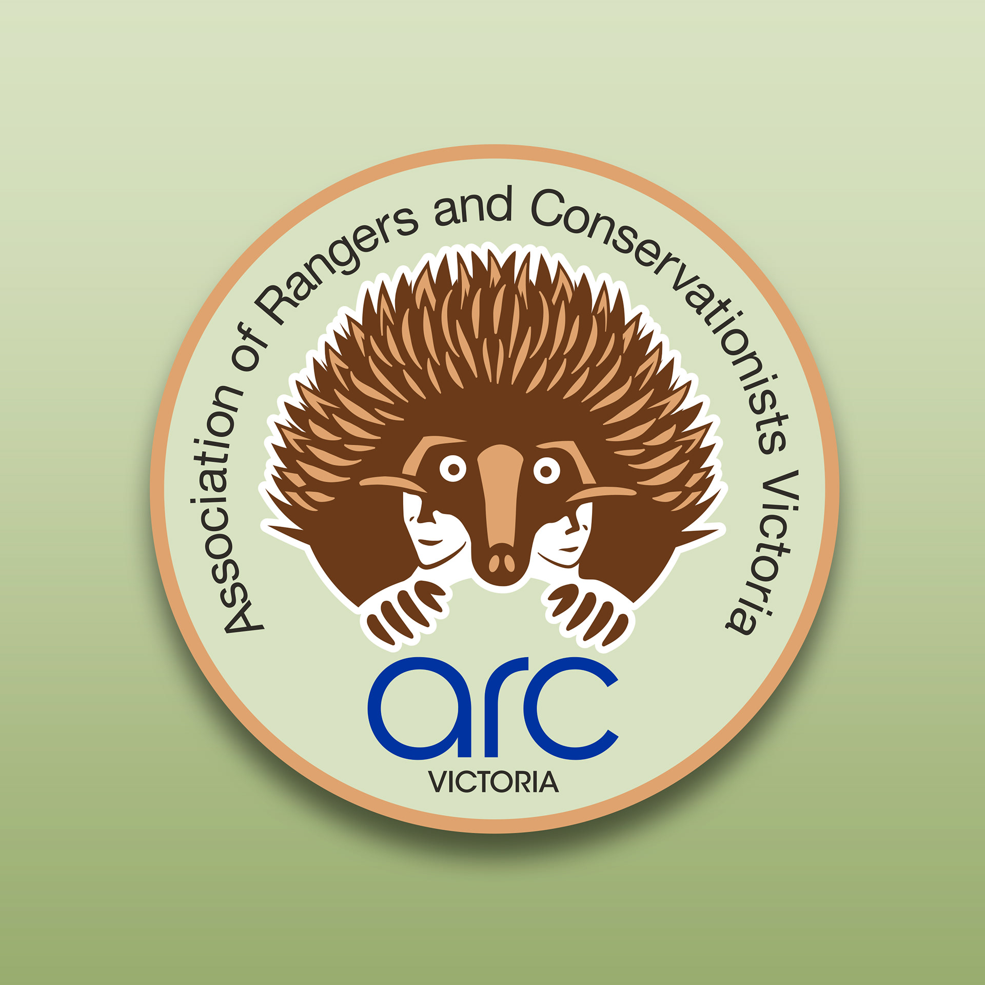
The Association of Rangers and Conservationists Victoria is the peak state organisation representing Rangers and Conservationists in their professional development. It has a 50-year history with most existing members deriving from Parks Victoria. The organisation had to a degree become insular and there was a need to make ARC Victoria more relevant, with a wider appeal at a grass roots level. They approached Stephen to undertake a refresh of their brand identity with the goal of attracting new members by creating talking points with a new logo design and supporting brand collateral. Franklin developed a modern design with an approachable feel. He used a stylised Echidna embracing silhouettes of people, evoking a sense of support and community. The outcome was a simple and friendly identity the reflected the core messaging of the organisation - Represent, Connect, Develop, Support.
Creative Direction: Stephen Franklin
Graphic Design: Stephen Franklin
Creative Retouching: Stephen Franklin
Graphic Design: Stephen Franklin
Creative Retouching: Stephen Franklin
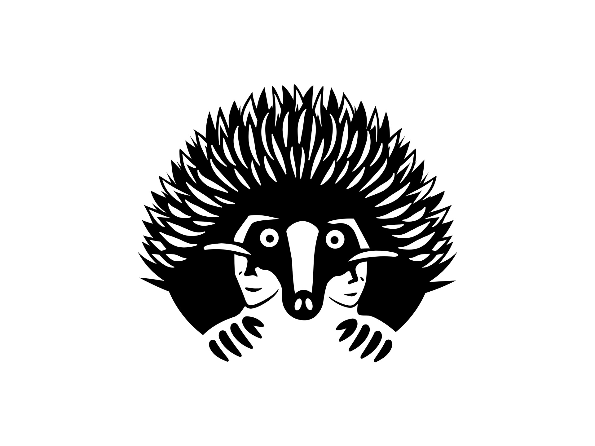
Initially Stephen approached the brandmark design with a ranger holding an Echidna (the organisations mascot). He eventually flipped this idea, making the Echidna embrace representations of the organisation members.
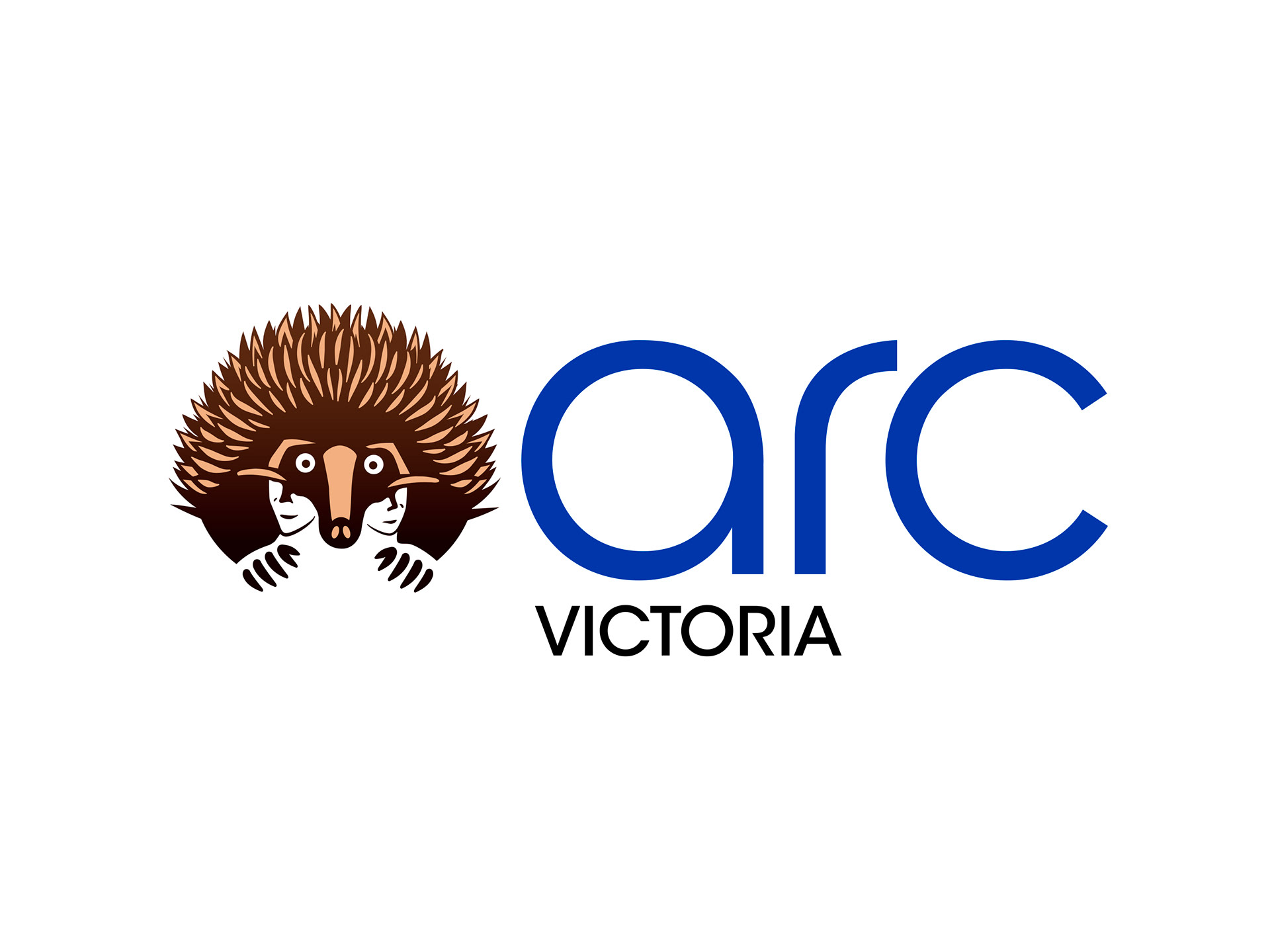
Stephen added the ARC Victoria brand type, customising outlined characters of the ARC in a lowercase version of ITC Avant Garde to match the roundness of the brandmark.

A subtle Earth tone gradient was added to the brandmark to give the Echidna illustration form.
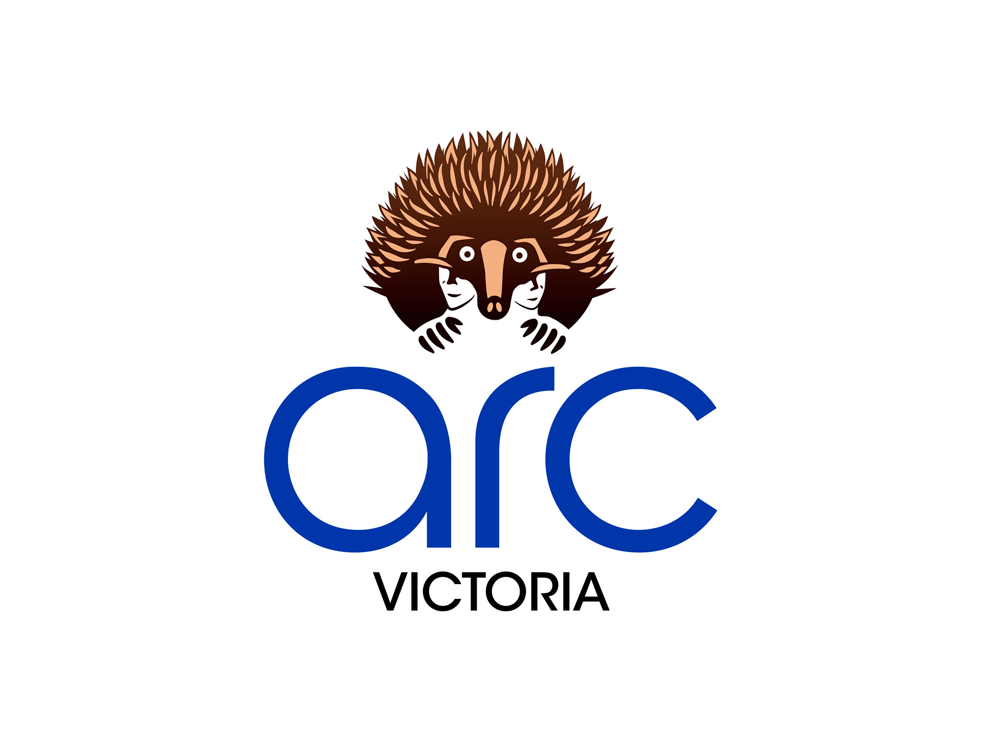
ARC Victoria full colour logo stacked.
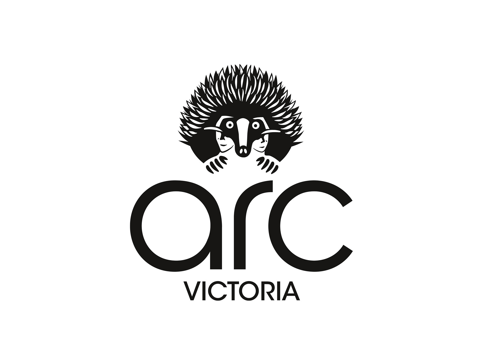
ARC Victoria black and white logo stacked.
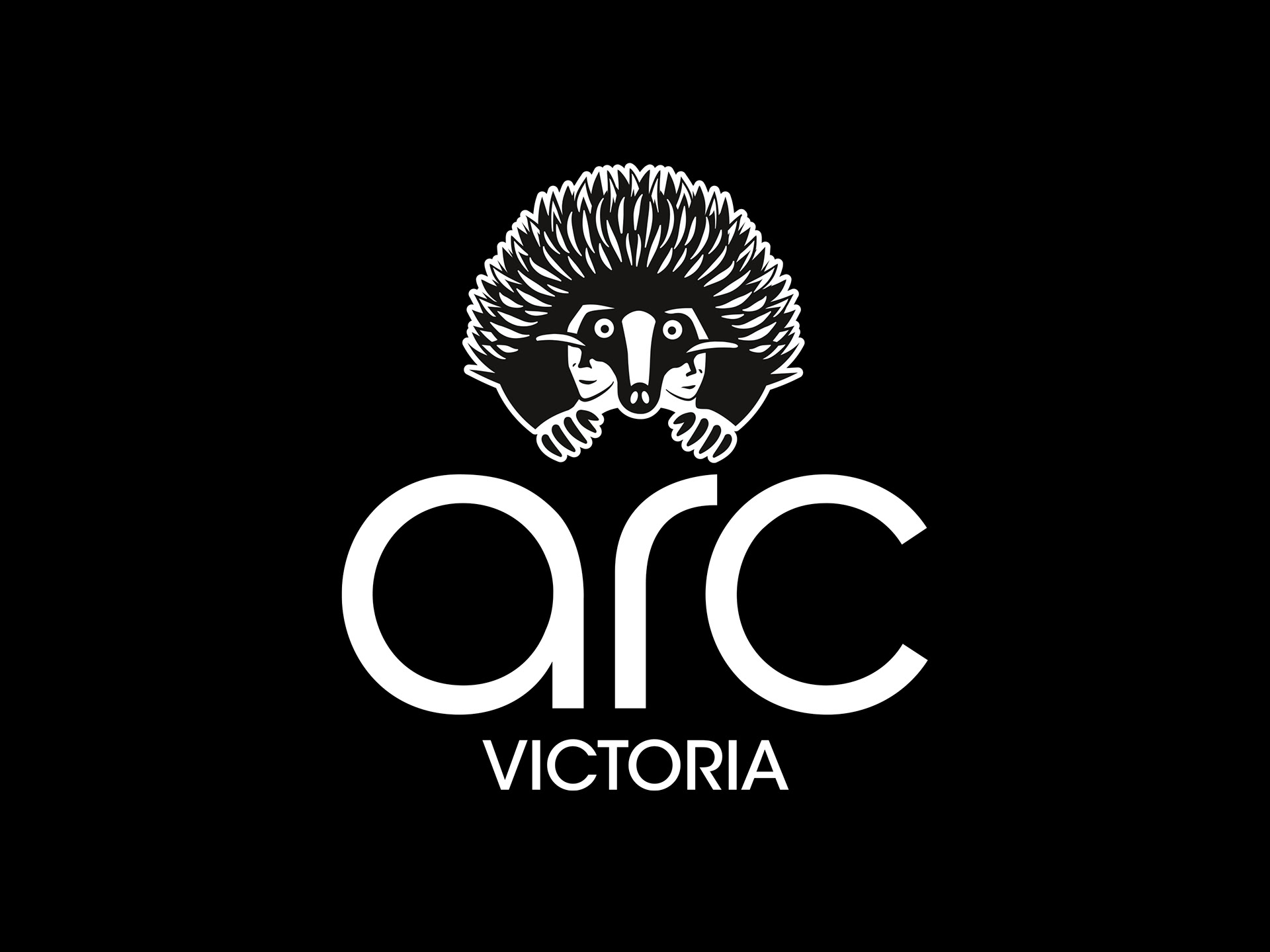
ARCV black & white logo stacked reversed.
A full set of master logos was created for various use cases for print and digital.
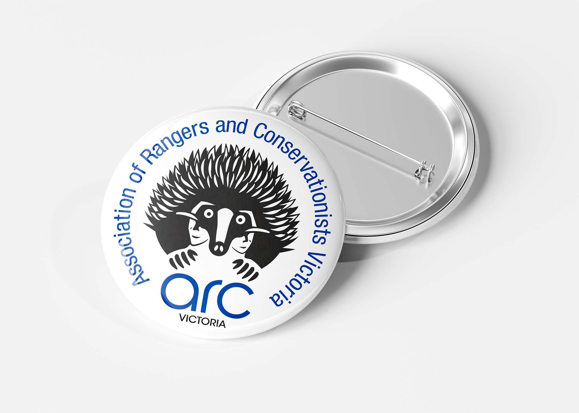
ARC Victoria button badge in two colour, black brandmark and blue type.
ARCV patch design intended for embroidery.
Franklin designed a badge and patch for use at events and membership drives.
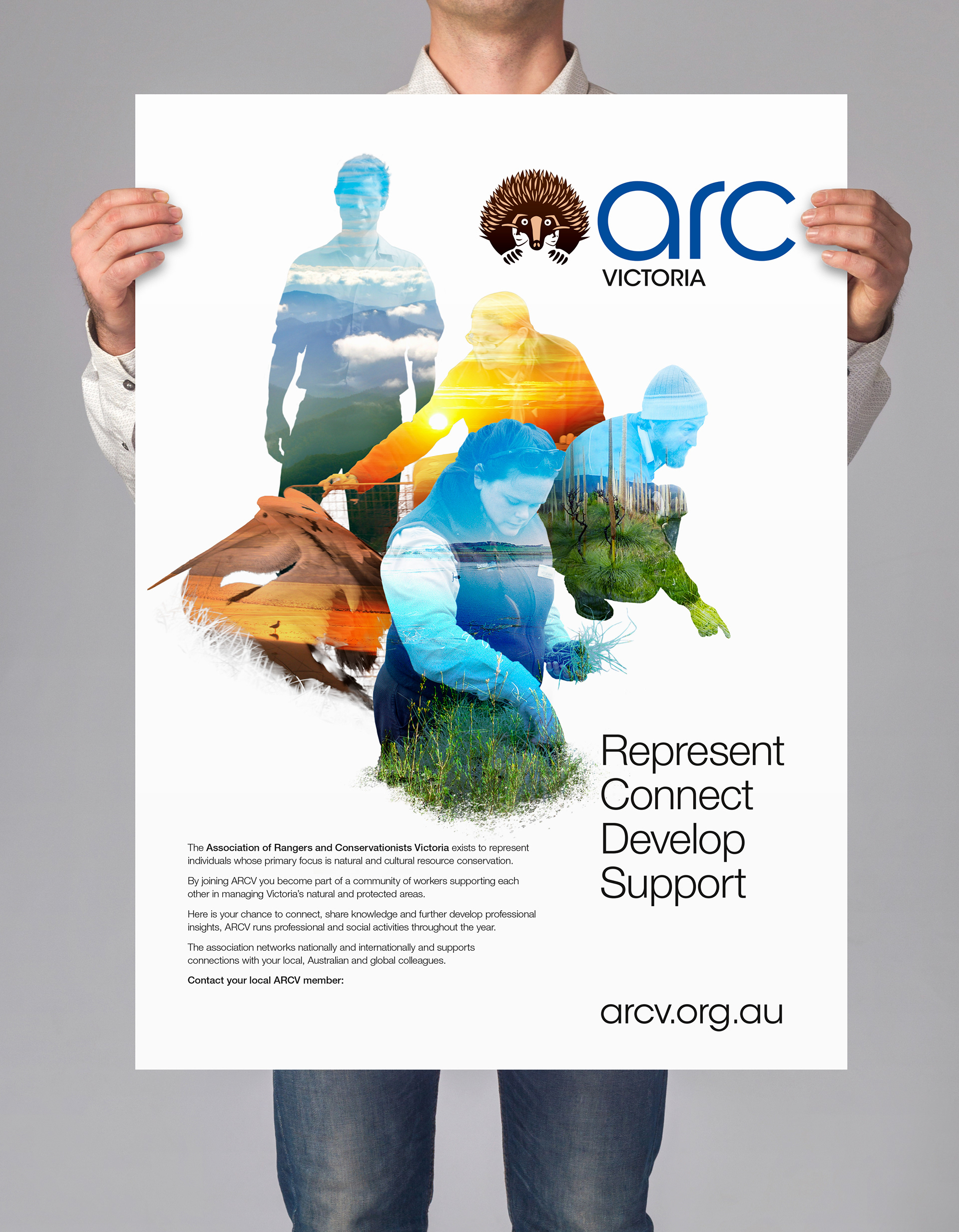
A graphic composition was developed to represent the various rolls of the organisation members and the locations they work in. This poster was delivered in a high-quality PDF format with an editable form element for adding the local ARCV members' name and contact details.
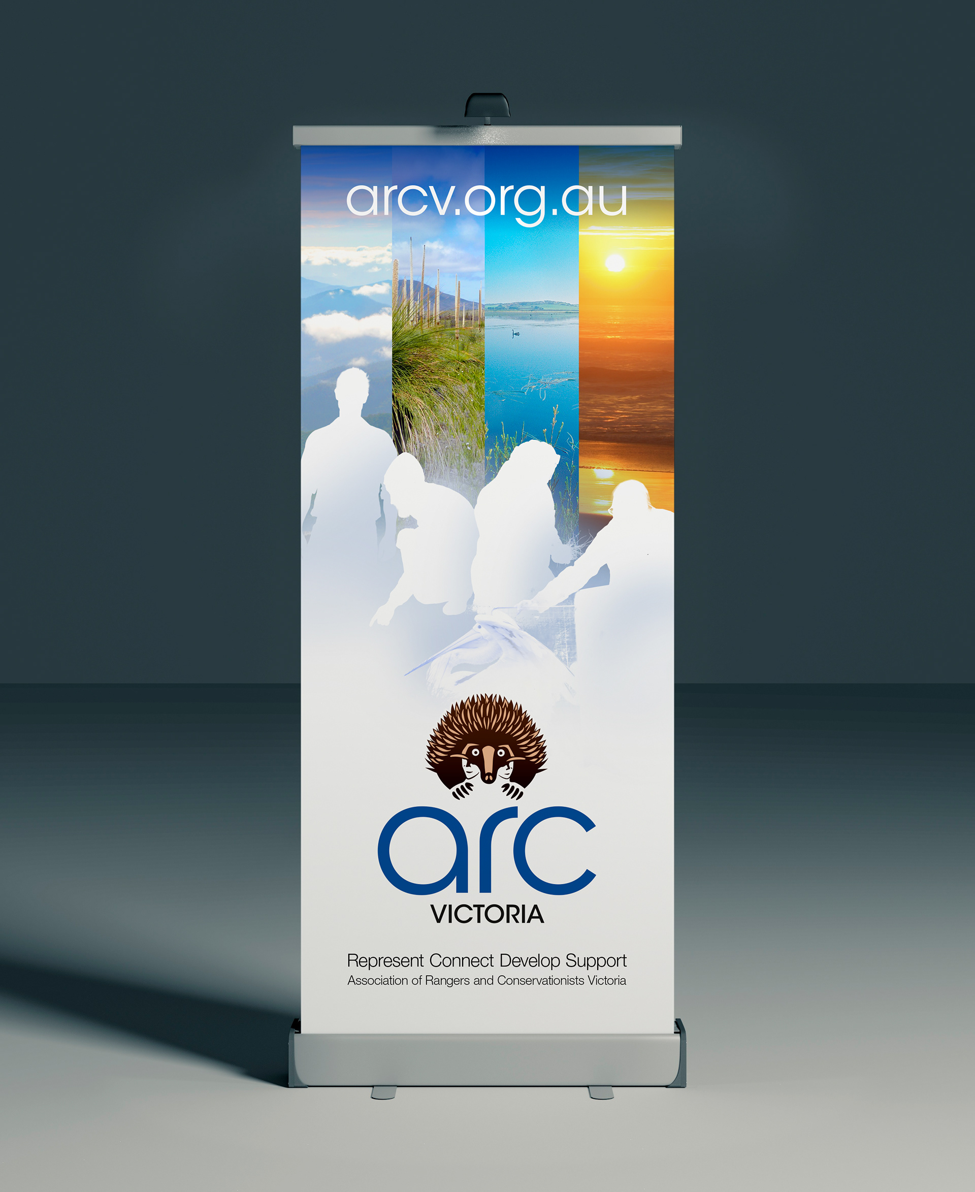
Stephen produced a pull-up banner for ARCV meetups or event stands. He used a reworked version of the poster graphic, pulling out the location images and adding in silhouettes of the members, matching the stylised brandmark illustration.
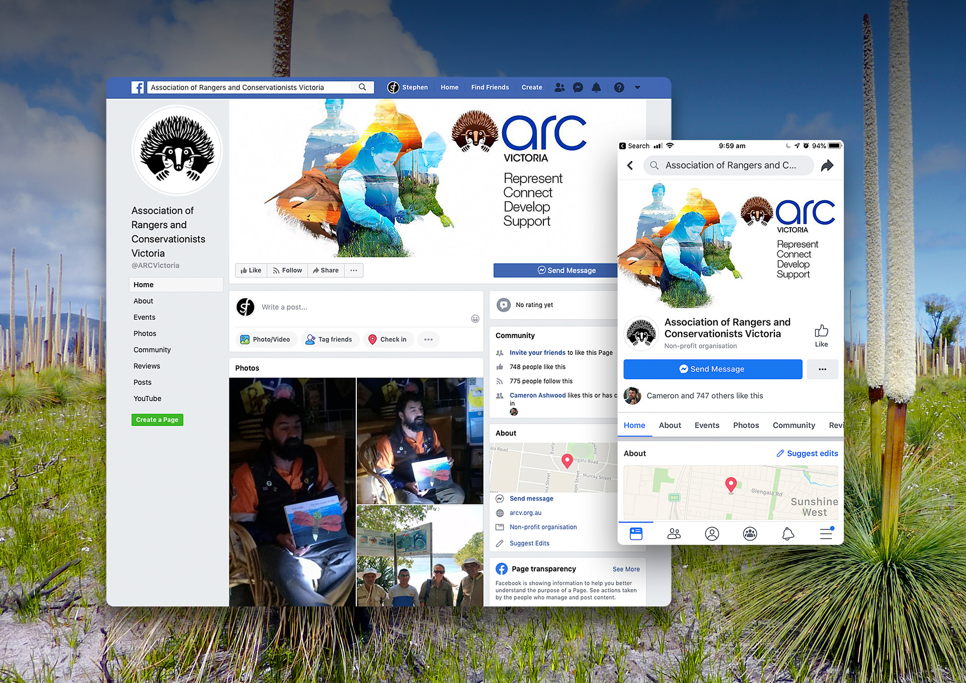
As a final part of the project Franklin repurposed the poster graphic for use on the ARCV social media channels and website.