The Ishimodo Brand and Design Agency's client, World Vision, needed to publish a report on the Global Index of Health Inequality for Children. The brief for this publication, entitled "The Killer Gap", was for Stephen to utilise the existing brand guidelines to produce this information-dense twenty-page document. He created a well-structured grid based on previous publications, with unmistakable section starts, striking quotes, and digestible charts and tables. The resulting design was easy to read and absorb, allowing for excellent comprehension and retention of information related to this vital report on global child health.

Design Direction: Ishimodo Brand and Design Agency
Graphic Design: Stephen Franklin
Illustration: Stephen Franklin
Front cover of World Vision - The Killer Gap publication with child carrying heavy water bottle.
For the cover, Stephen went with a large image, allowing is to speak for itself, adding weight to the subject matter.
First section spread showing the page layout grid, and typographic design.
Section starts also began with full bleed images that visually encapsulated the information to come. Significant data was pushed into tinted breakout boxes underneath important quotes supplied by the client.
The Killer Gap infographic showing children falling into a large ravine of problems separating the poor from the wealthier nations.
The Killer Gap infographic was distributed as PDF and printed digitally. The graphic had to work as a standalone piece, with enough information to convey this urgent message on health inequality for children.
Front cover and inside spread of the French language localisation.
As part of the project Franklin was requested to localise both the publication and the infographic in the French and Spanish languages.
French localisation of the infographic’s typography.
French localisation of The Killer Gap infographic’s typography. Special attention was given to the bold highlighted words. 
Front cover and inside spread of the Spanish language localisation.
The client supplied the translations to Stephen for the Spanish language localisation.
Spanish localisation of the infographic’s typography.
The Killer Gap infographic’s typography had to be updated with the Spanish language translation as well.

View more projects

TAFISA Brand Identity Refresh and Sub Brand Designs
Design refresh of the TAFISA (The Association For International Sport for All) brand identity and related sub-brands for the Muttromedia agency.
Espero Corporate Identity & Stationery
Design and development of the Espero Logistics Solutions corporate identity and stationery.
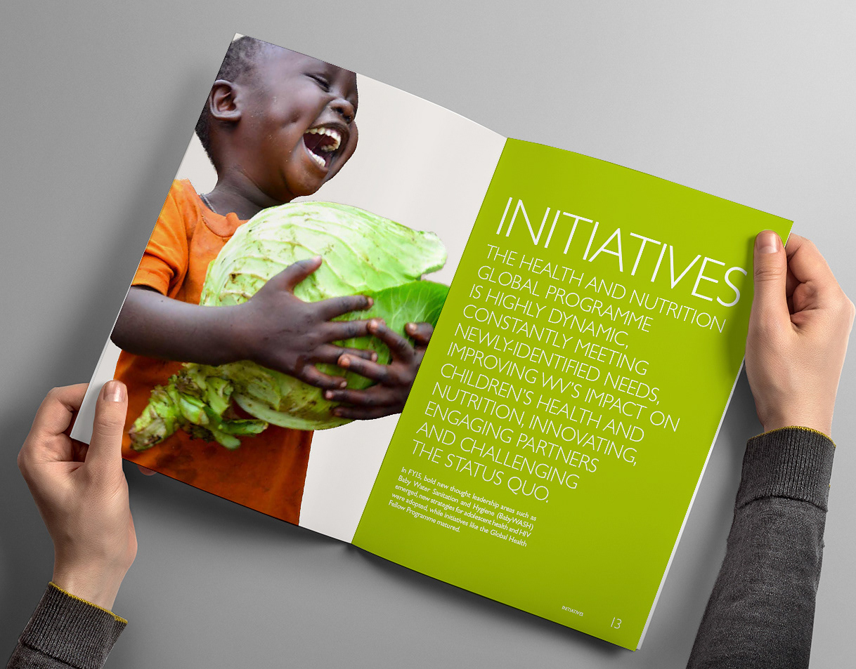
World Vision 2015 Annual Report Design
Creative direction, editorial design, and layout of the World Vision 2015 Health and Nutrition Annual Report for the Ishimodo Brand and Design Agency.
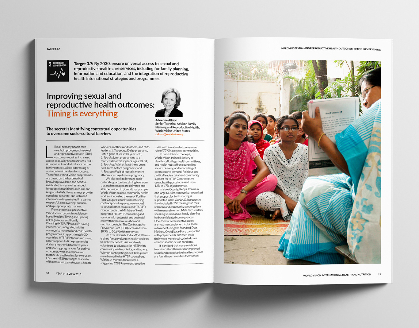
World Vision 2017 Annual Report Design
Editorial design, and layout of the World Vision 2017 Health and Nutrition Annual Report for the Ishimodo Brand and Design Agency. This sixteen-page document was prepared for release in both print and digital formats.
Black Rice Brand Identity
Creative direction and design development of the Black Rice Interiors brand identity for use with in-store signage, business stationery, van livery and website.
Byron Vista Social Club Logo
Illustrative design for the Byron Vista Social Club logo.
Tony Ferguson Point of Sale Brand Collateral
Creative direction of Tony Ferguson's point of sale brand collateral for the Ishimodo Brand and Design Agency. Included the design and layout of in-store Posters, End-shelf Header Cards, Shelf Wobblers, and Ceiling Disks.
Tasti D-Lite Point-of-Sale Machine Animated Banners
Design and development of motion graphics for the Point-of-Sale machine animated banners used in Tasti D-Lite Australia's flagship store on Chapel Street, Melbourne.
ARC Victoria Brand Identity
Brand identity design for the Association of Rangers and Conservationists Victoria. This included a refresh of ARC Victoria's logo design and supporting brand collateral such as badges, patches, local event posters, pull-up banners, and social media graphics.
ProgressClaim.com Sales Presenter Design
Creative direction of the ProgressClaim.com Sales Presenter Leave Behind. Included the design, layout, and prepress production of this A4 six-page roll fold brochure.
Back to Top