ECDC is a diagnostic clinic specifically for patients with focal onset dementias, and for those with cognitive syndromes that pose diagnostic difficulties. Stephen worked closely with senior staff to develop the brief and uncover the core tenets of the organisation. From this discovery process Franklin was able to create a unique brandmark and identity that conveyed a message of support, during what can be a distressing time for the carers of those with cognitive disorders.

Creative Direction: Stephen Franklin
Graphic Design: Stephen Franklin
Printing: Landmark Printing
ECDC business card and letterhead design.
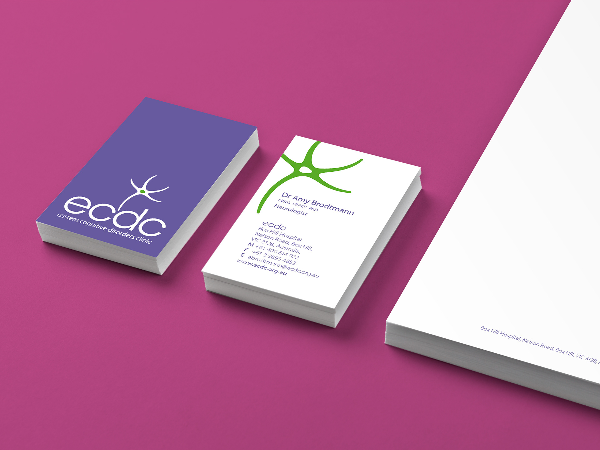
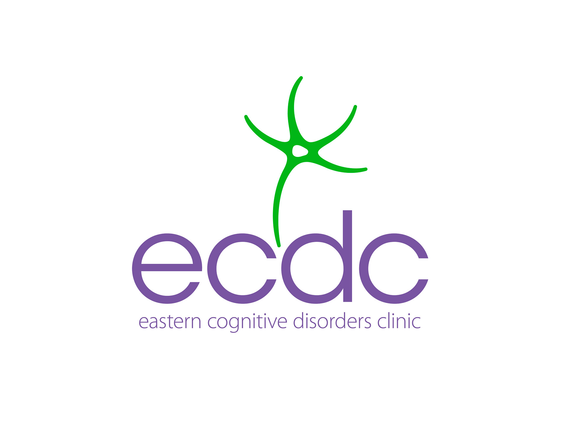
A primary palette of green and violet helps to soften the visual identity, conveying a sense of calm and caring, as does the dancing shape of the neuron symbol.
ECDC standard brandmark design in the primary green colour.
ECDC reversed brandmark design on violet coloured background.
The logo symbol design was based on the structure of a typical neuron. Dendrite arms extend out from the central Nucleus, with the long leg of the Axon dipping down in the centre. With the reverse version of the logo, the Nucleus was given a point of focus with a primary green.
ECDC stacked logo design.
Stacked version of the logo with dancing neuron leg dipping down between the clinic’s initials.
ECDC horizontal reversed logo design.
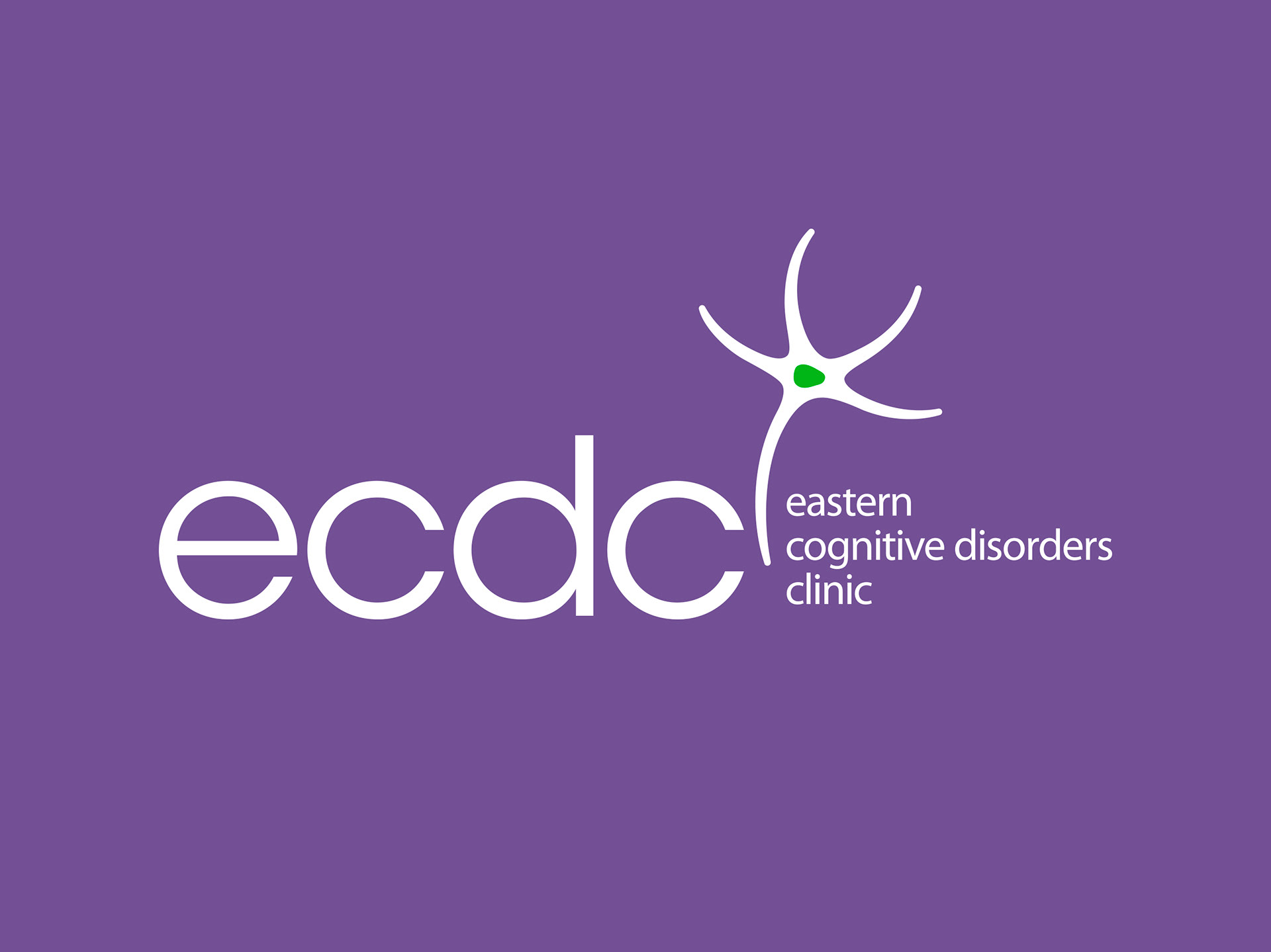
Reversed logo version in a horizontal format. The neuron symbol is tightly integrated with the type providing a natural division between the initials and the name.
ECDC business card and letterhead design.
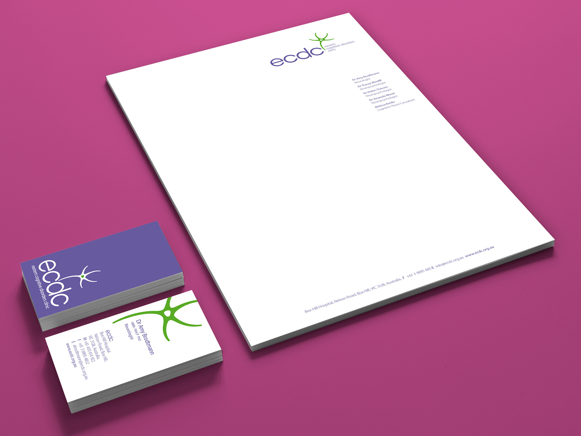
Stephen produced the ECDC corporate stationery, shown here with the standard and reversed versions of the brand identity.
ECDC website design.
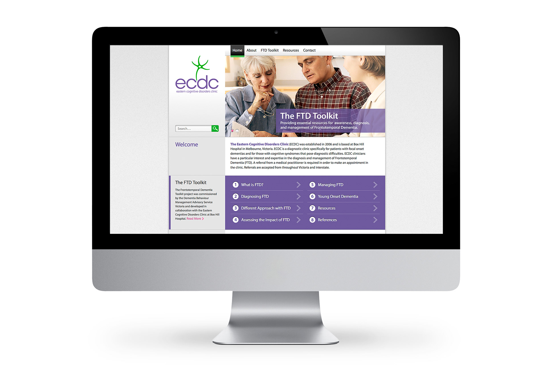
The logo design, primary colours and supporting fonts at work on the ECDC website. Myriad Pro was chosen as a secondary font for its legibility and extensive range of weights and styles.

View more projects

Little Yellow Cloud Brand Identity
Brand identity design for the Little Yellow Cloud® kids clothing brand.
Black Rice Brand Identity
Creative direction and design development of the Black Rice Interiors brand identity for use with in-store signage, business stationery, van livery and website.
World Vision 2015 Annual Report Design
Creative direction, editorial design, and layout of the World Vision 2015 Health and Nutrition Annual Report for the Ishimodo Brand and Design Agency.
ProgressClaim.com Sales Presenter Design
Creative direction of the ProgressClaim.com Sales Presenter Leave Behind. Included the design, layout, and prepress production of this A4 six-page roll fold brochure.
Byron Vista Social Club Logo
Illustrative design for the Byron Vista Social Club logo.
Espero Corporate Identity & Stationery
Design and development of the Espero Logistics Solutions corporate identity and stationery.
Fisher-Price Catalogue Print & Online
Fisher-Price catalogue for the Ishimodo Brand and Design Agency. Included the design and layout of this fifty-two-page publication for use in print and online.
Tasti D-Lite Point-of-Sale Machine Animated Banners
Design and development of motion graphics for the Point-of-Sale machine animated banners used in Tasti D-Lite Australia's flagship store on Chapel Street, Melbourne.
Bink Kids Brand Identity
Creative direction and design of the Bink Kids brand identity, including the wordmark design, brand stationery, and marketing materials for print and online media.
Tony Ferguson Brand Guidelines
Creative direction and design of the Tony Ferguson Brand Guidelines for the Ishimodo Brand and Design Agency. This forty-page digital document included the design, layout, and delivery of the PDF.
Back to Top