Glycon helped meet the research needs of the science and biotech sectors in Australia with their range of oligonucleotide products. Their brand name, Glycon, came from the snake god Asclepius, the god of healing and medicine. Working with this concept Stephen developed a stylised snake symbol and combined this with a rich palette of greens and Friz Quadrata as the primary typeface for the brand name. The outcome was a distinctive design that connected Glycon’s brand identity and modern medical technologies with its ancient mythological roots in the art of healing.
Creative Direction: Stephen Franklin
Graphic Design: Stephen Franklin
Printing: Landmark Printing
Graphic Design: Stephen Franklin
Printing: Landmark Printing
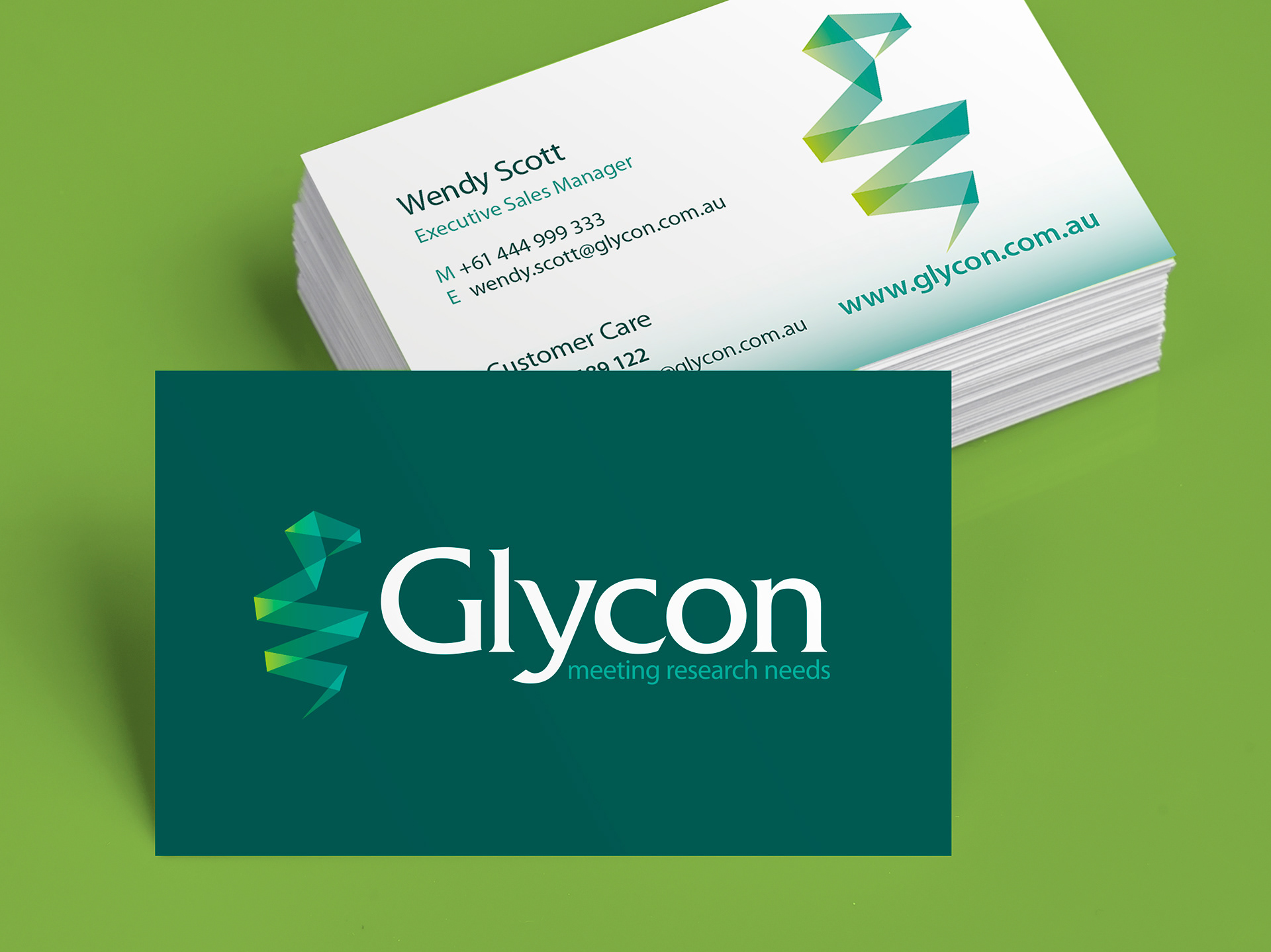
Stephen’s inspiration for the brandmark design came from the paper folds of origami creations.
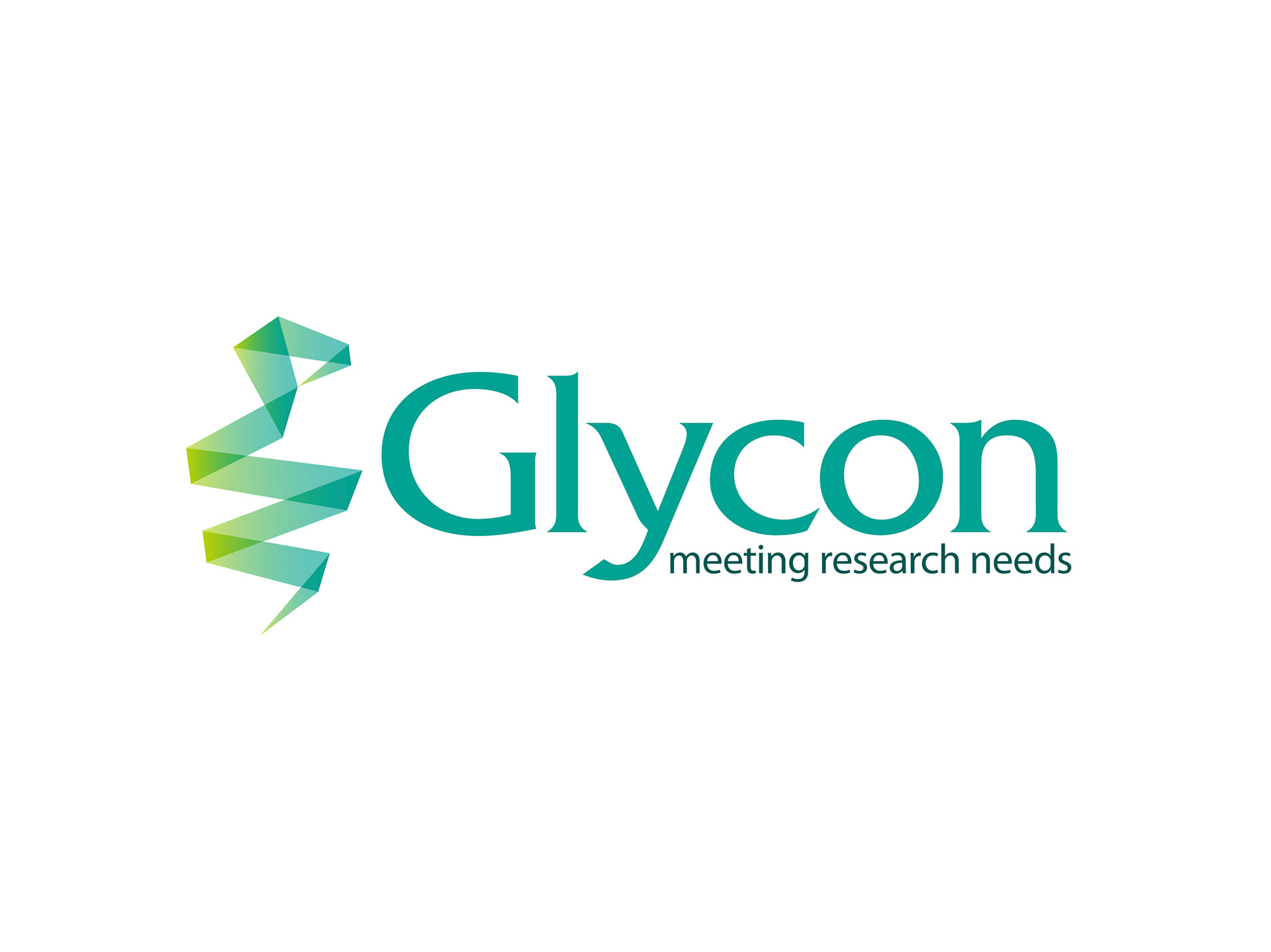
Glycon horizontal logo on white background.
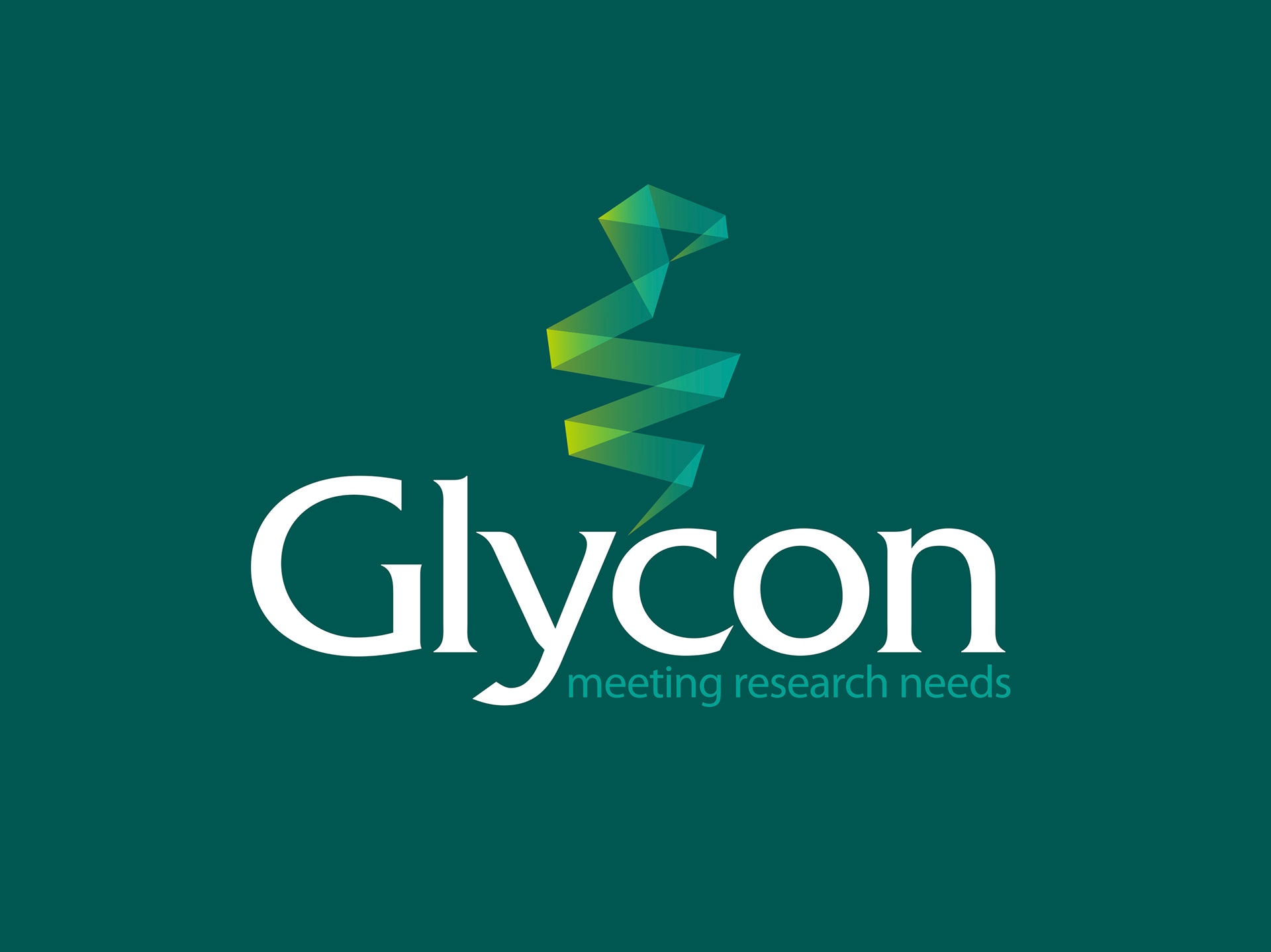
Glycon stacked logo reversed from solid primary green background.
The gradients of the symbol in the reversed version needed further development. This was to create the right feel to the lighting when seen on a solid background.

The brand palette was used extensively throughout the UI of the Glycon website, also designed and developed by Stephen Franklin.