With a brand name firmly in hand, Brightspark turned their attention to developing a visual identity. Stephen had an open brief for the project with only one constraint. The logo needed to work in both online and print mediums. Franklin began by carefully selecting the typefaces for the logo, finding two styles that complemented each other, and would work well with the limited resolution available online. He then gave the final logo its personality with a shooting ember, a creative spark. Stephen used the colour palette of rich hues to convey a sense of strength and imbue trust in the brand. The outcome was an identity that was serious enough for the corporate client but did not hide its confidence in taking risks in its thinking. 

Creative Direction: Stephen Franklin
Graphic Design: Stephen Franklin
Brightspark letterhead and business card.
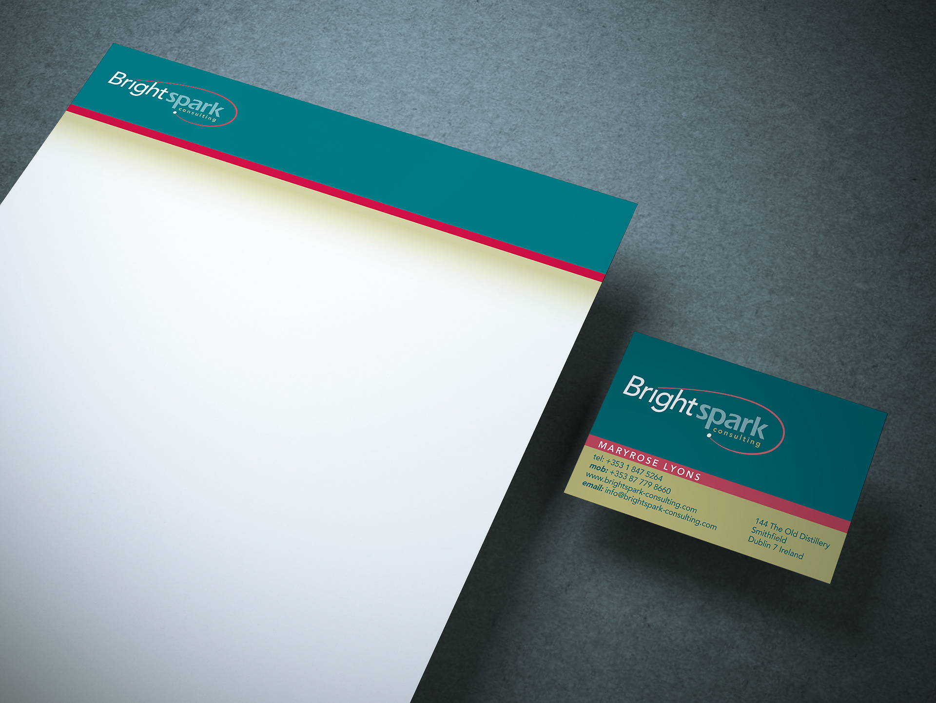
Three spot colours were used for the stationery allowing the colours to retain their richness.
Reversed Brightspark logo on solid background.
Standard Brightspark logo on white background.
The logo was developed for use on a solid brand colour background or on white. Colour was only added after the logo worked well in black and white.
Website homepage user interface mock-up.
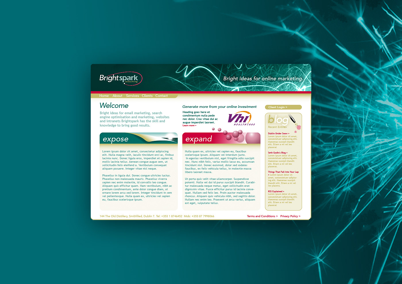
Working well in an online environment was integral to the design.

View more projects

Microsoft Catalogue Cover Image
Cover image of the Microsoft Windows product catalogue produced for the Frontline agency, Sydney, Australia. This image is a composite of multiple stock photography images and a photographic shoot involving two models: one for positioning and one for face and hands.
Microsoft Exchange Brochure Image
Composite image created for the cover of a Microsoft Exchange brochure. Sourced from multiple image styles and combined to create a visually integrated piece of digital artwork.
BigPond Cable Packaging Image
Worked with the Art Director at the Frontline agency to produce this secondary pack image, used as part of a Telstra Big Pond Cable Modem packaging. Involved matching and applying the colour halftone screen effect of the hand image to an image of the Microsoft mouse, combining both into a seamless composition.
Escape to Luz Illustration
Cover illustration for the Escape to Luz promotional brochure.
John Bullers Pies Packaging Artwork
Creative artworking for the John Bullers Family Pies. A new product range from Green Isle Foods.
ABOL User Interface Icons
Created user interface icons for various use cases for the Australian Business Online (ABOL) website, commissioned by Hothouse Interactive, Sydney, Australia.
The Oceania Project Logo
Logo design for The Oceania Project, a Not-for-profit research and information organisation established in 1988, dedicated to raising awareness about Cetacea (Whales, Dolphins and Porpoises) and the ocean environment.
FOOD Club Night 1st Birthday Poster and Flyer
Street poster and flyer for FOOD club night 1st Birthday celebrations, Dublin, Ireland.
Resource Connections Logo
Logo design for Resource Connections, an independent Australian energy consultant.
Microsoft Communiqué Cover Image
Front cover image for the Microsoft Communiqué magazine featuring the new Microsoft Front Page application. Utilising Alias Sketch 3D software to set the lighting and texturing of the composition of the image, and Photoshop for the final shading and colour balance.
Back to Top