Resource Connections was the business name of an independent consultant based in Sydney, Australia. He was at the forefront of the Natural Gas revolution about to happen in the mid 1990’s and needed a logo that spoke to the knowledge he had about this emerging market. Stephen approached the design the same way as he would a large fortune five hundred company. The logo needed to be simple yet communicate the core business intent instantly. He developed an X brandmark with blue tones, representative of the energy supply, with a strong supporting typeface for the business name and subsequent tagline. The result is a logo that belied the lone consultant behind the business and projected a sense of strength and confidence typical of a large company. An essential trait for attracting corporate clients.

Creative Direction: Stephen Franklin
Graphic Design: Stephen Franklin
Resource Connections showing X like brandmark made up of a dark blue and light blue stroke.
The complete Resource Connections logo, comprised of the brandmark design, business name and tagline.
View more projects

Thick & Thirsty Point of Sale Hero Image Retouching
Retouching of hero image for Thick & Thirsty point of sale promotion.
BigPond Cable Packaging Image
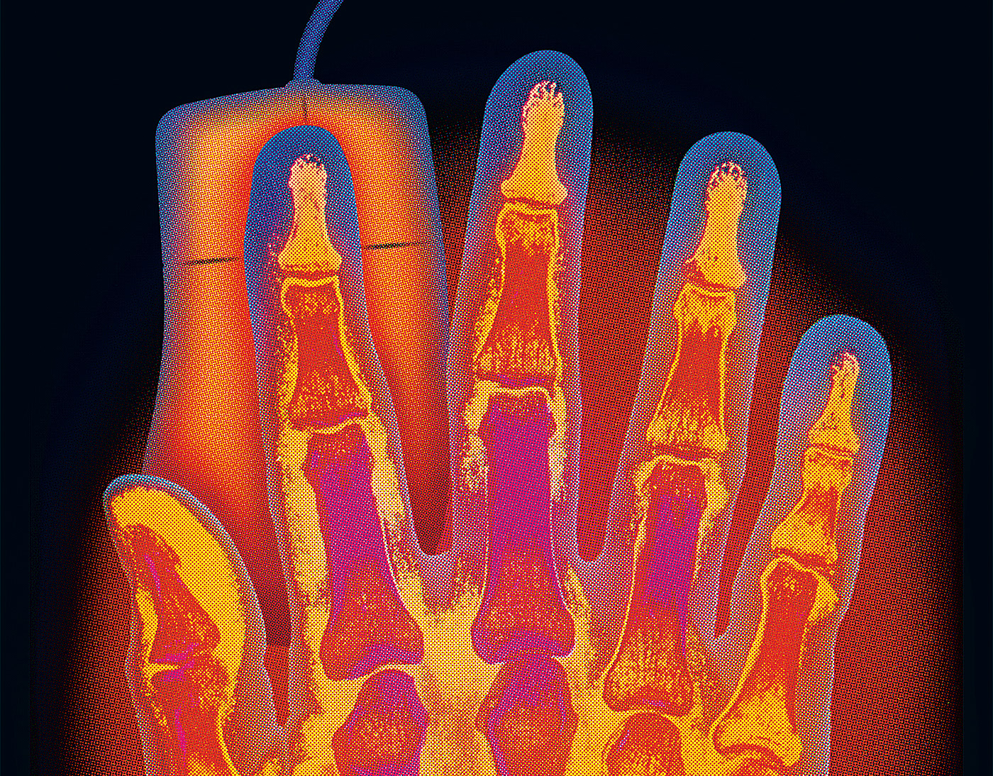
Worked with the Art Director at the Frontline agency to produce this secondary pack image, used as part of a Telstra Big Pond Cable Modem packaging. Involved matching and applying the colour halftone screen effect of the hand image to an image of the Microsoft mouse, combining both into a seamless composition.
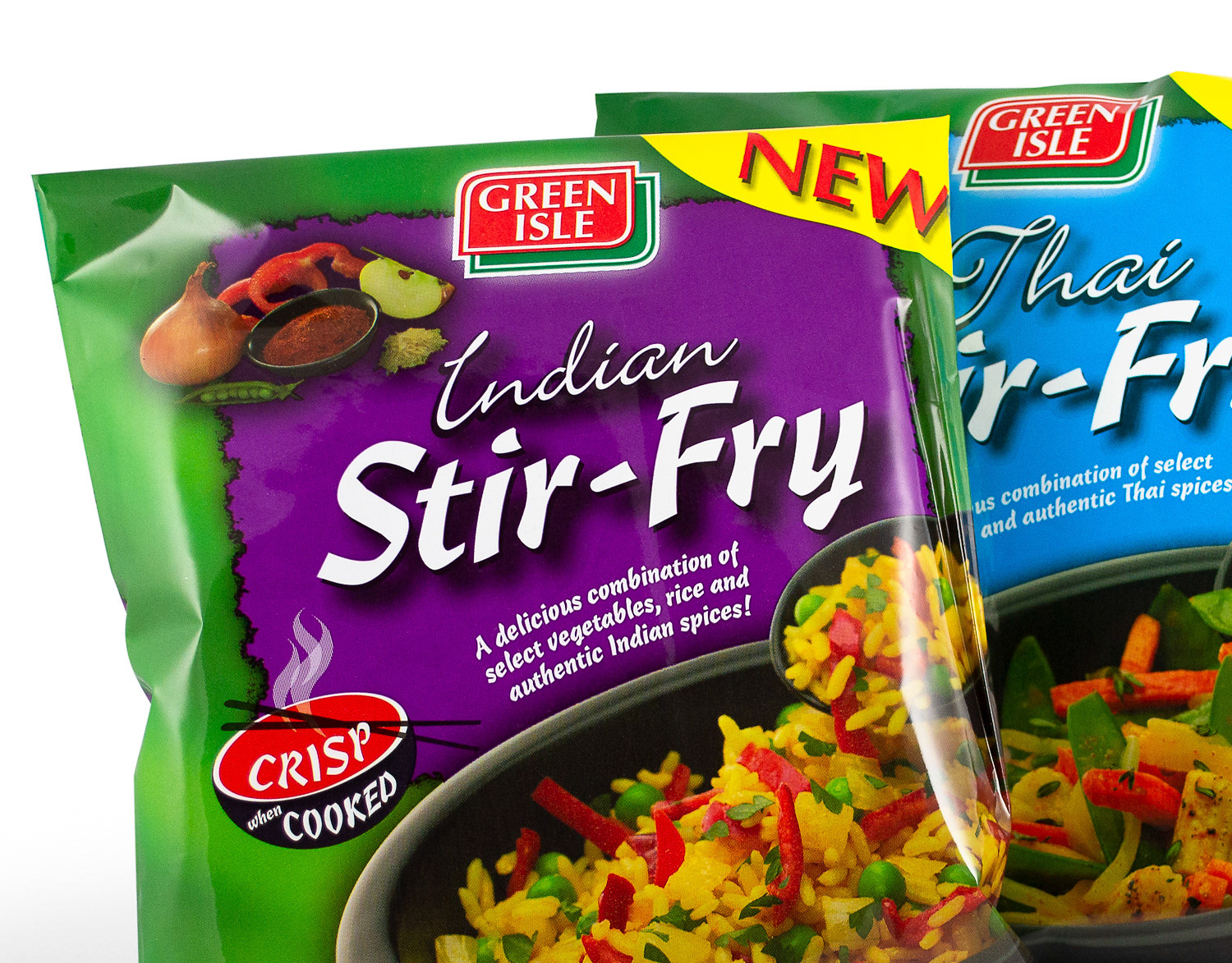
Green Isle Stir-Fry Packaging Artwork
Creative artworking on the Green Isle Stir-Fry flexographic packaging finished artwork.
Kellogg's Froot Loops Back of Pack Illustration
A promotional back-of-pack illustration created for Kellogg's Froot Loops cereal packaging. Included the digital creation and preparation of the finished image for use in the packaging artwork.
Merrilake Promotional Calendar Illustration
Stephen's contribution to the Merrilake agency’s promotional calendar. He was requested to respond to the brief "Merrilake Illustrators are not just bums on seats!" in the style of his favourite artist. Salvador Dali's "Sleep" was Franklin's inspiration.
Wyeth BioPharma Work Life Harmony Week
Designed both print and digital components for the Wyeth Bio Pharma - Work/Life Harmony Week. This included various printed pamphlets and messaging pieces along with the UX/UI for the program’s website.
Escape to Luz Illustration
Cover illustration for the Escape to Luz promotional brochure.
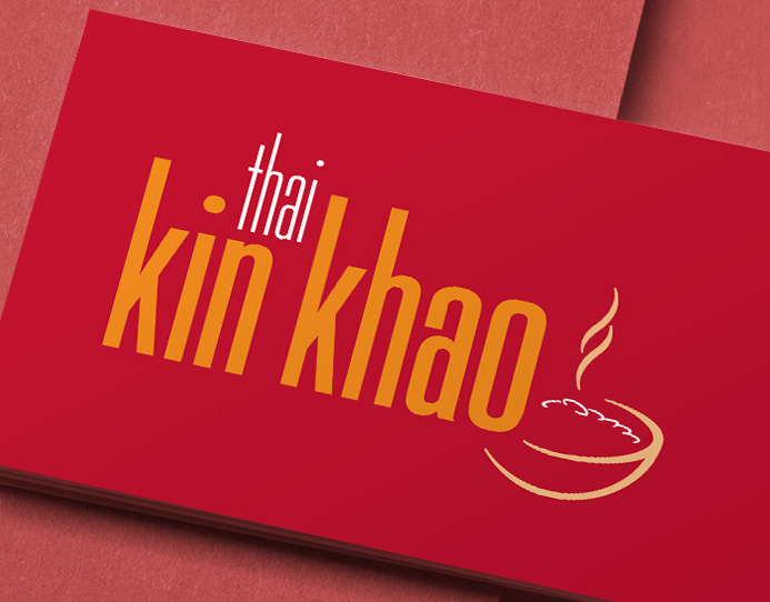
Kin Khao Brand Identity
Identity design for Kin Khao Thai restaurant, Athlone, Ireland. The design was executed across interiors, signage, menus, newspaper ads and other marketing materials.
Microsoft Catalogue Cover Image
Cover image of the Microsoft Windows product catalogue produced for the Frontline agency, Sydney, Australia. This image is a composite of multiple stock photography images and a photographic shoot involving two models: one for positioning and one for face and hands.
Integrated Vision Marketing Collateral
Creative direction and design of various marketing collateral for Integrated Vision, a leading Australian videoconferencing solutions provider. Stephen, operating as Graphic Vision, partnered with the client to produce a range of items including, a Quarterly Newsletter, DL Brochure, and DL Promotions, managing all designs from concept through to prepress and final print.
Back to Top