The brief for the creative artwork on the John Bullers packaging was simple, maintain strong flavour appeal across the range while keeping the look consistent. Stephen achieved this by building a base structure for both the mechanical artwork of the packaging, as well as the retouching for the background and hero images for each variant. The variant colours were separated out into their own spot colours with black gradients or tints overprinted on top. For the hero image a single base pie image was used for the plate and crust with the filling later composited into shot. The outcome was a range of products that had a tight visual consistency but enough standout on shelf for consumer recognition.

Creative Direction: Mesh Design
Creative Artworking: Stephen Franklin

Two printed samples from the John Bullers range of family pies.
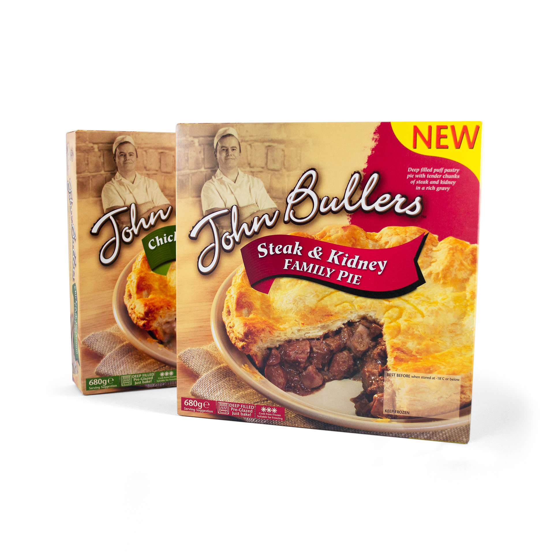
Great care was taken in structuring the base artwork files. This ensured consistency on press and with any further expansion of the John Bullers range.
Printed sample of the John Bullers Chicken and Mushroom Pie.
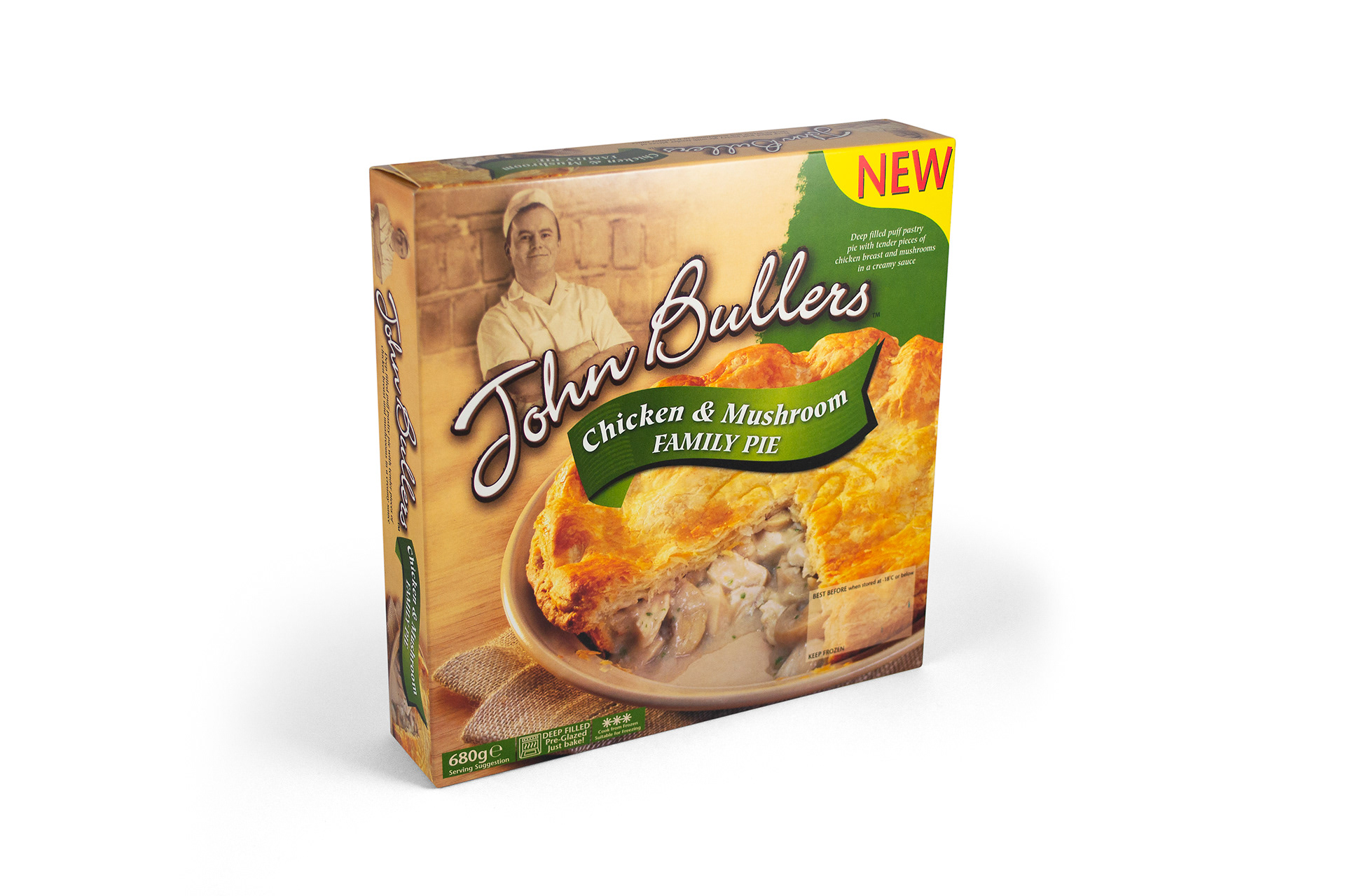
The green colour of the variant name banner, and panel behind the product name, are global spot colours and easily updated for range extensions.
Printed sample of the John Bullers Steak and Kidney Pie.
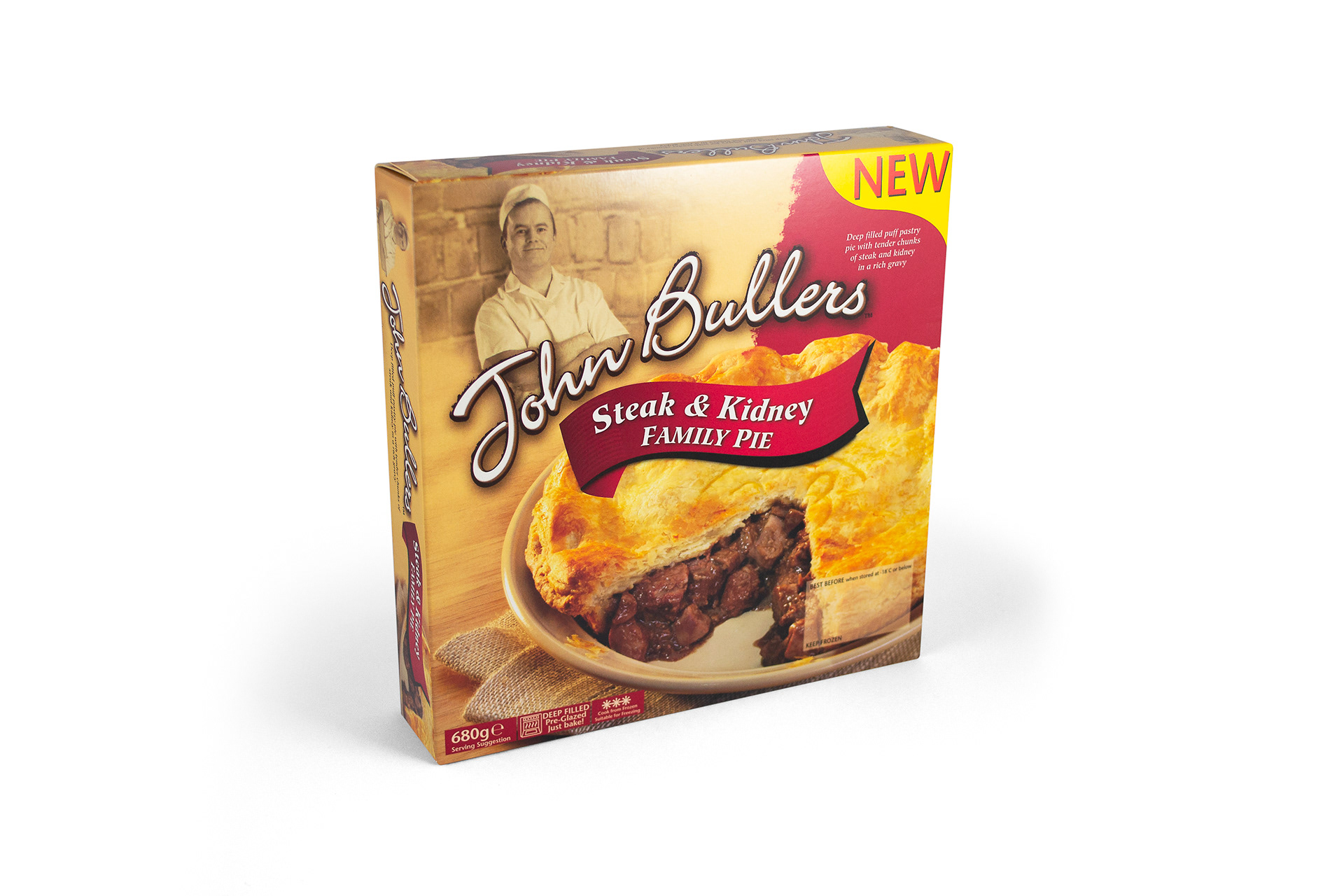
A base hero image was created for the plate and pie crust. Each variant’s filling was later composited into shot, as seen here and with the previous example.

View more projects

Integrated Vision Marketing Collateral
Creative direction and design of various marketing collateral for Integrated Vision, a leading Australian videoconferencing solutions provider. Stephen, operating as Graphic Vision, partnered with the client to produce a range of items including, a Quarterly Newsletter, DL Brochure, and DL Promotions, managing all designs from concept through to prepress and final print.
Microsoft Exchange Brochure Image
Composite image created for the cover of a Microsoft Exchange brochure. Sourced from multiple image styles and combined to create a visually integrated piece of digital artwork.
ABOL User Interface Icons
Created user interface icons for various use cases for the Australian Business Online (ABOL) website, commissioned by Hothouse Interactive, Sydney, Australia.
Merrilake Promotional Calendar Illustration
Stephen's contribution to the Merrilake agency’s promotional calendar. He was requested to respond to the brief "Merrilake Illustrators are not just bums on seats!" in the style of his favourite artist. Salvador Dali's "Sleep" was Franklin's inspiration.
Escape to Luz Brand Identity
Identity design for Escape to Luz, a Dublin based holiday company which organises personalised trips to the Costa del la Luz in the Southwest of Spain.
Green Isle Potato Bake Packaging Artwork
Creative artworking on the Green Isle Potato Bake flexographic packaging finished artwork.
SoundNet Newsletter and Masthead
Editorial design and masthead design of SoundNet, the official newsletter of The Oceania Project a non-profit research organisation dedicated to raising awareness about Whales, Dolphins and Porpoises and the ocean environment.
Green Isle Stir-Fry Packaging Artwork
Creative artworking on the Green Isle Stir-Fry flexographic packaging finished artwork.
Ecotech Logo Design and Stationery
Logo design and stationery for Ecotech Recycling, Dublin, Ireland.
Freedom Unlimited Website
Design and development of the Freedom Unlimited website, Dublin, Ireland.
Back to Top