Ecotech Recycling had over fourteen years of operational experience in recycling technologies in Ireland. They needed a logo that reflected their knowledge and expertise, appealing to their core market of multinational companies and local authorities. Stephen approached the design by distinguishing the two parts of the name with the right choice of typeface. A rounder more organic serif font for 'Eco', and a clean modern San serif for 'Tech'. He then added a small leaf flourish above the Eco to further strengthen the environmental messaging. The result was an identity that made a clear statement about the recycling technologies Ecotech were bringing to the Irish market.
Creative Direction: Stephen Franklin
Graphic Design: Stephen Franklin

Complete lockup for the logo. A two-tone palette of green was chosen for the primary brand colours.
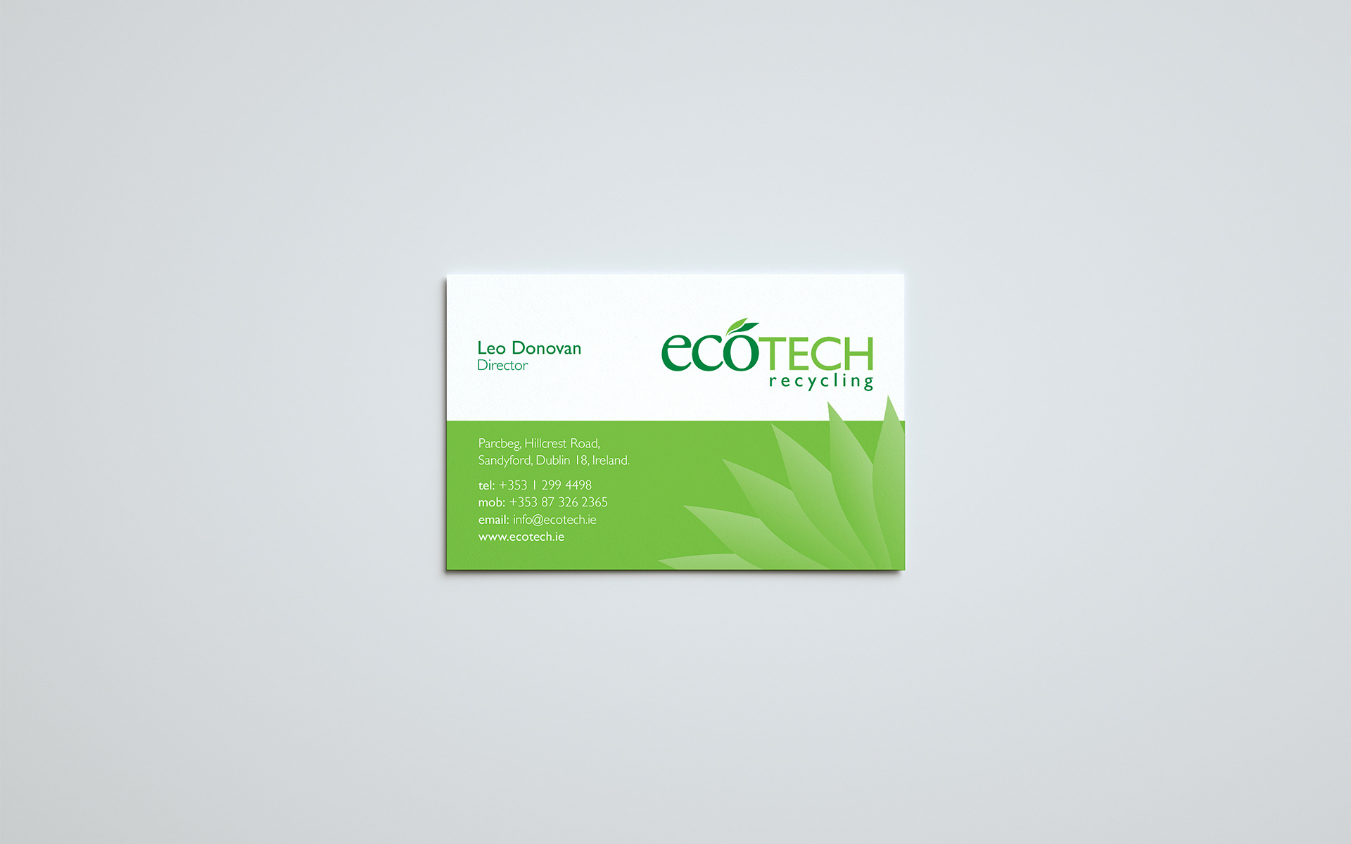
Stephen used a green panel to hold the contact details in the business card and give the logo its own visual space.
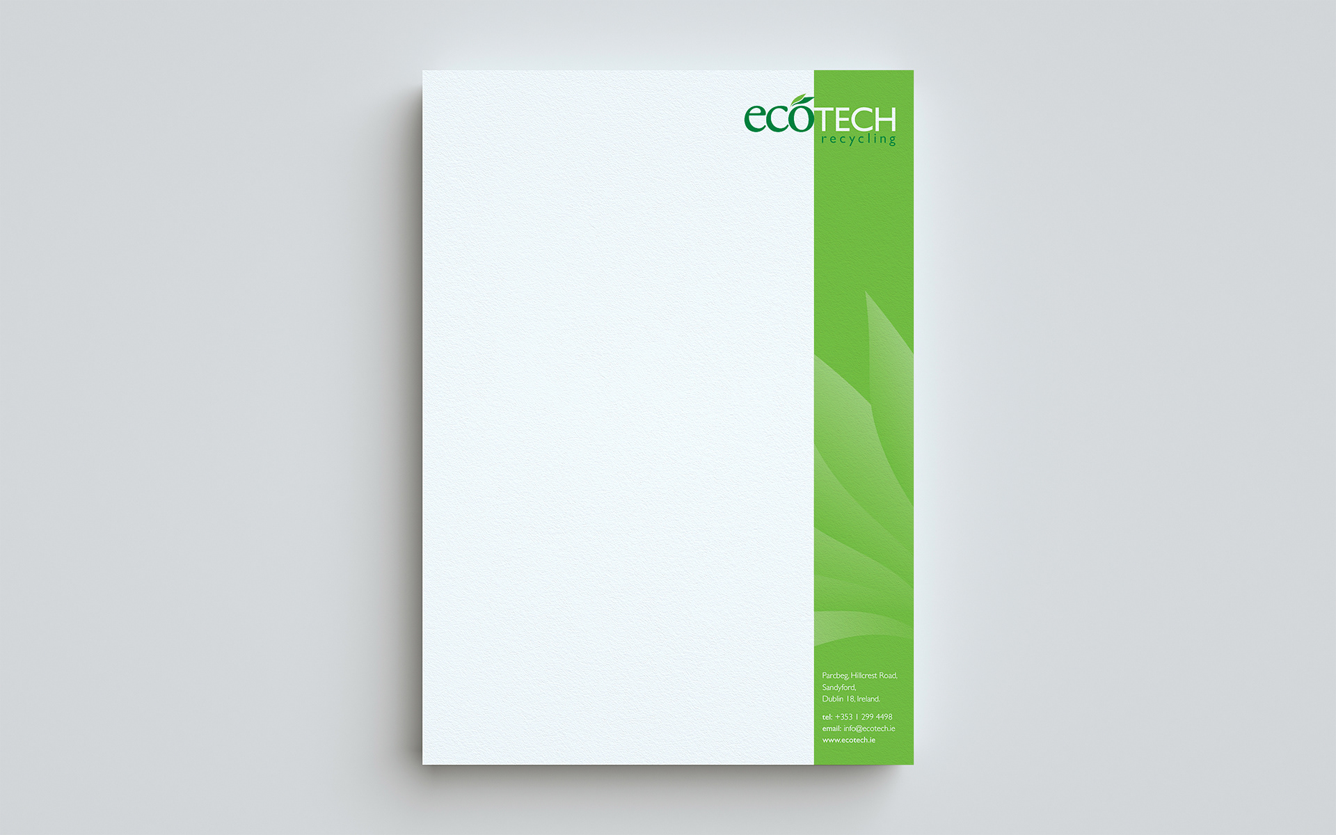
Franklin utilised a repeating fan of leaves on both the business card and letterhead, mirroring the leaf marks in the logo.