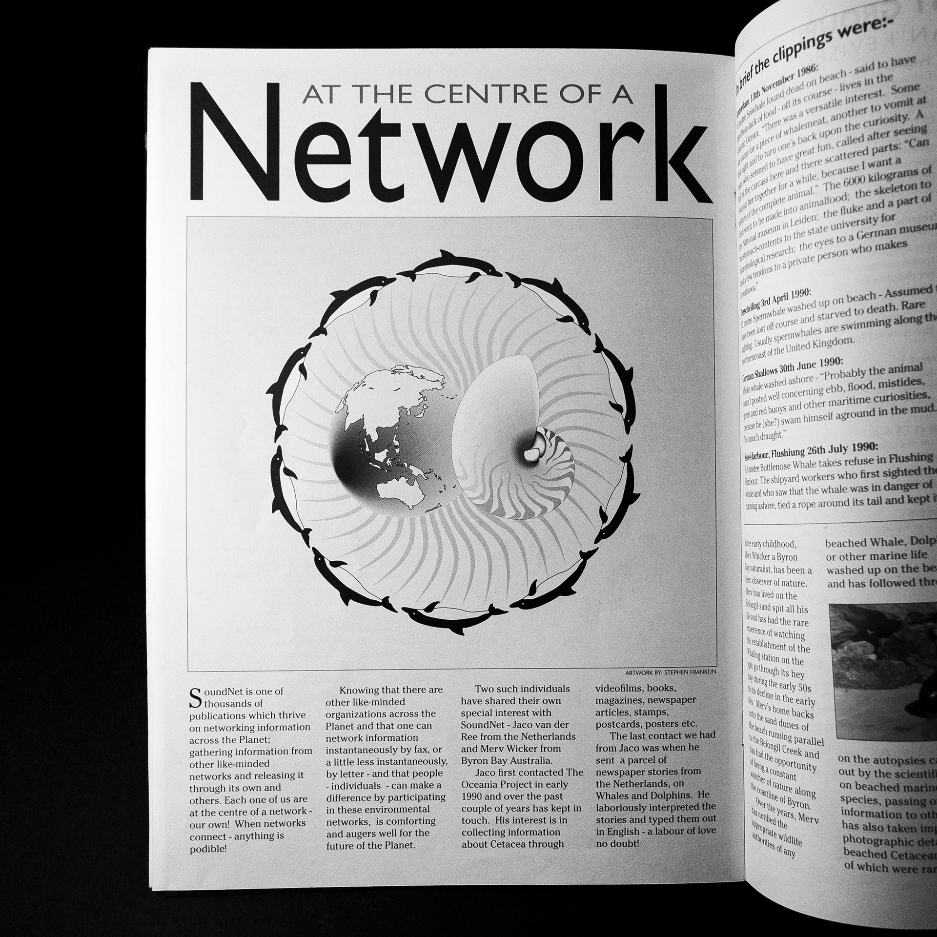
The Oceania Project needed a platform to disseminate information it was gathering, including current news, action alerts and research. To handle such dense amounts of material, Stephen created a tight typographical four column grid with feature sections to help break up the copy. The overall design successfully allowed the Oceania Project to quickly spread the latest news from around the world to its community of supporters and fellow researchers in the scientific community.

Creative Direction: Stephen Franklin
Editorial Design: Stephen Franklin
Illustration: Stephen Franklin
SoundNet issues spread out to show the masthead and issue number.
SoundNet was published as a short form newsletter and printed on recycled paper. The publication would later transition to a monthly email newsletter.
SoundNet typography showing the joined lowercase d and uppercase N.
Stephen created a masthead that joined the ‘d’ of Sound and the ‘N’ of Net, saving space without affecting the legibility of the publication’s name.
Front cover of SoundNet issue number 3 with illustration of dolphin caught in a driftnet.
The full masthead lockup incorporated elements of The Oceania Project logo, with the issue number running below.
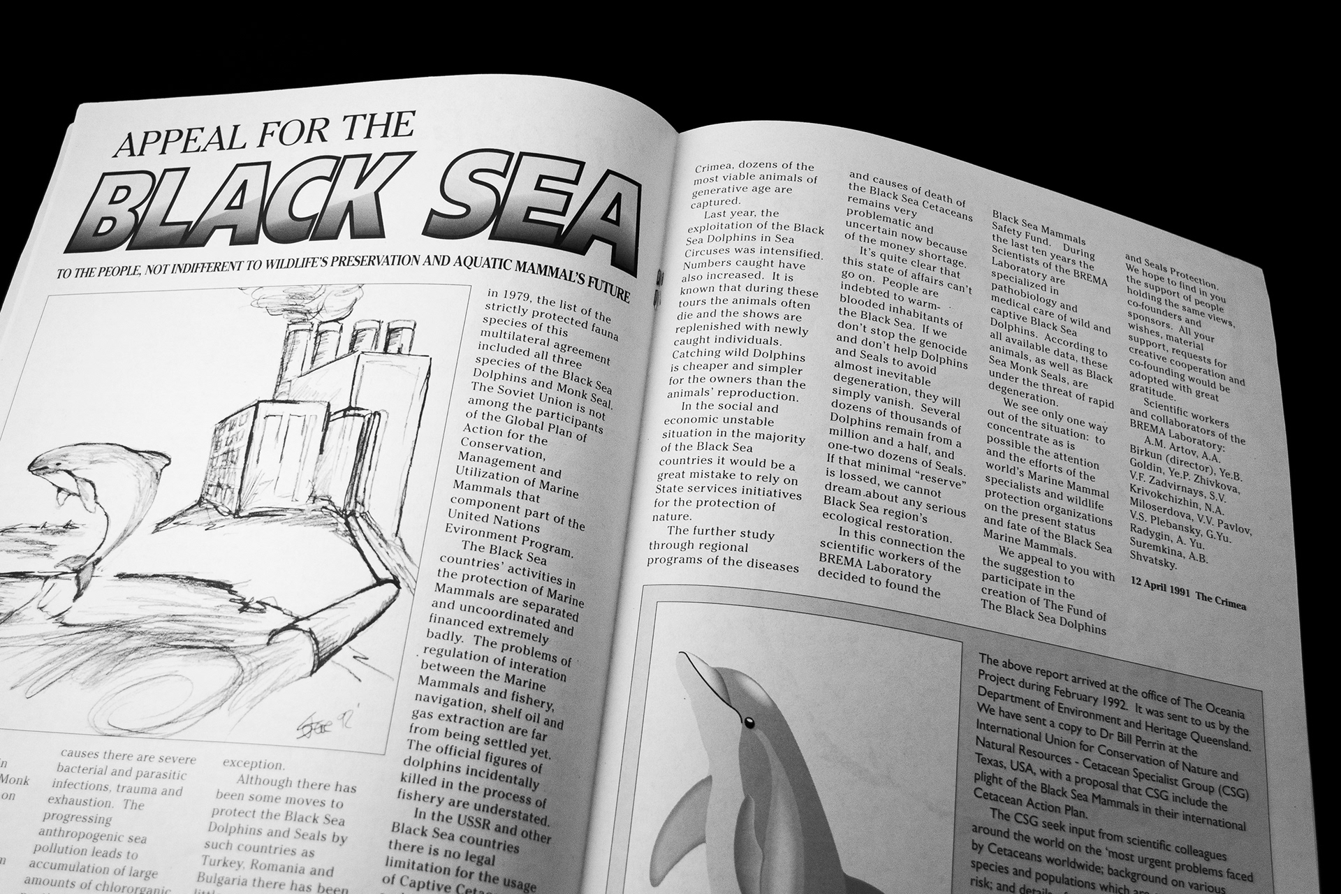
Stephen used a basic four column grid for the layout, creating unique headline lockups for each article. He broke up the dense flow of type with many of his own illustrations while highlighting valuable information in breakout boxes.

View more projects

Queensland Energy Revolution Report
A seventy-page report on Queensland energy. Franklin designed the complete report including all graphs, charts, and illustrations. The target format was a short run digitally printed document.
Brightspark Brand Identity
Identity design for Brightspark, a Dublin-based digital marketing agency.
Kellogg's Froot Loops Back of Pack Illustration
A promotional back-of-pack illustration created for Kellogg's Froot Loops cereal packaging. Included the digital creation and preparation of the finished image for use in the packaging artwork.
ABOL User Interface Icons
Created user interface icons for various use cases for the Australian Business Online (ABOL) website, commissioned by Hothouse Interactive, Sydney, Australia.
Thick & Thirsty Point of Sale Hero Image Retouching
Retouching of hero image for Thick & Thirsty point of sale promotion.
HCi Identity Design
Corporate identity and stationery design for HCi, a Knowledge and Process Management company based in Sydney, Australia.
Sqeez Juice Tetra Pak Packaging Finished Artwork
Finished artwork for the Sqeez range of juices in Tetra Pak packaging.
Braams Brand and Marketing Collateral
Creative direction and production of Braams Property Services design collateral, and marketing materials from 1997 through to 2001.
College Portfolio
Portfolio submitted as a requirement for graduating from the KvB College of Visual communication, Sydney Australia. Stephen received a diploma in Graphic Design on the 7th of December 1987.
Wyeth BioPharma Work Life Harmony Week
Designed both print and digital components for the Wyeth Bio Pharma - Work/Life Harmony Week. This included various printed pamphlets and messaging pieces along with the UX/UI for the program’s website.
Back to Top