When Ciara approached Stephen to design the logo and marketing materials for her family holiday company, Escape to Luz, she wanted him to convey the natural beauty of the area they were promoting. With its sun-soaked beaches, small fishing villages and exquisite cities brimming with Andalusian authenticity. Stephen tapped into his firsthand experience of the region, creating a stylised sun brandmark heavily influenced by the Moorish designs he had seen in the Alhambra in Granada. To complement this stylised graphic, he used the Zapfino typeface for the brand name, with its large flourishes and slightly Arabic feel. The colour palette for the identity used a sea blue, rich orange and a burnt yellow to reflect the coastal setting of Costa del la Luz. As part of the project Stephen also produced a marketing brochure, designing the layout and illustrating the cover, drawing inspiration for the image from the local Spanish architecture. The outcome was a brand identity that conjured up images of splendour, freedom, and a true “Escape to the Light”.

Creative Direction: Stephen Franklin
Graphic Design: Stephen Franklin 
Illustration: Stephen Franklin
Escape to Luz business cards.
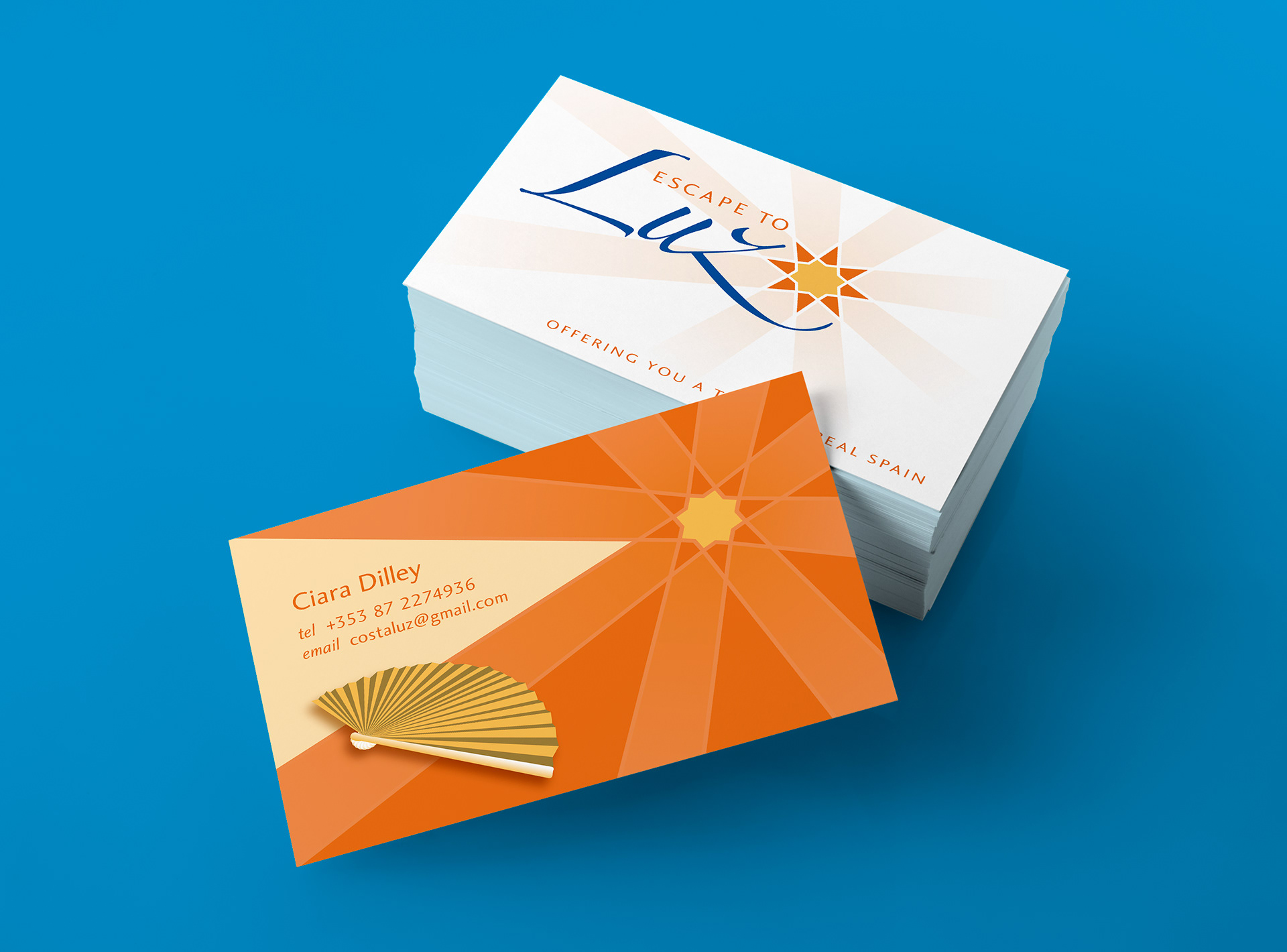
Stephen utilised a clean white background for the front of the business card.
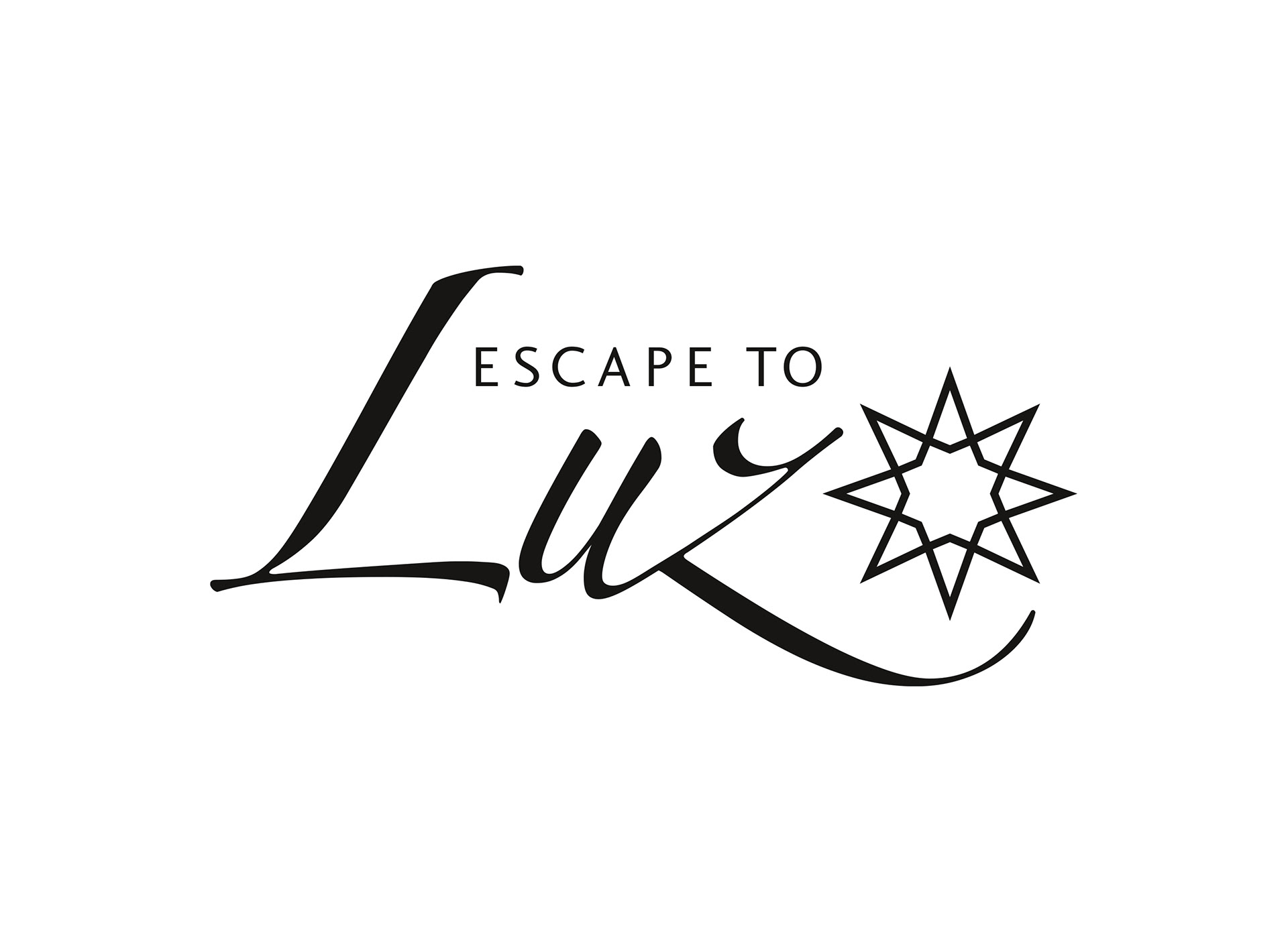
Escape to Luz black and white logo.
Escape to Luz colour logo.
Franklin ensured the brandmark and final logo lockup worked in black and white before designing the colour version.
a.	Escape to Luz brochure illustration with sun streaming over terracotta tiled roofs.
Stephen drew inspiration for the brochure cover illustration from the local Spanish architecture, with its bright white walls, and terracotta roof tiles.
Escape to Luz illustrated brochure cover with orange coloured back cover including an illustration of a Spanish fan.
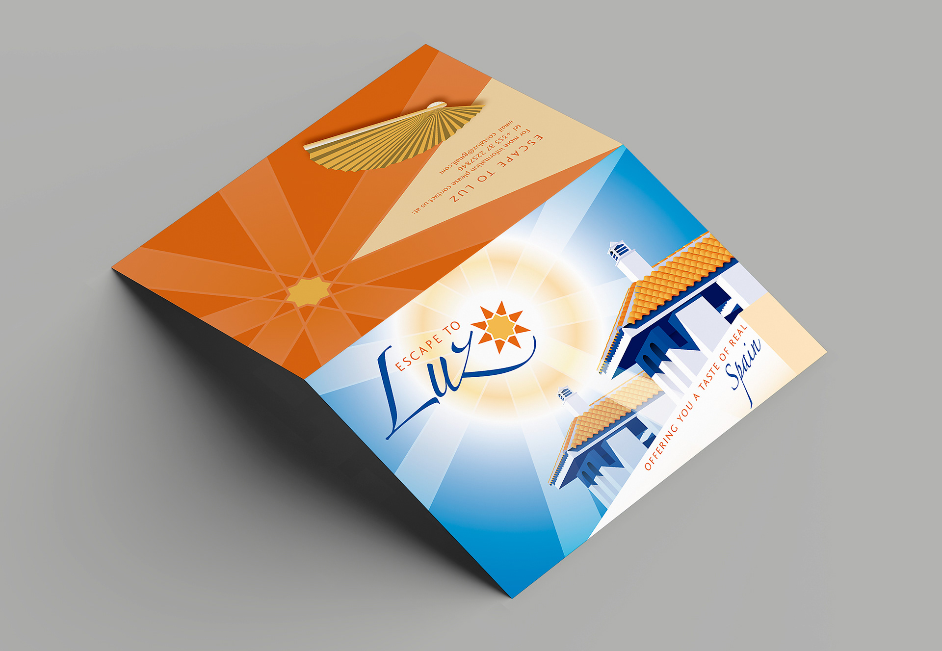
The tent fold brochure was designed with a 1950’s poster or postcard aesthetic.
Escape to Luz brochure and internal layout.
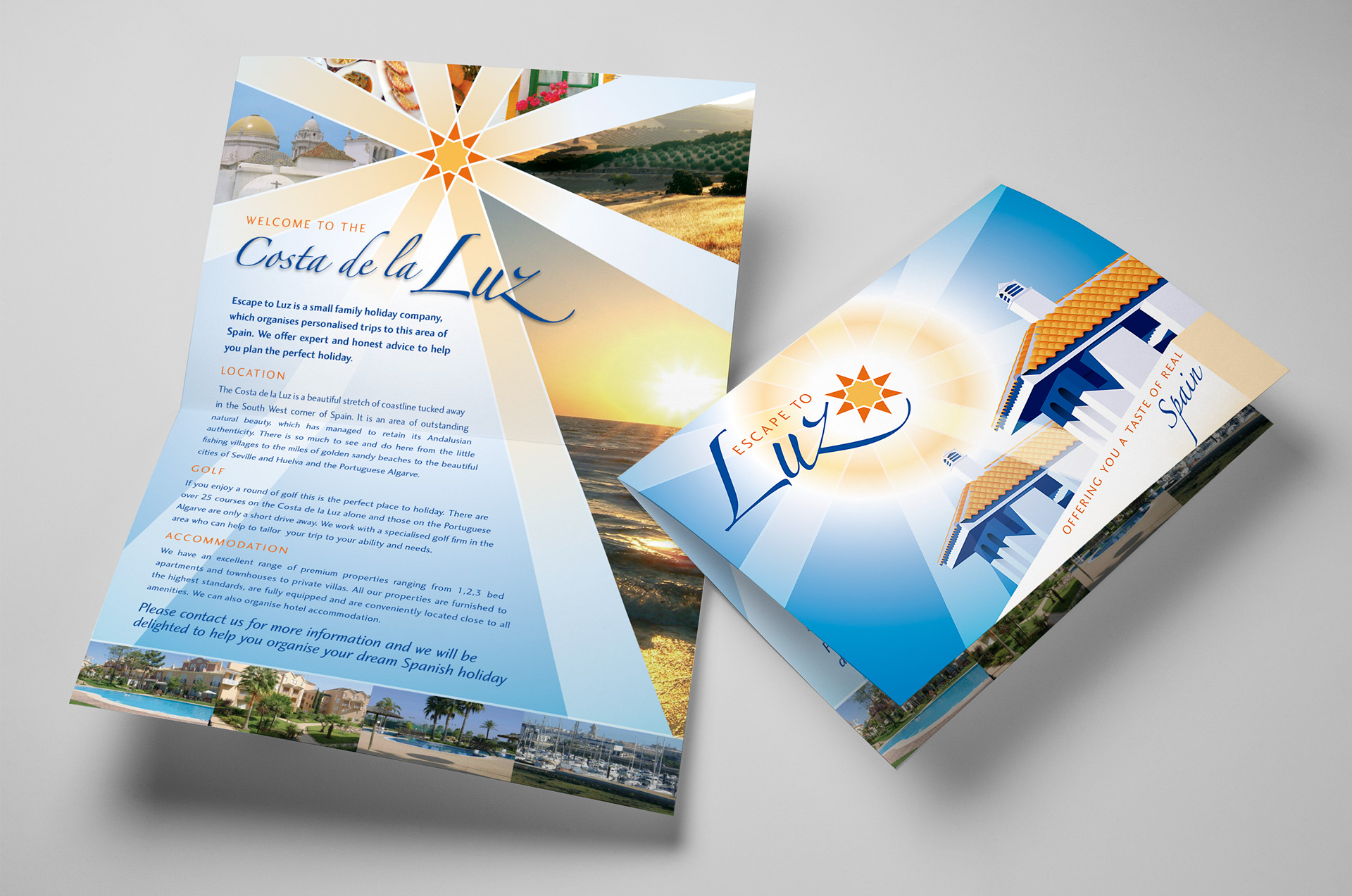
The rays of the sun graphic provided a unique look to the internal layout of the promotional brochure.

View more projects

Microsoft Windows Server NT Image
Cover illustration created for a Microsoft Windows Server NT sales brochure for the Frontline agency, Sydney. 
John Bullers Pies Packaging Artwork
Creative artworking for the John Bullers Family Pies. A new product range from Green Isle Foods.
BigPond Cable Launch Hero Image
Worked with the Art Director at Frontline to produce a hero image, the centrepiece of the Telstra Big Pond launch campaign. Blended two stock photography images using various distortion effects to create the blurred image on the outside and manipulated colour values to maintain an overall consistency.
Freedom Unlimited Website
Design and development of the Freedom Unlimited website, Dublin, Ireland.
Unilever Flora Packaging Artwork
Development of master illustrations, photography, and master elements for the Unilever Flora Heart design packaging artwork.
Concept Visualisations for Landini Associates
Concept visualisations created for Landini Associates client projects. Each image was based on supplied architectural elevations, along with a creative brief for the materials to be used for the interior design.
Thick & Thirsty Point of Sale Hero Image Retouching
Retouching of hero image for Thick & Thirsty point of sale promotion.
Queensland Energy Revolution Report
A seventy-page report on Queensland energy. Franklin designed the complete report including all graphs, charts, and illustrations. The target format was a short run digitally printed document.
Green Isle Stir-Fry Packaging Artwork
Creative artworking on the Green Isle Stir-Fry flexographic packaging finished artwork.
Integrated Vision Marketing Collateral
Creative direction and design of various marketing collateral for Integrated Vision, a leading Australian videoconferencing solutions provider. Stephen, operating as Graphic Vision, partnered with the client to produce a range of items including, a Quarterly Newsletter, DL Brochure, and DL Promotions, managing all designs from concept through to prepress and final print.
Back to Top