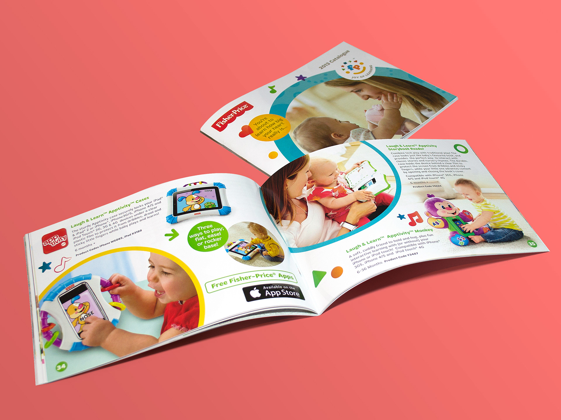
Ishimodo's client, Mattel, had developed new guidelines for the Fisher-Price brand. And they needed to revise the print catalogue localised to the Australian market with this updated visual system. Stephen built out a well-defined layout grid structure for the catalogue, allowing for the playful use of the new brand materials. The outcome was a layout that flowed effortlessly from one page to the next, with clearly defined sections, making it easy for parents to find toys suitable for their child's developmental stage.

Design Direction: Ishimodo Brand and Design Agency
Graphic Design: Stephen Franklin
Front cover and inside spread of the Fisher-Price catalogue.
Stephen was supplied with all brand assets, including the product photography, shape icons and patterns, along with usage guidelines on how they should be utilised.
Inside cover and contents page showing Newborn, Infant and Preschool sections.
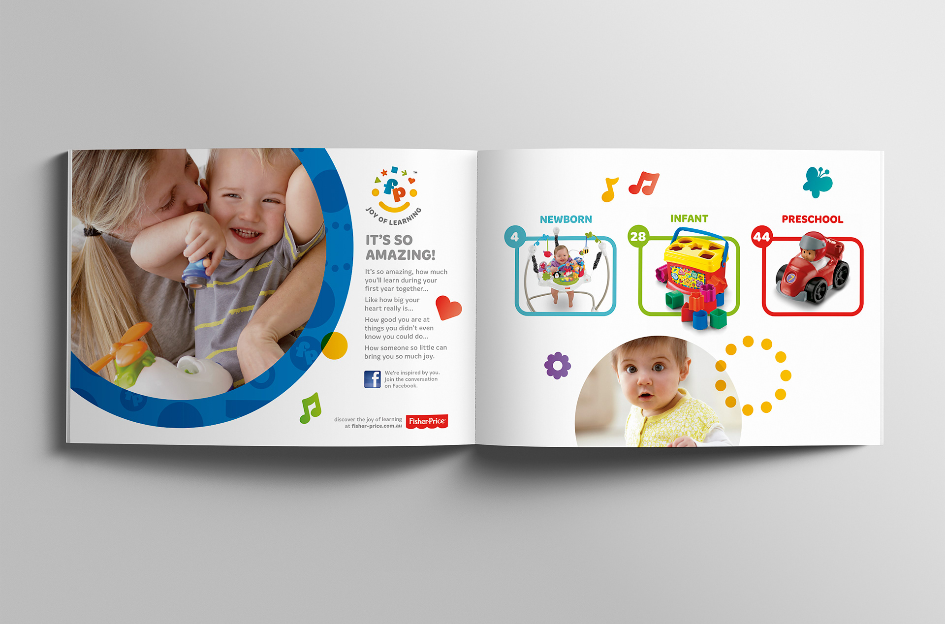
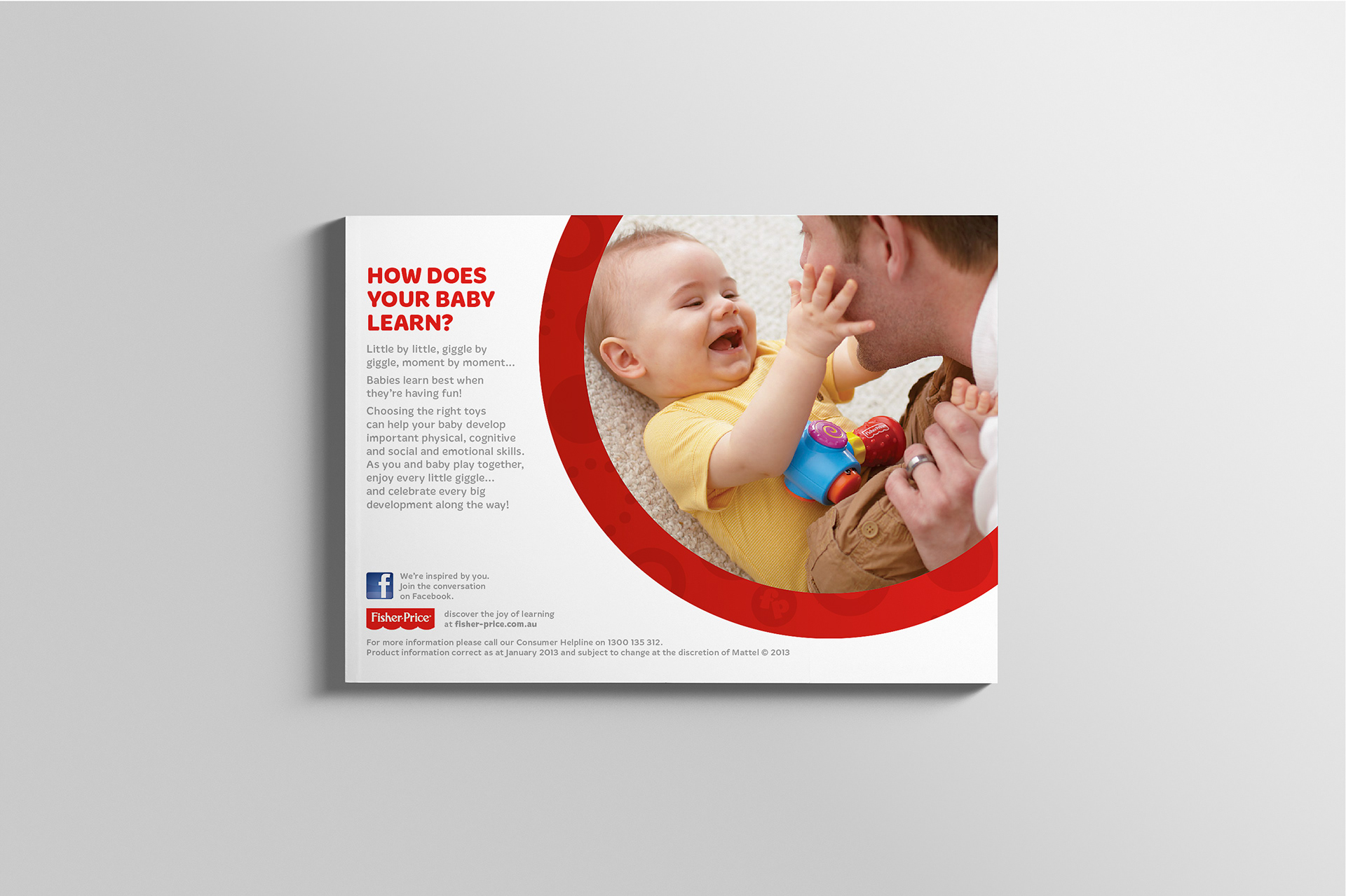
There were three main sections to the publication based on the child development stages of Newborn, Infant and Preschool. 
Newborn section starting page spread.
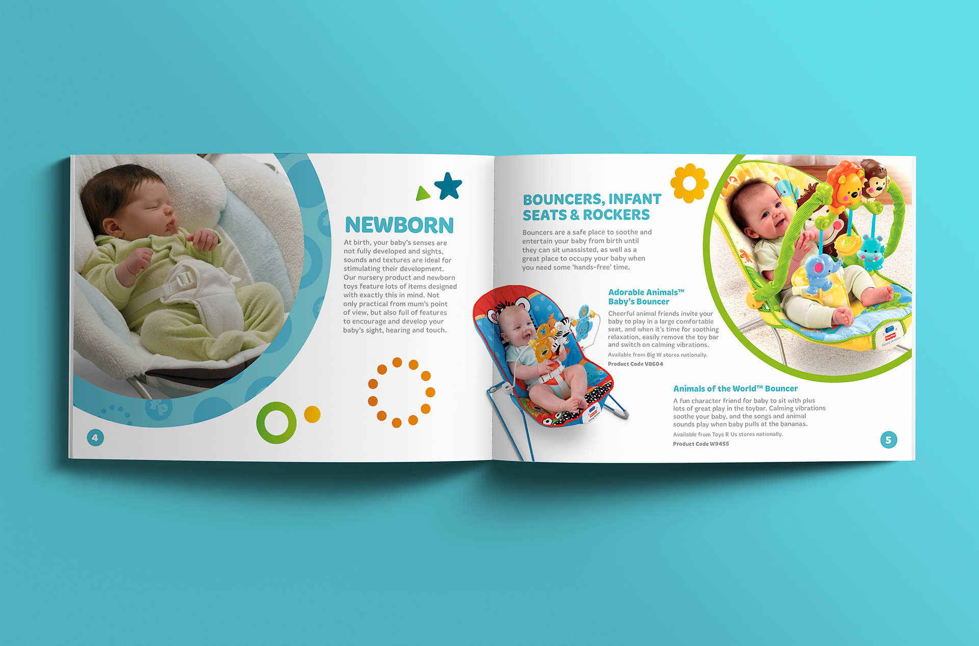
Franklin began each section with an emotive image that captured the essence of the relevant developmental stage.
Newborn section spread show the range of Fisher-Price playgyms.
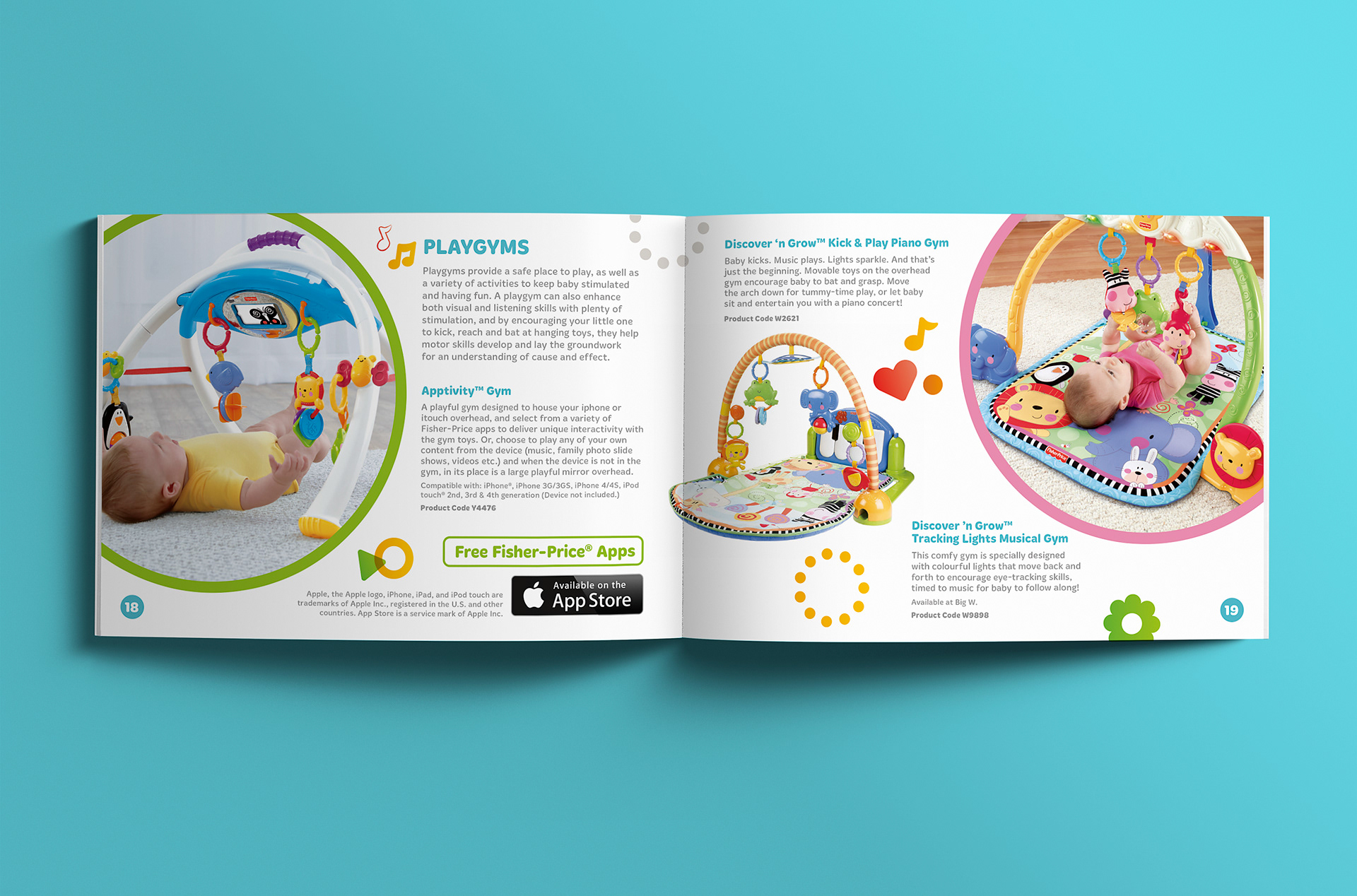
Although appearing to be freeform, the page layout did adhere to an underlying grid.
Infant section starting page spread.
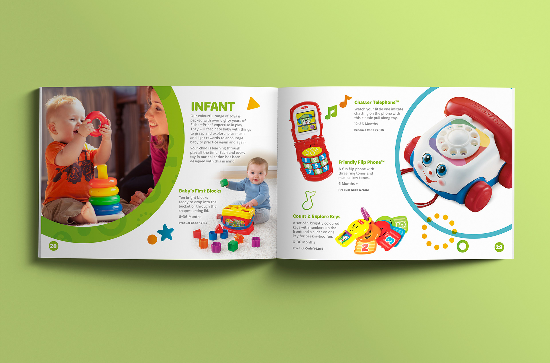
Stephen worked with design direction from Ishimodo to craft individual layouts, choosing suitable images for hero products such as the classic Fisher-Price Chatter Telephone.
Infant section spread showing Fisher-Price iOS apps and related toys.
Product details all used a clear styling system for Headings, Subheadings, Body Copy and Product Codes.
Preschool section starting page spread.
Franklin kept to the brand guidelines using the colours indicated for different child development stages, as seen here with the use of Fisher-Price red for the Preschool section.
Preschool section spread showing the Little People toy range.
The individual layouts were all hand crafted to suit the supplied content and create a distinct flow from one group of products to the next. 
Back page with branded emotive image and marketing copy.
As part of the project Stephen also produced an online version in PDF format. 

View more projects

World Vision 2017 Annual Report Design
Editorial design, and layout of the World Vision 2017 Health and Nutrition Annual Report for the Ishimodo Brand and Design Agency. This sixteen-page document was prepared for release in both print and digital formats.
World Vision The Killer Gap Report & Infographic
Editorial design and layout of the World Vision - Child Health Now publication "The Killer Gap". Also included the design and illustration of a supporting infographic that would be available for download from the World Vision website.
Carmichaels Logo
Logo design for Fresh New Media's client, Carmichaels. The project included initial creative direction and the development of the brand for print and television.
Tony Ferguson Brand Guidelines
Creative direction and design of the Tony Ferguson Brand Guidelines for the Ishimodo Brand and Design Agency. This forty-page digital document included the design, layout, and delivery of the PDF.
Black Rice Brand Identity
Glycon Brand Identity Design
Design, development and creative direction for the Glycon brand identity.
ECDC Corporate Identity Design
Creative direction and design of the Eastern Cognitive Disorders Clinic (ECDC) corporate identity.
iWhales Brand Identity
TAFISA Brand Identity Refresh and Sub Brand Designs
Design refresh of the TAFISA (The Association For International Sport for All) brand identity for the MuttroMedia agency.
Little Yellow Cloud Brand Identity
Brand identity design for the Little Yellow Cloud® kids clothing brand.
Back to Top