Bink Kids began as a joint venture project that Franklin became involved in, importing a range of designer kids clothing sourced from various European suppliers. A brand identity was needed for the online shop that would eventually retail these products to the local Australian market. Stephen began by selecting Drop Medium, a font designed by Hubert Jocham Type, as the primary typeface for the word Bink. After subtly modifying the type, he established a range of rich primary colours used throughout the identity and associated design collateral. The outcome was a bold and bubbly brand that mirrored the colourful kids clothing it represented.

Creative Direction: Stephen Franklin
Graphic Design: Stephen Franklin
Bink Kids primary logo reversed white on shaded blue background.
To give the lettering some extra depth Franklin initially added 3D modelling to the Bink letters, which was later reduce to a single colour edge shading for better reproduction in print and online.
Bink Kids logo single colour black and white version.
Bink Kids logo reversed white from black background.
Single colour Bink Kids logo in blue primary colour.
Bink Kids logo with web address reversed white on shaded blue background.
Stephen hand kerned the character spacing and then angled the word Bink slightly to allow for the 'kids' tag underneath. The web address was added later for use in print and online marketing materials.
Bink Kids business cards with Bink Kids logo reversed white out of red and blue backgrounds.
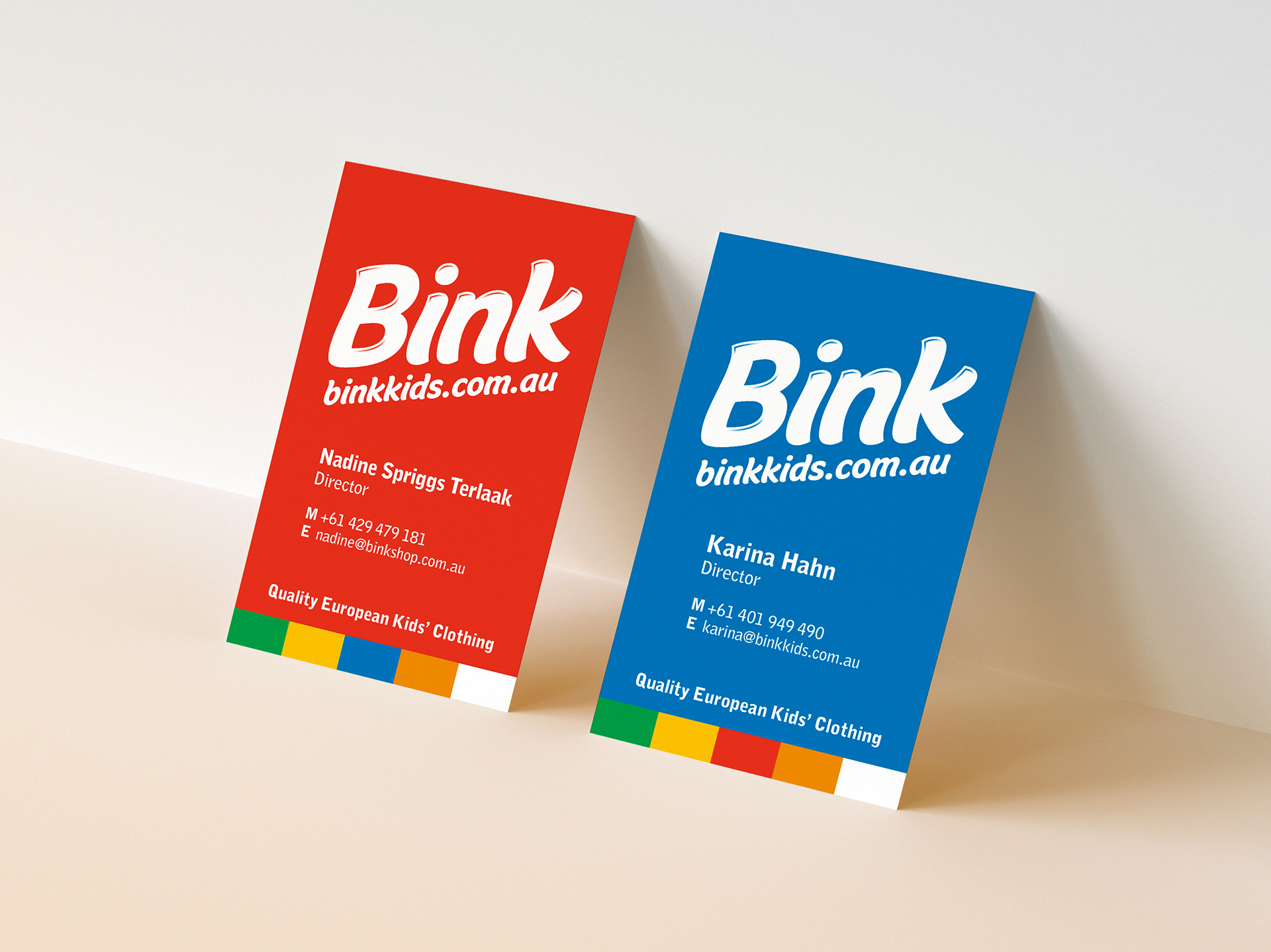
Franklin created a colour palette of rich primary colours which were interchangeable behind the white Bink Kids logo.
Standard and gift-wrapped mailer box packaging.
Stephen designed mailer packaging for customer orders that opened out flat, providing a unique unboxing experience.
Postcard with winter range product images.
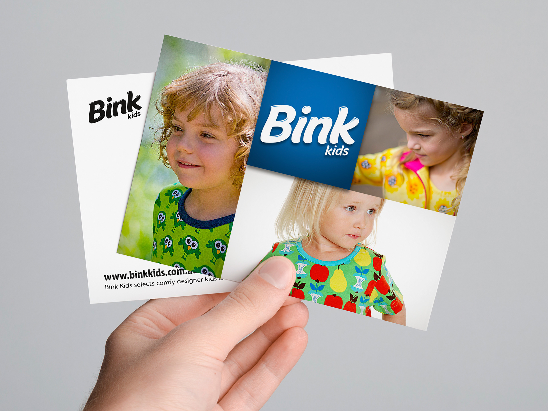
Postcard with spring range product images.
Franklin created a postcard that could be included with each order as marketing for seasonal product releases.
Homepage for the Bink Kids online store displayed on a computer.
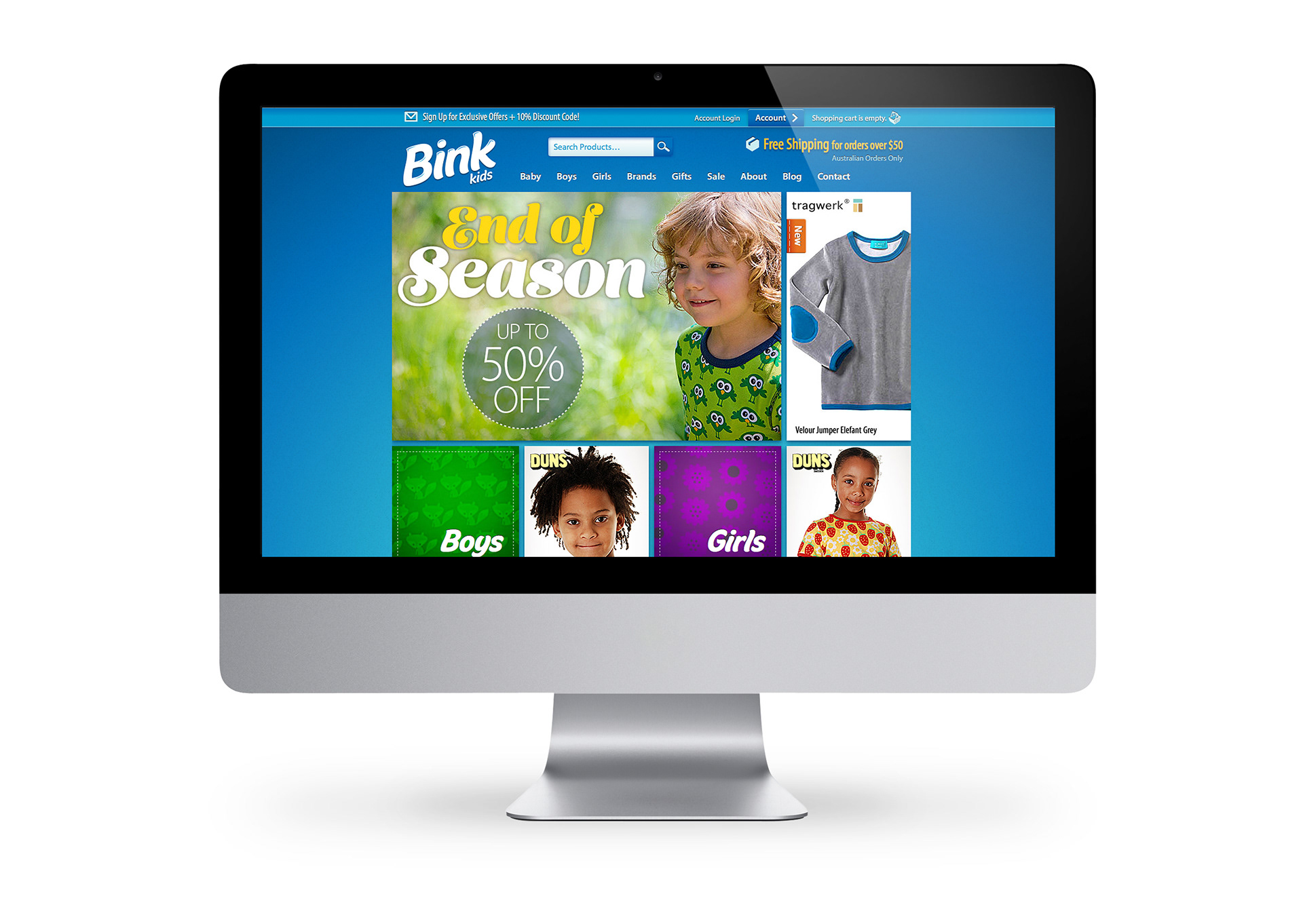
The brand identity was used extensively throughout the website created by SF Generator, Franklins separate web design and development business.
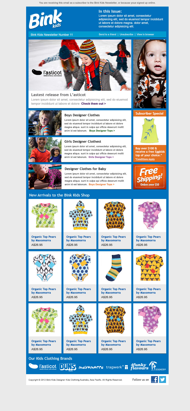
Bink Kids email newsletter template.
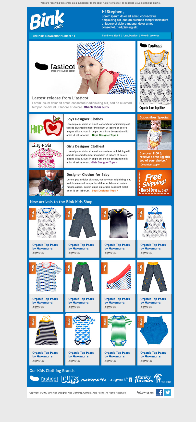
Bink Kids personalised email newsletter template.
Stephen translated the design language used in the print materials over to the online marketing as seen here in the subscriber and promotional email newsletters.
Bink Kids promotional email newsletter
Bink Kids social media profile image.
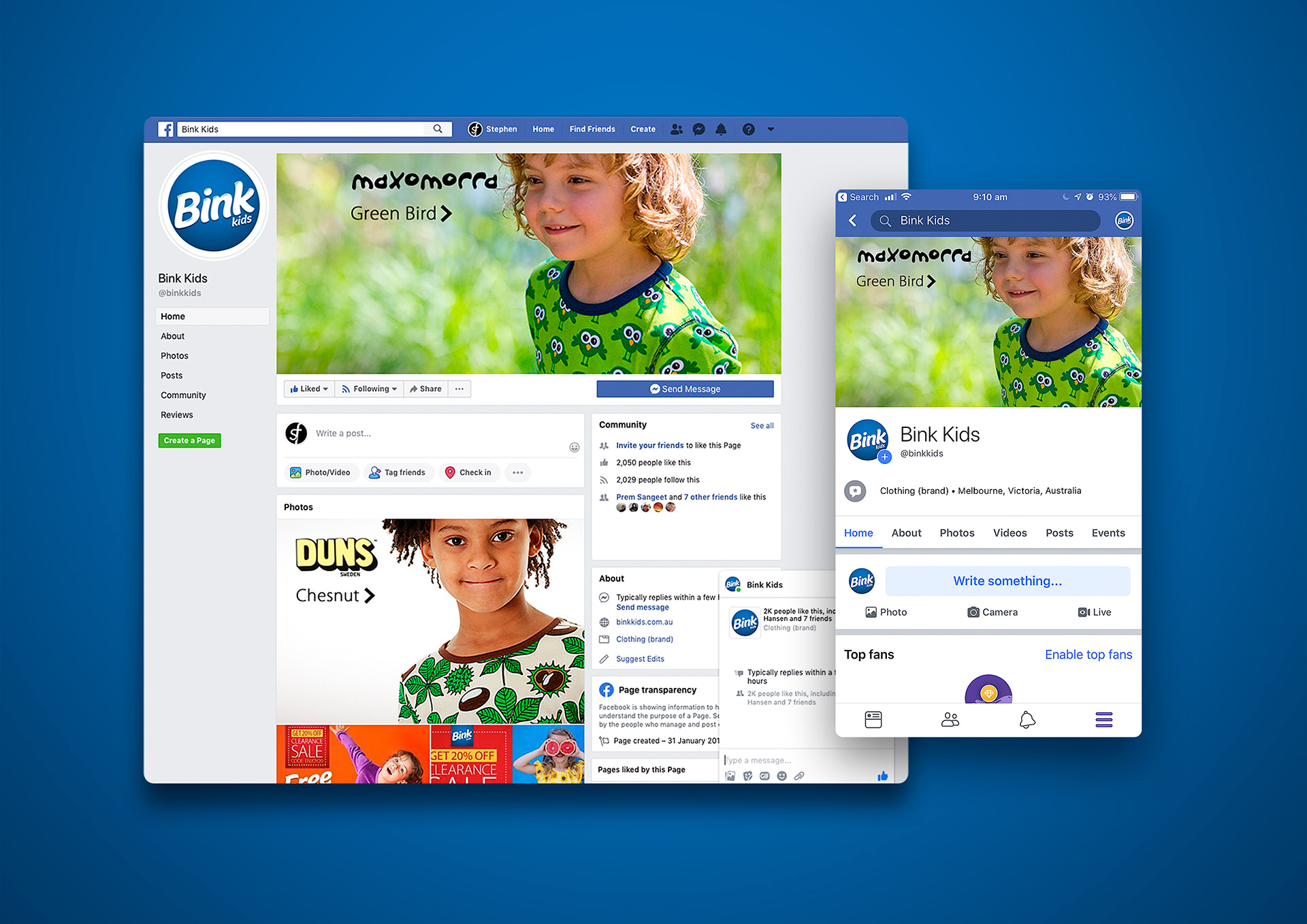
Franklin created a standalone social media profile image using the Bink Kids logo for use on the Facebook business page.
Browser and mobile views of the Bink Kids Facebook business page.

View more projects

Oban Quality Brand Identity, Stationery & Website
Oban Quality brand identity, stationery and collateral including a refresh of the existing Oban Consulting logo. Also included is the design and development of the Oban Consulting website with an Oban Quality landing page.
Tony Ferguson Brand Guidelines
Creative direction and design of the Tony Ferguson Brand Guidelines for the Ishimodo Brand and Design Agency. This forty-page digital document included the design, layout, and delivery of the PDF.
World Vision 2017 Annual Report Design
Editorial design, and layout of the World Vision 2017 Health and Nutrition Annual Report for the Ishimodo Brand and Design Agency. This sixteen-page document was prepared for release in both print and digital formats.
Fisher-Price Catalogue Print & Online
Fisher-Price catalogue for the Ishimodo Brand and Design Agency. Included the design and layout of this fifty-two-page publication for use in print and online.
World Vision 2016 Annual Report Design
Editorial design, and layout of the World Vision 2016 Health and Nutrition Annual Report for the Ishimodo Brand and Design Agency. This thirty-two-page document was prepared for release in both print and digital formats.
iWhales Brand Identity
Creative direction and design of the iWhales brand identity for The Oceania Project. Included development of the brandmark and brand lockup used on all iWhales marketing materials and merchandise.
World Vision 2015 Annual Report Design
Creative direction, editorial design, and layout of the World Vision 2015 Health and Nutrition Annual Report for the Ishimodo Brand and Design Agency.
Black Rice Brand Identity
Creative direction and design development of the Black Rice Interiors brand identity for use with in-store signage, business stationery, van livery and website.
TAFISA Brand Identity Refresh and Sub Brand Designs
Design refresh of the TAFISA (The Association For International Sport for All) brand identity and related sub-brands for the Muttromedia agency.
Tony Ferguson Recipe Book Editorial Design
Creative direction and Editorial Design of the Tony Ferguson - Everyday Favourites recipe book for the Ishimodo Brand and Design Agency. Included design, layout, and prepress production of this sixty-four-page booklet.
Back to Top