The brief from Tom for the Geezah Sound System brand identity was simple. It needed to be able to be used as a stencil and applied easily to any rental equipment or custom PA designs. Franklin started with a classic type design from Paul Renner, Futura Medium Italic. He then added subtle cut marks to the counters of the ‘g’, ‘e’, and ‘a’ character making them suitable for stencilling. Playing on the idea of these cuts being shadows Franklin added similar cuts to the ‘z’, and ‘h’ letter forms following either a curve or straight line as the perceived shadow. The result was a clean, instantly recognisable brand logo that could be easily applied to any piece of sound or stage equipment.

Creative Direction: Stephen Franklin
Graphic Design: Stephen Franklin
Geezah logo design.
The subtle shadows added a sense of dimension to the logo, whilst providing stencilling abilities.
Geezah business card design.
A simple single colour design was used for the business card to mirror the look of the sound equipment.
Geezah logo stencilled onto sound equipment.
The logo needed to standout when applied to sound systems and stage equipment.

View more projects

Integrated Vision Marketing Collateral
Creative direction and design of various marketing collateral for Integrated Vision, a leading Australian videoconferencing solutions provider. Stephen, operating as Graphic Vision, partnered with the client to produce a range of items including, a Quarterly Newsletter, DL Brochure, and DL Promotions, managing all designs from concept through to prepress and final print.
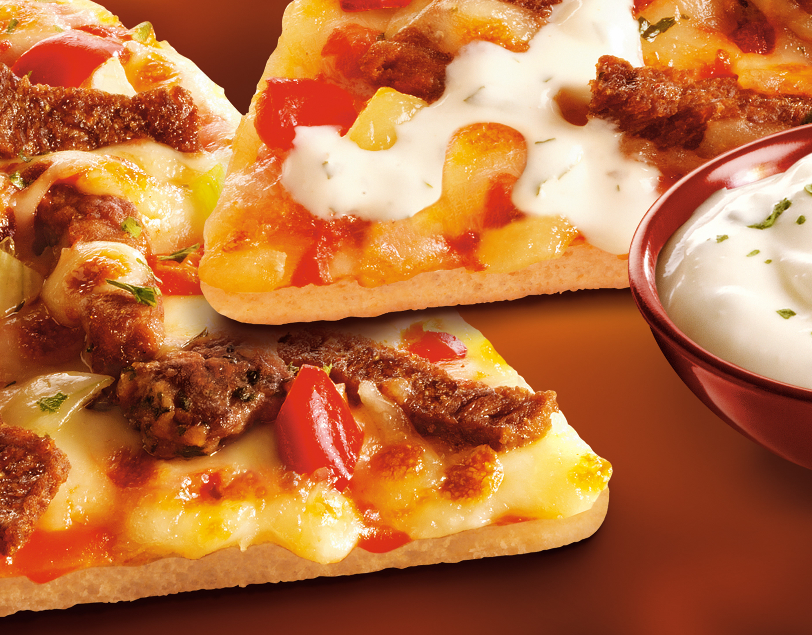
Grandiosa Lørdagspizza Packaging Retouching
Retouching of the front of pack hero image for the Norwegian frozen pizza brand Grandiosa.
BigPond Cable Launch Hero Image
Worked with the Art Director at Frontline to produce a hero image, the centrepiece of the Telstra Big Pond launch campaign. Blended two stock photography images using various distortion effects to create the blurred image on the outside and manipulated colour values to maintain an overall consistency.
John Bullers Pies Packaging Artwork
Creative artworking for the John Bullers Family Pies. A new product range from Green Isle Foods.
Wyeth BioPharma Work Life Harmony Week
Designed both print and digital components for the Wyeth Bio Pharma - Work/Life Harmony Week. This included various printed pamphlets and messaging pieces along with the UX/UI for the program’s website.
Brightspark Brand Identity
Identity design for Brightspark, a Dublin-based digital marketing agency.
Coco Pops Back of Pack Illustration
A promotional back of pack illustration for Kellogg's Coco Pops cereal packaging.
The Oceania Project Logo
Logo design for The Oceania Project, a Not-for-profit research and information organisation established in 1988, dedicated to raising awareness about Cetacea (Whales, Dolphins and Porpoises) and the ocean environment.
Testra PSO Document
41 Page proposal document for Credit Suisse First Boston to act as global coordinator for the Telstra PSO (Public Share Offer). Designed the layout including all graphs and charts. Entire document was designed and completed at short notice over 3 days to meet a tight Government deadline.
Resource Connections Logo
Logo design for Resource Connections, an independent Australian energy consultant.
Back to Top