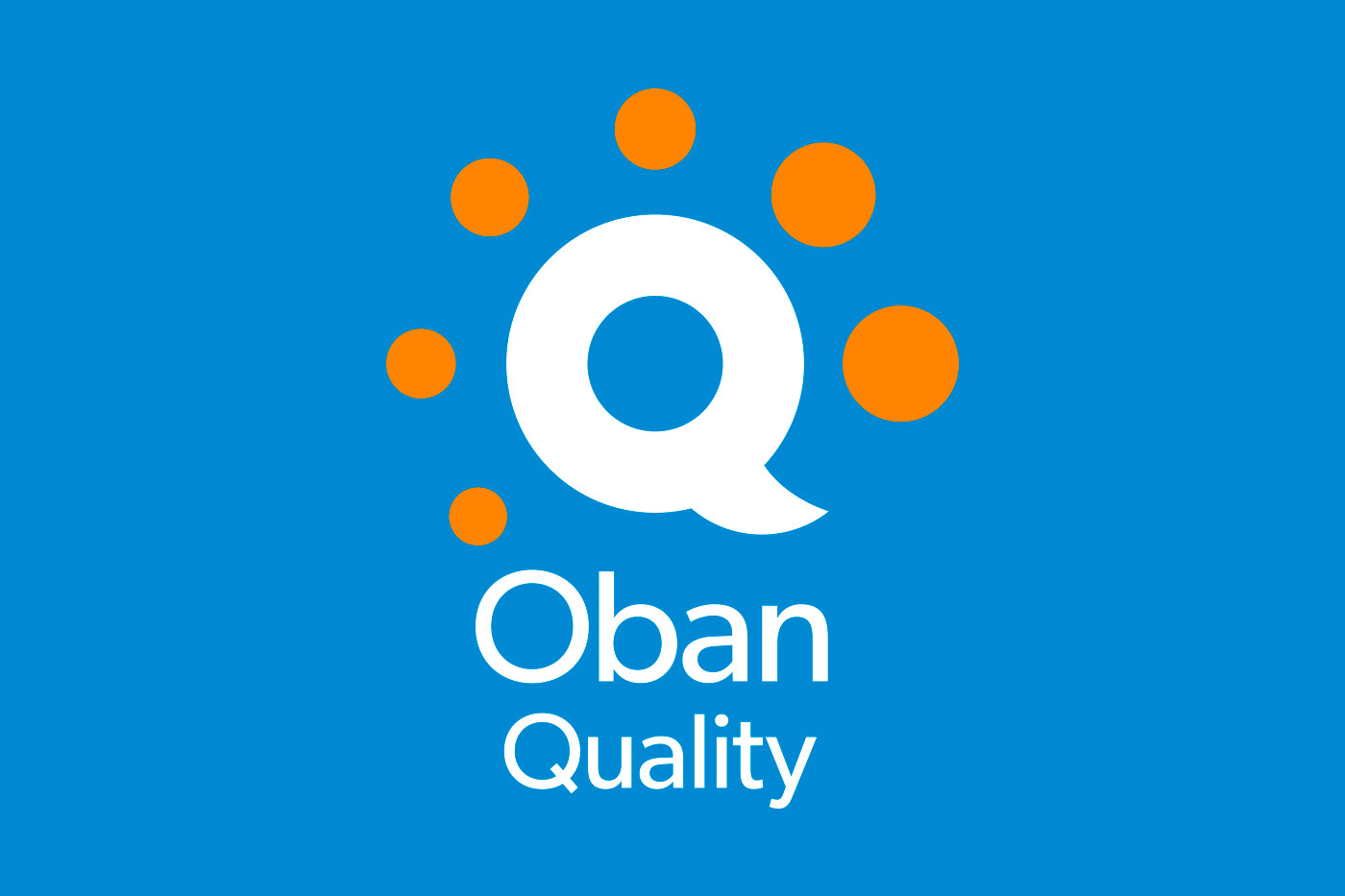
Stephen was approached by Oban Consulting to develop the brand identity for its new Oban Quality Hub service. The Hub facilitates a paperless consumer feedback system (compliments, comments, and complaints) via an on-screen form. Franklin's solution was to focus on a strong graphical treatment of the brand. He used a bold Q shape representing a dialogue speech bubble, with varying sizes of concentric dots as either the users, or the feedback rating itself. The result, when paired with the complimentary brand type, was a logo that accurately reflected the nature of the Oban Quality Hub service. Acting as the communications link between the organisation and the end consumer.

Creative Direction: Stephen Franklin
Graphic Design: Stephen Franklin
Web Design: Stephen Franklin
Oban Quality business cards printed with a blue background, white type, and reversed logo.
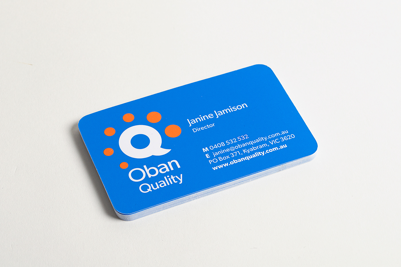
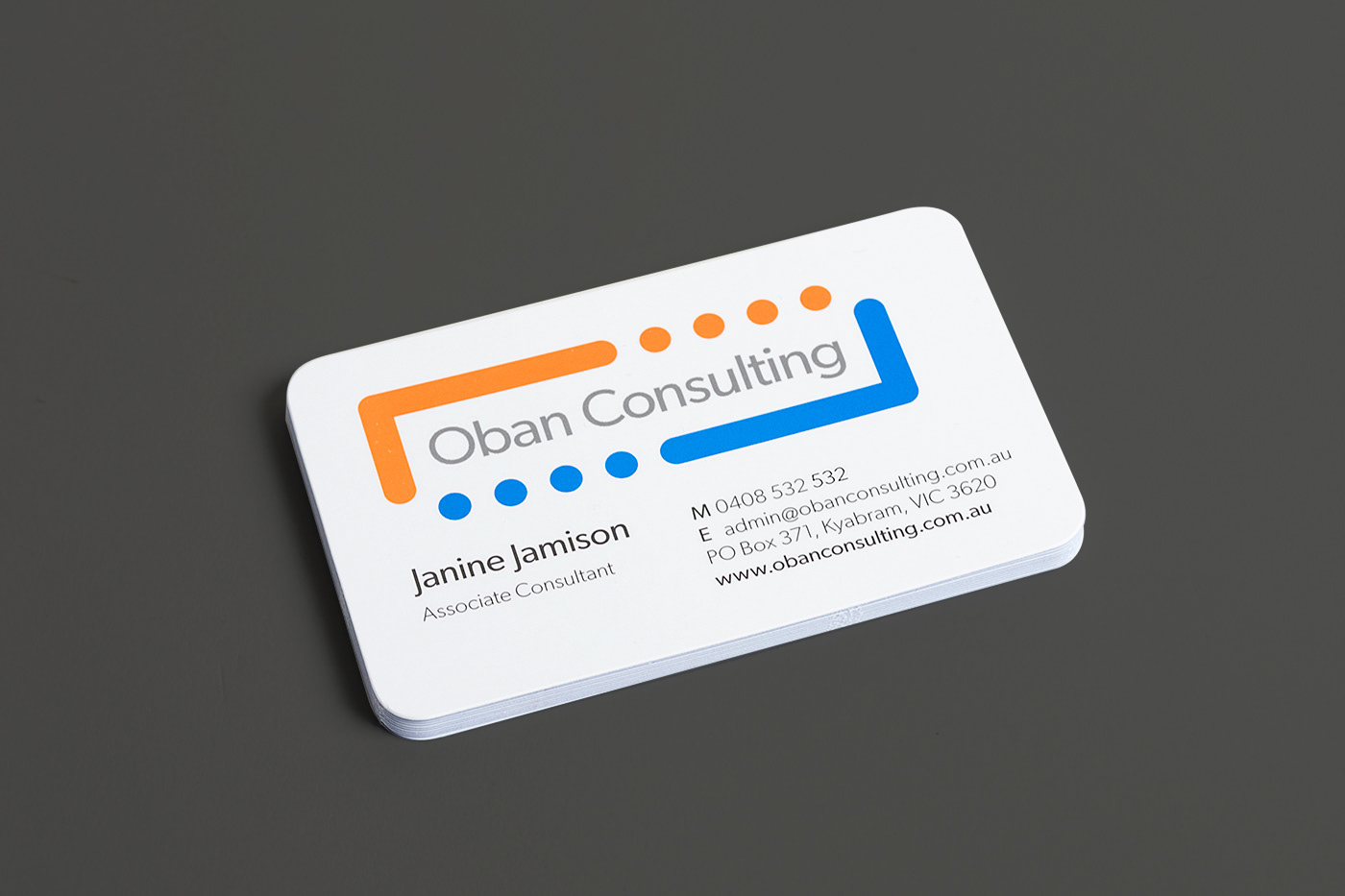
The Oban Quality business cards were die cut with rounded corners to match the circular shapes of the brandmark.
Standalone Oban Quality symbol for use with the Oban Quality Hub software.
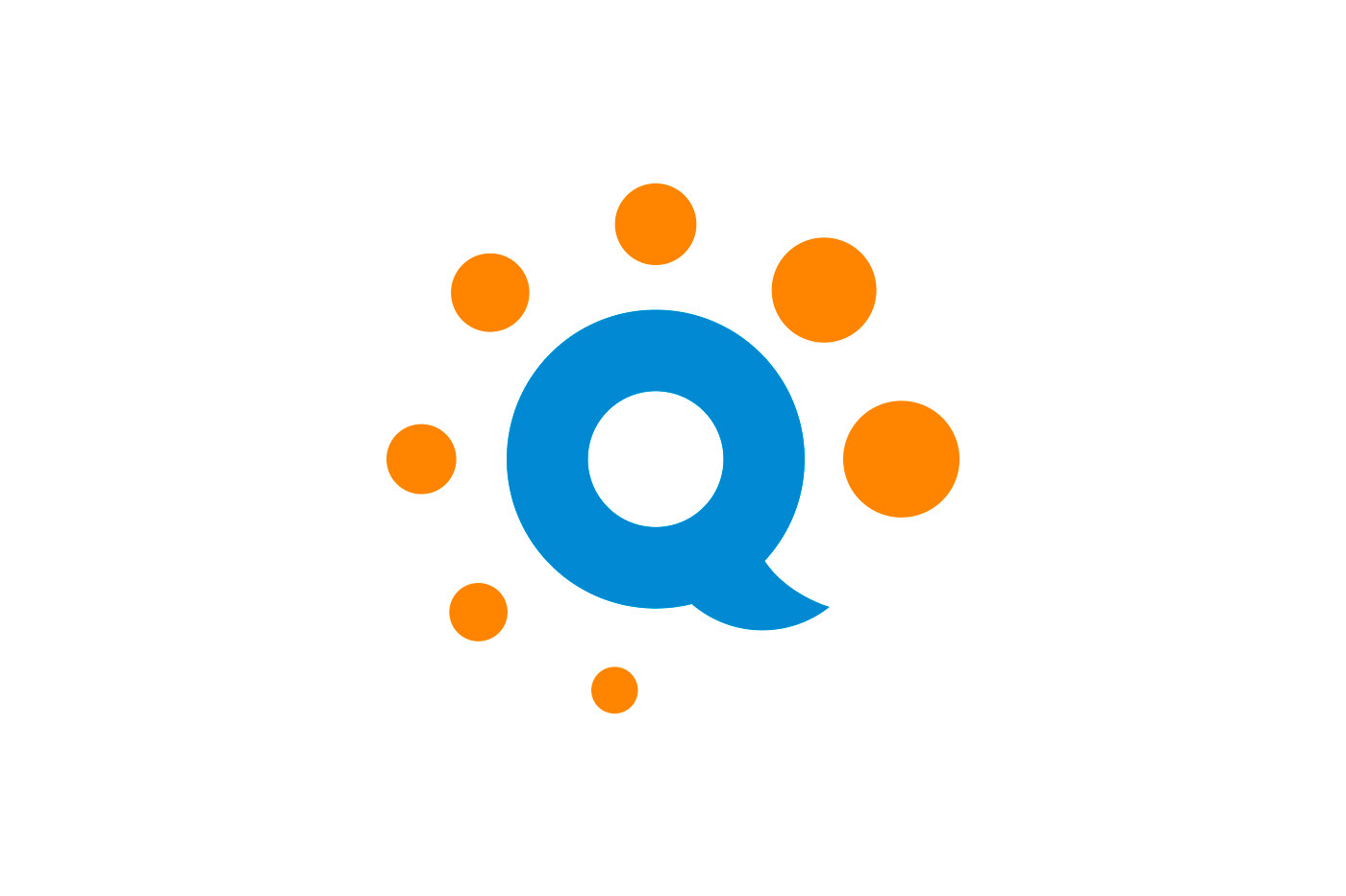
Design cues - in the form of orange dots - were taken from the original Oban Consulting logo design, which Stephen would later refresh.
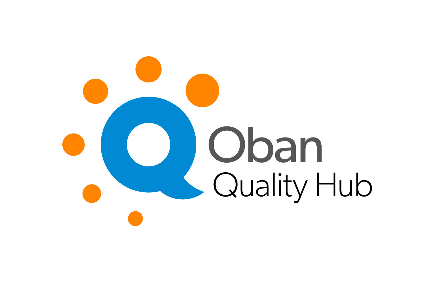
Horizontal lockup for the Oban Quality Hub identity
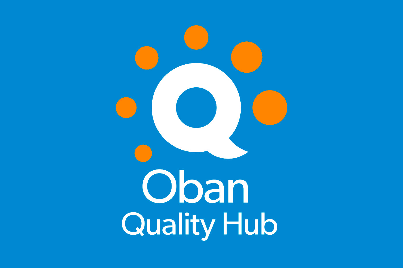
Reversed version of the Oban Quality Hub logo in a stacked format.
The Gibson font family with its open rounded counters and modern San serif look, was used for the primary and secondary typefaces.
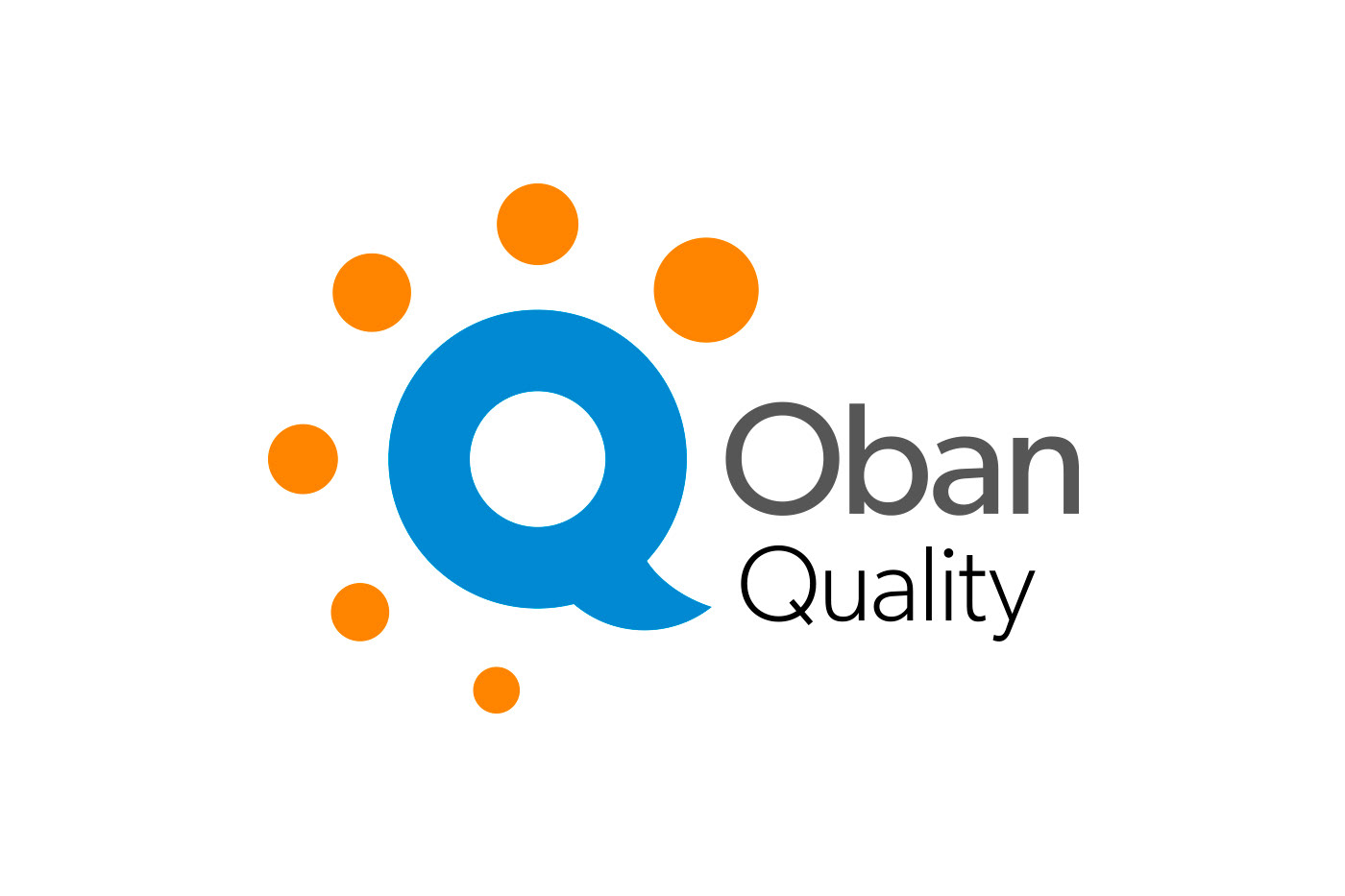
Horizontal lockup for the Oban Quality logo.
Reversed version of the Oban Quality logo in a stacked format.
As part of the project the Oban Quality logo was created to provide an overarching identity for the Oban Quality services.
Oban Quality Pull-up Banner.
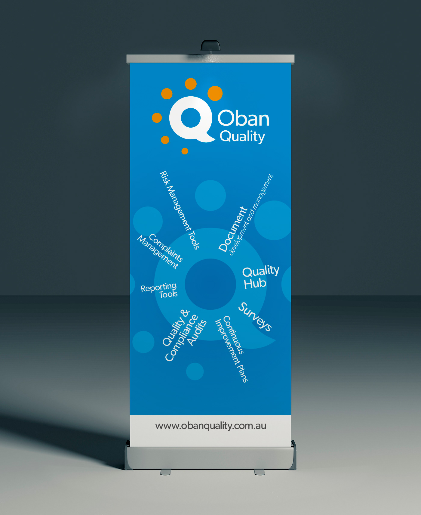
Using the Oban Quality logo, Franklin produced a Pull-up Banner for use at trade fairs and events.
White business card with Oban Consulting logo and details.
After successfully creating the brand identity for both the Oban Quality Hub and Oban Quality logo, Stephen worked on the refresh of the Oban Consulting logo and website.
Oban Consulting logo refresh.
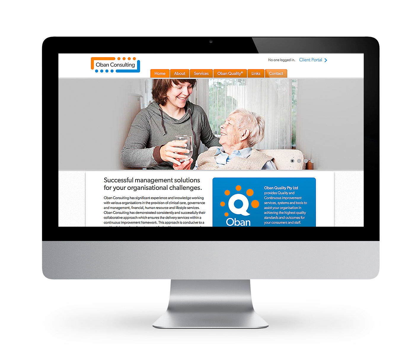
Oban Consulting homepage.
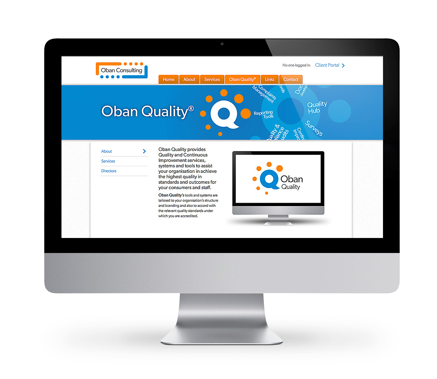
Oban Quality landing page.
Stephen also designed and developed the Oban Consulting website through his digital arm of the studio, Generator Codes.

View more projects

World Vision 2016 Annual Report Design
Editorial design, and layout of the World Vision 2016 Health and Nutrition Annual Report for the Ishimodo Brand and Design Agency. This thirty-two-page document was prepared for release in both print and digital formats.
World Vision The Killer Gap Report & Infographic
Editorial design and layout of the World Vision - Child Health Now publication "The Killer Gap". Also included the design and illustration of a supporting infographic that would be available for download from the World Vision website.
Escape to Luz Illustration
Cover illustration for the Escape to Luz promotional brochure.
Black Rice Brand Identity
Creative direction and design development of the Black Rice Interiors brand identity for use with in-store signage, business stationery, van livery and website.
Bink Kids Brand Identity
Creative direction and design of the Bink Kids brand identity, including the wordmark design, brand stationery, and marketing materials for print and online media.
.A.K. Identity Design
Self-initiated identity design project for London based EDM Producer/Artist .A.K.
Whirlpool Stella Washer & Dryer Retouching
Retouching of the European Stella range of washers and dryers from Whirlpool for the Ishimodo brand design agency. Included product localisation from French to English, clean-up of image backgrounds, and minor colour changes.
Jaguar Automotive Retouching
Speculative Jaguar automotive retouching project. Developed a single test image for a request for proposal.
Little Yellow Cloud Brand Identity
Brand identity design for the Little Yellow Cloud® kids clothing brand.
Nissan Juke Colour Change and Automotive Retouching
Colour change of the white Nissan Juke and automotive retouching of variant specific trim for the Nissan After Sales marketing materials. These retouched images supported the release of this car model in the Australian market.
Back to Top