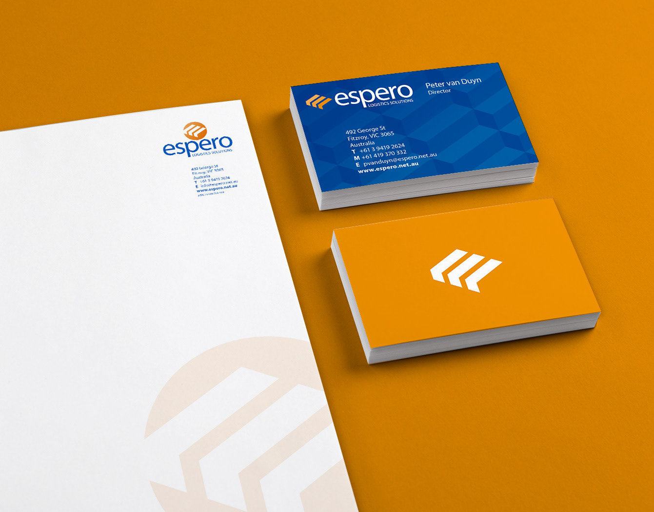
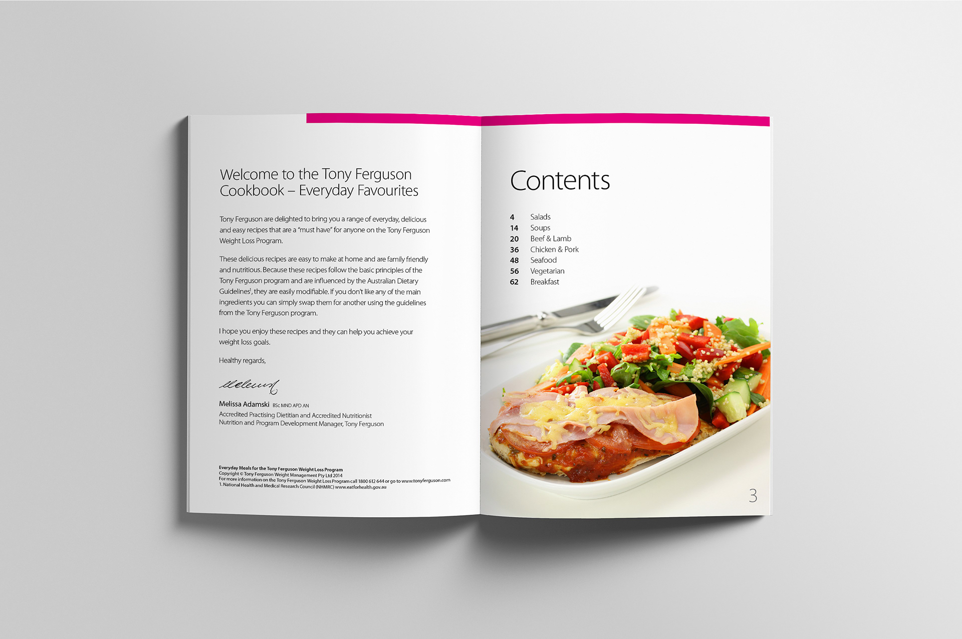
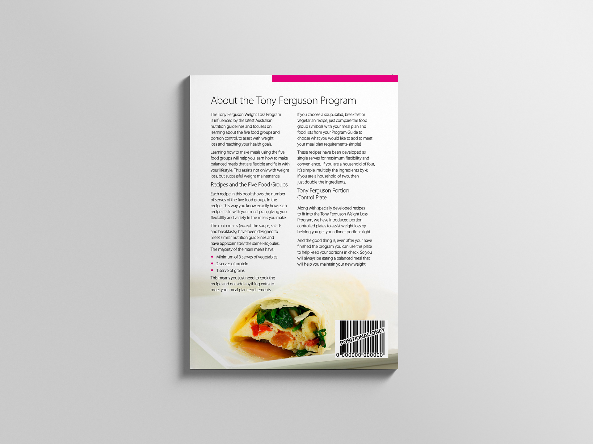
After successfully redesigning the Tony Ferguson product range, the Ishimodo Agency returned to Stephen with a follow-up project, designing a book of portion-controlled recipes based on the five food groups. The brief was to keep the overall look and feel of the publication clean, white, and spacious. Franklin created a page layout with good flow and balance, allowing plenty of room to accommodate the food photography. Each section was colour coded and sat within the newly established Tony Ferguson brand guidelines. The outcome was an easy-to-read booklet with clear ingredient lists and instructions for each recipe, providing delicious meal ideas for customers following the Tony Ferguson Weight Loss Program.

Design Direction: Ishimodo Brand and Design Agency
Creative Direction: Stephen Franklin
Photography: Adam Cleave
Retouching: Stephen Franklin
Front cover of the Tony Ferguson recipe book.
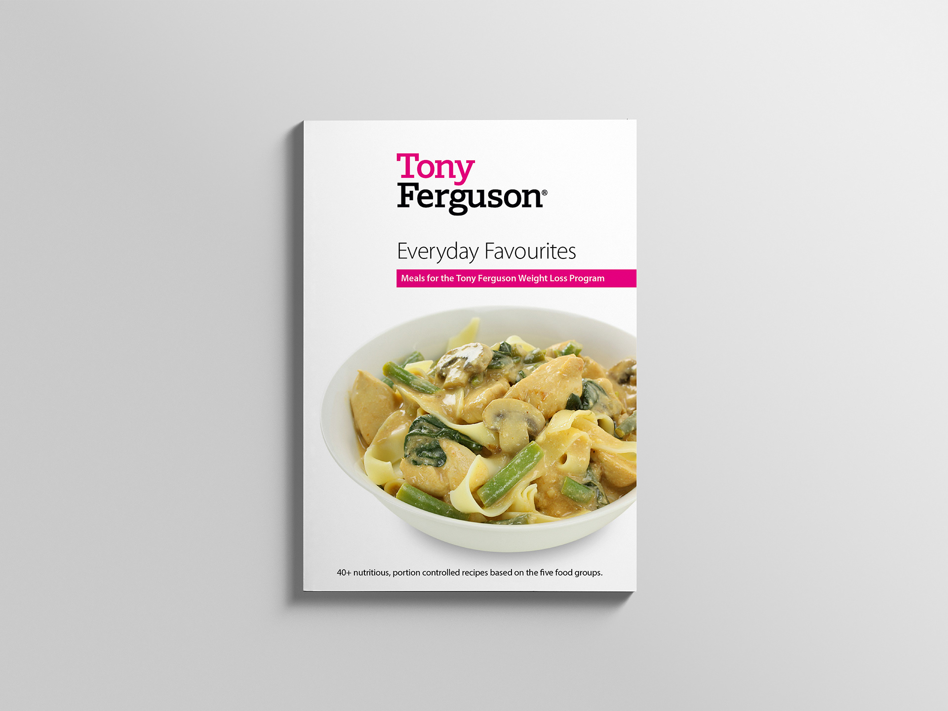
Stephen based the cover layout on the work he did with the front of pack designs for the Tony Ferguson product range.
Inside cover and contents page double page spread.
The typography was kept light with large headings for high legibility.
Salads section start double page spread with heading on left and contents list on right.
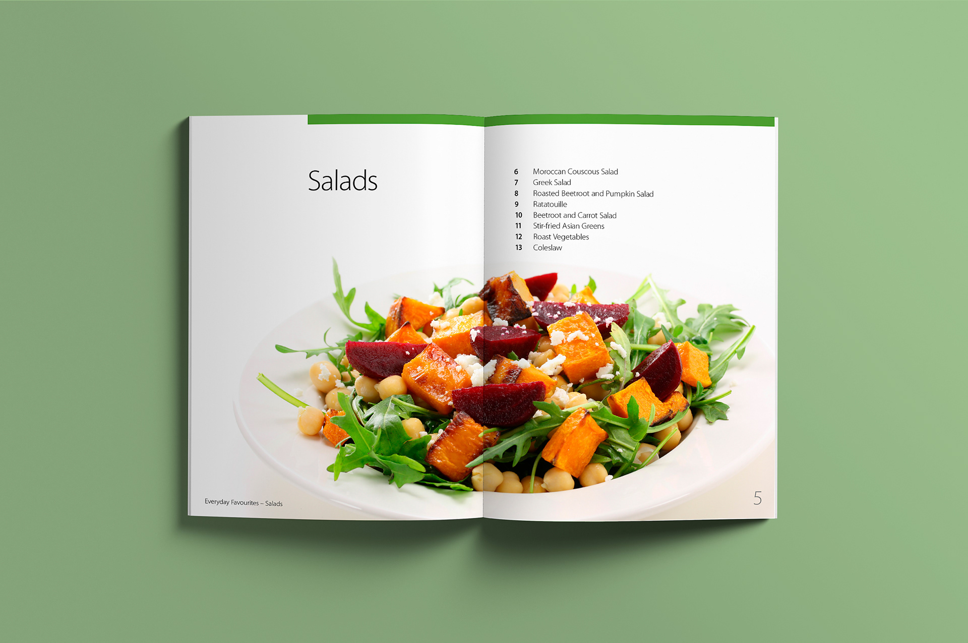
Each section was colour coded with a thin strip at the top like the one found on the Tony Ferguson product packaging.
Page spread showing half-page vertical image on left and half-page horizontal image on right.
Franklin developed a range of master pages to keep the layout fresh and provide an engaging rhythm for the reader.
Soups section start double page spread with soup meal image across both pages.
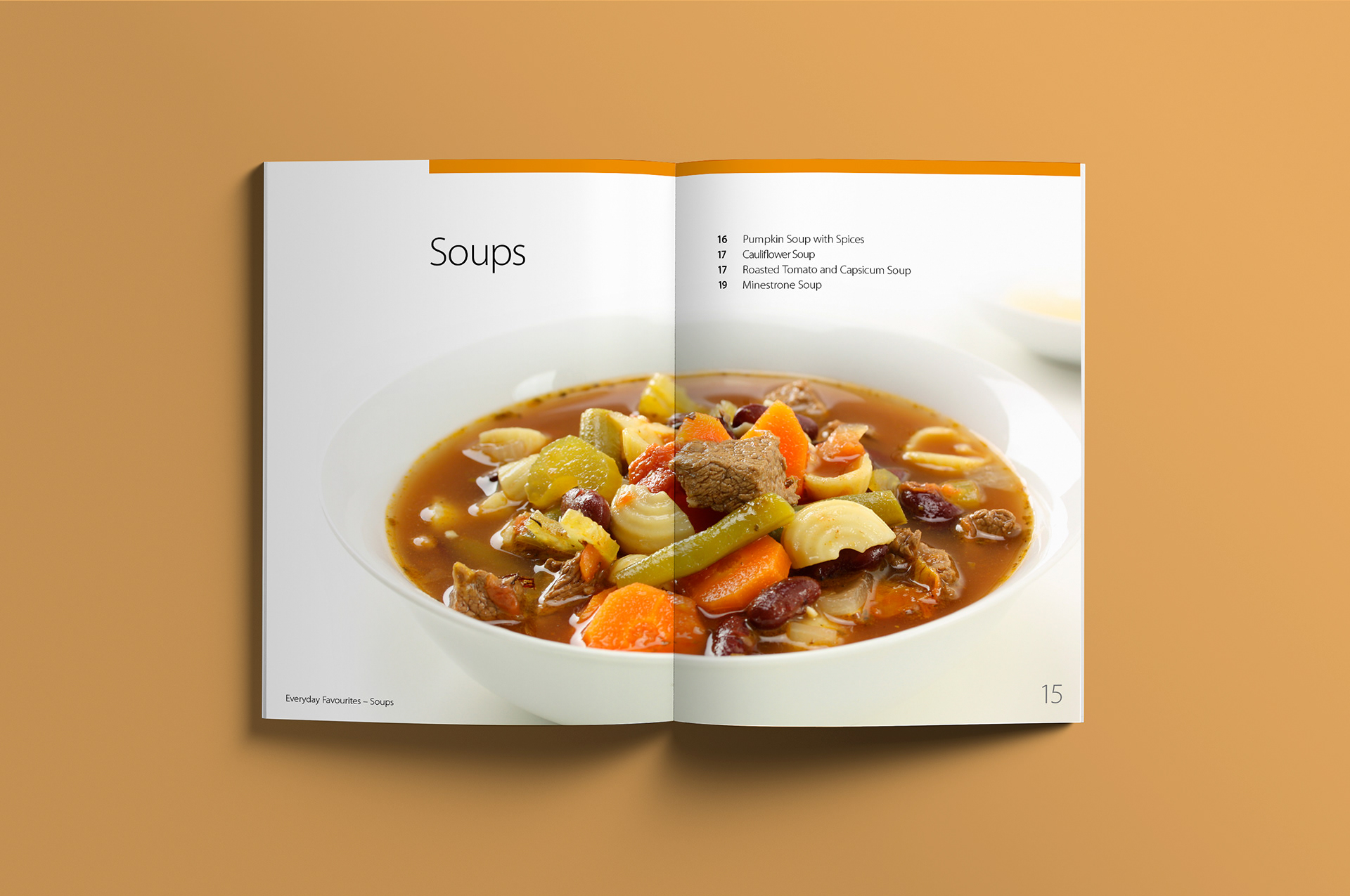
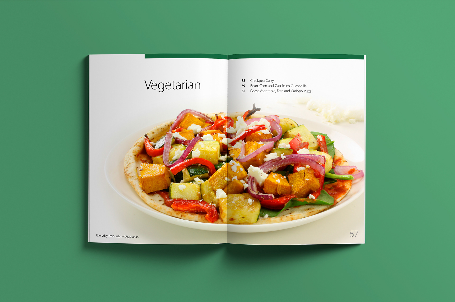
The product photography by Adam Cleave, with its excellent appetite appeal, was presented across a double page spread for each section start.
Soup recipe double page spread showing running footer.
The running footer was split between a clear publication and section name and a large folio number on the right for quick reference.
Beef and Lamb section start double page spread with retouched hero image.
Stephen retouched the tone above the images either fading it to white or deep etching it out altogether.
Moroccan Meatballs recipe with the recipe on right and icons under the heading.
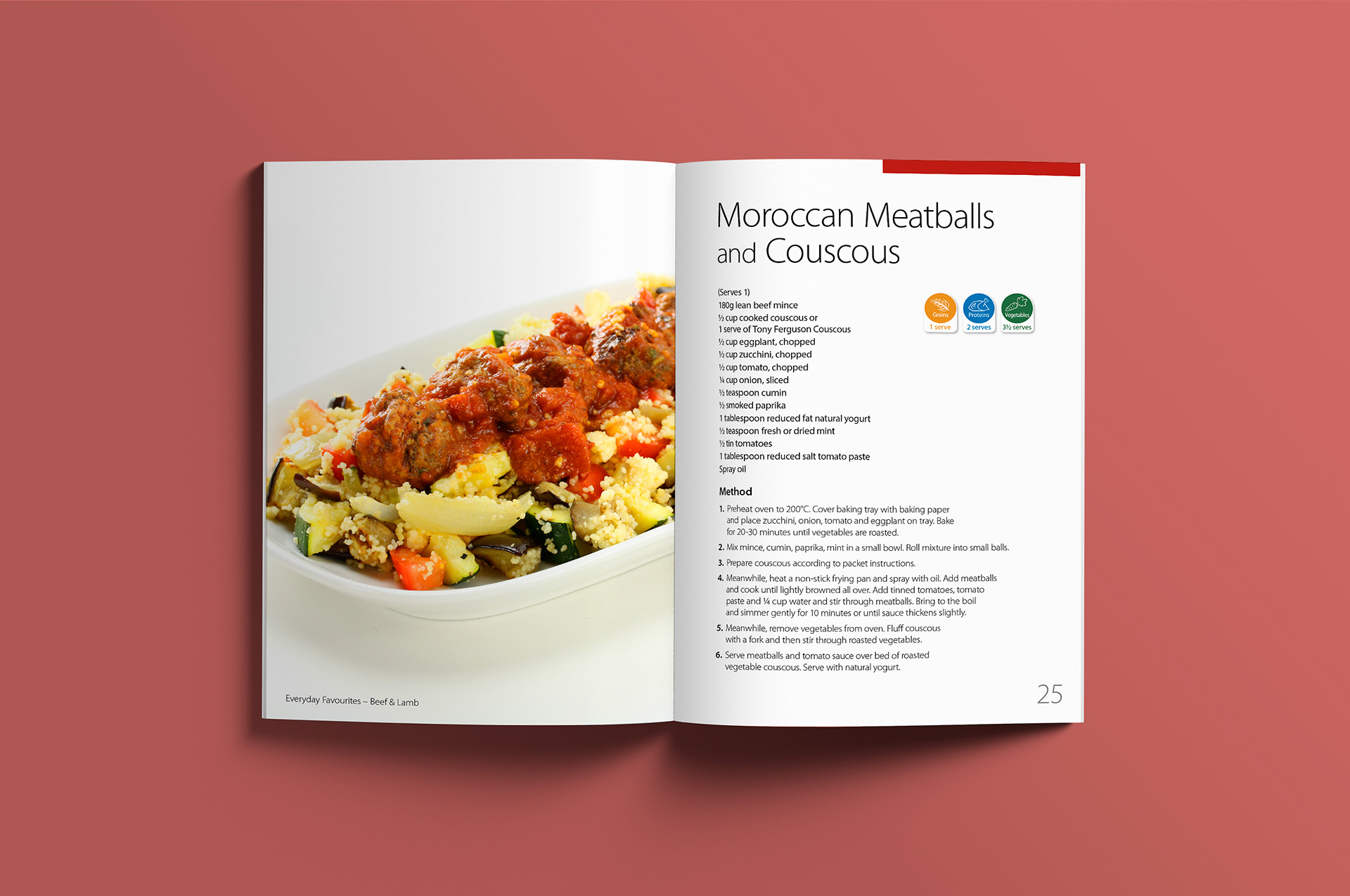
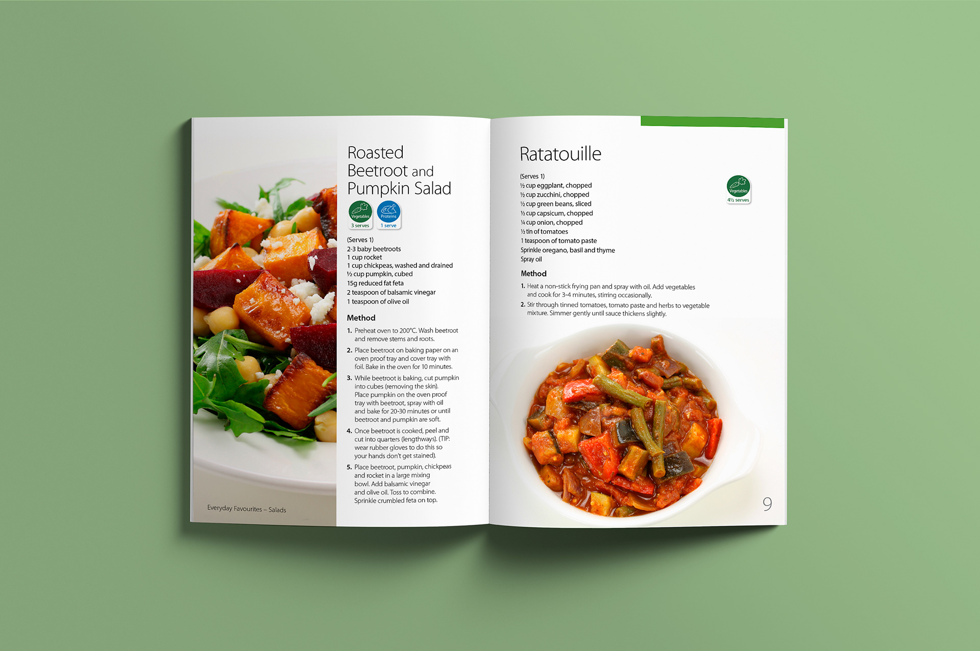
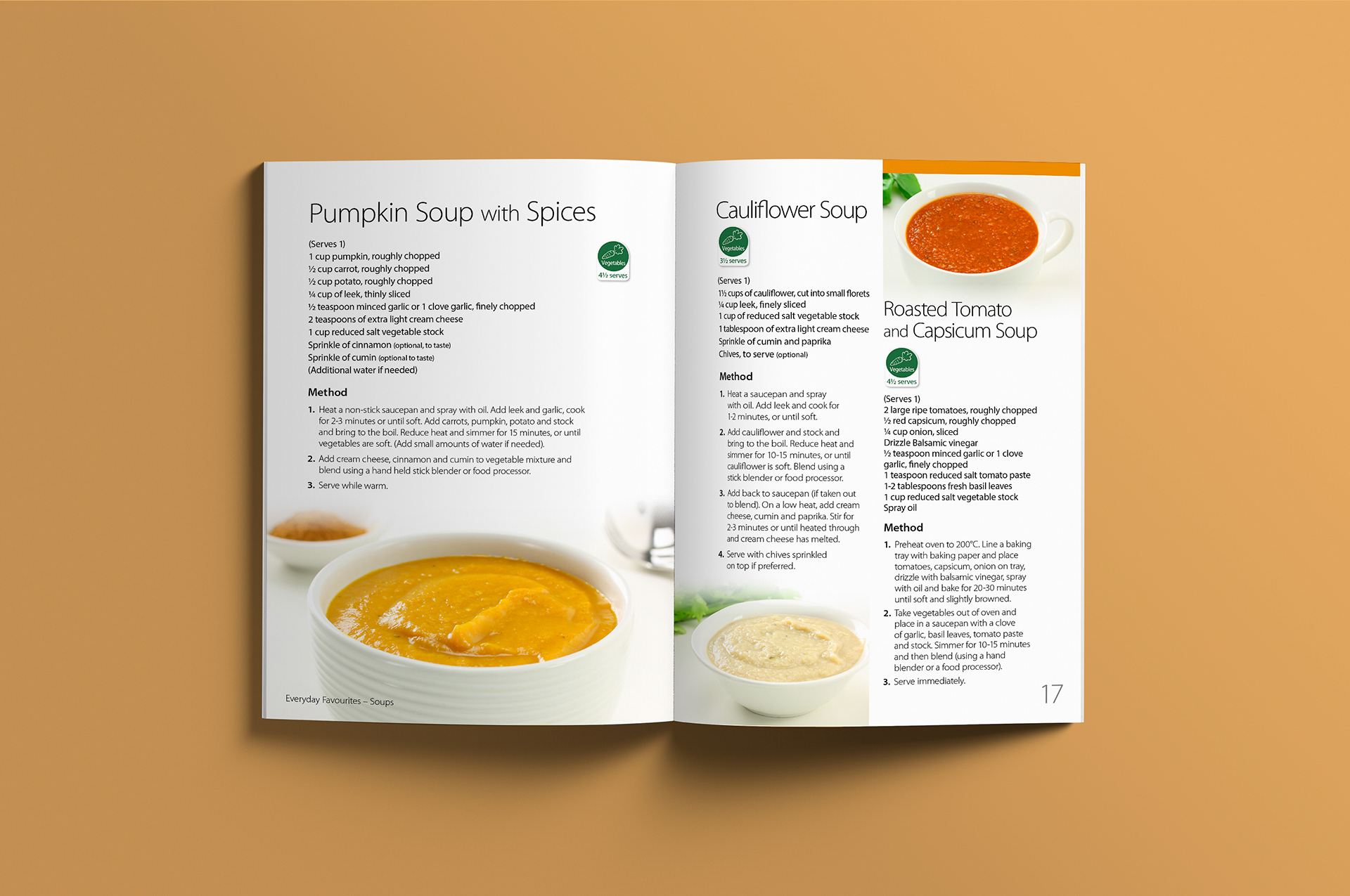
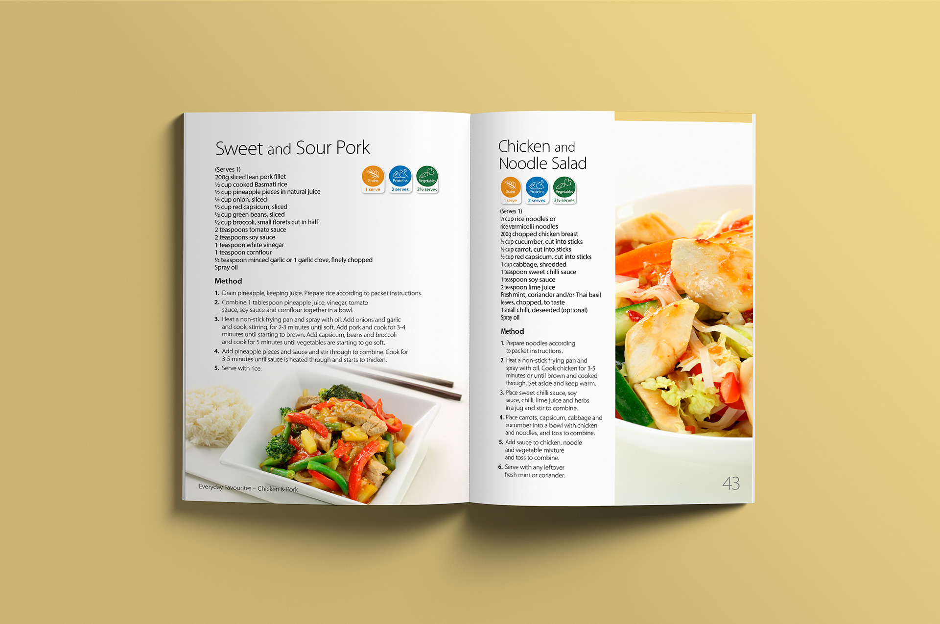
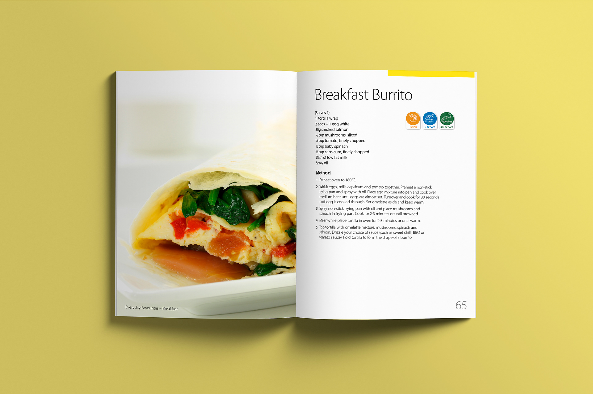
Every recipe utilised a quick reference icon system at the top that was based on the symbols used in Tony Ferguson’s product packaging.
Chicken and Pork section start double page spread.
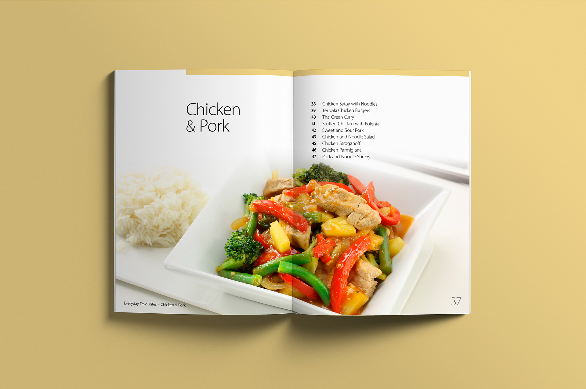
The colour coding loosely followed the norms for the basic food groups. Red for beef, yellow tones for chicken, green for salads and vegetarian etc. 
Double page spread showing detailed recipe information.
Despite some information dense meal instructions Stephen managed to allow enough white space to keep the layout light and clean.
Seafood section start double page spread.
Section starts were clearly labelled with a large heading and list of content to follow.
Seafood recipe’s spread across two pages each with a colour balanced image at the base.
The neutral tones of each image were moved as close to one another as possible to keep a consistent look and feel.
Vegetarian section start double page spread.
Vegetarian recipes spread across two pages showing ingredients and cooking instructions.
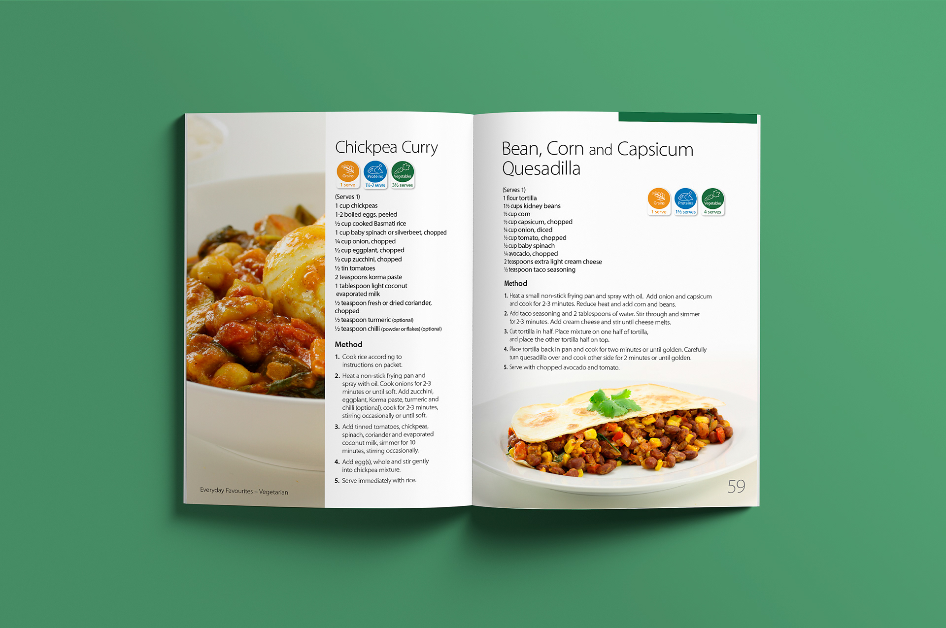
Franklin typeset the cooking method for each recipe with a clear heading and numbered list.
Breakfast section start double page spread.
Breakfast burrito recipe with full bleed image on left page and recipe on the right.
To make up the required sixty-four pages need for printing, Stephen expanded some recipes to a full double page spread.
Tony Ferguson recipe book back cover with positional barcode in place.
The booklet was sold separately in select chemists alongside Tony Fergusons weight loss products. 

View more projects

World Vision The Killer Gap Report & Infographic
Editorial design and layout of the World Vision - Child Health Now publication "The Killer Gap". Also included the design and illustration of a supporting infographic that would be available for download from the World Vision website.
Glycon Brand Identity Design
Design, development and creative direction for the Glycon brand identity.
Tony Ferguson Point of Sale Brand Collateral
Creative direction of Tony Ferguson's point of sale brand collateral for the Ishimodo Brand and Design Agency. Included the design and layout of in-store Posters, End-shelf Header Cards, Shelf Wobblers, and Ceiling Disks.
iWhales Brand Identity
Creative direction and design of the iWhales brand identity for The Oceania Project. Included development of the brandmark and brand lockup used on all iWhales marketing materials and merchandise.
World Vision 2017 Annual Report Design
Editorial design, and layout of the World Vision 2017 Health and Nutrition Annual Report for the Ishimodo Brand and Design Agency. This sixteen-page document was prepared for release in both print and digital formats.
Black Rice Brand Identity
Creative direction and design development of the Black Rice Interiors brand identity for use with in-store signage, business stationery, van livery and website.
Fisher-Price Catalogue Print & Online
Fisher-Price catalogue for the Ishimodo Brand and Design Agency. Included the design and layout of this fifty-two-page publication for use in print and online.
TAFISA Triple AC Program Guidebook
Creative direction, design, and layout of the TAFISA (The Association For International Sport for All) guidebook for their Triple AC program for the Muttromedia Agency.
ECDC Corporate Identity Design
Creative direction and design of the Eastern Cognitive Disorders Clinic (ECDC) corporate identity.
Oban Quality Brand Identity, Stationery & Website
Oban Quality brand identity, stationery and collateral including a refresh of the existing Oban Consulting logo. Also included is the design and development of the Oban Consulting website with an Oban Quality landing page.
Back to Top