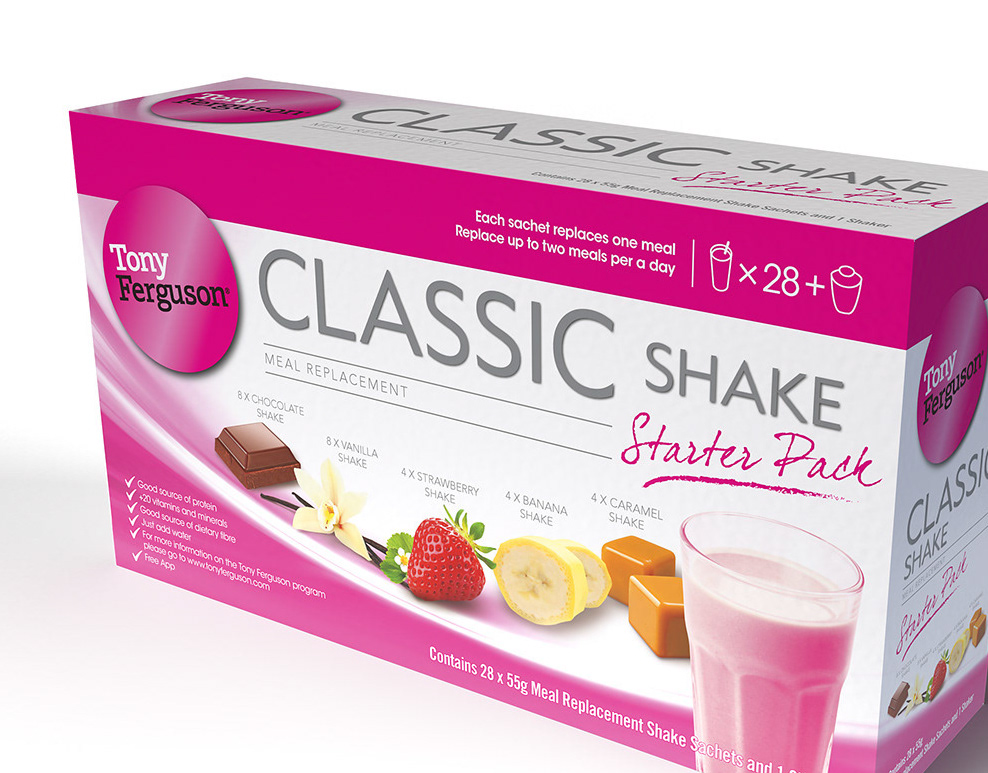
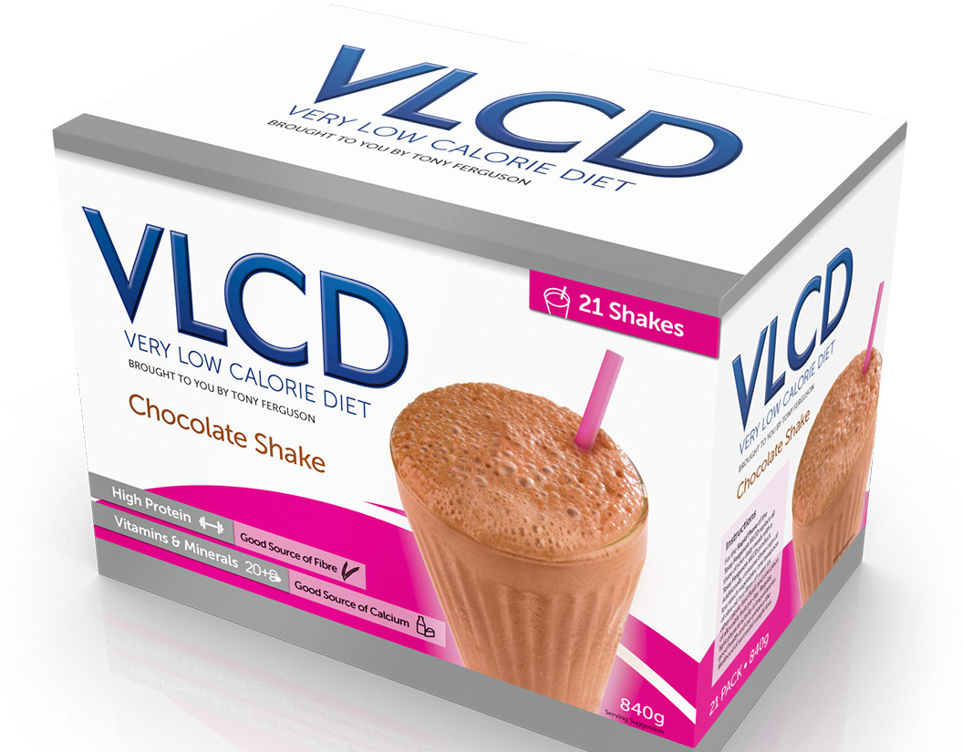
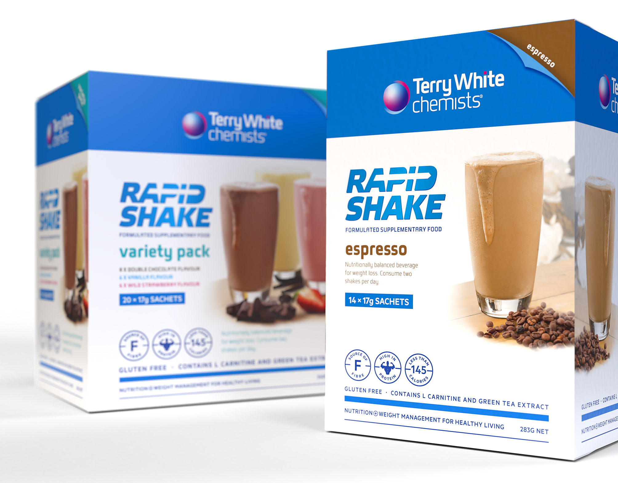
Based on the success of the VLCD Product Range launch and momentum in the low-calorie diet shake market, Tony Ferguson wanted to push ahead with the launch of their Rapid shakes. With the VLCD and Classic ranges in store, Ishimodo needed to ensure that the Rapid packaging sat comfortably with the other Tony Ferguson products. Starting with approved initial concepts, Franklin added elements from existing packs to the design. He took the background swirl and the hero shake image from the Classic range packaging, adding a splash to create a sense of movement. The Tony Ferguson silver was also introduced on the pack as a secondary colour. The result was a robust, individual design with a significant presence on the shelf that had a direct visual connection to the rest of the Tony Ferguson product family.

Design Direction: Ishimodo Brand and Design Agency
Graphic Design: Stephen Franklin
Printing: AMR Hewitts PrintPackaging
The Tony Ferguson Rapid Shake range product packaging for Chocolate, Vanilla Flavour and Espresso variants.
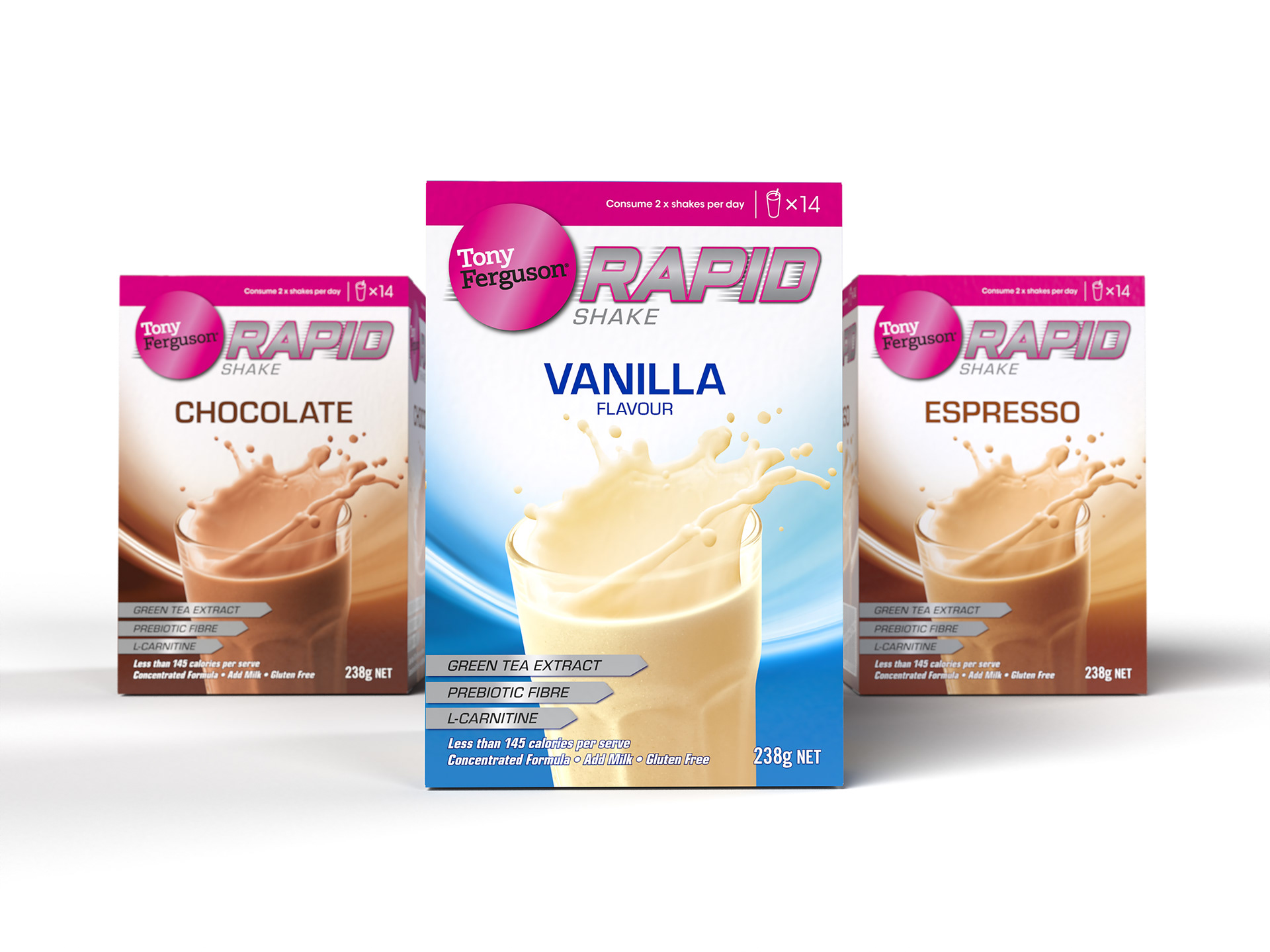
Starting with a supplied concept that looked visually complex, Stephen simplified the design of the range down to a clear hierarchy. The Tony Ferguson master brand and sub brand, flavour variant, followed by the product sell features and weight statement.
The Chocolate variant from the Tony Ferguson Rapid Shake range.
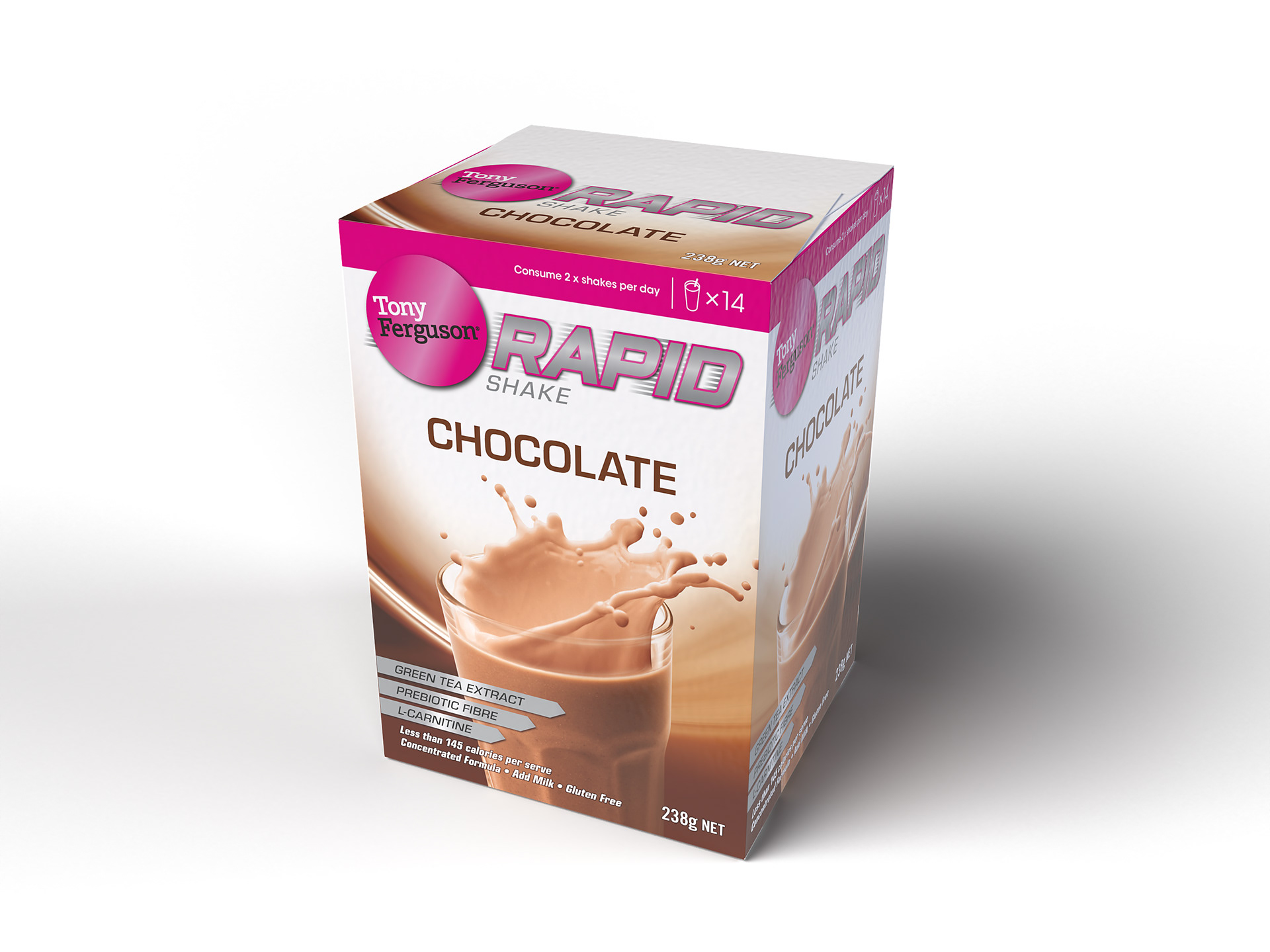
The speed lines on the Rapid type were kept from the original concept, with the silver secondary colour added to help tie in the range with other Tony Ferguson products.
The Espresso variant from the Tony Ferguson Rapid Shake range.
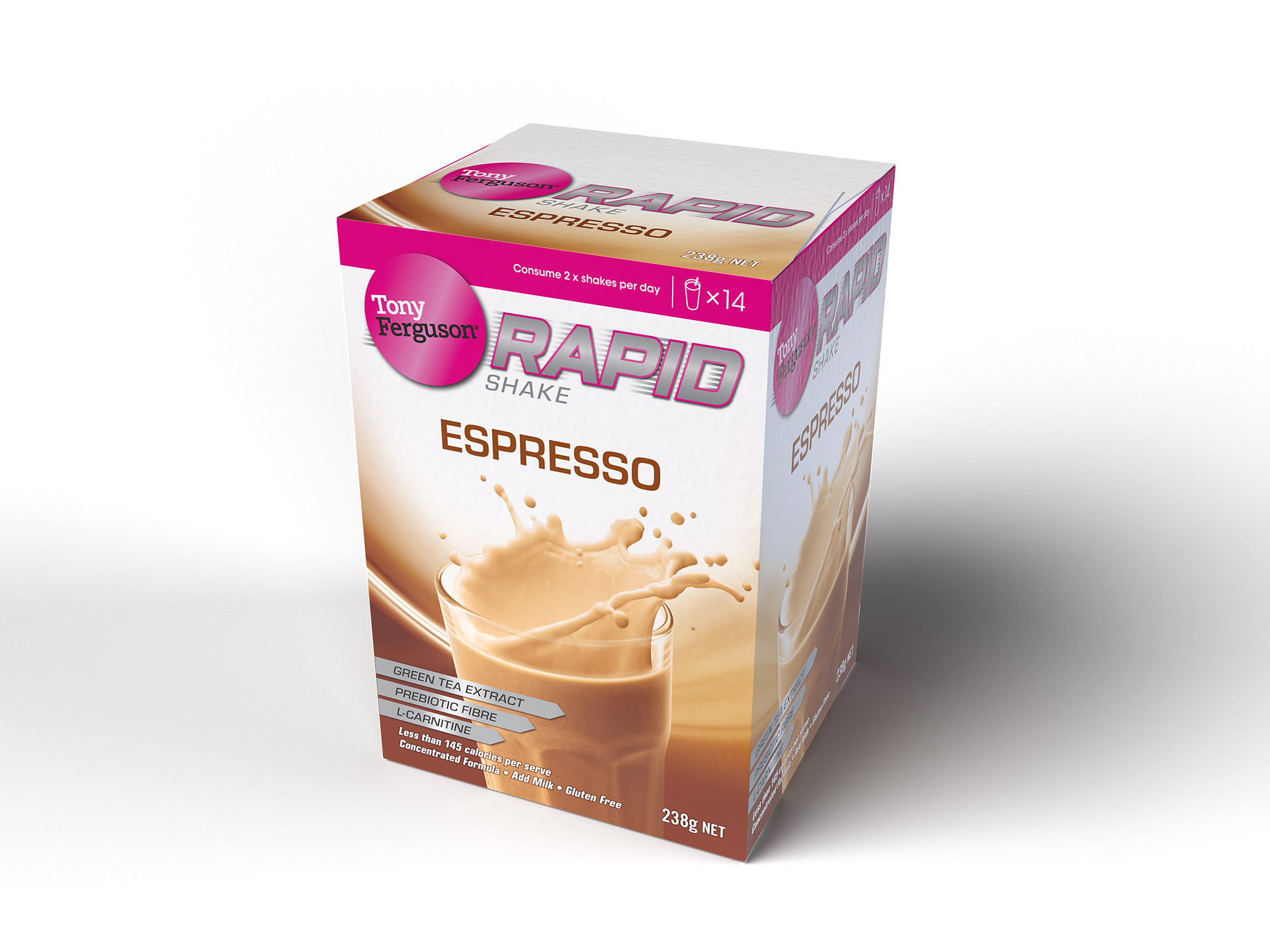
Stephen took the still shake image from the front of the Classic range, adding angular movement to the composition by retouching in a milk splash to the contents of the glass. 
The Vanilla variant from the Tony Ferguson Rapid Shake range.
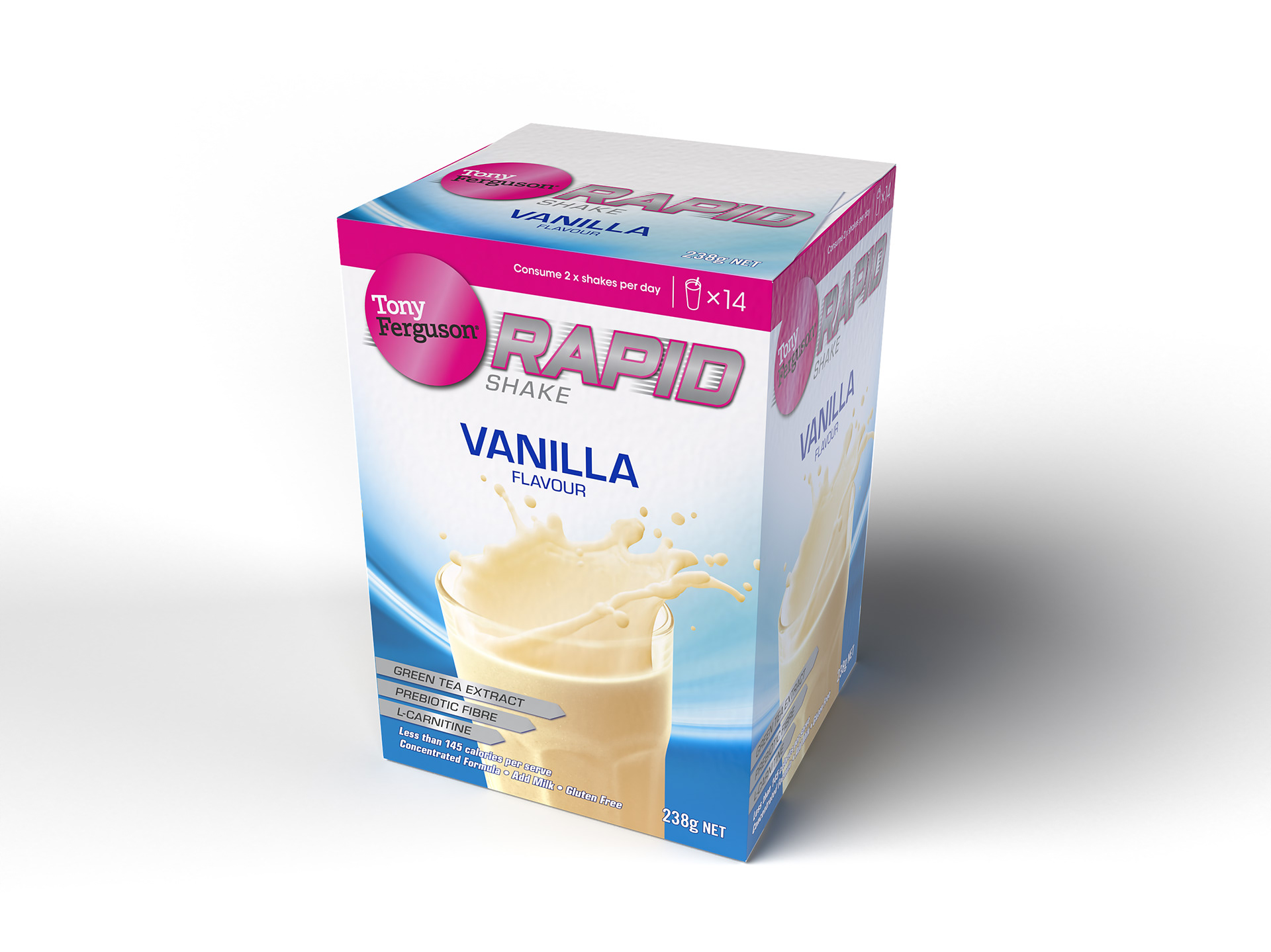
The final elements that added familiarity to the Rapid range were the background image from the Classic pack and the modified silver sell feature panels from the VLCD packaging

View more projects

TrimFast 1200 Brand Identity and Packaging Design
Design, development and production of the TrimFast 1200 weight loss program brand identity and meal replacement shake product range, for the Ishimodo Brand and Design Agency.
Terry White Chemists Rapid Shake Range
Design and rollout of the Terry White Chemists Rapid Shake Range for the Ishimodo Brand and Design Agency. Included the design development and finished artwork for five SKUs (Stock-Keeping Units) based on supplied design handover.
Strive Protein Bar Packaging & POS
Design development and production of the Ferguson Nutrition range of Strive Protein Bars for the Ishimodo Brand and Design Agency. Included the design of the product shippers and development of in-store Point-of-Sale material.
CitroShield Product Range Brand Refresh
Creative direction and design development of packaging labels for the CitroShield Range of natural cleaning products. Included the production of all print ready finished artwork.
Slavutych Beer Artwork
Finished artwork for a Slavutych Beer bottle label based on design files created by LFH Brand Identity.
Potato Face Salt and Vinegar Range Extension
Packaging design and character development of the Salt and Vinegar range extension for the Potato Face brand of stacked chips from Dallas International.
TrimLife 1200 Meal Replacement Range
Production of the TrimLife 1200 Meal Replacement Range for the Ishimodo Brand and Design Agency. Included the design development and finished artwork of packaging for multiple variants, including shakes, bars, soups, and associated product shippers.
Great Mates Tomato Sauce Packaging Label Design
Packaging label design, illustration, and artwork of the Great mates! branded tomato sauce products for Dallas International.
Potato Face Stacked Chips Packaging Design
Packaging design and character development of the Potato Face brand of stacked chips for Dallas International.
LaserMAX Brand Packaging
Creative direction and design development of the LaserMAX range of laser light retail products. Also included the development of the LaserMAX brand identity.
Back to Top