Australian grocery distributor Dallas international approached Stephen to produce a range of stacked potato chips under the Potato Face brand. The brief was to design a fun, quirky and eye-catching pack to attract the Australian consumer. Franklin focused on the Potato Face brand character, envisioning it playing in different situations, giving a unique identity to each product variant. The result was a set of playful characters paired with bright, colourful environments that gave the range a life of its own, and visibly separated it from the competition when on shelf.
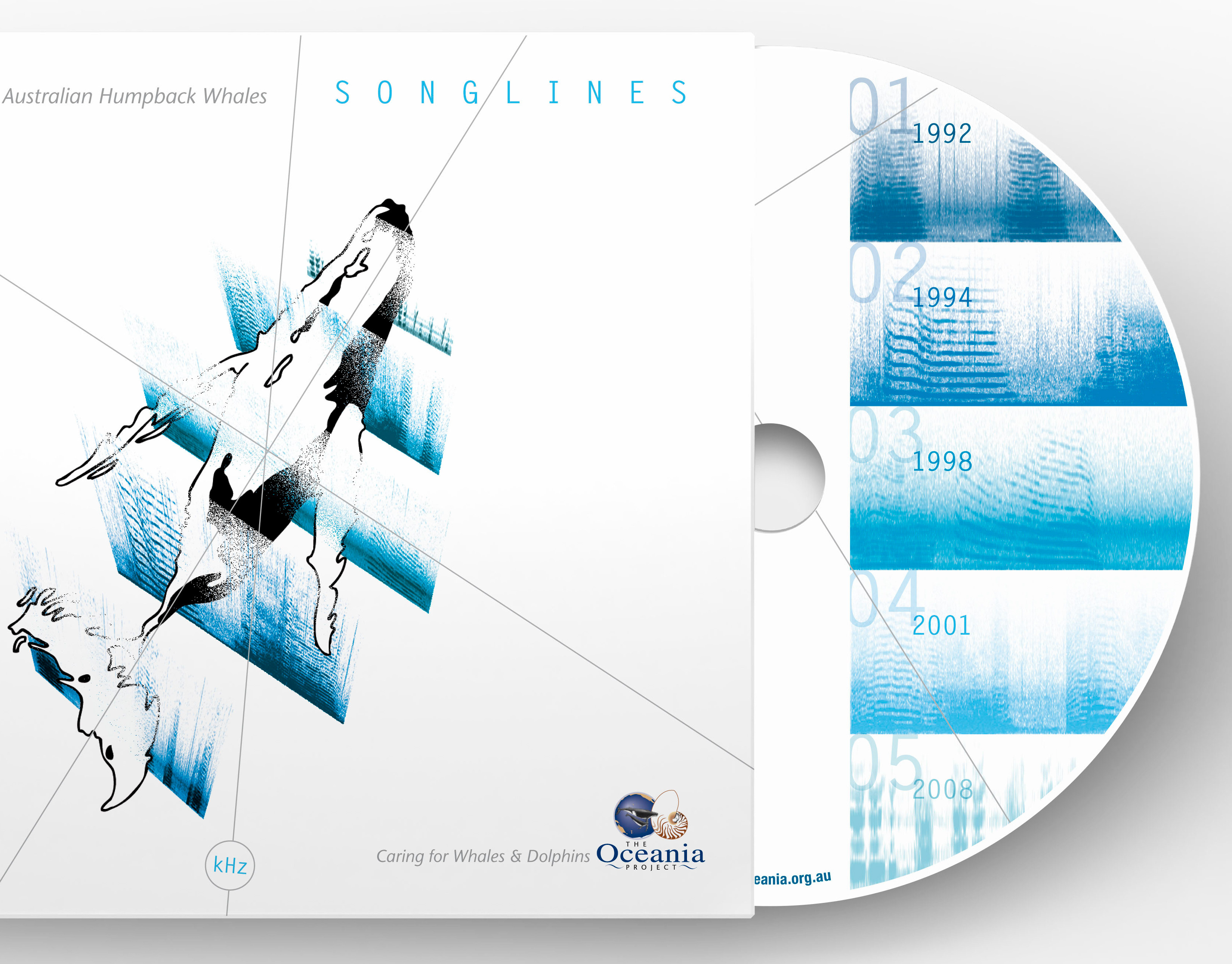
Design Coordination: Anita Martini
Creative Direction: Stephen Franklin
Graphic Design: Stephen Franklin
Retouching: Stephen Franklin
Creative Direction: Stephen Franklin
Graphic Design: Stephen Franklin
Retouching: Stephen Franklin
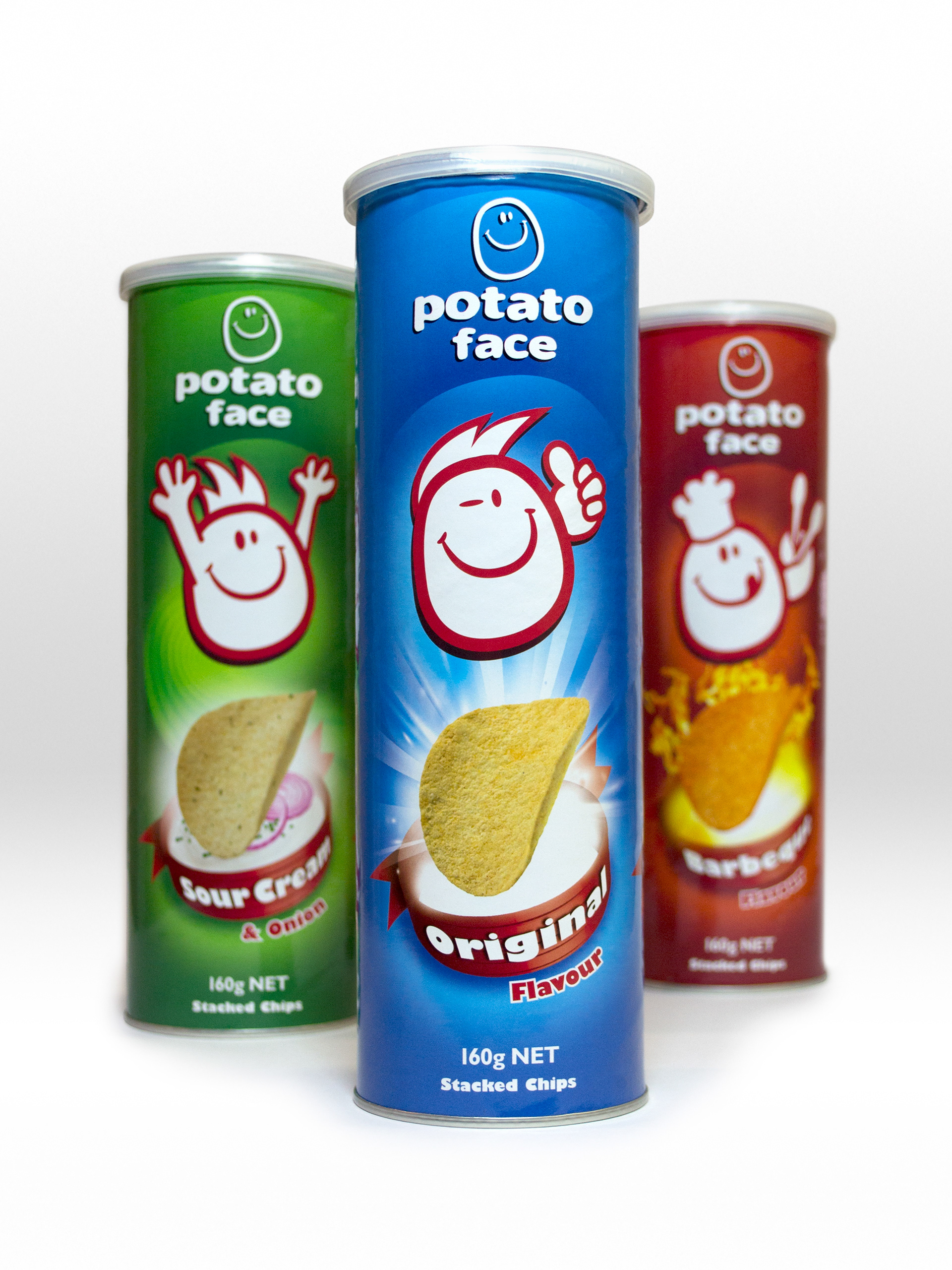
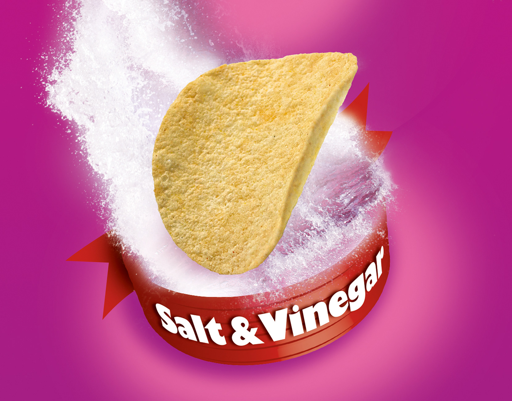
The initial range consisted of three variants, Original, Sour Cream and Barbecue. Stephen would later produce the Salt and Vinegar range extension.
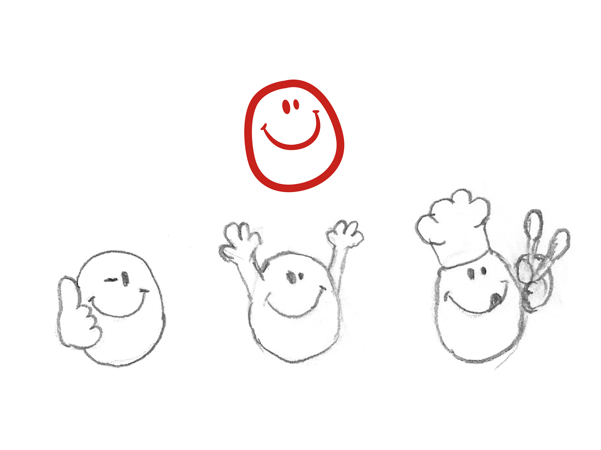
Working with the existing potato face brand identity, Stephen sketched initial ideas for the character of each variant.

With direction from the client, Stephen added hair to the first two characters, giving each with their own unique personality.
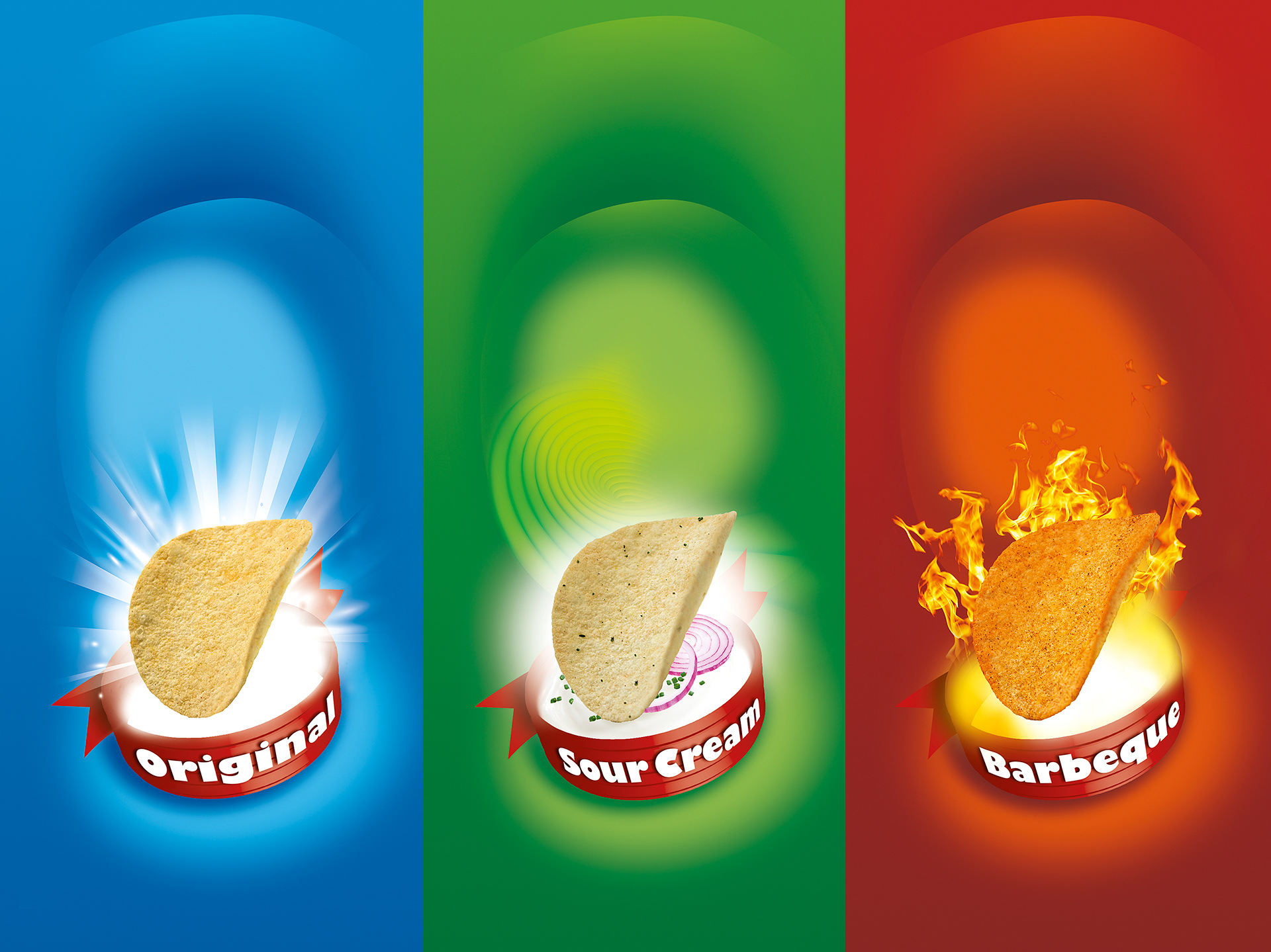
Rich, colourful backgrounds were developed for each pack to support the new Potato Face characters and provide good separation of the variants on shelf.

Each character was then combined with the backgrounds and placed above the product shot to form the final front of pack composition.
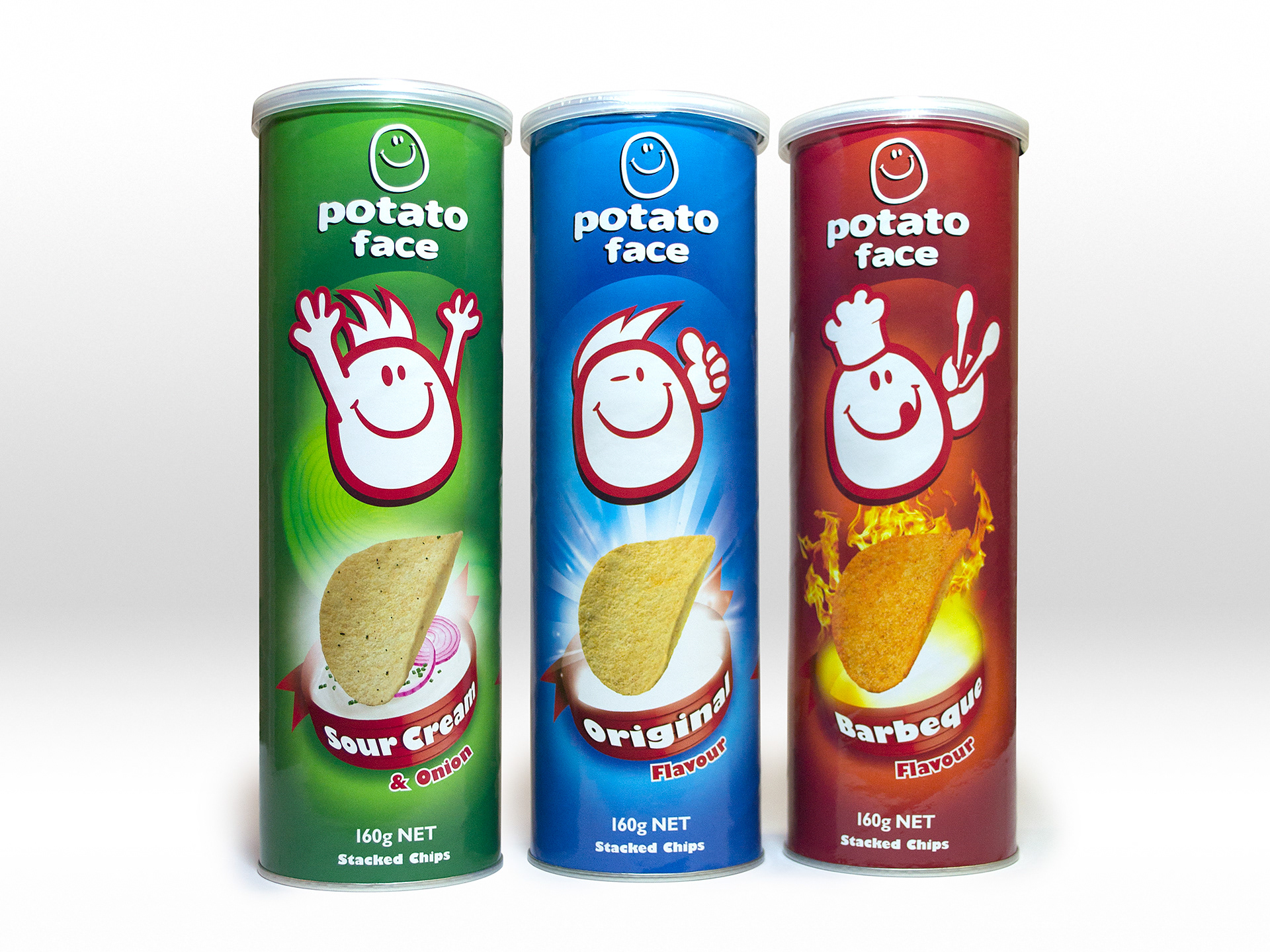
The final packs each had a unique, quirky character, with strong eye-catching flavour cues.