HCi is a company dedicated to providing skilled technical writers for project or permanent resources in a wide range of industry sectors. In 1998 they needed to update their visual identity to communicate this singular focus. Franklin worked closely with HCi management to develop the creative brief for the project. It led to a design with a simple yet clear statement of purpose. A red underscore beneath the brand name denotes the iterative process of writing, with the lowercase “i”, indicative of the personnel, the people that HCi represent. The result is a strong and concise identity that gets straight to the point.

Creative Direction: Stephen Franklin
Graphic Design: Stephen Franklin
HCi logo using a capitalised H and C with lowercase I, all underlined with a red stroke.
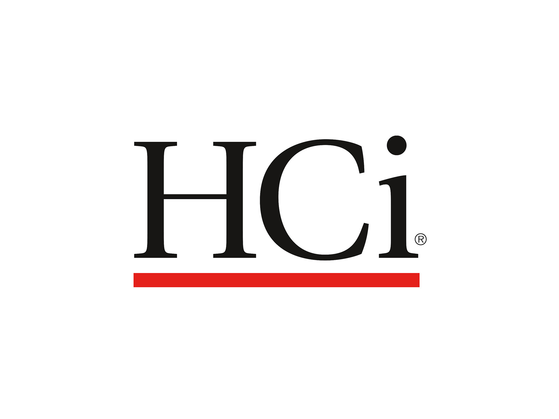
The HCi logo became the registered trademark of the company.
A range of HCi stationery items spread across a table.
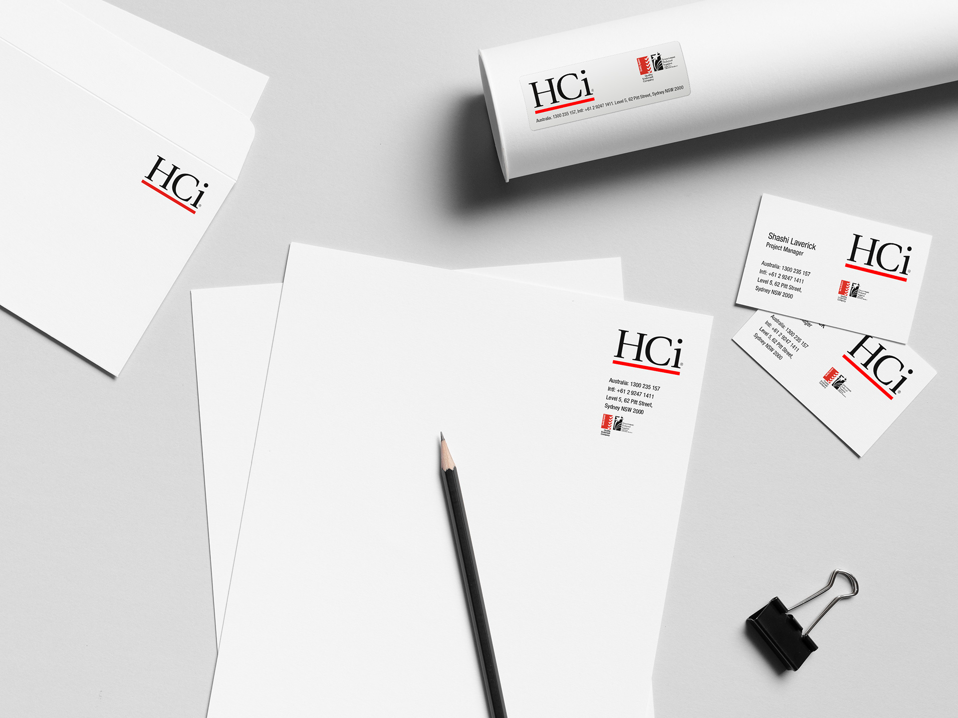
Stephen produced a range of stationery for HCi including DL Envelopes, Stickers, Business Cards, and Letterhead.
Open HCi presentation folder. Below is a branded With Compliments slip.
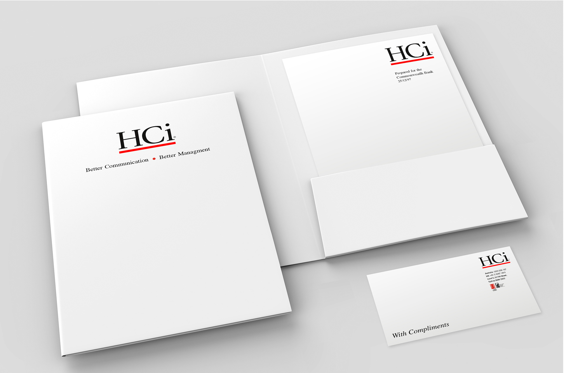
Along with the basic stationery Franklin designed a Presentation Folder, Presentation Cover and With Compliments slip.
Hands holding out a HCi sales brochure.
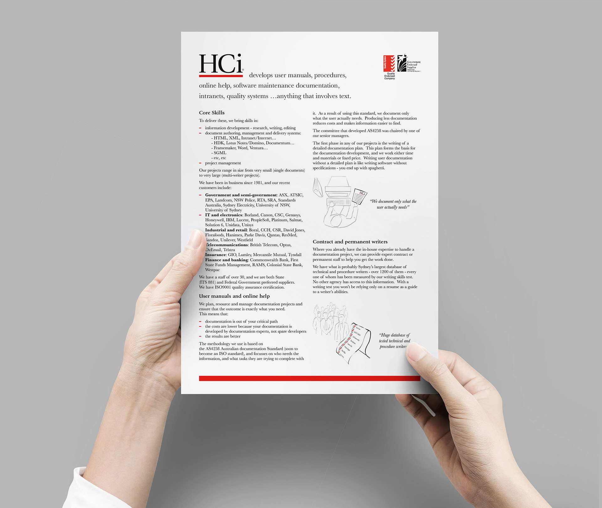
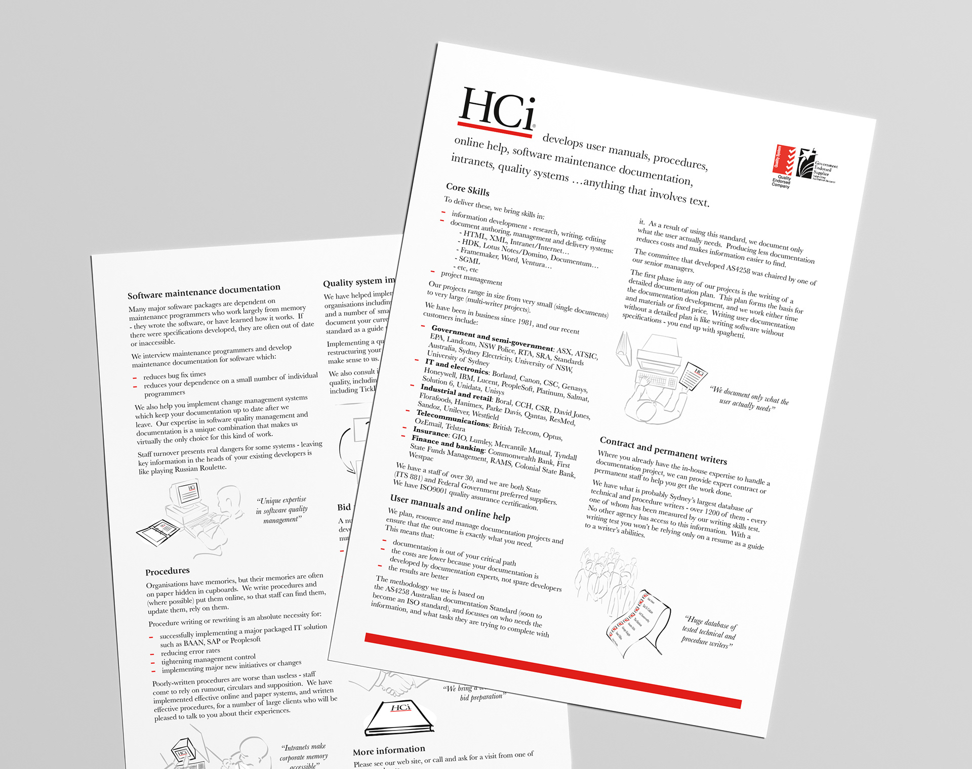
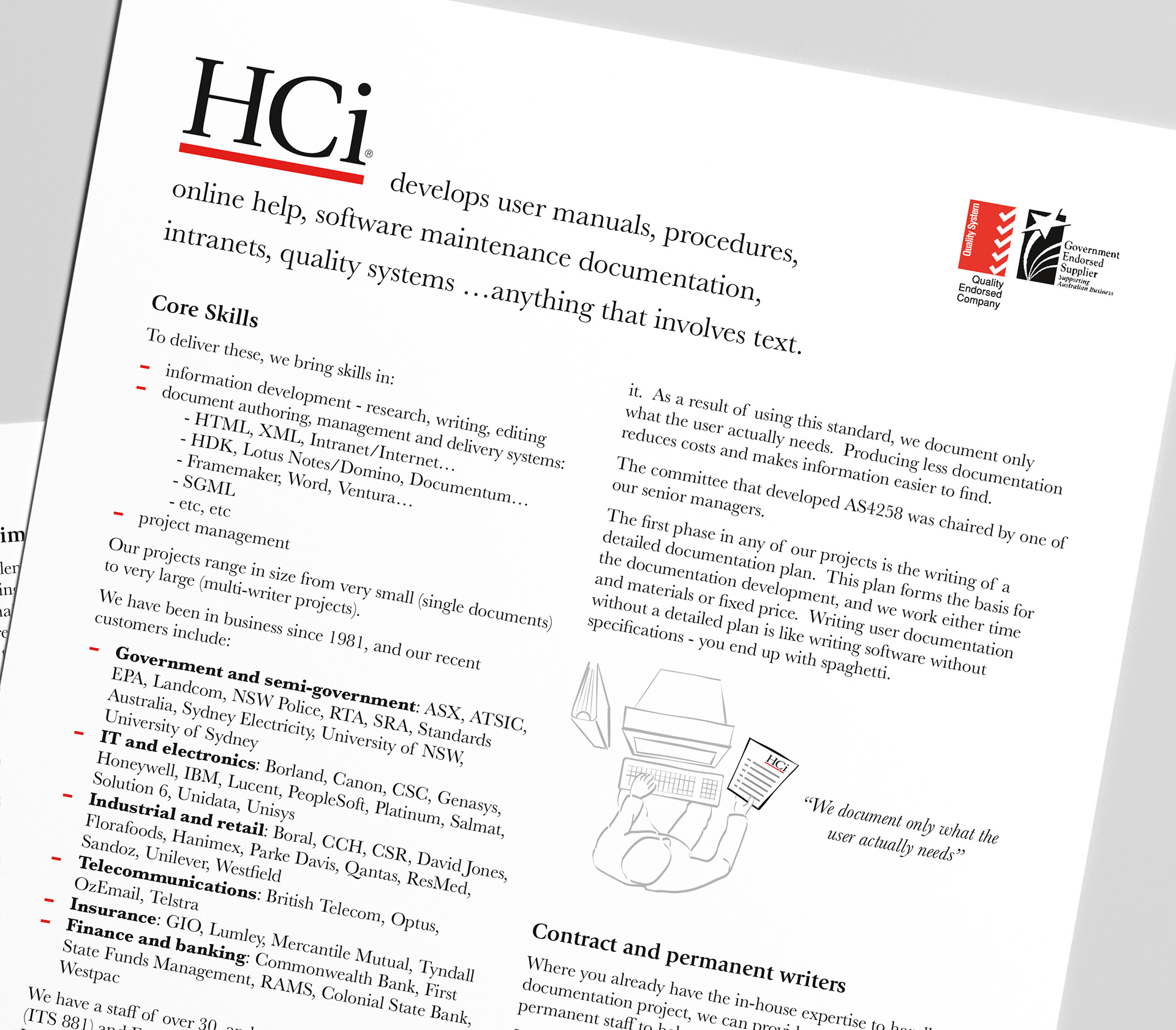
As part of the project Stephen also created the design, layout, and illustrations for a HCi sales flyer.
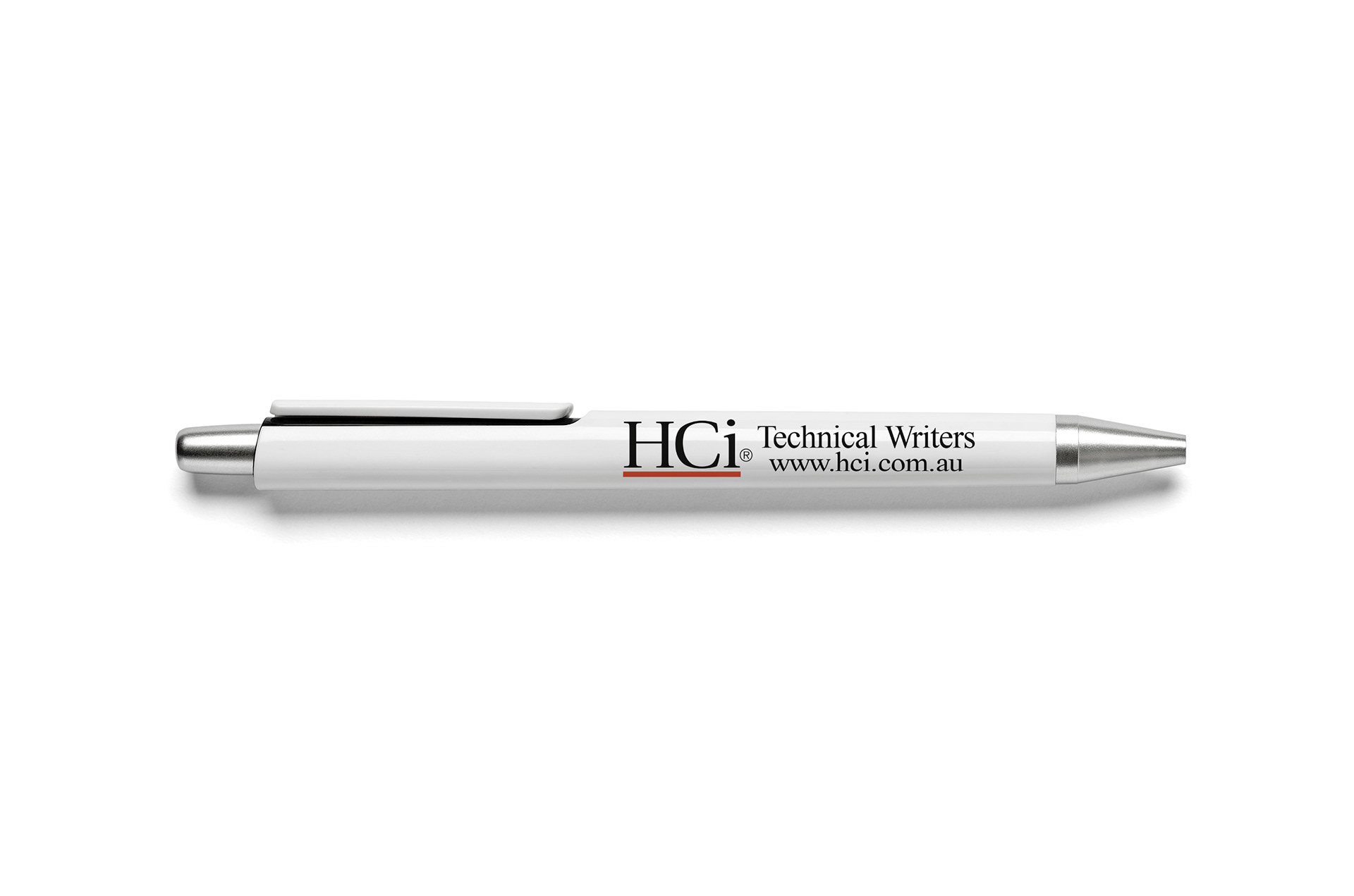
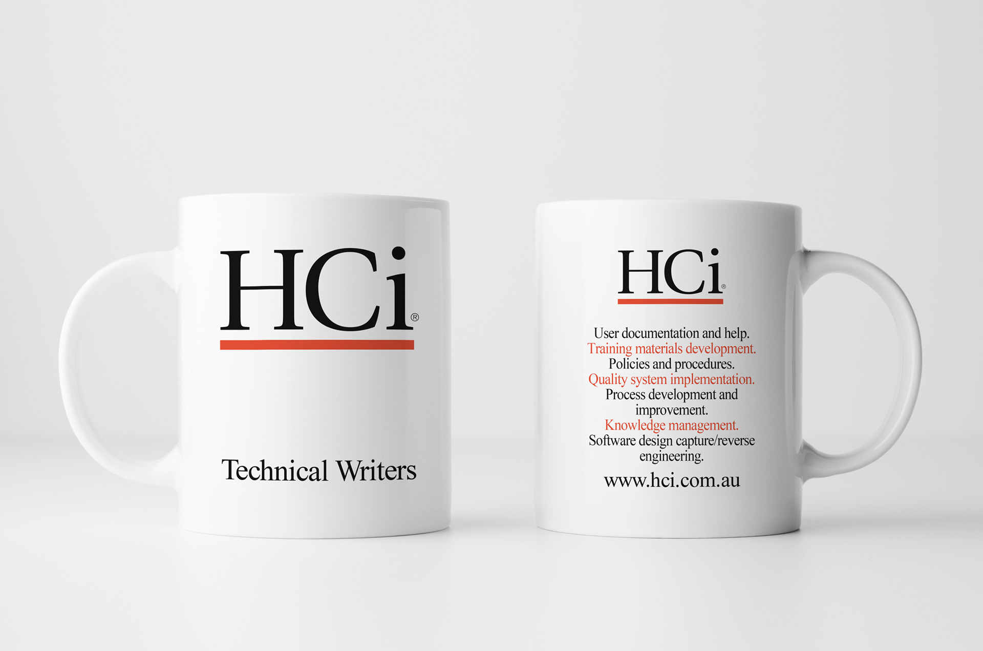
Pen and mug designs for free promotional items given to HCi clientele.
Branded mug with logo on one side and services list on the other.
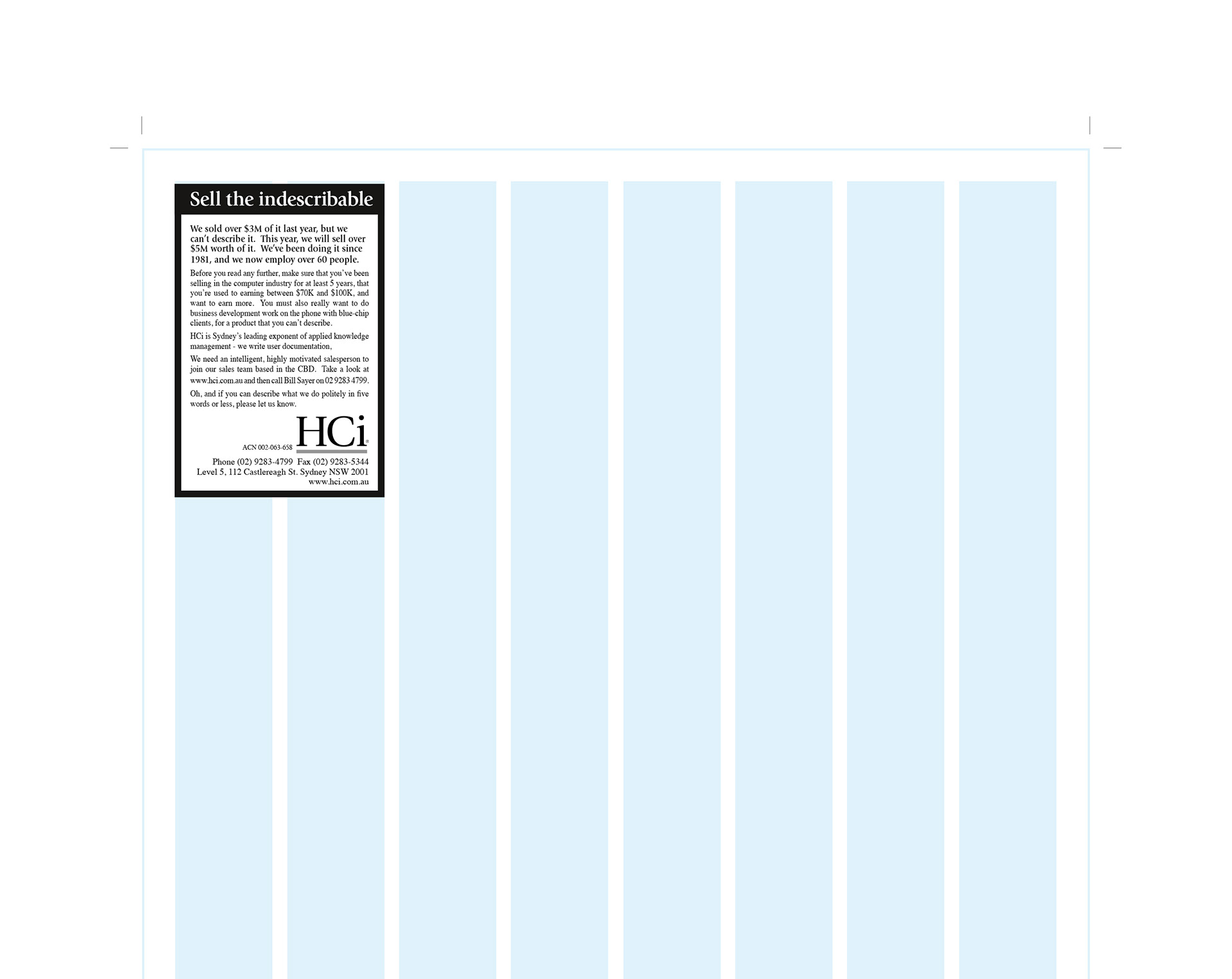
Long length two column ad.
Short length two column ad.
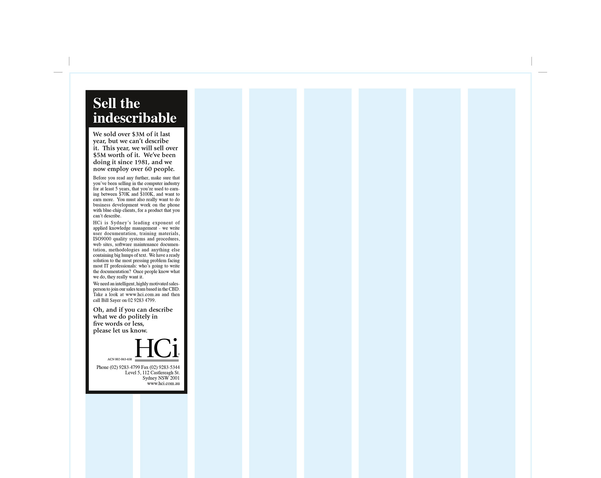
Franklin also produced some ad layouts for placement in local Sydney print publications.

View more projects

Merrilake Promotional Calendar Illustration
Stephen's contribution to the Merrilake agency’s promotional calendar. He was requested to respond to the brief "Merrilake Illustrators are not just bums on seats!" in the style of his favourite artist. Salvador Dali's "Sleep" was Franklin's inspiration.
Kin Khao Brand Identity
Identity design for Kin Khao Thai restaurant, Athlone, Ireland. The design was executed across interiors, signage, menus, newspaper ads and other marketing materials.
Microsoft Exchange Brochure Image
Composite image created for the cover of a Microsoft Exchange brochure. Sourced from multiple image styles and combined to create a visually integrated piece of digital artwork.
Braams Brand and Marketing Collateral
Creative direction and production of Braams Property Services design collateral, and marketing materials from 1997 through to 2001.
SoundNet Newsletter and Masthead
Editorial design and masthead design of SoundNet, the official newsletter of The Oceania Project a non-profit research organisation dedicated to raising awareness about Whales, Dolphins and Porpoises and the ocean environment.
Grandiosa Lørdagspizza Packaging Retouching
Retouching of the front of pack hero image for the Norwegian frozen pizza brand Grandiosa.
Kellogg's Froot Loops Back of Pack Illustration
A promotional back-of-pack illustration created for Kellogg's Froot Loops cereal packaging. Included the digital creation and preparation of the finished image for use in the packaging artwork.
Queensland Energy Revolution Report
A seventy-page report on Queensland energy. Franklin designed the complete report including all graphs, charts, and illustrations. The target format was a short run digitally printed document.
Coco Pops Back of Pack Illustration
A promotional back of pack illustration for Kellogg's Coco Pops cereal packaging.
Green Isle Stir-Fry Packaging Artwork
Creative artworking on the Green Isle Stir-Fry flexographic packaging finished artwork.
Back to Top