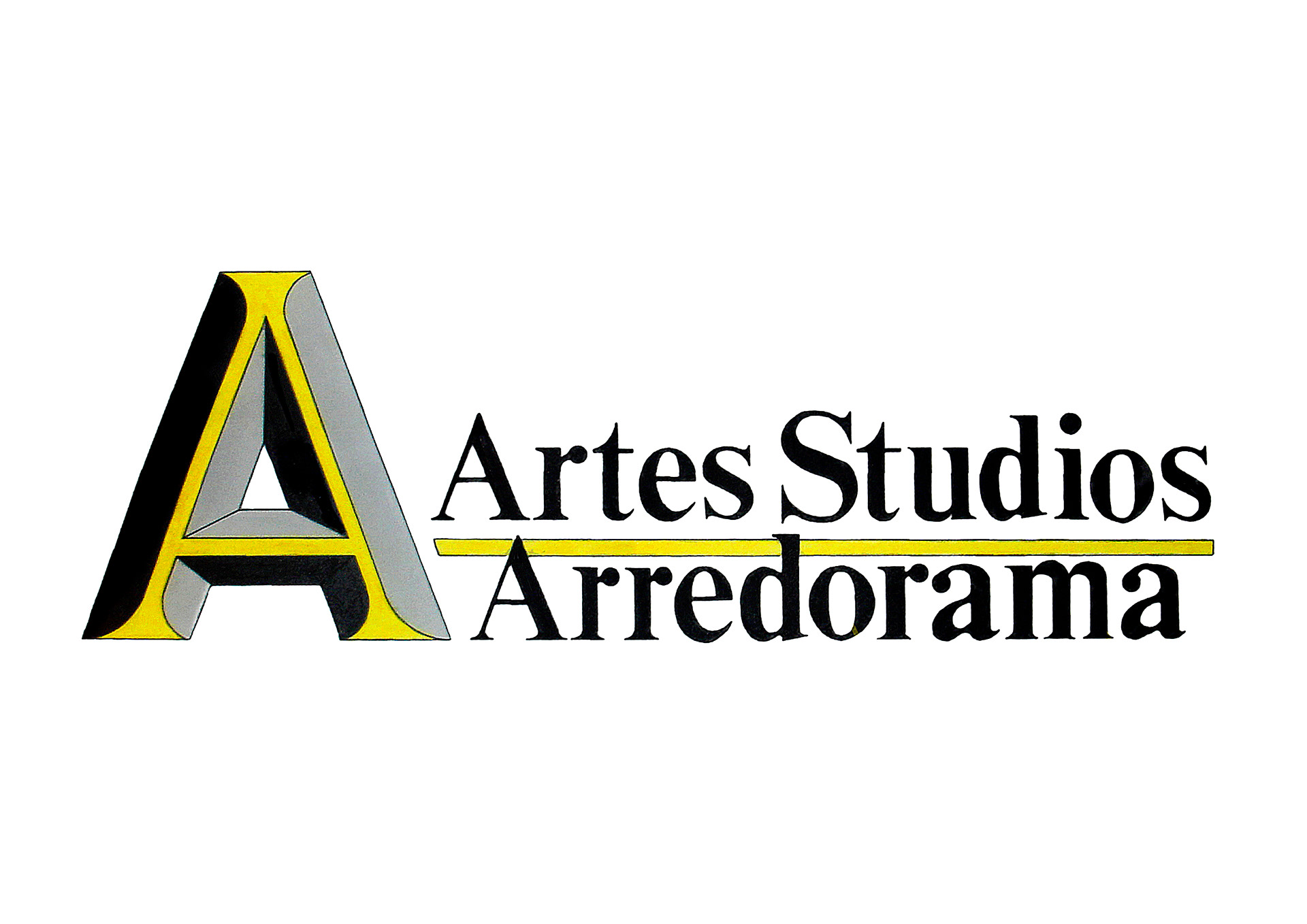
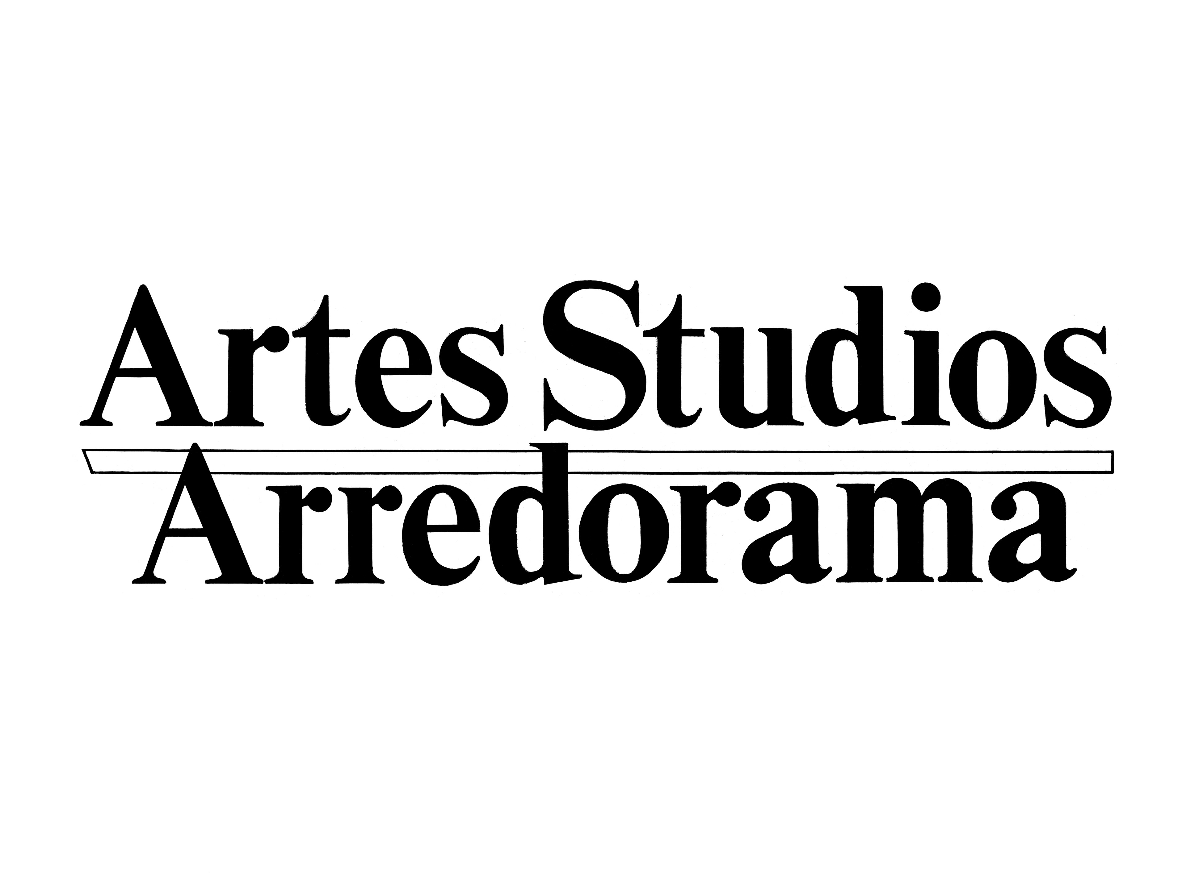
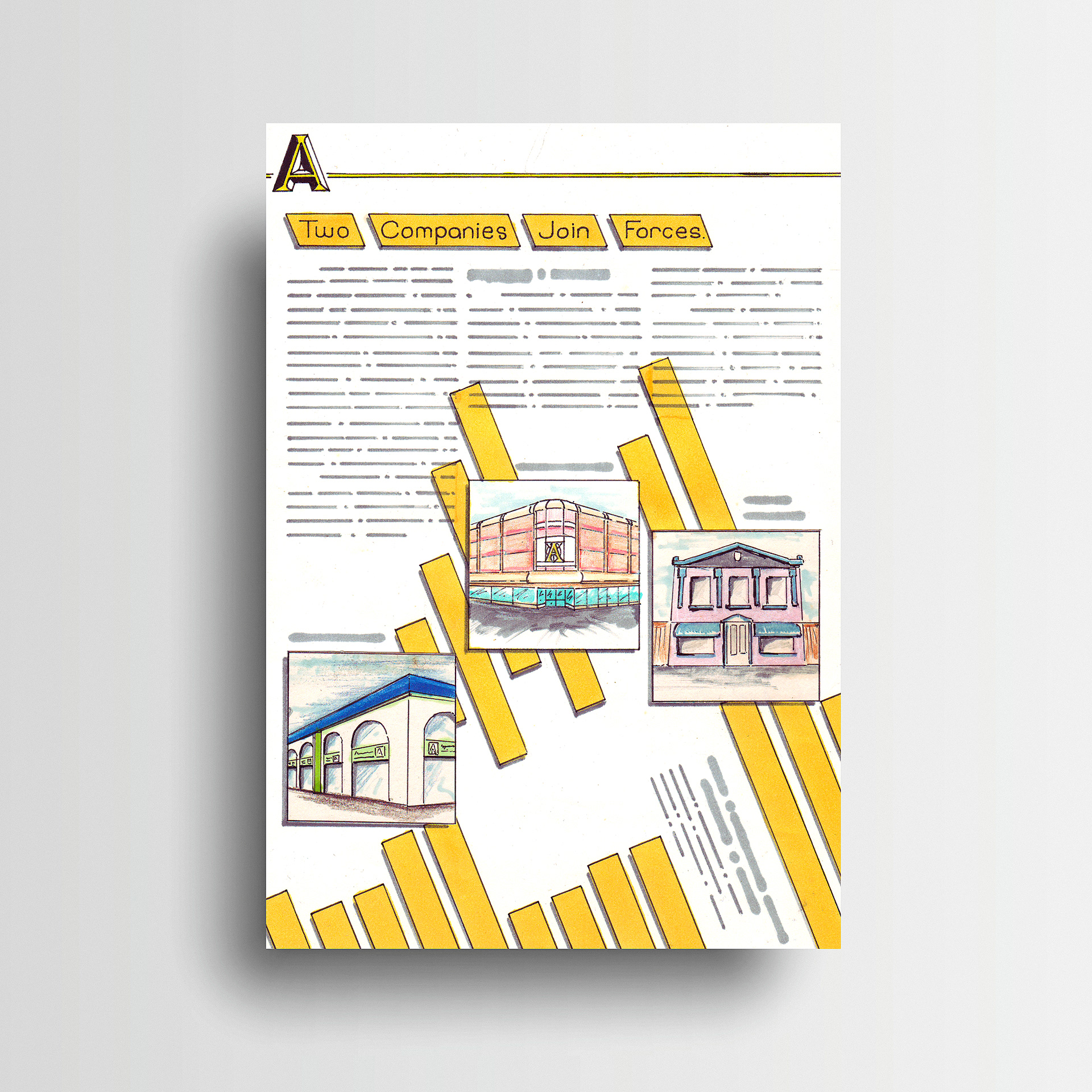
Two local furniture import businesses, Artes Studios and Arredorama, were merging during the time of Stephen's studies at the KvB College. For their final portfolio students were tasked with creating a new brand identity to reflect the coming together of the two product range styles, classic and modern. Stephen's solution is reflected in the completed brand logo, using a serif 'A' chiselled from a sans serif character. The embodiment of modern and classic combined into one form. This produced a logo that delivered the brand message in a clear and precise manner. It sits comfortably with the brand names to form the brandmark or stands firm by itself in the subsequent design collateral. Striving to convey the desired feeling or information in its purest form continues to be a hallmark of Stephen’s design style.

Art Direction: Stephen Franklin
Graphic Design: Stephen Franklin
Illustration: Stephen Franklin
Artes Studios Arredorama stationery designs.
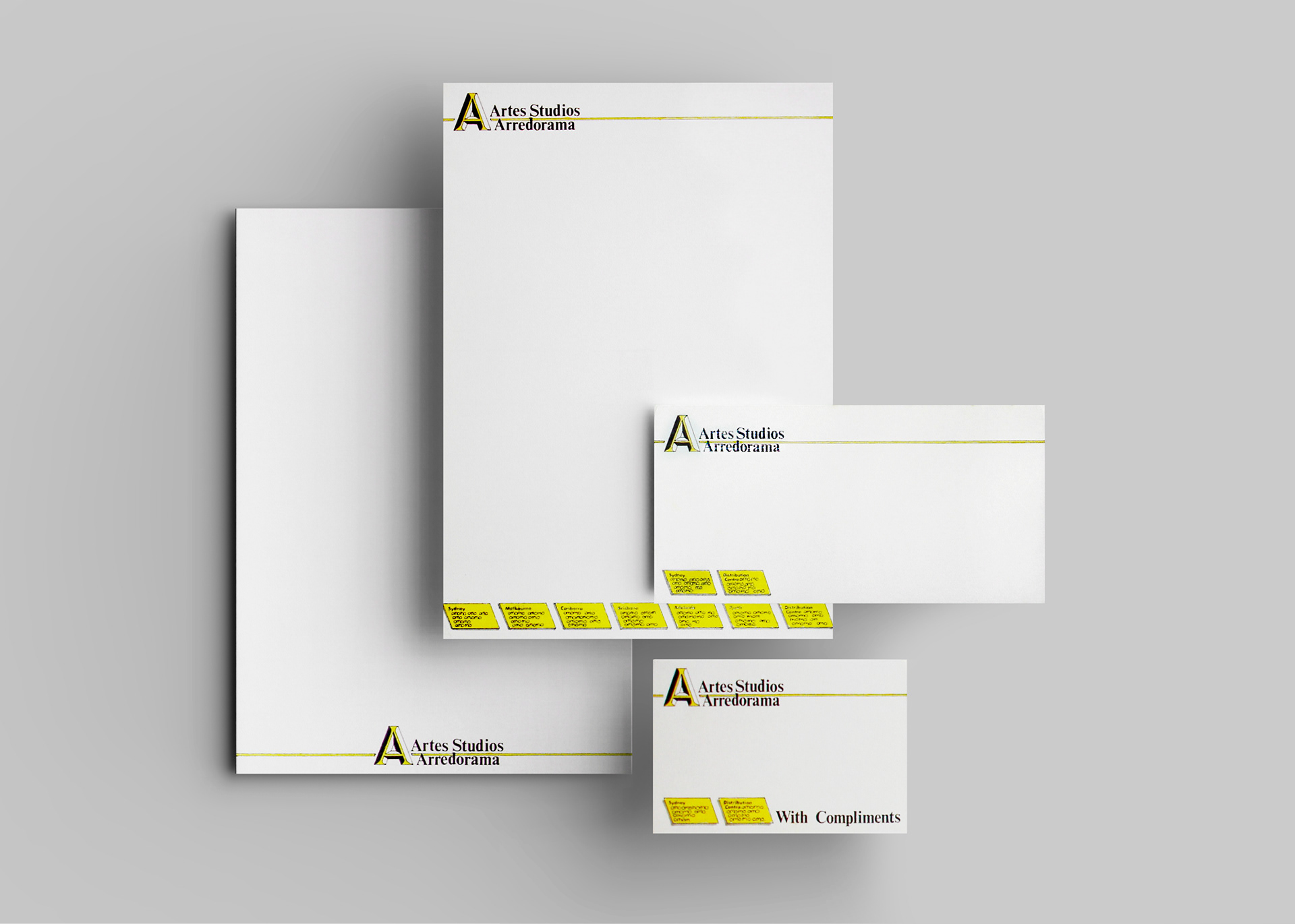
The new brand aesthetic required the use of simple lines and solid shapes in the stationery to match its clean look.
Artes Studios Arredorama brand logo design rendering.
To reflect the contrasting product ranges, yellow, black, and grey were used as the primary colours.
Finished artwork for hand draw brandmark.
All finished artwork for the brandmark was created at an enlarged size to hide imperfections in the hand drawn linework and lettering.
Brand logo hand drawn lettering finished artwork.
Storefront design concept illustrated in marker and pencil.
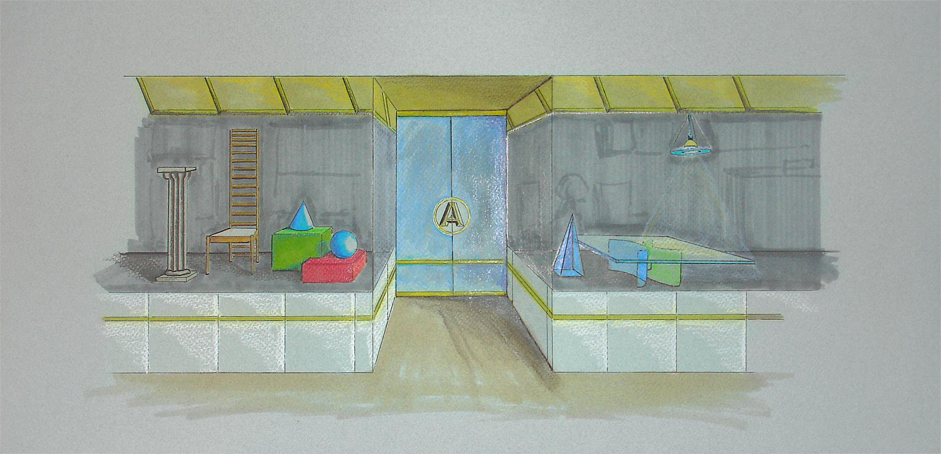
The store front needed to suggest the mix of classic and modern. Clean white and yellow tiles with large panels of uninterrupted glass were used to achieve the result.  
Poster design for Knoll Zapf office furniture system.
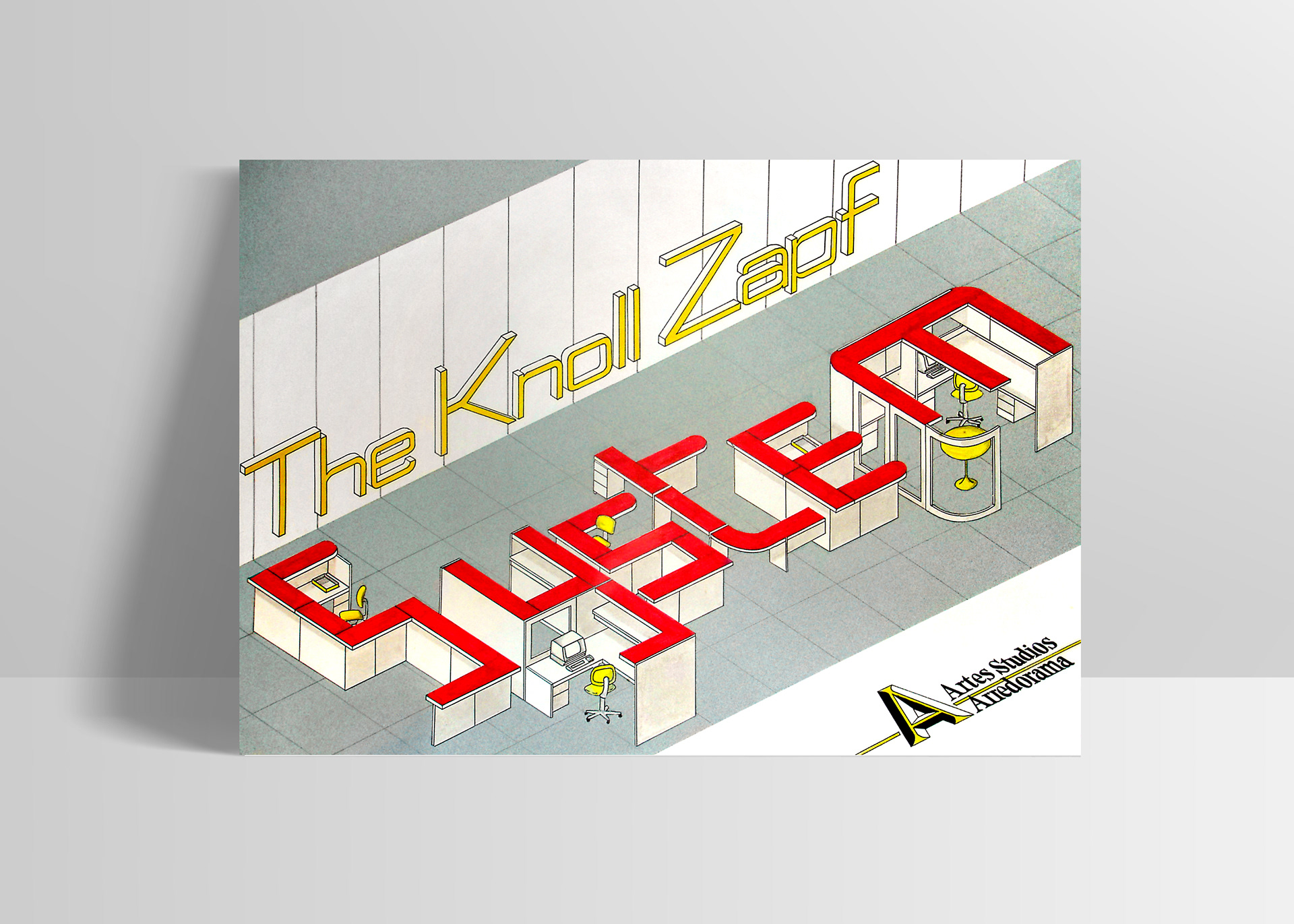
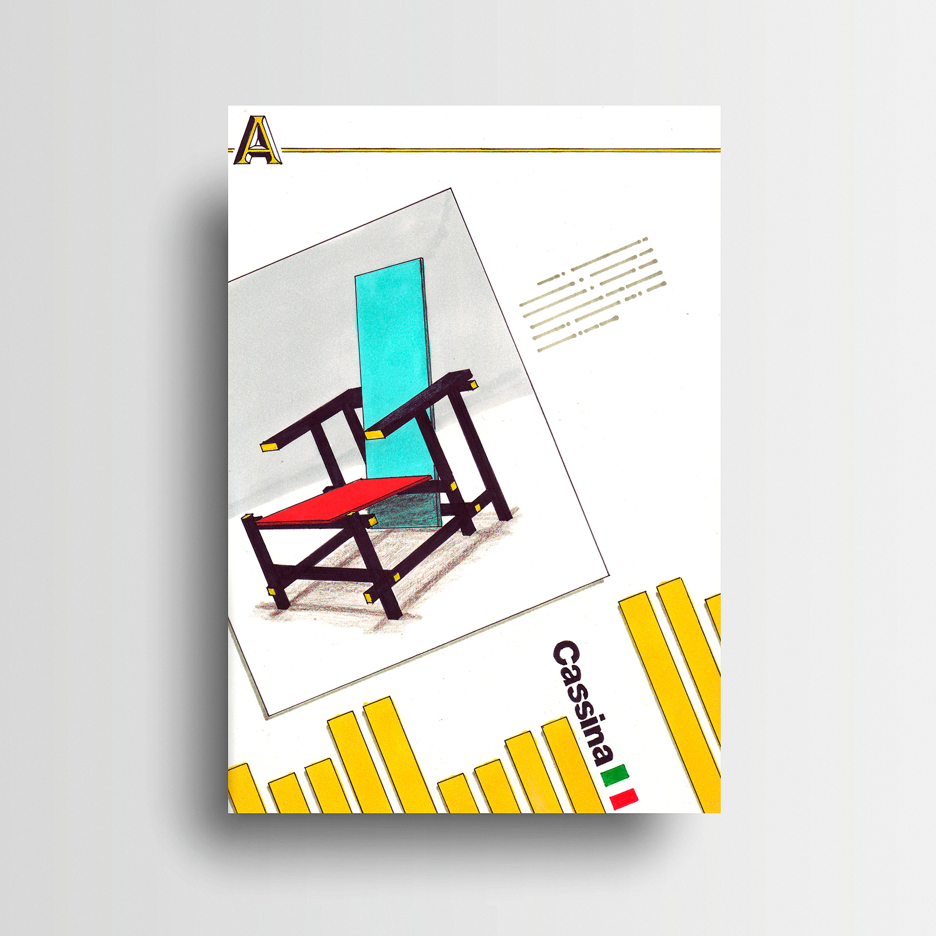
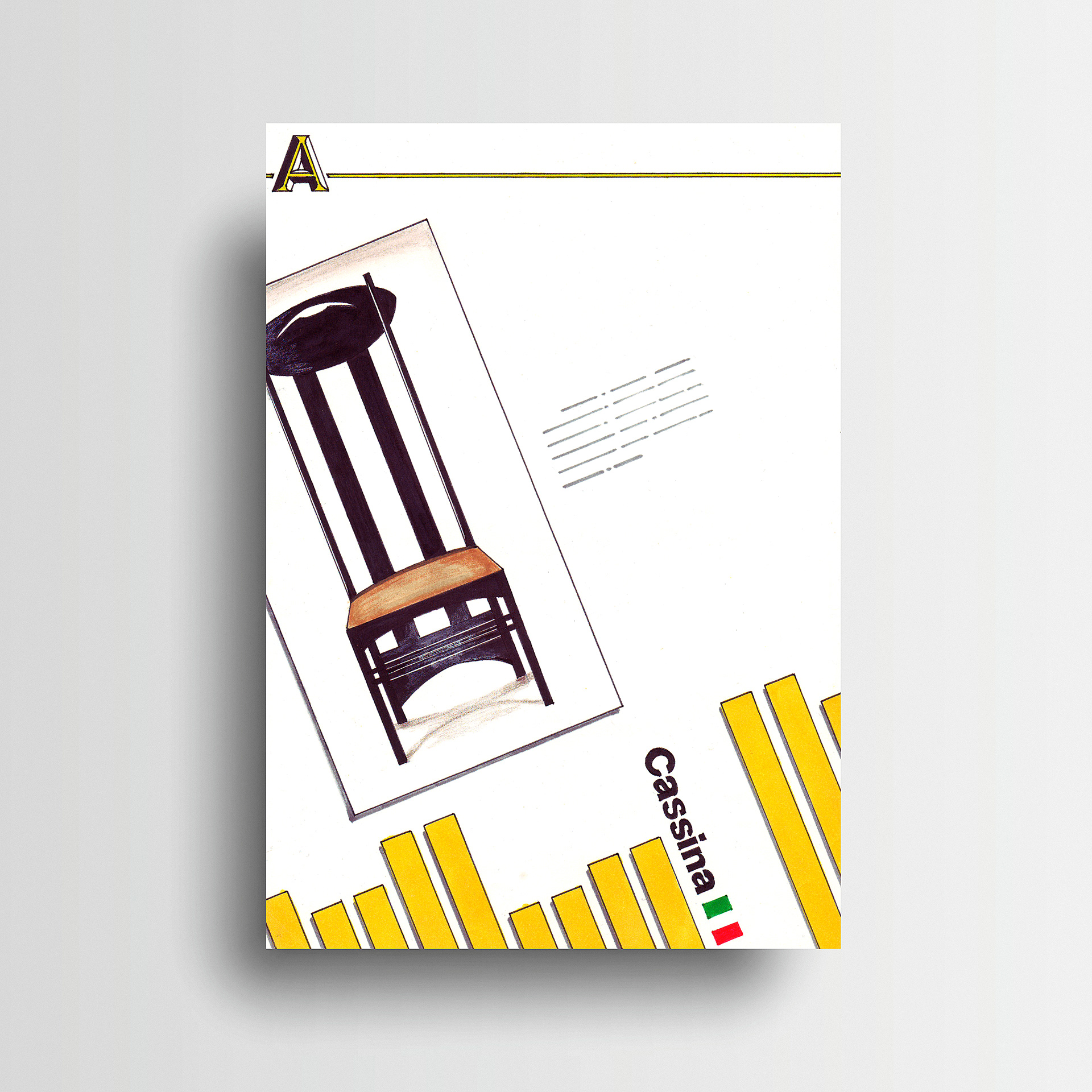
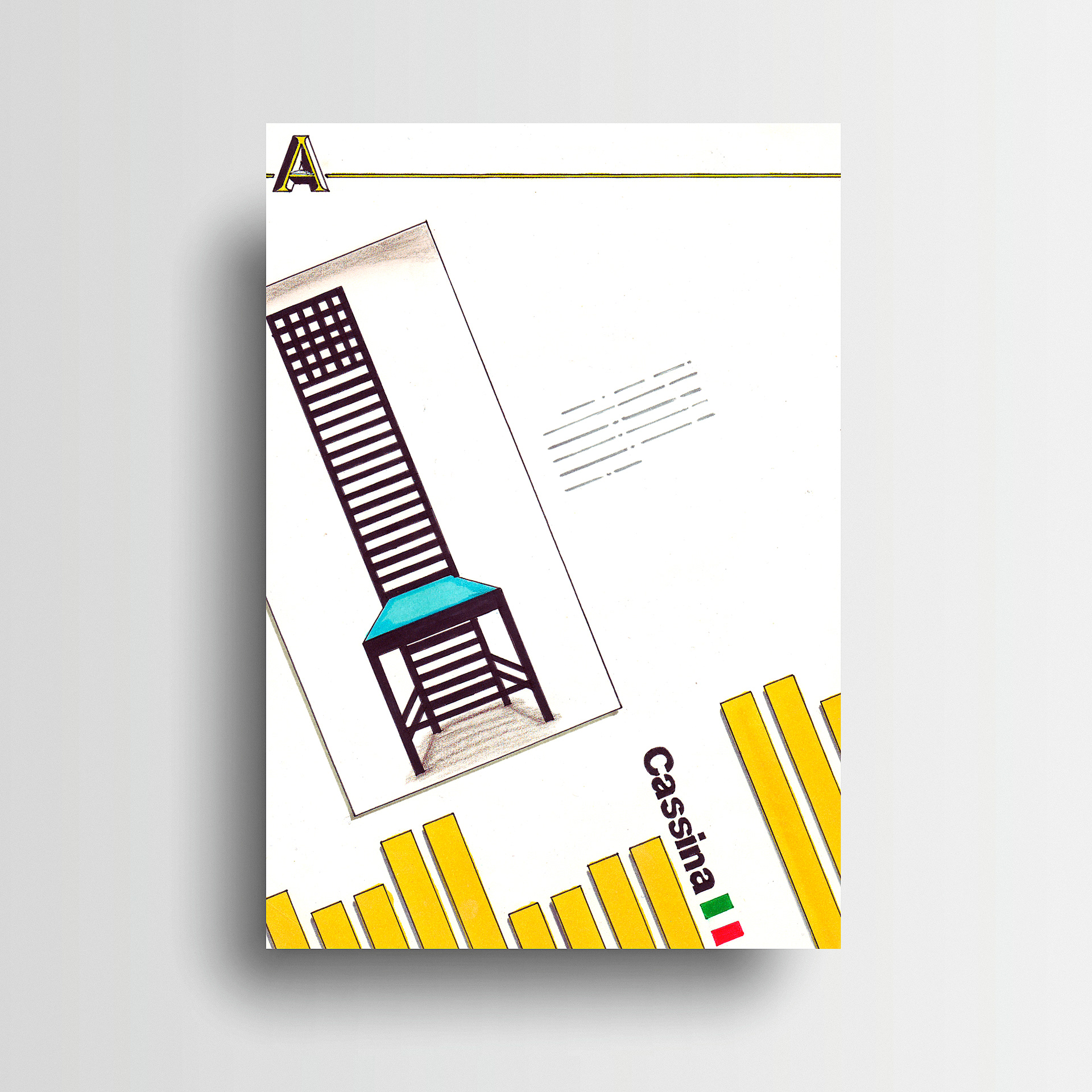
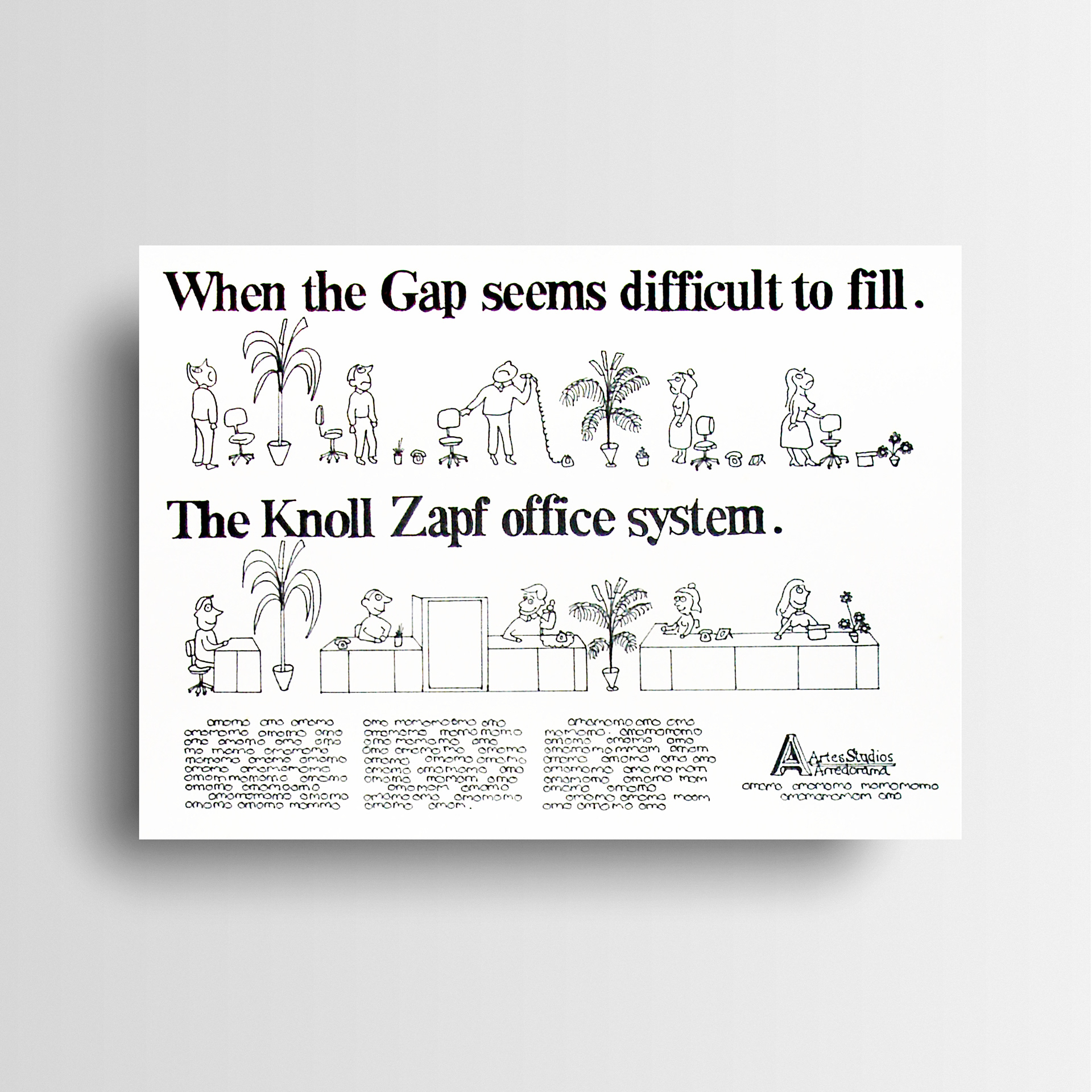
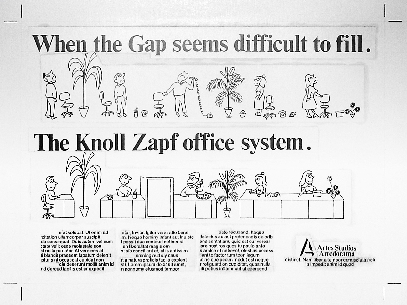
The flexibility of the Knoll Zapf office furniture system is displayed in this full-size poster rendering.
Instore poster design concept.
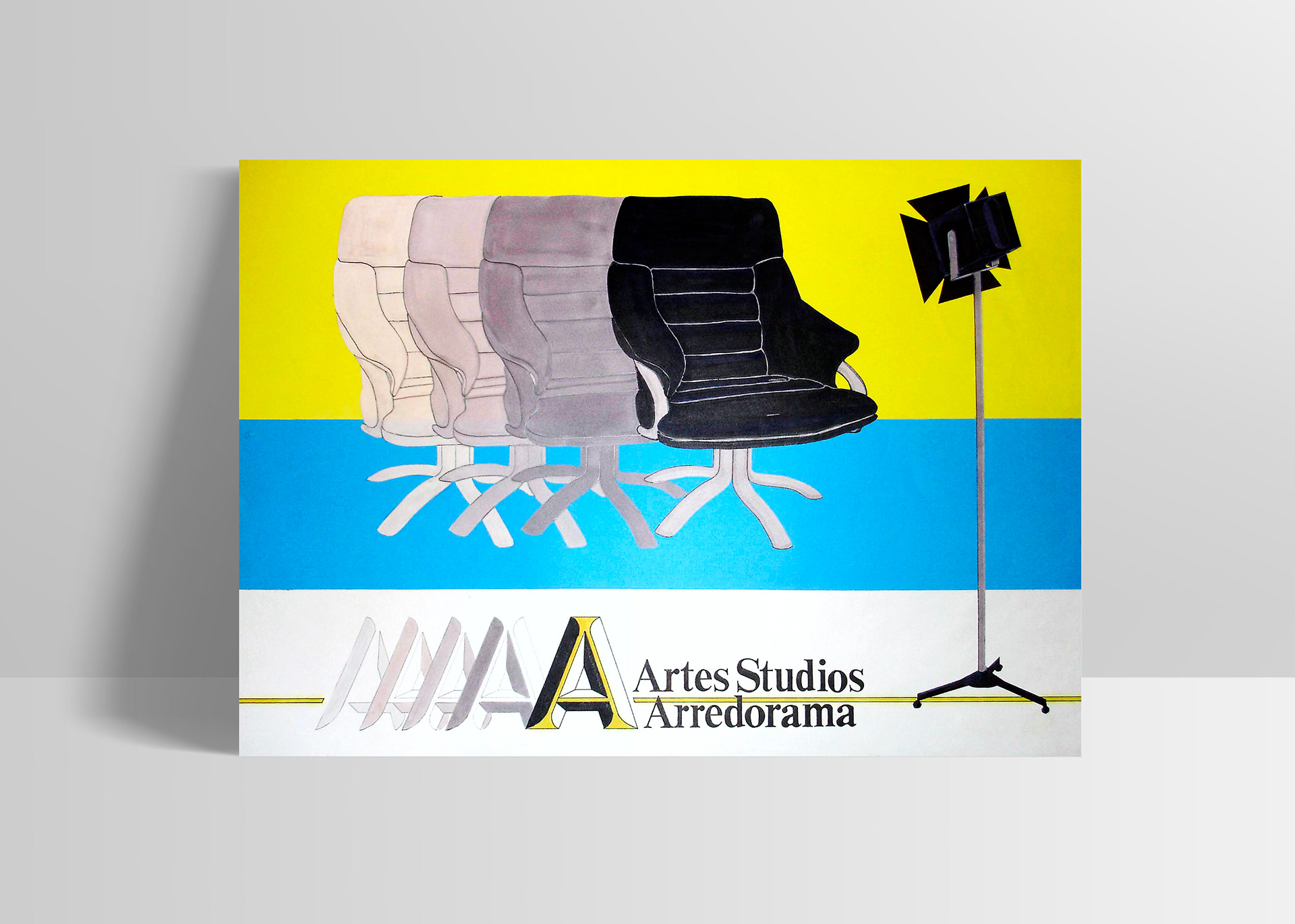
Additional brand poster concept conveying the colour options available instore.
Folder design mock-up for holding A4 product sheets.
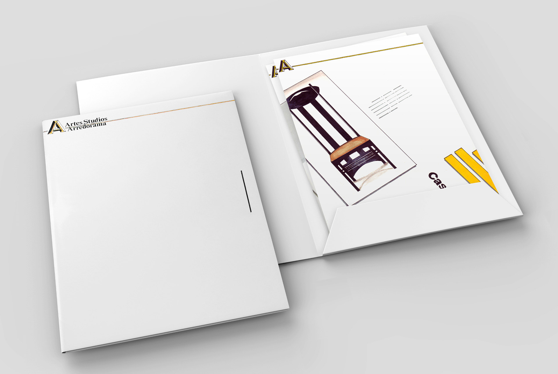
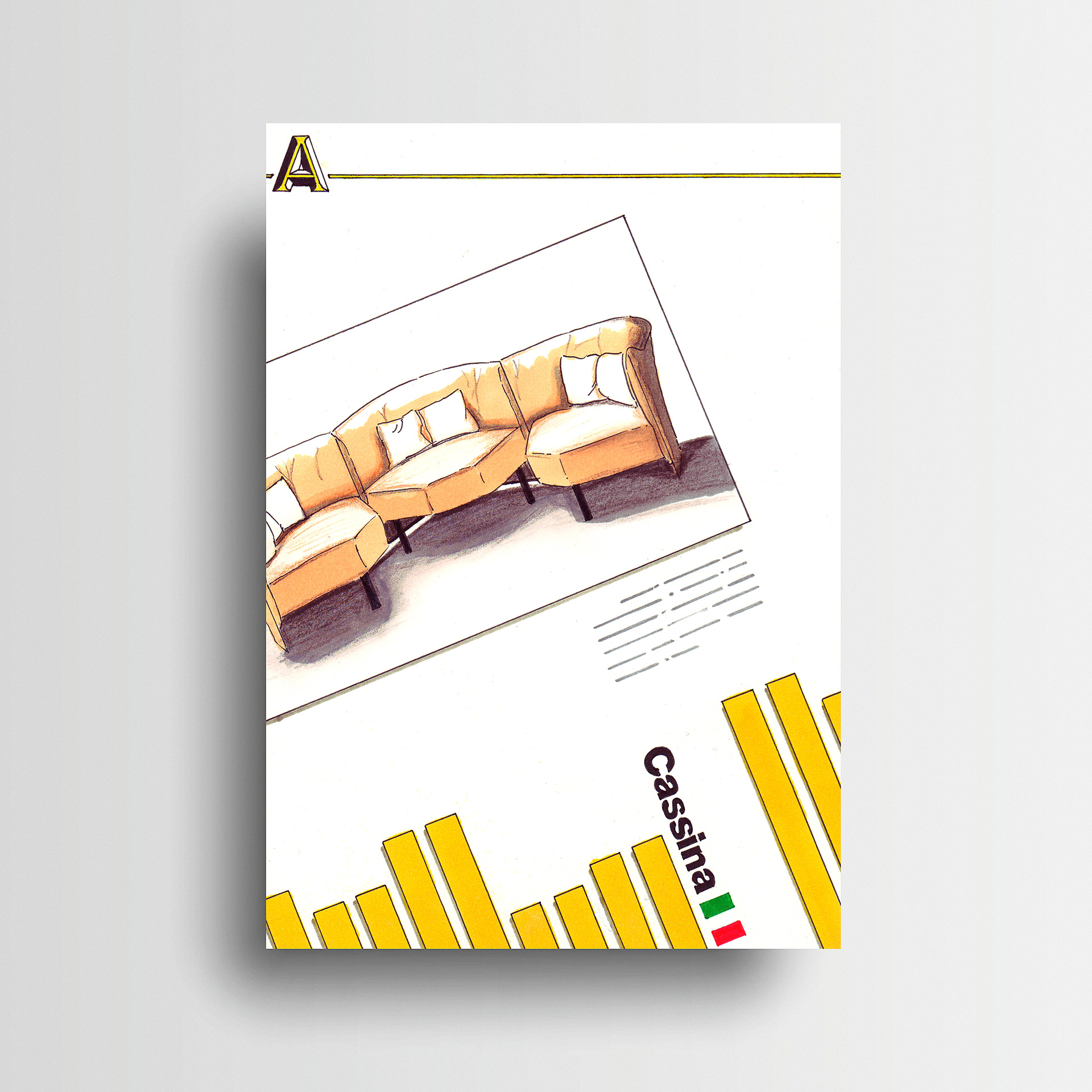
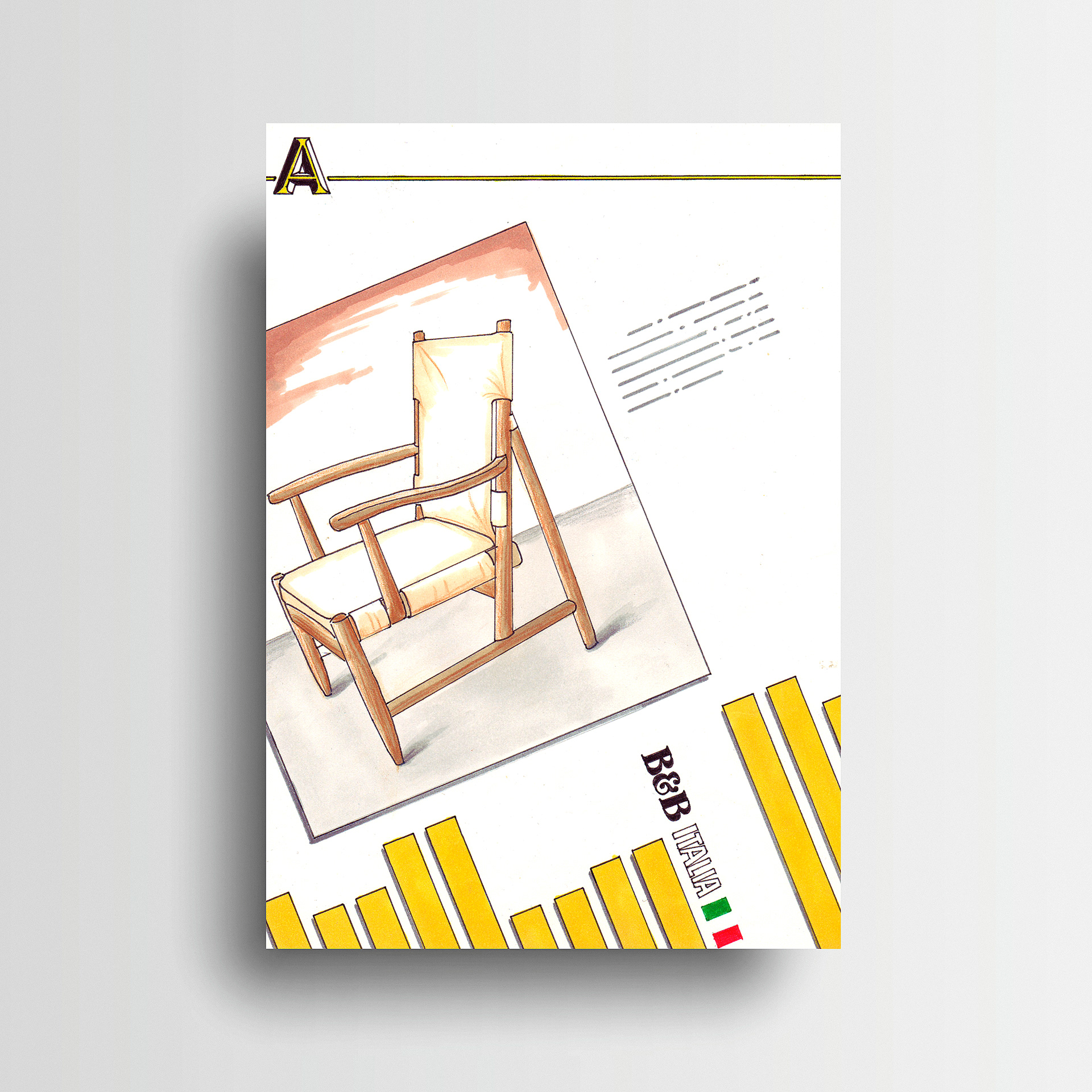
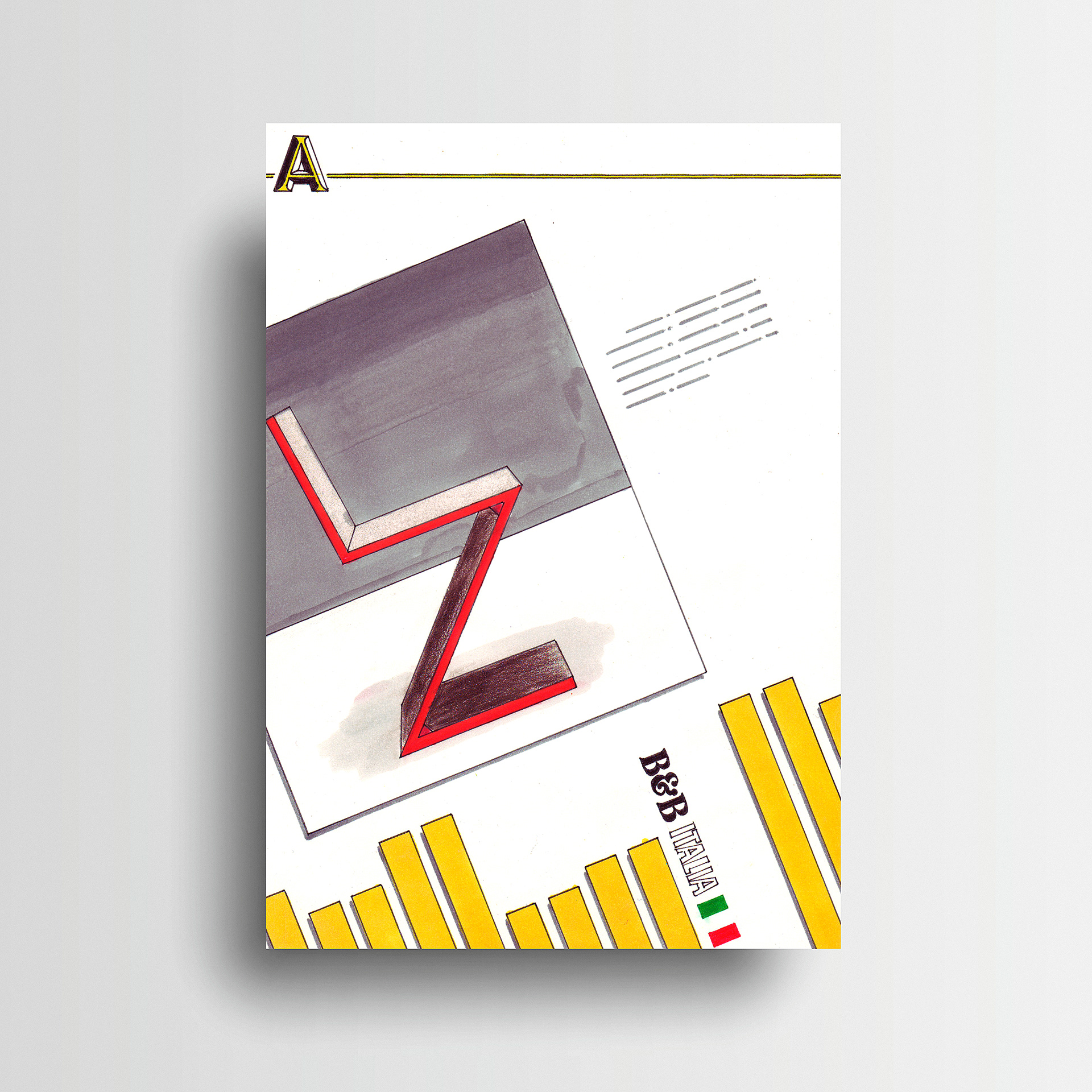
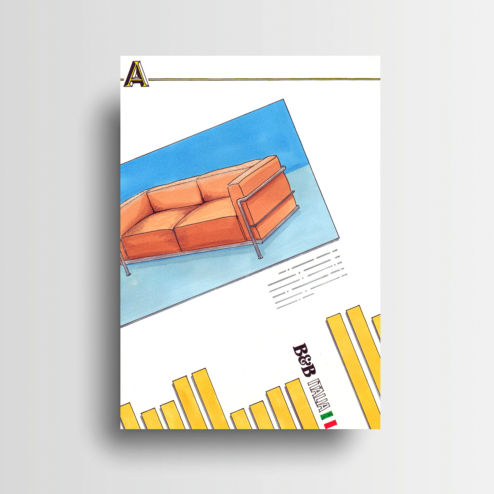
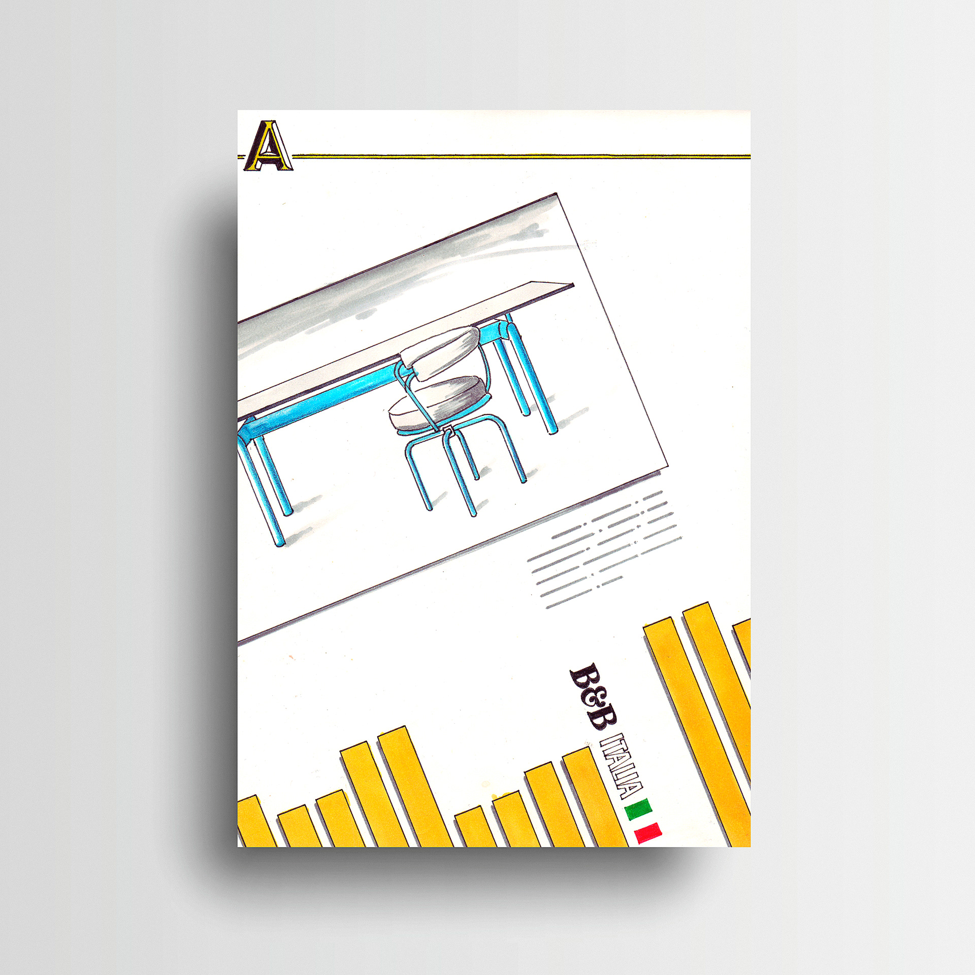
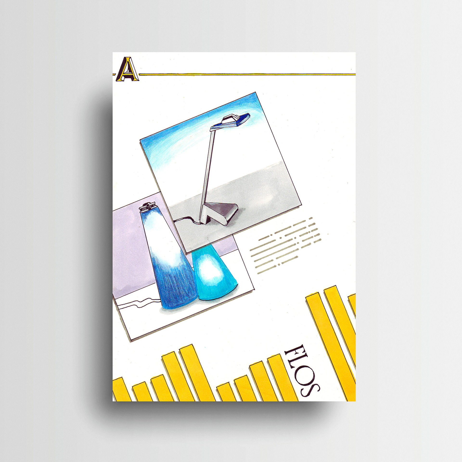
Clean white with simple branding was used in this handmade product folder concept to give visual prominence to the leaflets inside. An angular layout was used for the product sheets to highlight the uniqueness of the individual furniture pieces. Hand drawn finished artwork of the product folder and leaflet template was required for the final portfolio submission.​​​​​​​
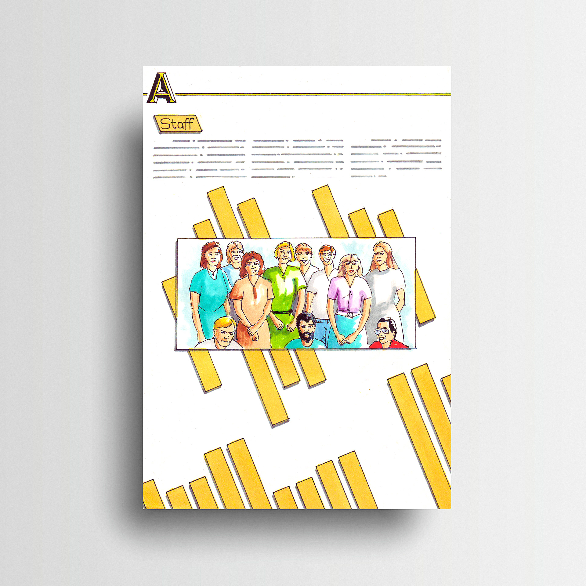
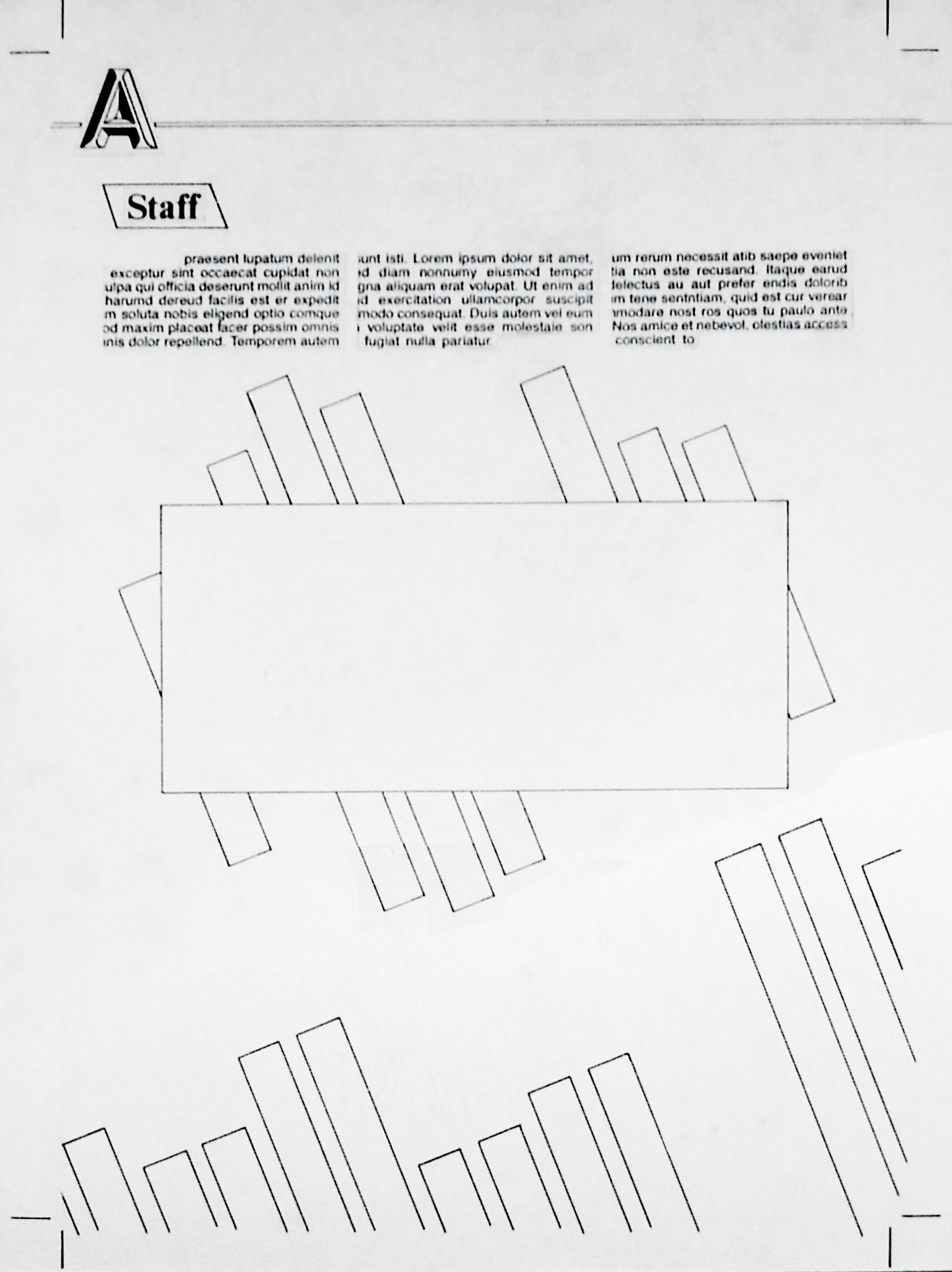
Hand comped finished artwork for Staff leaflet.
Finished artwork for internal product sheets.
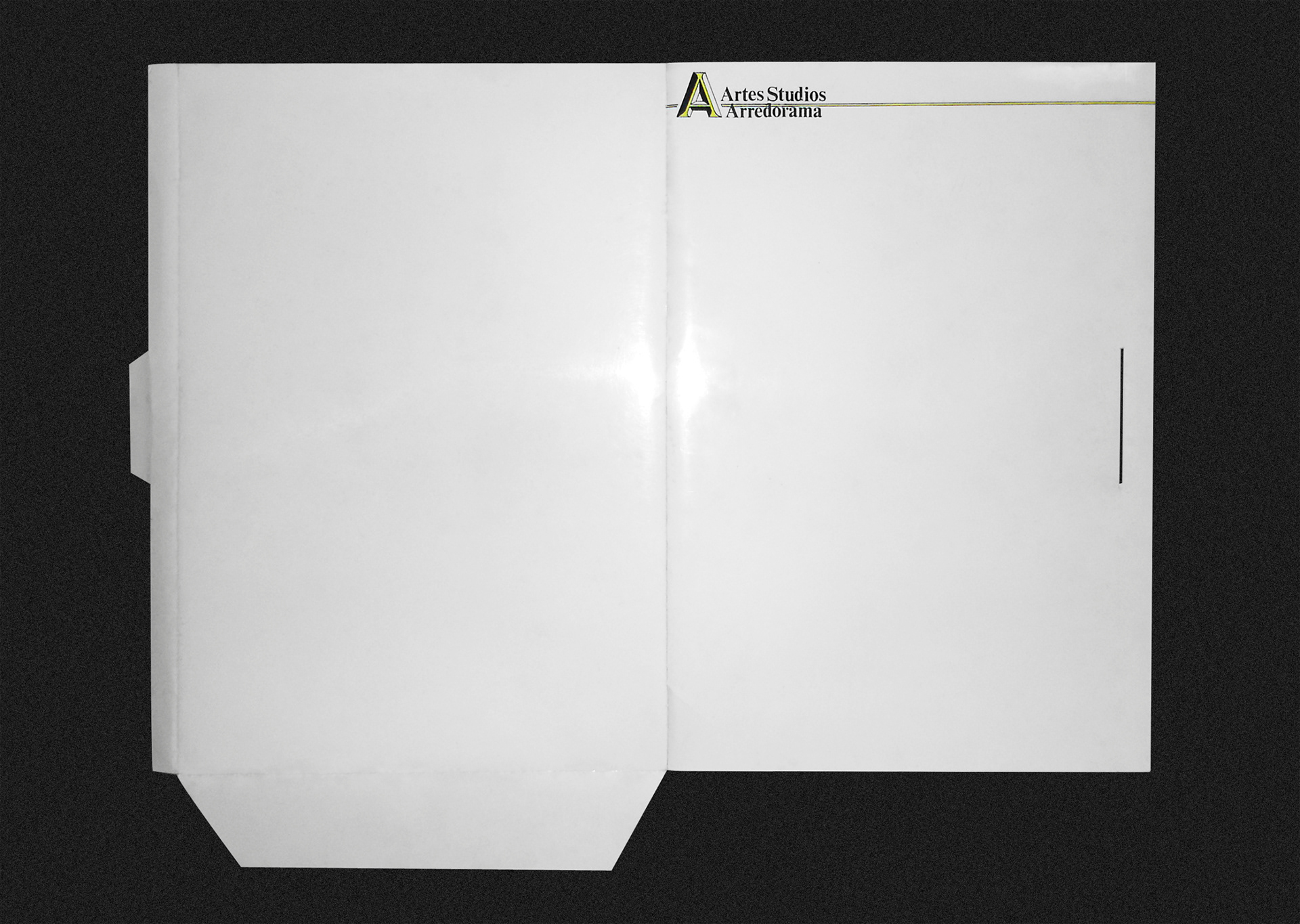
Folder mock-up.
Folder mock-up.
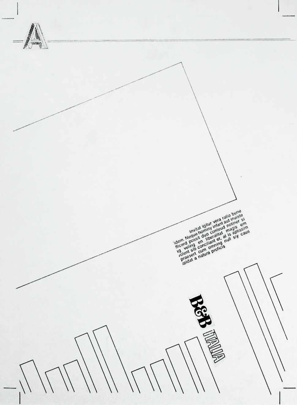
Folder flat hand comped finished artwork.
Single page magazine ad design.
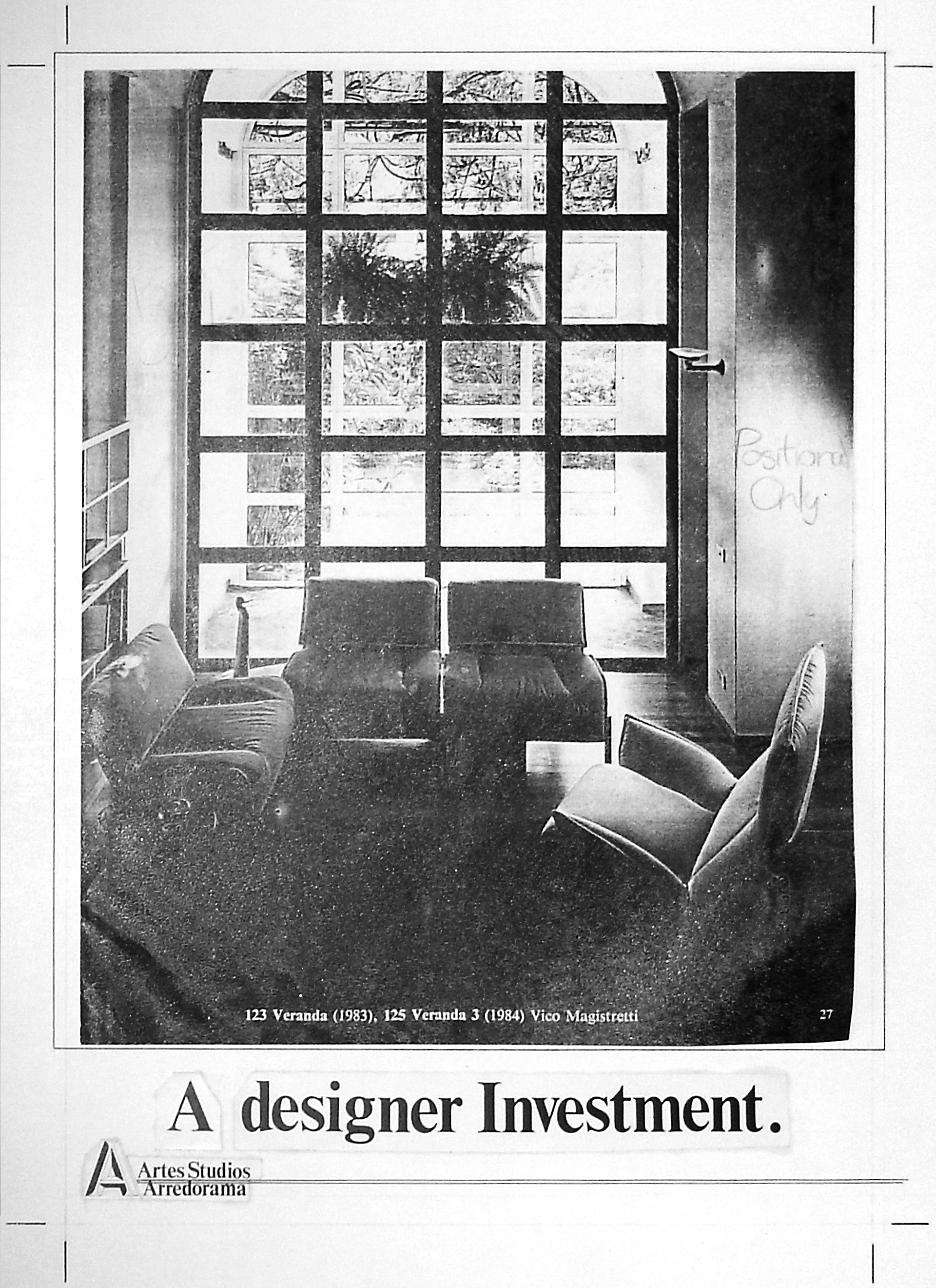
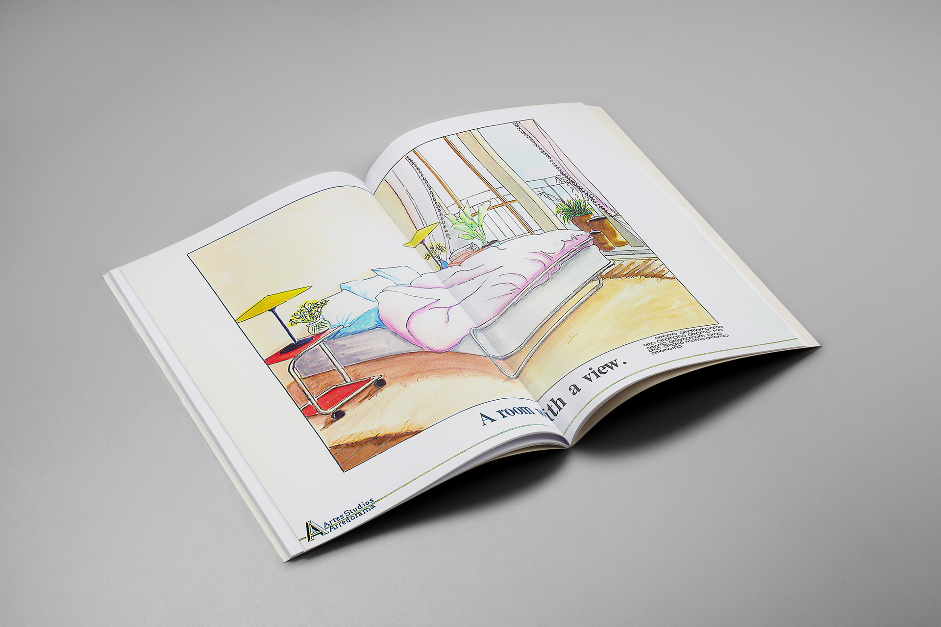
The marketing needed to capture the lifestyle investment promised by the brand, as seen in the half page, full page, and double page ads below. All the marketing concepts presented in the portfolio required handmade layouts of the finished artwork.
Single page ad render.
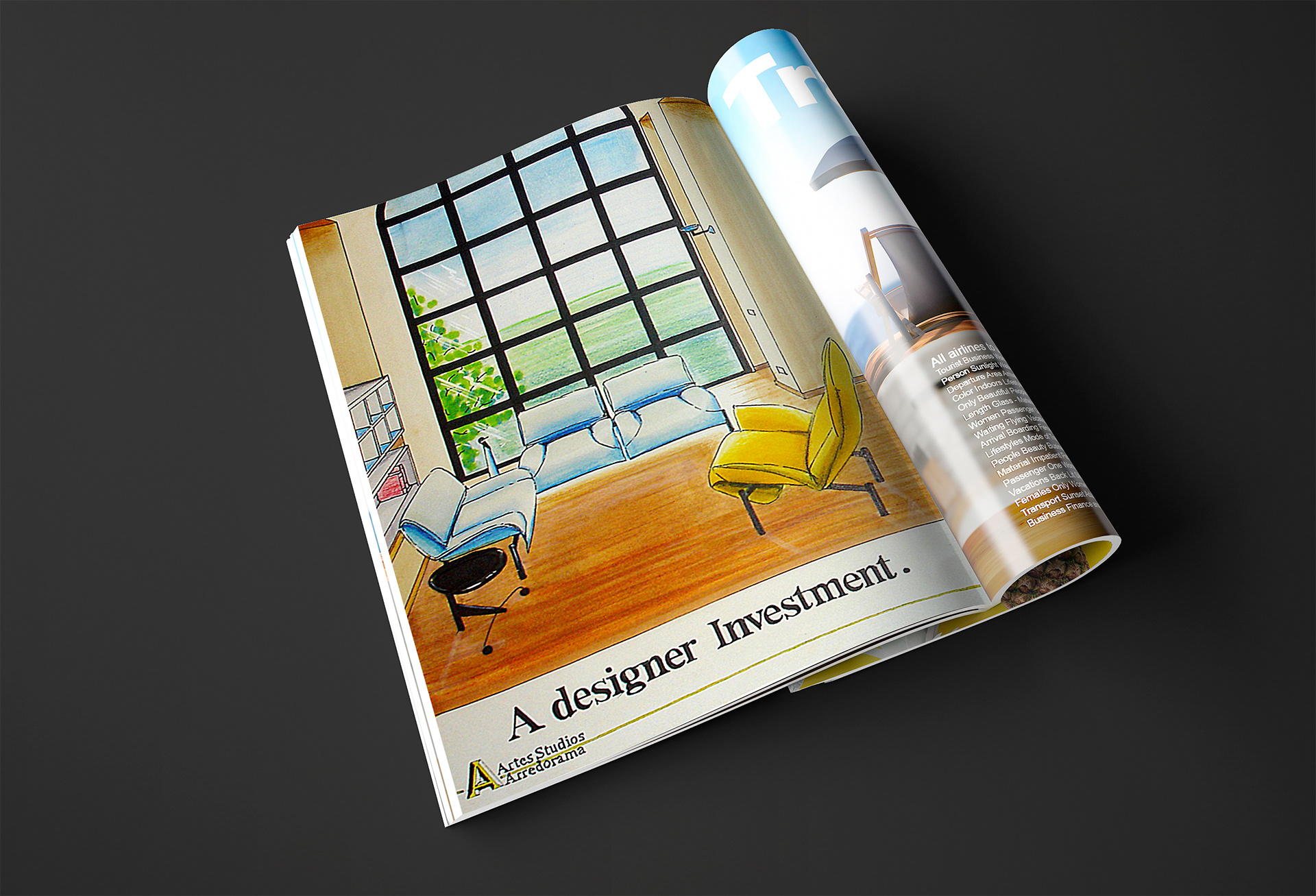
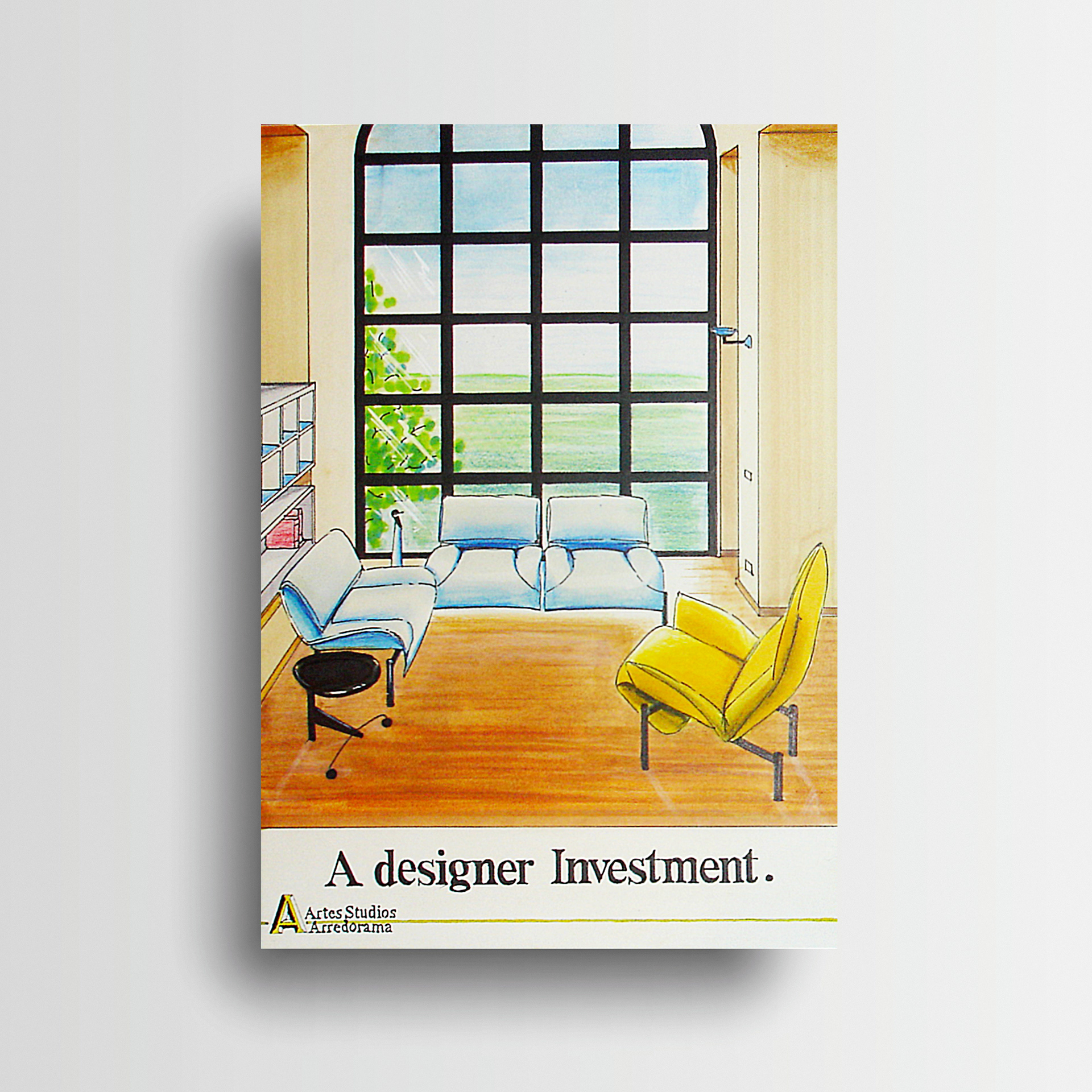
Single page ad finished artwork.
Double page magazine ad design.
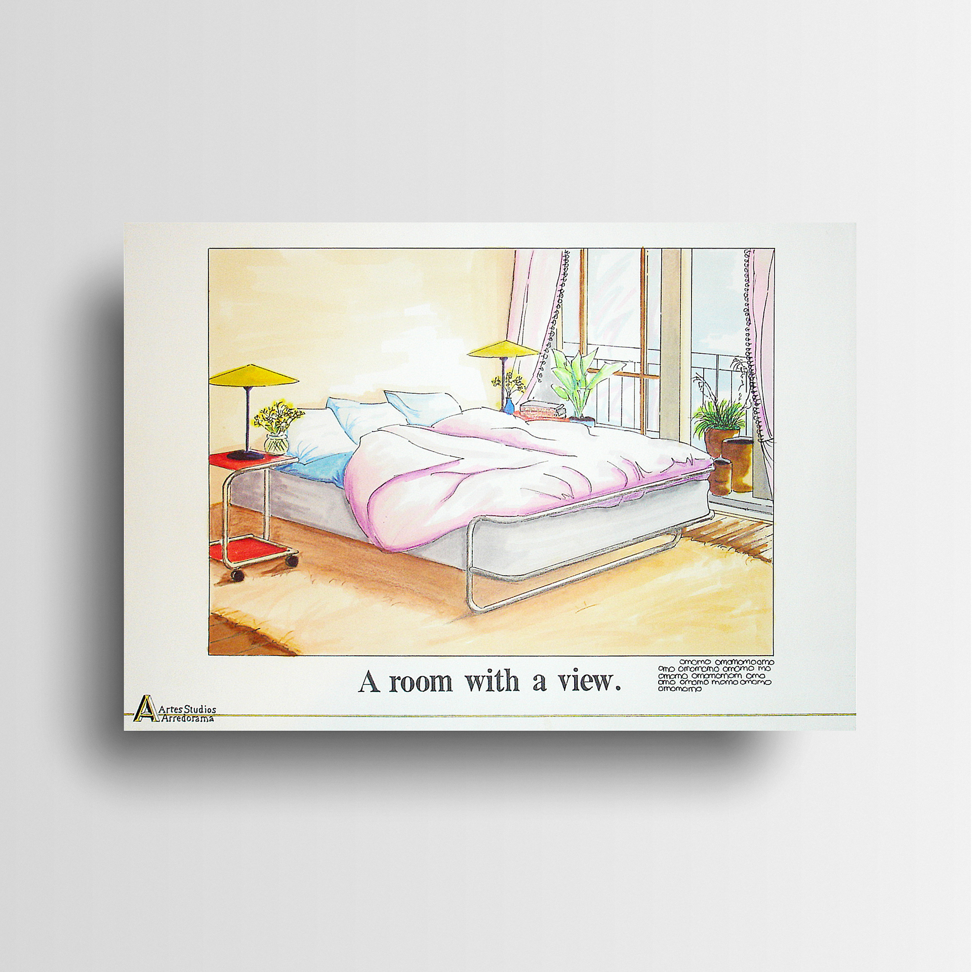
Double page ad render.
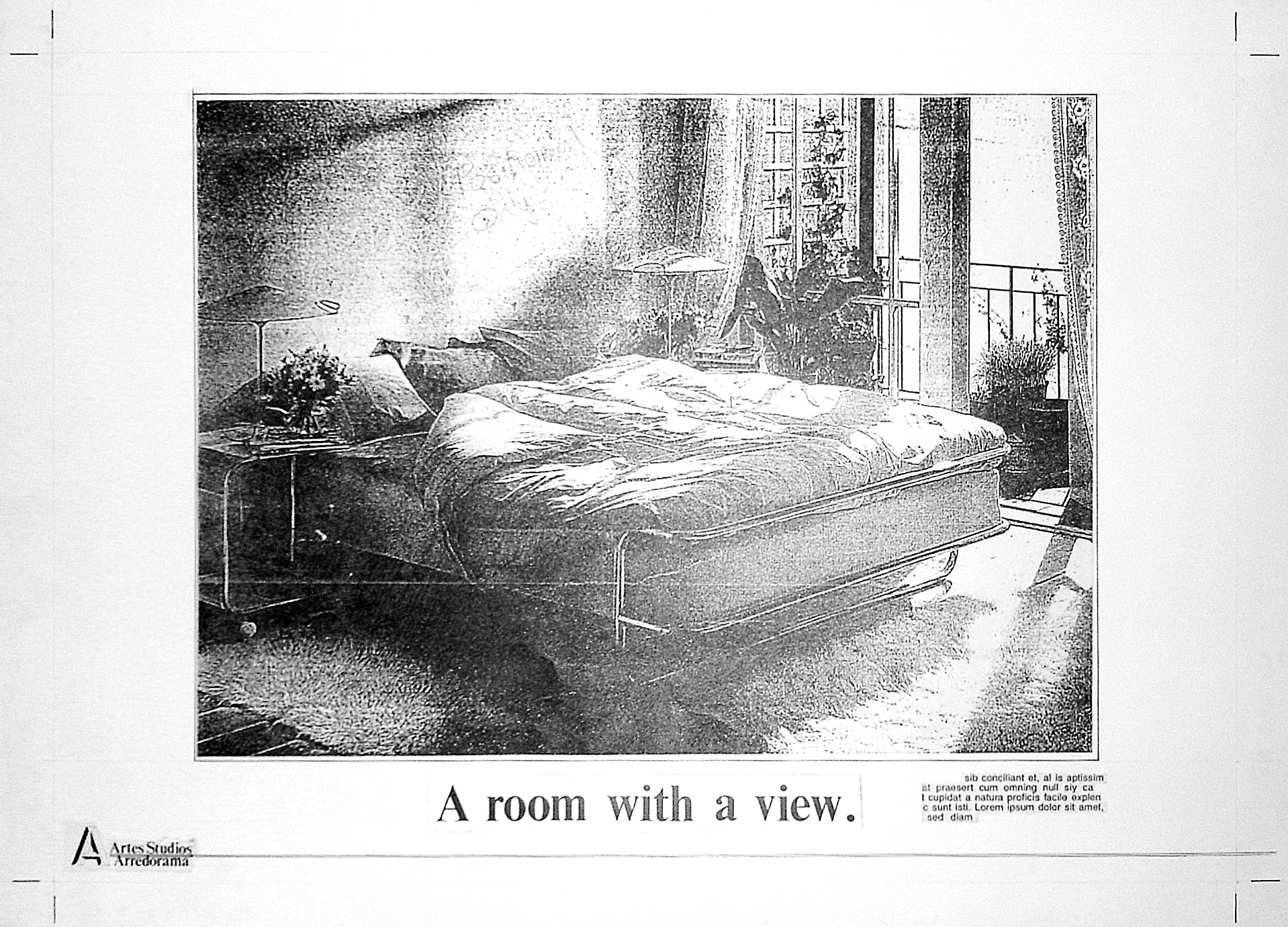
Double page ad finished artwork.
Half page black and white ad.
Half page black and white ad finished artwork.
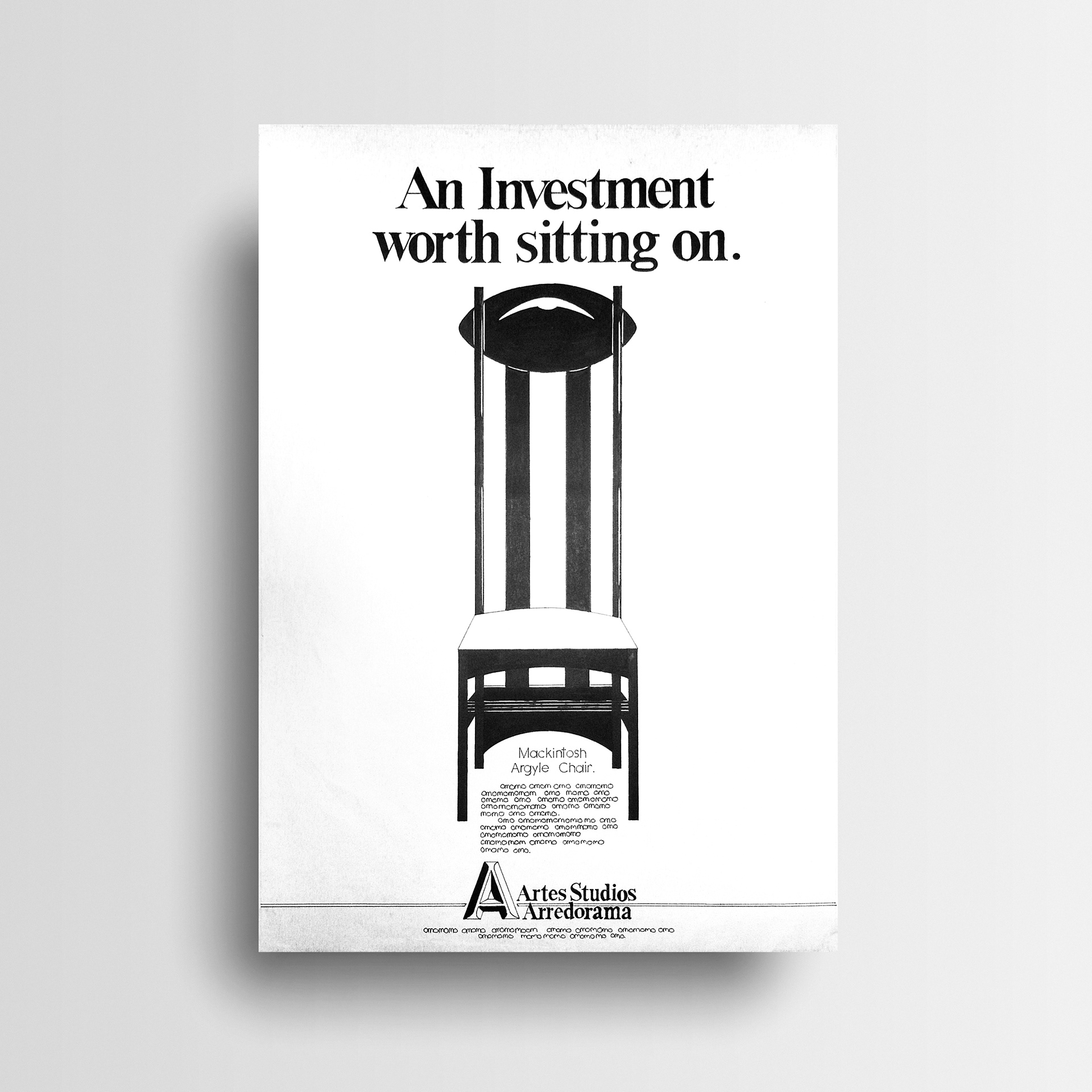
Full page black and white ad.
Full page black and white ad finished artwork.
Opening scenes for television commercial shown in storyboards.
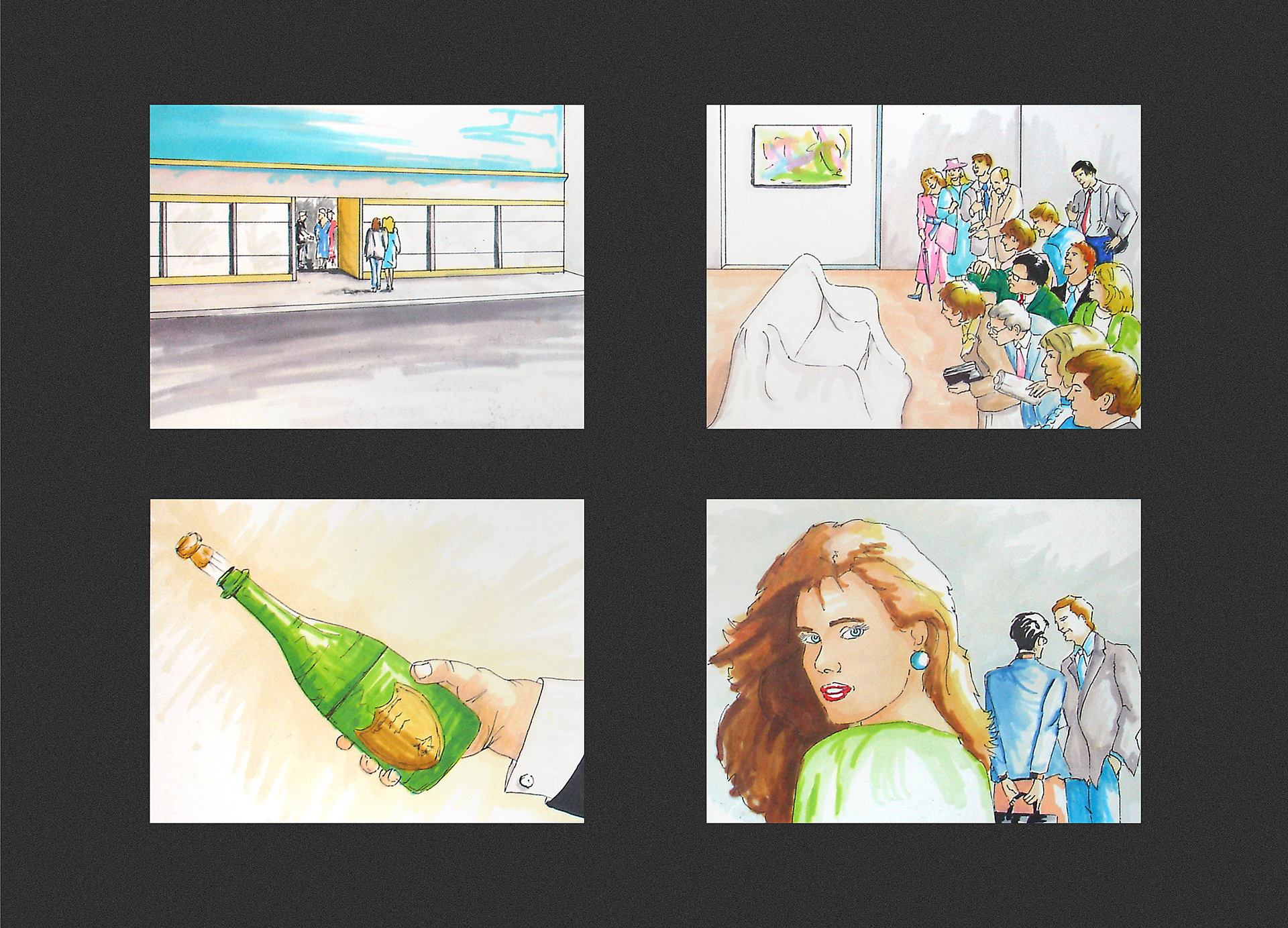
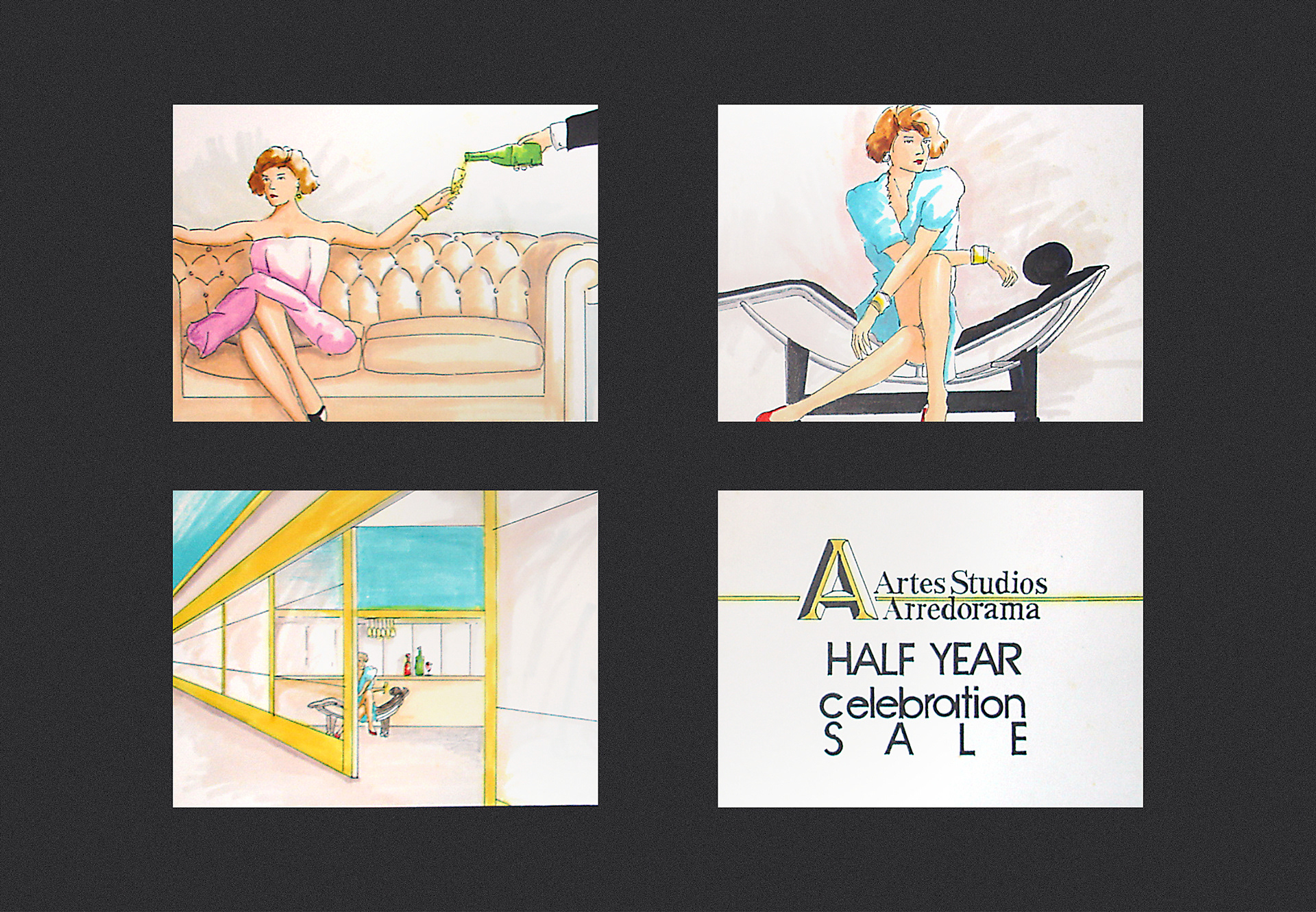
When considering the storyboards for the TV ad, Stephen decided that an art gallery event was the tone required to match the value of the range on sale.
Closing scenes for television commercial shown in storyboards.

View more projects

Microsoft Communiqué Cover Image
Front cover image for the Microsoft Communiqué magazine featuring the new Microsoft Front Page application. Utilising Alias Sketch 3D software to set the lighting and texturing of the composition of the image, and Photoshop for the final shading and colour balance.
Integrated Vision Marketing Collateral
Creative direction and design of various marketing collateral for Integrated Vision, a leading Australian videoconferencing solutions provider. Stephen, operating as Graphic Vision, partnered with the client to produce a range of items including, a Quarterly Newsletter, DL Brochure, and DL Promotions, managing all designs from concept through to prepress and final print.
Wyeth BioPharma Work Life Harmony Week
Designed both print and digital components for the Wyeth Bio Pharma - Work/Life Harmony Week. This included various printed pamphlets and messaging pieces along with the UX/UI for the program’s website.
Thick & Thirsty Point of Sale Hero Image Retouching
Retouching of hero image for Thick & Thirsty point of sale promotion.
Microsoft Catalogue Cover Image
Cover image of the Microsoft Windows product catalogue produced for the Frontline agency, Sydney, Australia. This image is a composite of multiple stock photography images and a photographic shoot involving two models: one for positioning and one for face and hands.
ABOL User Interface Icons
Created user interface icons for various use cases for the Australian Business Online (ABOL) website, commissioned by Hothouse Interactive, Sydney, Australia.
AGL Brochure Illustrations
Children's alphabet blocks illustrations created for an AGL bill payment brochure.
Geezah Logo Design
Logo and stencil design for the Geezah Sound System, Dublin Ireland.
TAFE NSW Snakes & Ladders TVC Illustration
Snakes and ladders illustration used as the central prop for a TAFE NSW television commercial. Final artwork was produced at a size of 3 x 3 metres and used on set. The largest snake was later animated and composited with live action to complete the ad.
Escape to Luz Illustration
Cover illustration for the Escape to Luz promotional brochure.
Back to Top