When the Tony Ferguson brand team was being absorbed into a new business entity run by Terry White Chemists management, the Ishimodo Agency was tasked with creating a style guidelines document as part of the handover. The brief was to prepare an easy-to-follow document outlining essential brand and style elements to ensure consistency across all communications. Having worked on all facets of Tony Ferguson’s brand collateral, from packaging to marketing materials and point of sale, Stephen could compile a cohesive design language, codifying the work he had completed for Ishimodo’s client. The result was a comprehensive set of rules and styles that gave the new management team a unified visual reference while managing the existing Tony Ferguson Brand assets.

Design Direction: Ishimodo Brand and Design Agency
Creative Direction: Stephen Franklin
Graphic Design: Stephen Franklin
Front cover of the Tony Ferguson Brand Guidelines.
Stephen kept the cover simple, utilising the front of pack design from some recent Tony Ferguson packaging work.
Clear space rules for the Tony Ferguson logo.
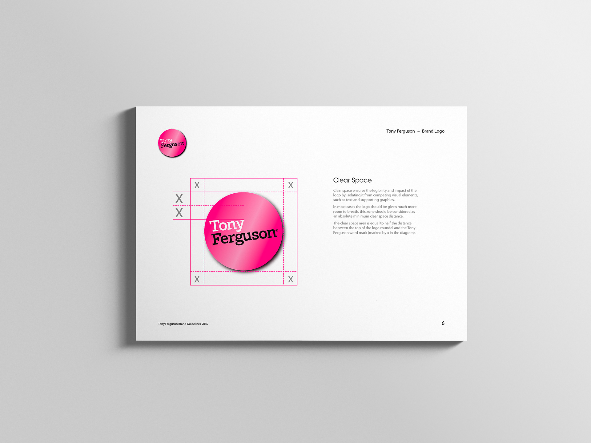
Although Franklin hadn’t worked on this version of the Tony Ferguson logo, he was able to develop clear space rules for this new brand lockup.
Typography style guidelines for the Tony Ferguson brand.
The typography was reduced to a simple choice of either a primary or secondary typeface.
Colour guidelines for the Tony Ferguson brand.
An essential set of colours and gradients were pulled together from the Tony Ferguson packaging and marketing materials
Imagery and photography suggested style guidelines.
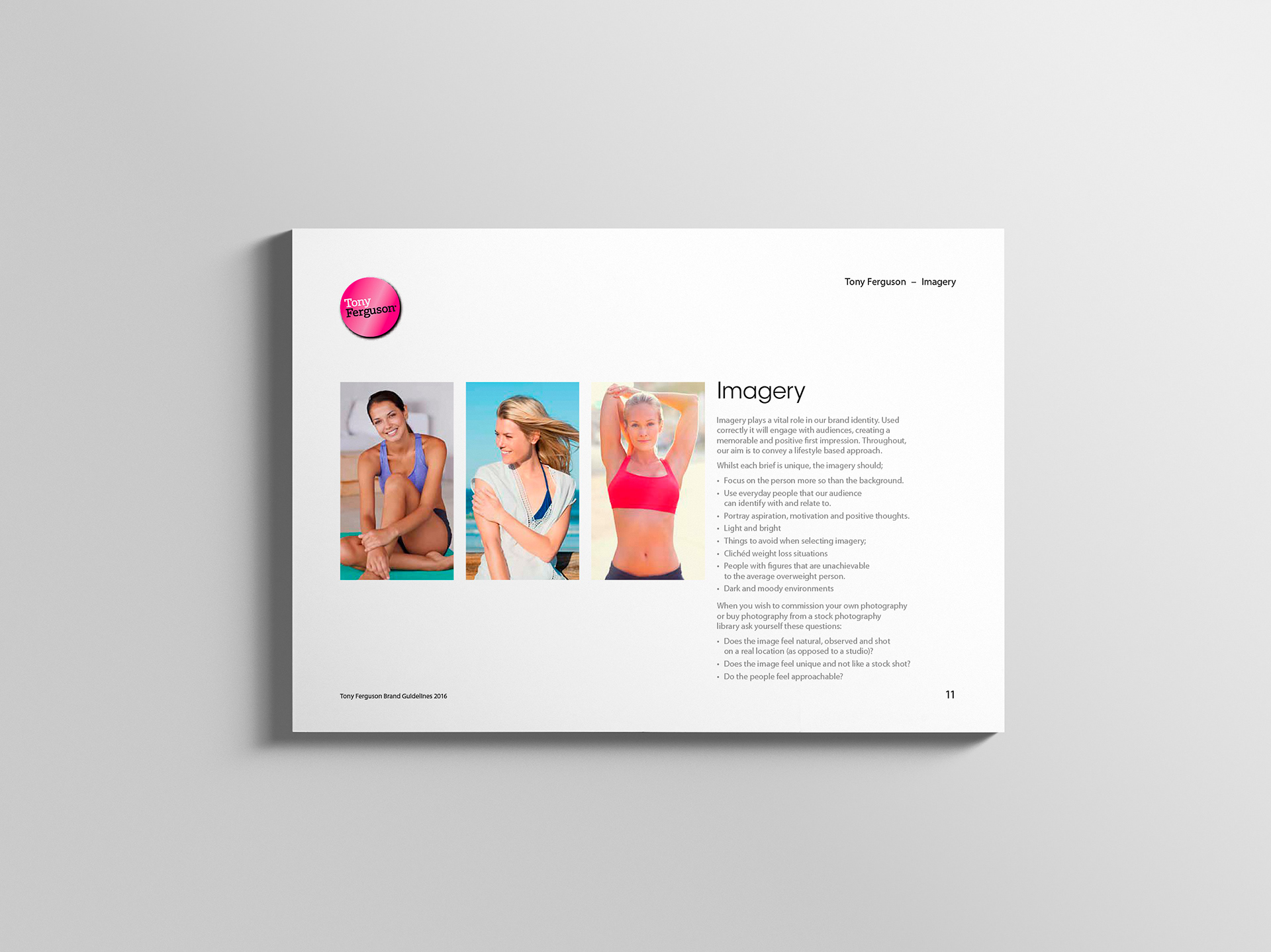
Franklin had set the tone of the imagery during his work on the Tony Ferguson Point of Sale projects.
Design guidelines for the Tony Ferguson brand packaging.
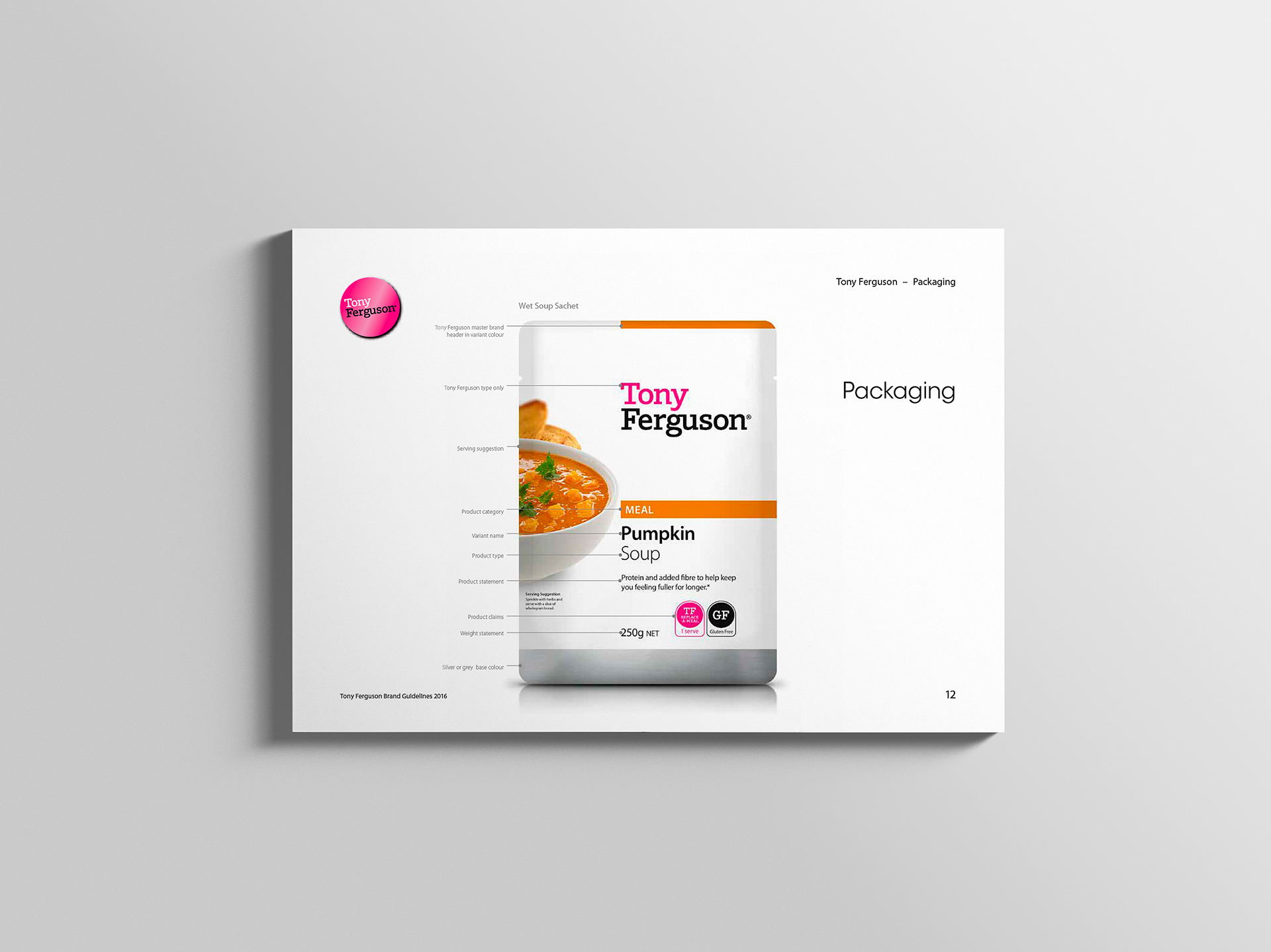
Stephen had worked extensively on the Tony Ferguson packaging, allowing him to break down the Front of Pack design hierarchy for the guidelines. 
Point of Sale marketing guidelines based on an instore poster.
This poster worked as an excellent case study of the style guidelines used in Point of Sale and advertising materials.

View more projects

Vivant Creations Brand Management
Brand management for Vivant Creations, including the design and development of multiple Vivant product ranges from initial concepts through to final products, packaging, and marketing.
Fisher-Price Catalogue Print & Online
Fisher-Price catalogue for the Ishimodo Brand and Design Agency. Included the design and layout of this fifty-two-page publication for use in print and online.
World Vision 2015 Annual Report Design
Creative direction, editorial design, and layout of the World Vision 2015 Health and Nutrition Annual Report for the Ishimodo Brand and Design Agency.
Black Rice Brand Identity
Creative direction and design development of the Black Rice Interiors brand identity for use with in-store signage, business stationery, van livery and website.
Espero Corporate Identity & Stationery
Design and development of the Espero Logistics Solutions corporate identity and stationery.
ECDC Corporate Identity Design
Creative direction and design of the Eastern Cognitive Disorders Clinic (ECDC) corporate identity.
Bink Kids Brand Identity
Creative direction and design of the Bink Kids brand identity, including the wordmark design, brand stationery, and marketing materials for print and online media.
Little Yellow Cloud Brand Identity
Brand identity design for the Little Yellow Cloud® kids clothing brand.
Oban Quality Brand Identity, Stationery & Website
Oban Quality brand identity, stationery and collateral including a refresh of the existing Oban Consulting logo. Also included is the design and development of the Oban Consulting website with an Oban Quality landing page.
Carmichaels Logo
Logo design for Fresh New Media's client, Carmichaels. The project included initial creative direction and the development of the brand for print and television.
Back to Top