Following on from the success of the World Vision 2016 Annual Health and Nutrition report, the Ishimodo Agency briefed Stephen on the 2017 publication. With an established, well-received design, this year's brief was to reduce the document to twenty pages. Franklin refined the layout elements, tightening the section start headers and reducing the size of the breakout boxes, now re-purposed as recommendations. As a result, the report was half the size of the previous year, bringing it down to sixteen pages. Making the final publication suitable for print and digital while losing none of the design elements that made it informative and engaging.

Design Direction: Ishimodo Brand and Design Agency
Graphic Design: Stephen Franklin
Front cover showing a smiling young boy looking up to the title of the publication.
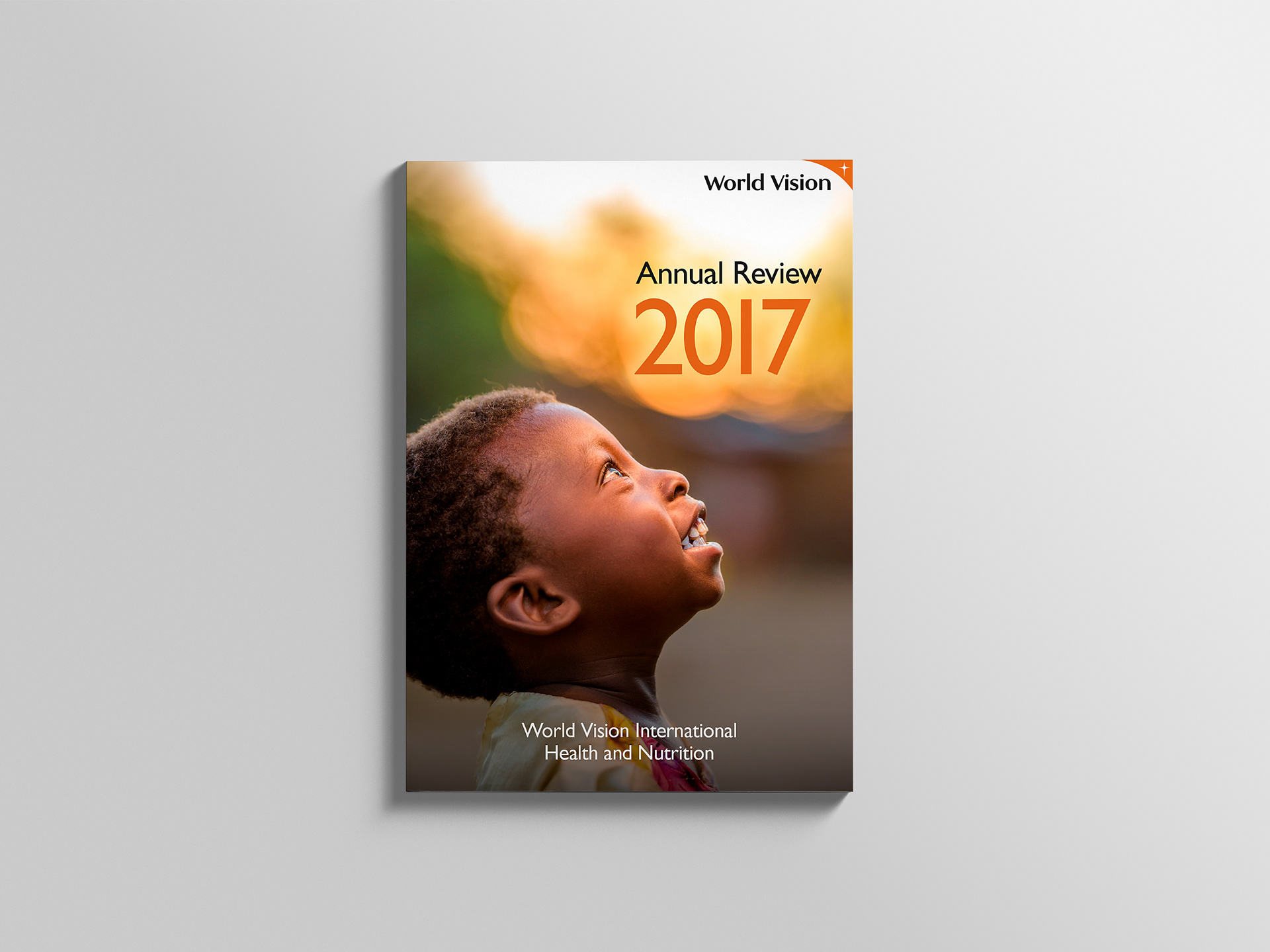
The cover of the 2017 Annual Review went back to a full bleed image like the World Vision 2015 Health and Nutrition Report.
Inside page spread with Introduction on the left and Contents page on the right.
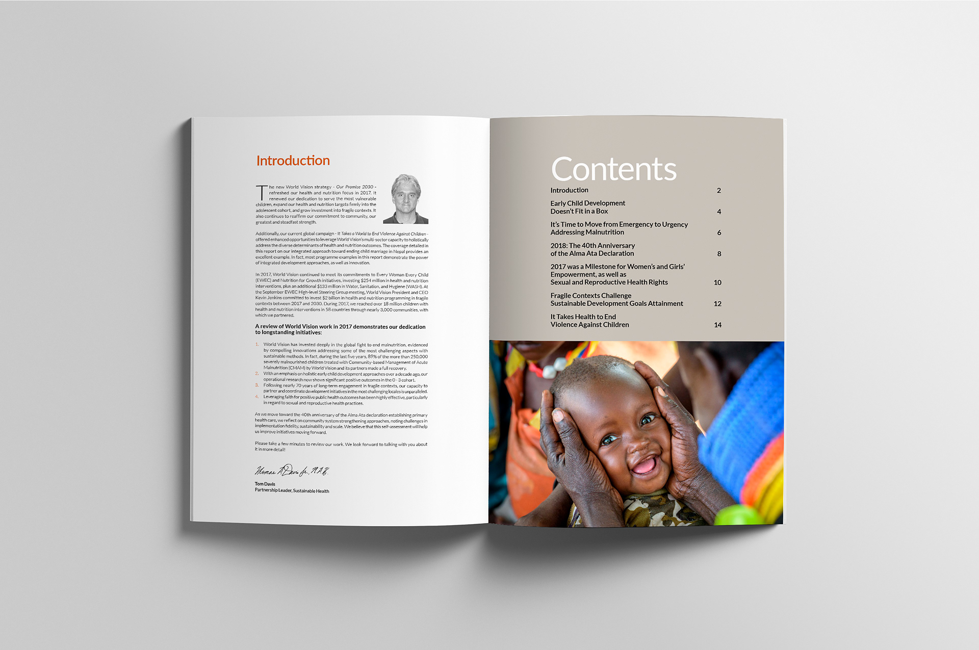
Stephen used the World Vision warm grey from the brand guidelines for the Contents page with a full colour image below. This set the style that was used with the recommendation break-out boxes on the following pages. 
Section spread showing the design changes to various layout elements from the previous publication.
To save space in this year’s report Franklin reduced the section header depth and made the breakout box design smaller and more densely packed with information. 
Section spread showing reflection box and links at the end of the article.
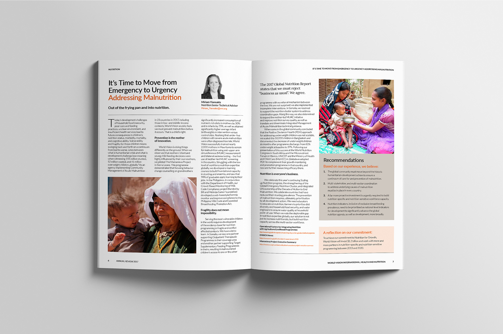
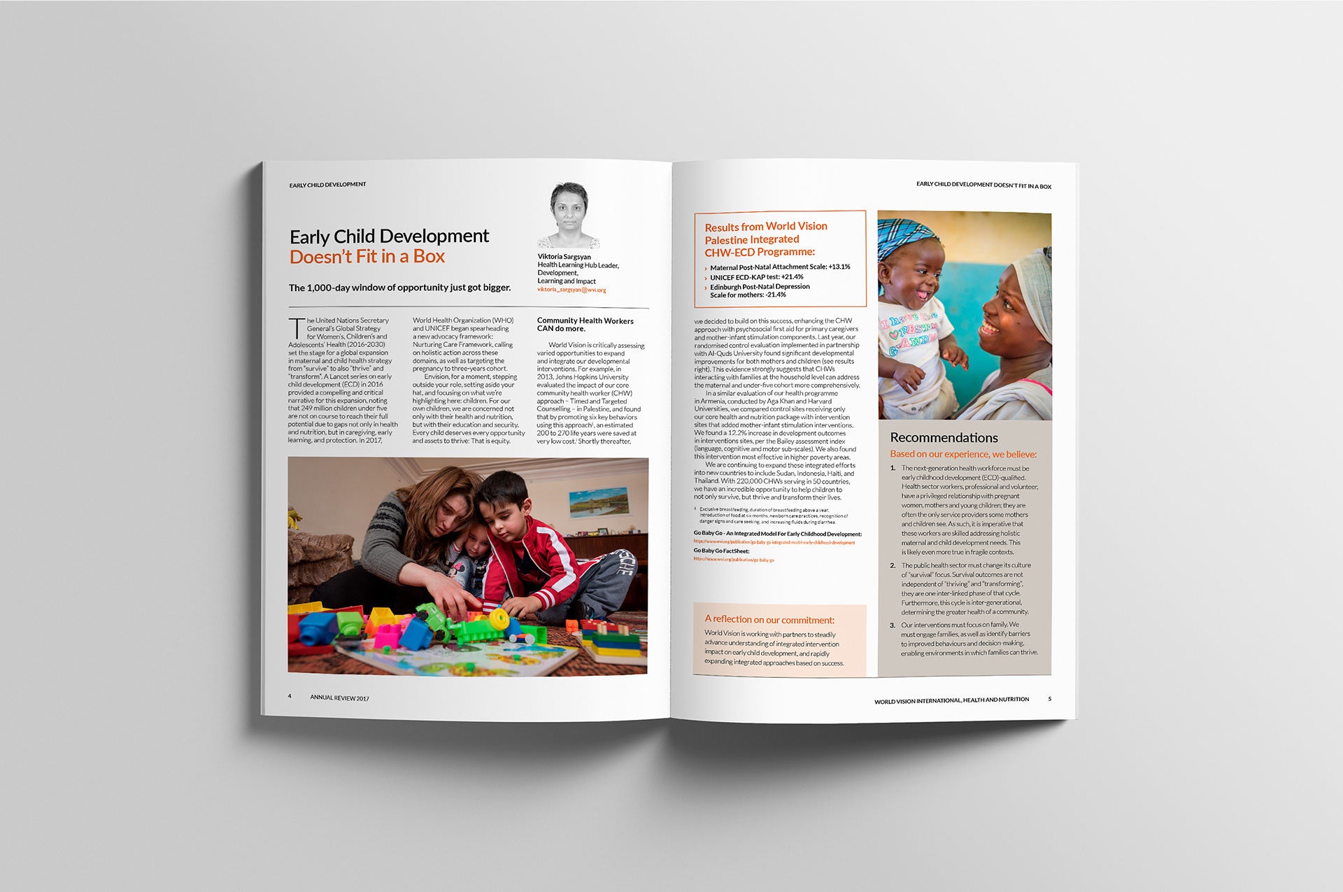
Based on Ishimodo's design direction, Stephen added a reflections box at the end of each section, along with external links to supporting articles, which acted as a call to action for each section.
Section spread with half-page image under section header and intro copy.
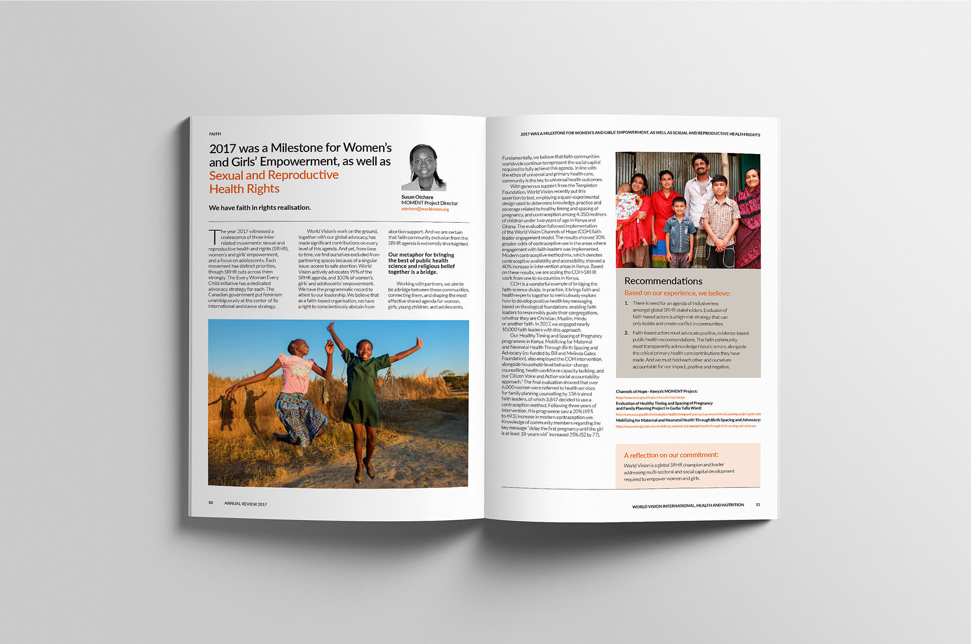
The new condensed layout still allowed for some half-page imagery.
Section spread showing condensed pull quote on right hand page.
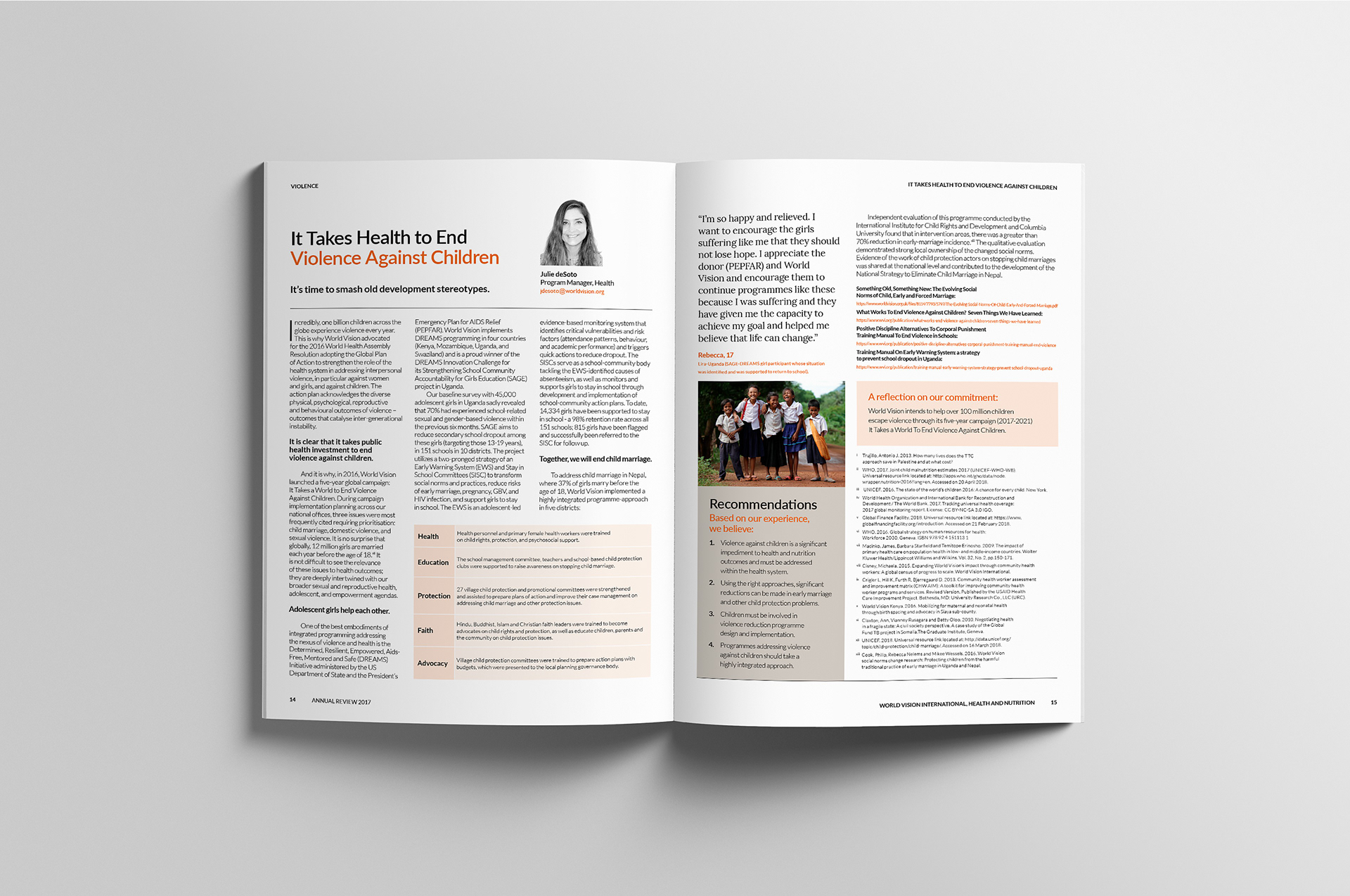
Pull quotes were also reduced in font size to save space.
Back cover page with hopeful image of smiling boy.
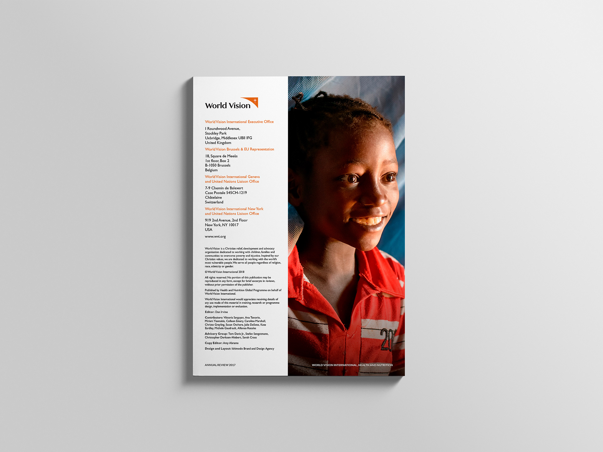
The back cover design was kept from the previous World Vision Annual Reports.

View more projects

Carmichaels Logo
Logo design for Fresh New Media's client, Carmichaels. The project included initial creative direction and the development of the brand for print and television.
World Vision The Killer Gap Report & Infographic
Editorial design and layout of the World Vision - Child Health Now publication "The Killer Gap". Also included the design and illustration of a supporting infographic that would be available for download from the World Vision website.
Bink Kids Brand Identity
Creative direction and design of the Bink Kids brand identity, including the wordmark design, brand stationery, and marketing materials for print and online media.
Glycon Brand Identity Design
Design, development and creative direction for the Glycon brand identity.
Vivant Creations Brand Management
Brand management for Vivant Creations, including the design and development of multiple Vivant product ranges from initial concepts through to final products, packaging, and marketing.
Tony Ferguson Recipe Book Editorial Design
Creative direction and Editorial Design of the Tony Ferguson - Everyday Favourites recipe book for the Ishimodo Brand and Design Agency. Included design, layout, and prepress production of this sixty-four-page booklet.
Little Yellow Cloud Brand Identity
Brand identity design for the Little Yellow Cloud® kids clothing brand.
World Vision 2015 Annual Report Design
Creative direction, editorial design, and layout of the World Vision 2015 Health and Nutrition Annual Report for the Ishimodo Brand and Design Agency.
Tony Ferguson Point of Sale Brand Collateral
Creative direction of Tony Ferguson's point of sale brand collateral for the Ishimodo Brand and Design Agency. Included the design and layout of in-store Posters, End-shelf Header Cards, Shelf Wobblers, and Ceiling Disks.
iWhales Brand Identity
Creative direction and design of the iWhales brand identity for The Oceania Project. Included development of the brandmark and brand lockup used on all iWhales marketing materials and merchandise.
Back to Top