This project’s challenge was to maintain the colour consistency of the Donegal Catch brand lockup across a range of four SKUs (Stock Keeping Units). Franklin achieved this by separating out the blue band and the red of the NEW flash as separate Pantone spot colours. This allowed the printers to control the colour of the Donegal Catch branding and product photography independently from the brand lockup’s bell shape. Stephen also worked on maintaining the same level of uniformity with the retouching of the hero images. He matched the plate colours with the background compositions on each product variant. The result was artwork that maintained a high level of colour consistency across the range, on press, and across multiple print runs.

Creative Direction: Mesh Design
Creative Artworking: Stephen Franklin
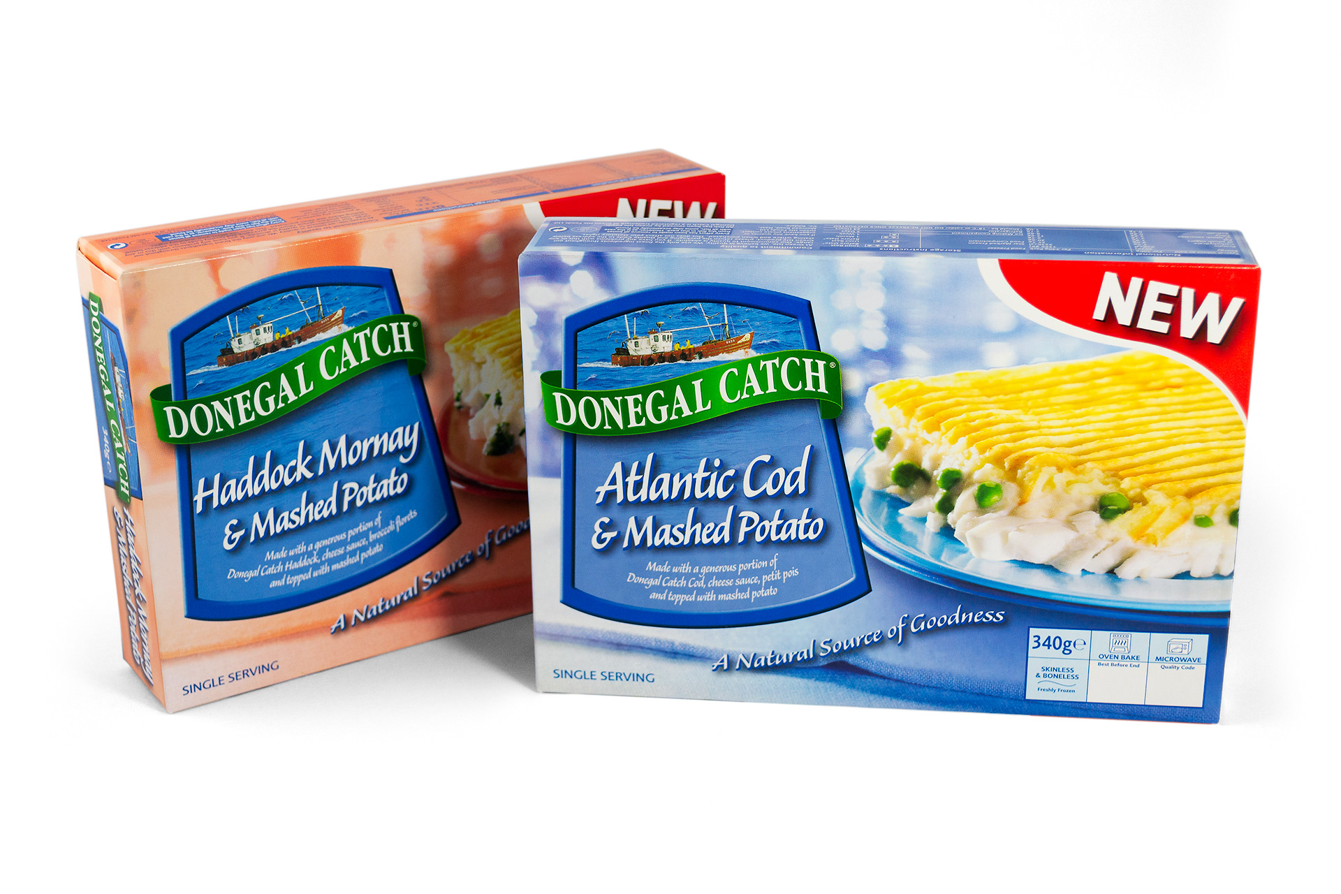
The spot blue colour seen here in use on the band of the bell-shaped brand lockup.
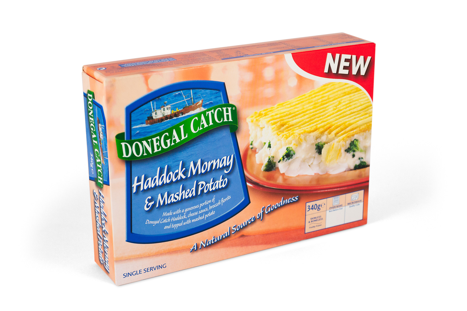
Care was taken in retouching the colour of the product hero’s plate to match the colour of the background composition created by the Mesh design team.
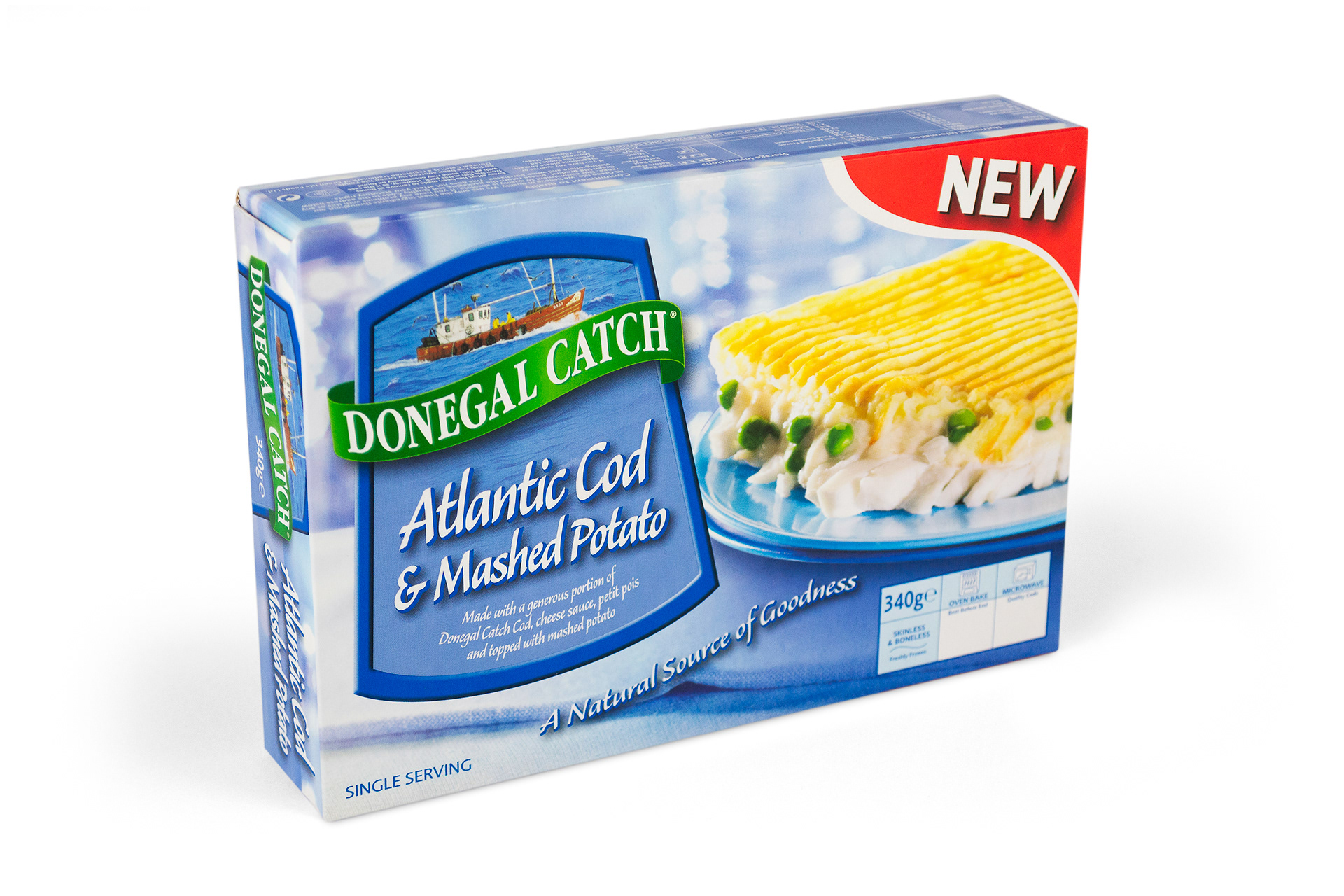
The logo was composed of clean breakdown of Cyan and Yellow ink percentages to stay consistent with the green of the Donegal Brand.

View more projects

Mars EVA Mech Suit
Mars EVA (Extravehicular Activity) exoskeleton mech suit - a personal design project to help discover the basics of 3D modelling and texturing.
Microsoft Catalogue Cover Image
Cover image of the Microsoft Windows product catalogue produced for the Frontline agency, Sydney, Australia. This image is a composite of multiple stock photography images and a photographic shoot involving two models: one for positioning and one for face and hands.
Testra PSO Document
41 Page proposal document for Credit Suisse First Boston to act as global coordinator for the Telstra PSO (Public Share Offer). Designed the layout including all graphs and charts. Entire document was designed and completed at short notice over 3 days to meet a tight Government deadline.
John Bullers Pies Packaging Artwork
Creative artworking for the John Bullers Family Pies. A new product range from Green Isle Foods.
Braams Brand and Marketing Collateral
Creative direction and production of Braams Property Services design collateral, and marketing materials from 1997 through to 2001.
Queensland Energy Revolution Report
A seventy-page report on Queensland energy. Franklin designed the complete report including all graphs, charts, and illustrations. The target format was a short run digitally printed document.
Integrated Vision Marketing Collateral
Creative direction and design of various marketing collateral for Integrated Vision, a leading Australian videoconferencing solutions provider. Stephen, operating as Graphic Vision, partnered with the client to produce a range of items including, a Quarterly Newsletter, DL Brochure, and DL Promotions, managing all designs from concept through to prepress and final print.
Coco Pops Back of Pack Illustration
A promotional back of pack illustration for Kellogg's Coco Pops cereal packaging.
Kellogg's Froot Loops Back of Pack Illustration
A promotional back-of-pack illustration created for Kellogg's Froot Loops cereal packaging. Included the digital creation and preparation of the finished image for use in the packaging artwork.
Kin Khao Brand Identity
Identity design for Kin Khao Thai restaurant, Athlone, Ireland. The design was executed across interiors, signage, menus, newspaper ads and other marketing materials.
Back to Top