When life coach Jackie Fitzpatrick approached Stephen about designing a website for her consultancy, she wanted something that reflected the unique character of her coaching style. Stephen approached this brief by homing in on the message “it's never too late to start a journey”. He created a typographically rich image in the form of a life map with branching choices. And a unique navigation menu for the site using a compass as a metaphor for how Jackie could help guide her clients through these major decision points. The outcome was a unique website design that grabbed the reader’s attention, drawing them deeper into the site content, and leading them closer to taking the next step on their life's journey.

Web Design: Stephen Franklin
UX/UI: Stephen Franklin
Web Development: Stephen Franklin
Freedom Unlimited homepage.
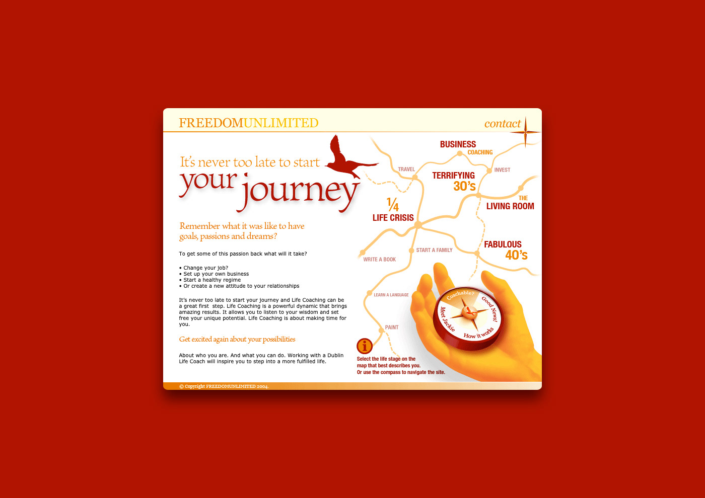
The website used a unique compass navigation menu with accompanying life map.
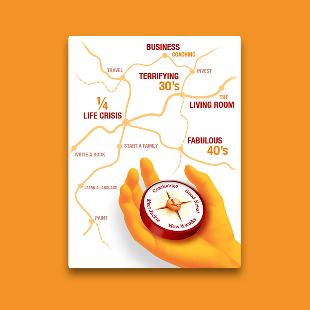
Freedom Unlimited map and hand navigation.
Vibrant orange and deep red duotone image.
Stephen used a palette of vibrant orange and deep red for the colour scheme. To help tie everything together visually, the website images utilised these colours with a duotone look.
Landing page banner image.
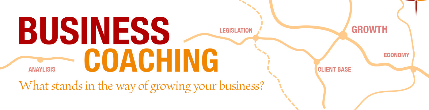
A strong typographical style was used consistently throughout the website, as seen here in the Business Coaching landing page banner image.
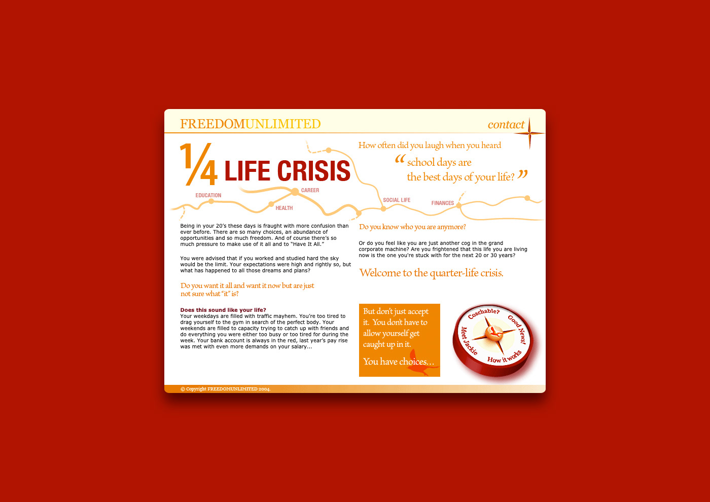
Quarter life landing page.
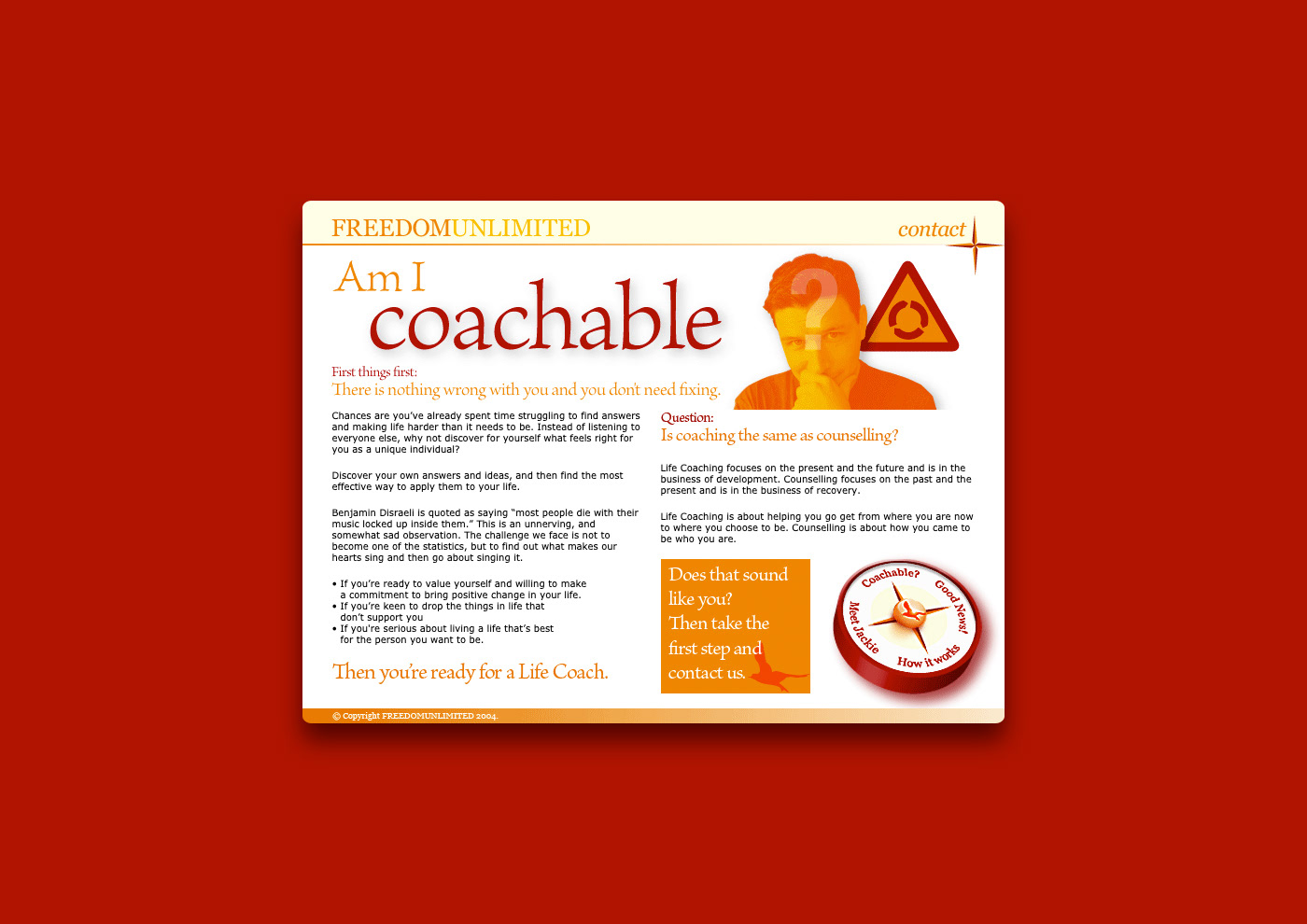
Am I Coachable landing page.
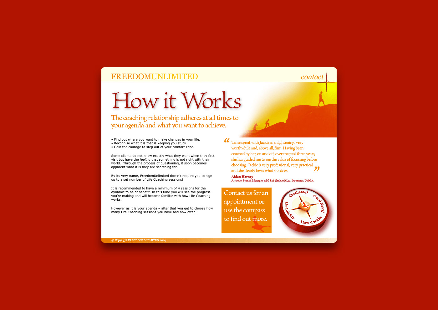
How it Works landing page.
Each landing page featured a distinctive graphic, tied together with the rest of the site through the rich colour palette and typographic choices.  

View more projects

Brightspark Brand Identity
Identity design for Brightspark, a Dublin-based digital marketing agency.
ABOL User Interface Icons
Created user interface icons for various use cases for the Australian Business Online (ABOL) website, commissioned by Hothouse Interactive, Sydney, Australia.
Concept Visualisations for Landini Associates
Concept visualisations created for Landini Associates client projects. Each image was based on supplied architectural elevations, along with a creative brief for the materials to be used for the interior design.
Merrilake Promotional Calendar Illustration
Stephen's contribution to the Merrilake agency’s promotional calendar. He was requested to respond to the brief "Merrilake Illustrators are not just bums on seats!" in the style of his favourite artist. Salvador Dali's "Sleep" was Franklin's inspiration.
SoundNet Newsletter and Masthead
Editorial design and masthead design of SoundNet, the official newsletter of The Oceania Project a non-profit research organisation dedicated to raising awareness about Whales, Dolphins and Porpoises and the ocean environment.
College Portfolio
Portfolio submitted as a requirement for graduating from the KvB College of Visual communication, Sydney Australia. Stephen received a diploma in Graphic Design on the 7th of December 1987.
BigPond Cable Packaging Image
Worked with the Art Director at the Frontline agency to produce this secondary pack image, used as part of a Telstra Big Pond Cable Modem packaging. Involved matching and applying the colour halftone screen effect of the hand image to an image of the Microsoft mouse, combining both into a seamless composition.
Thick & Thirsty Point of Sale Hero Image Retouching
Retouching of hero image for Thick & Thirsty point of sale promotion.
Wyeth BioPharma Work Life Harmony Week
Designed both print and digital components for the Wyeth Bio Pharma - Work/Life Harmony Week. This included various printed pamphlets and messaging pieces along with the UX/UI for the program’s website.
The Oceania Project Logo
Logo design for The Oceania Project, a Not-for-profit research and information organisation established in 1988, dedicated to raising awareness about Cetacea (Whales, Dolphins and Porpoises) and the ocean environment.
Back to Top